Reader small image

You're reading from  Predictive Analytics Using Rattle and Qlik Sense

Product typeBook
Published inJun 2015
Reading LevelIntermediate
Publisher
ISBN-139781784395803
Edition1st Edition
Languages
Right arrow
Authors (2):
Ferran Garcia Pagans
author image
Ferran Garcia Pagans

Ferran Garcia Pagans studied software engineering at the University of Gironaand Ramon Llull University. After that, he did his masters in business administration at ESADE Business School. He has 16 years of experience in the software industry,where he has helped customers from different industries to create software solutions. He started his career working at the Ramon Llull University as a teacher and researcher.Then, he moved to the Volkswagen group as a software developer. After that, he worked with Oracle as a Java, SOA, and BPM specialist. Currently, he is a solution architect at Qlik, where he helps customers to achieve competitive advantages with data applications.
Read more about Ferran Garcia Pagans

Fernando G Pagans
Fernando G Pagans
author image
Fernando G Pagans

Ferran Garcia Pagans studied software engineering at the University of Gironaand Ramon Llull University. After that, he did his masters in business administration at ESADE Business School. He has 16 years of experience in the software industry,where he has helped customers from different industries to create software solutions. He started his career working at the Ramon Llull University as a teacher and researcher.Then, he moved to the Volkswagen group as a software developer. After that, he worked with Oracle as a Java, SOA, and BPM specialist. Currently, he is a solution architect at Qlik, where he helps customers to achieve competitive advantages with data applications.
Read more about Fernando G Pagans

View More author details
Right arrow

Chapter 4. Creating Your First Qlik Sense Application

In the previous chapters, we've seen how to use Rattle to modify and explore our data. The exploration we've done is mainly a mathematical exploration. Qlik Sense is the perfect tool to explore and understand the data from a business point of view. Qlik Sense is easy and intuitive. In this chapter, we'll create a simple application in order to explore the basics of Qlik Sense.

To create a simple application, we'll follow these steps:

  • Download an example dataset

  • Learn how to load it into Qlik Sense

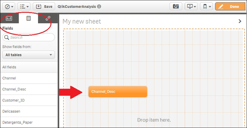
  • Learn about the Qlik Sense data model and its application structure

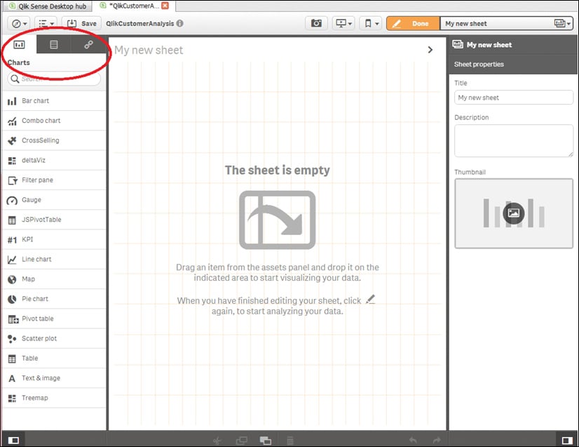
  • Learn how to create basic charts such as bar and pie charts

  • To finish our application, we'll create some filters that will help us to select the desired information

  • Finally, we'll learn to explore our dataset using Qlik Sense; at this point, we'll start answering basic business questions

Customer segmentation and customer buying behavior


Segmenting the customers means dividing our customers into groups relevant to our business. Customers are divided based on demography, behavior, and other indicators. Analyzing your customers and dividing them into different groups allows you to be more accurate in your marketing activities.

There are different types of customer segmentation; some of them are:

  • Geographic segmentation

  • Demographic segmentation

  • Buying behavior segmentation

  • Psychographic segmentation

  • Segmentation by benefits

  • Cultural segmentation

In this chapter, we'll develop an application that allows us to visually create customer segments based on different variables. In the next chapter, we'll create a system that will automatically segment our customers based on their shopping habits in the main product categories. The main objective of this application is improving our knowledge of our customers to address more effective marketing activities.

Loading data and creating a data model


In order to create an example application, I've downloaded a dataset from the Center for Machine Learning and Intelligent Systems at the University of California, Irvine. They have a dataset repository you can use for training purposes. The datasets are organized by task (clustering, classification, regression, and others), by attribute type, by domain area, and so on. This is a very useful resource to practice your new skills and we'll be using it again in this book.

Note

You can find more information from Bache, K. and Lichman, M. (2013); UCI Machine Learning Repository [http://archive.ics.uci.edu/ml]; Irvine, CA: University of California, School of Information and Computer Science.

In this chapter, we're going to use a dataset called Wholesale customers Data Set. The dataset is originated from a larger database – Abreu, N. (2011); Analise do perfil do cliente Recheio e desenvolvimento de um sistema promocional; Mestrado em Marketing, ISCTE-IUL, Lisbon...

Creating a simple data app


As we've seen in Chapter 1, Getting Ready with Predictive Analytics, a Qlik Sense application is based on different sheets. In this section, we'll learn how to add a new sheet in your application and how to add basic charts and filters.

In the Qlik Sense main menu, choose App overview to open your application. A new Qlik Sense application always has an empty sheet called My new sheet, and you always have the option of adding a new one. This option is shown in the following screenshot:

Now you are on an empty sheet. In order to modify a Qlik Sense sheet, you need to turn the Edit mode on. You can do this by clicking on the Edit mode to add new visual components, as shown in this screenshot:

Associative logic


Before learning how to create charts, we'll learn how associative logic works. Associative logic is a key functionality in Qlik Sense – it allows a business user without technical knowledge to explore the data.

In the following screenshot, we'll see the Qlik Sense main screen in the Edit mode. The screen is divided into three areas. In the center pane, you can see the sheet you're developing; the current screenshot shows an empty sheet. The right-hand pane shows the properties of the active object. In this case, the right-hand pane shows the sheet properties – Title, Description, and Thumbnail. The left-hand pane has a tab row with three options – Charts, Fields, and Master items; in this chapter, we'll use Charts and Fields, as shown here:

From the left-hand side tab row, select Fields; you'll see all fields in alphabetical order. Drag the Channel_Desc field and drop it into the central area, as shown in the following screenshot:

This action will add a filter pane to your...

Creating charts


Before starting to create chart diagrams, delete the filters we've created in the previous section or create a new sheet.

To create a Qlik Sense visualization, you need to know three important things:

  • The type of chart you are going to use

  • The dimension objects you are going to use in your analysis

  • The metric or metrics

We're going to start with a very basic chart. Our objective is to create a pie chart like the chart in the following screenshot. This chart explains the distribution of our customers between two channels – Horeca and Retail:

In this pie chart, the dimension is Channel and the measure is the number of customers. On the left-hand side of the following screenshot, there is a bar with all of the different charts that Qlik Sense provides. Drag a pie chart and drop it into the central area as shown in the following screenshot. Change the size of the chart with the orange lines and place it wherever you prefer:

In order to finish the pie chart, you need to choose a dimension...

Analyzing your data


Our new application has two filters we can use to get a response to our questions. Select Horeca in the Channel filters. The application responds by actualizing the data. Now everything you see is related to the Horeca customers. Use the green or red buttons to confirm or cancel your selection. This is depicted in the following screenshot:

In the following screenshot, I've selected Horeca and Porto, and in the Top Customers table, I can see the top 10 Horeca customers in Porto. Now you can use the filters and the visualizations we've created to answer your own questions:

Tip

You can filter the data using the filters we've put in the application or you can filter the data by clicking on the charts.

Finally, I've created a new sheet called 360º Analysis. In this last sheet, we analyze the customer average money spent and the total money spent in the two different sales channels, the three regions, and the six different product categories. The following screenshot represents...

Further learning


In this chapter, we've learned three main things about Qlik Sense – how to load and transform data, how to make selections to filter data, and how to create basic visualizations.

To find out more information about these features, I suggest you go through this document created by Michael Tarallo on the Qlik Community – https://community.qlik.com/docs/DOC-6932.

For data loading, you will find a section in the previous document called Data Loading & Modeling, but we especially like Power of Qlik Script, a series of three videos. There is a special video to learn how associative logic works, called Working with Selections, and in the Apps & Visualizations sections, you'll find videos that explain how to create data visualizations.

Qlik Community is a very active users' community around the Qlik platform. You will find a lot of resources related to Qlik Sense on this site. I strongly recommend you to register with Qlik Community.

Summary


In this chapter, we saw how to use Qlik Sense to create an application that helps us to analyze our customer data. We used a simple dataset with just 440 customers that we downloaded from the University of California website mentioned earlier. The dataset contained only two dimensions—channel and region—and six measures—Fresh, Frozen, Milk, Grocery, Delicatessen, and Detergents_Paper.

We learned how to load a dataset from a CSV file. We created a data model and uploaded additional tables created in a spreadsheet editor. Finally, we saw that we can create additional fields in a table using the spreadsheet editor or the data load editor. We also saw that the data load editor provides a lot of control over the data.

After creating the data model, we learned what associative logic is and how a business user can slice and dice his data using it.

Finally, we learned how to create basic visualizations using Qlik Sense, and we created our first Qlik Sense app.

In the next chapter, we'll use...

lock icon
The rest of the chapter is locked
You have been reading a chapter from
Predictive Analytics Using Rattle and Qlik Sense
Published in: Jun 2015Publisher: ISBN-13: 9781784395803
Register for a free Packt account to unlock a world of extra content!
A free Packt account unlocks extra newsletters, articles, discounted offers, and much more. Start advancing your knowledge today.
undefined
Unlock this book and the full library FREE for 7 days
Get unlimited access to 7000+ expert-authored eBooks and videos courses covering every tech area you can think of
Renews at $15.99/month. Cancel anytime

Authors (2)

author image
Ferran Garcia Pagans

Ferran Garcia Pagans studied software engineering at the University of Gironaand Ramon Llull University. After that, he did his masters in business administration at ESADE Business School. He has 16 years of experience in the software industry,where he has helped customers from different industries to create software solutions. He started his career working at the Ramon Llull University as a teacher and researcher.Then, he moved to the Volkswagen group as a software developer. After that, he worked with Oracle as a Java, SOA, and BPM specialist. Currently, he is a solution architect at Qlik, where he helps customers to achieve competitive advantages with data applications.
Read more about Ferran Garcia Pagans

author image
Fernando G Pagans

Ferran Garcia Pagans studied software engineering at the University of Gironaand Ramon Llull University. After that, he did his masters in business administration at ESADE Business School. He has 16 years of experience in the software industry,where he has helped customers from different industries to create software solutions. He started his career working at the Ramon Llull University as a teacher and researcher.Then, he moved to the Volkswagen group as a software developer. After that, he worked with Oracle as a Java, SOA, and BPM specialist. Currently, he is a solution architect at Qlik, where he helps customers to achieve competitive advantages with data applications.
Read more about Fernando G Pagans