


Time series data is usually a set of ordered data collected over equally spaced intervals. Time series data occurs in most business and scientific disciplines, and the data is closely tied to the concept of forecasting, which uses previously measured data points to predict future data points based upon a specific statistical model.
Time series data differs from the kind of data that we have been looking at previously; because it is a set of ordered data points, it can contain components such as trend, seasonality, and autocorrelation, which have little meaning in other types of analysis, such as "Cross-sectional" analysis, which looks at data collected at a static point in time.
Usually, time series data is collected in equally spaced intervals, such as days, weeks, quarters, or years, but that is not always the case. Measurement of events such as natural disasters is a prime example. In some cases, you can transform uneven data into equally spaced data. In other cases, you...
We will start by reading in a dataset which contains health care enrollment data over a period for several categories. This data has been sourced from Table HIB-2, health insurance coverage status and type of coverage all persons by age and sex: 1999 to 2012, and it is available from the CMS website at http://www.census.gov/data/tables/time-series/demo/health-insurance/historical-series/hib.html.
This table shows the number of people covered by government and private insurance, as well as the number of people not covered.
This table has several embedded time series across all the 14 years represented. 14 data points would not be considered an extremely long time series; however, we will use this data to demonstrate how we can comb through many time series at once. Since it is small, it will be easy enough to verify the results via visual inspection and printing subsets of the data. As you become familiar with the methodology, it will enable you to expand to...
Next, we will read in a few rows of the file (using the nrow parameters), and then run a str() function on the input to see which variables are contained within the file. There are several metrics in the file related to medicare enrollment. We will just concentrate on the total enrollment metrics, and not utilize some of the other sub-segments (such as military and private insurance) for this chapter:
x <- read.csv("x <- read.csv("hihist2bedit.csv", nrow = 10)"
 str(x)
 > 'data.frame': 10 obs. of  13 variables:
 >  $ Year        : Factor w/ 10 levels "2003","2004 (4)",..: 10 9 8 7 6 5
 4 3 2 1
 >  $ Year.1      : int  2012 2011 2010 2009 2008 2007 2006 2005 2004 2003
 >  $ Total.People: num  311116 308827 306553 304280 301483 ...
 >  $ Total       : num  263165 260214 256603 255295 256702 ...
 >  $ pritotal    : num  198812 197323 196147 196245 202626 ...
 >  $ priemp      : num  170877 170102 169372 170762 177543 ...
> $ pridirect : num...For this exercise, we will be using a restricted set of columns from the CSV file. We can either select the specific columns from the dataframe just read in (if we just read in the whole file), or reread the csv file using the colClasses parameter to only read the columns that are required. Often, this method is preferable when you are reading a large file, and will instruct read.csv to only retain the first three and the last two columns, and ignore the columns priemp through govmilitary.
After rereading in the file, with a subset of the columns, we print a few records from the beginning and end of the file. We can do this using a combination of the rbind(), head(), and tail() functions. This will give us all of the columns we will be using for this chapter, except for some columns, which we will derive in the next section:
x <- read.csv("hihist2bedit.csv", colClasses = c(NA,NA, NA, NA, rep("NULL", 7)))

 rbind(head(x), tail(x))
> Year Year.1 Total.People...Year and Year.1 (columns 1 and 2): Year is the year for which the annual enrollment figures are taken. You will notice that year appears twice, in column 1 (as a factor) and then again in column 2 (integer). This is because the data has been previously preprocessed, and appears twice merely for convenience, since there are certain instances in which we will prefer to use a factor, and other instances in which we prefer to use an integer. The numbers in parentheses in Year refer to footnotes in the original data sources. Please refer the the reference notes at the CMS website for a full explanation of how the data was collected. While you could always create integers from factors and vice versa in the code, this saves valuable processing time if certain transformations can be made available beforehand.
Total people (column 3): Total people is the population size of the category. They may either enrolled for health coverage (total) or not (Not.Covered).
Total (column...
The variable that we will begin to look at initially will be the variable Not.Covered. We will be interested in examining any possible enrollment trends using this variable. Since the population size will differ depending upon the category, we will calculate the percentage of people not covered in a given year by dividing the raw number corresponding to this variable by the total in the population for that category. This will give us a new variable named Not.Covered.Pct. This will also standardize the metric across the different-sized categories, large and small, and enable us to compare.
After calculating the variable, we can print the first few records, and also print some summary statistics for this one variable:
Since we have only looked at parts of the file (via head() or tail() functions), we do not know how many categories there are and how they differ in terms of health care coverage. So we will start off by looking at some of the groupings.
In previous chapters, we have used sql() and the aggregate() function to group data. For this example, we will use the dplyr package. One advange of the dplyr() package is that it can also be used with pipe syntax, which allows the result of one function to be passed to the next function without intermediate assignments:
library(dplyr)
>
> Attaching package: 'dplyr'
> The following objects are masked from 'package:stats':
>
>     filter, lag
> The following objects are masked from 'package:base':
>
>     intersect, setdiff, setequal, union
# str(x)
The by.cat object will show the average number insured, and the average total population for each category. Remember, this data is also grouped...
Often, you will want to augment your original data with some of the calculated data as derived previously. In these cases, you can merge the data back into the original data using a common key. Again, we will use the dplyr package to take the results just obtained (by.cat) and join them back to the original data (x), using the common key cat.
We will be using a left_join just for an example; however, we could have used a right join to obtain the same results, since by.cat was completely derived from x. After joining the two dataframes, we will end up with a new dataframe named x2:
 # Merge the summary measures back into the original data. Merge by cat.


 x2 <- by.cat %>% left_join(x, by = "cat")
 head(x2)
 > Source: local data frame [6 x 9]
 >
 >        cat Avg.Total.Insured Avg.People      Year Year.1 Total.People
 >     (fctr)             (dbl)      (dbl)    (fctr)  (int)        (dbl)
 > 1 ALL AGES           ...
Earlier, we mentioned needing to have equally sized time intervals. Additionally, before we perform any time series analysis, we need to check for the number of non-missing time intervals. So, let's check the number of enrollment years for each category.
Using the dplyr package, we can use summarize (n()) to count the number of entries for each category:
# -- summarize and sort by the number of years
yr.count <- x2 %>% group_by(cat) %>% summarise(n = n()) %>% arrange(n)

# - we can see that there are 14 years for all of the groups.  That is good!
print(yr.count, 10)
 > Source: local data frame [24 x 2]
 >
 >                      cat     n
 >                   (fctr) (int)
 > 1         18 to 24 YEARS    14
 > 2         25 to 34 YEARS    14
 > 3         35 to 44 YEARS    14
 > 4         45 to 54 YEARS    14
 > 5         55 to 64 YEARS    14
 > 6      65 YEARS AND OVER    14
 > 7               ALL AGES    14
 > 8 ...
In many instances, we will only want to look at the top categories, especially when there are many demographical categories that have been subsetted. In this example, there are only 24 categories but in other examples, there may be a much larger number of categories.
The dataframe x2 is already sorted by Avg.People. Since we know that there are 14 enrollment records for each category, we can get the top 10 categories based upon the highest base population by selecting the first 14*10 (or 140) rows. We will store this in a new dataframe, x3, and save this to disk.
Since we know each group has 14 years, extracting the top 10 groups is easy to calculate. After assigning x2, print the first 15 records and observe that the category break after the first 14 records:
x3 <- x2[1:(14 * 10), ]
head(x3,15)
  cat Avg.Total.Insured Avg.People Year Year.1 Total.People Total Not.Covered
 <fctr> <dbl> <dbl> <fctr> <...
The lattice package is a useful package to learn, especially for analysts who like to work in formula notation (y~x).
In this example, we will run a lattice plot in order to plot Not.Covered.Pct on the y-axis, Year on the x-axis, and produce separate plots by category.
The main call is specified by the following:
xyplot(Not.Covered.Pct ~ Year | cat, data = x3)
Since we are plotting the top 10 groups, we can specify layout=c(5,2) to indicate we want to arrange the 10 plots in a 5*2 matrix. Not.Covered.Pct is to be arranged on the y axis (left side of the ~ sign), and Year is arranged along the x-axis (right side of ~ sign). The bar (|) indicates that the data is to be plotted separately by each category:
library(lattice)
x.tick.number <- 14
at <- seq(1, nrow(x3), length.out = x.tick.number)
labels <- round(seq(1999, 2012, length.out = x.tick.number))

p <- xyplot(Not.Covered.Pct ~ Year | cat, data = x3, type = "l", main = list(label = "Enrollment by...
If you like using ggplot, a similar set of graphs can be rendered using facets:
require("ggplot2")

.df <- data.frame(x = x3$Year.1, y = x3$Not.Covered.Pct, z = x3$cat, s = x3$cat)
.df <- .df[order(.df$x), ]
.plot <- ggplot(data = .df, aes(x = x, y = y, colour = z, shape = z))
+ geom_point()
+      geom_line(size = 1)
+ scale_shape_manual(values = seq(0, 15))
+ scale_y_continuous(expand = c(0.01, 0))
+ facet_wrap(~s)
+ xlab("Year.1")
+ ylab("Not.Covered.Pct")
+ labs(colour = "cat", shape = "cat")
+ theme(panel.margin = unit(0.3, "lines"), legend.position = "none")
print(.plot) 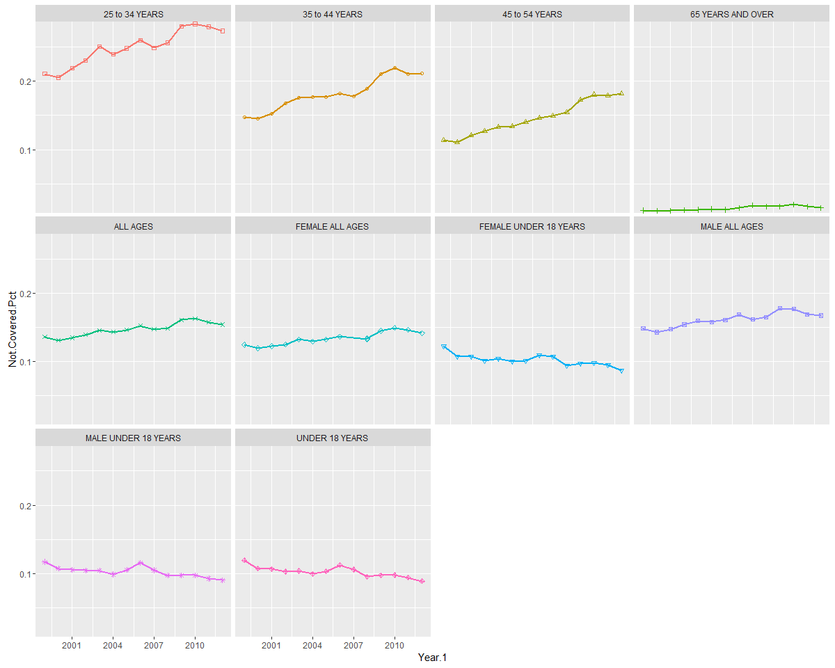
One benefit of assigning plots to a plot object is that you can later send the plots to an external file, such as a PDF, view it externally, and even view it in your browser directly from R. For example, for the Lattice graphs example, you can use trellis.device and specify the output parameters, and then print the object. As we illustrated in an earlier chapter, you can use browseURL to open the PDF in your browser:
# send to pdf
setwd("C:/PracticalPredictiveAnalytics/Outputs")
trellis.device(pdf, file = "x3.pdf")
print(p)
dev.off()
#NOT run
#browseURL('file://c://PracticalPredictiveAnalytics//Outputs//x3.pdf')In a linear trend model, one constructs a linear regression least squares line by running an lm() regression through the data points. These models are good for initially exploring trends visually. We can take advantage of our lm() function, which is available in base R, in order to specifically calculate the slope of the trend line.
For example, the first 14 rows show the data for the entire population group (ALL AGES). We can run a regression on Not.Covered.Pct for each of the years numbered 1-14 and see that the coefficient for the Year.1 variable is positive, indicating that there is a linear increase in the non-coverage percentage as ime advances. We can also the coeficient output by itself, by wrapping the lm() function within a coef() function.
After running the regression using the lm() function, we can subsequently use the coef function to specifically extract the slope and the intercept from the lm model.
Since this is a regression in which there is only one...
Now that we have seen how we can run a single time series regression, we can move on to automating separate regressions and extracting the coefficients over all of the categories.
There are several ways to do this. One way is by using the do() function within the dplyr package. Here is the sequence of events:
- The data is first grouped by category.
- Then, a linear regression (
lm()function) is run for each category, withYearas the independent variable, andNot.Coveredas the dependent variable. This is all wrapped within a do() function. - The coefficient is extracted from the model. The coefficient will act as a proxy for the direction and magnitude of the trend.
- Finally, a dataframe of lists is created (
fitted.models), where the coefficients and intercepts are stored for each regression run on every category. The categories that have the highest positive coefficients exhibit the greatest increasing linear trend, while the declining trend is indicated by negative coefficients...
Now that we have the coefficients, we can begin to rank each of the categories by increasing trend. Since the results we have obtained so far are contained in embedded lists, which are a bit difficult to work with, we can perform some code manipulation to transform them into a regular data frame, with one row per category, consisting of the category name, coefficient, and coefficient rank:
library(dplyr)
# extract the coefficients part from the model list, and then transpose the
# data frame so that the coefficient appear one per row, rather than 1 per
# column.

xx <- as.data.frame(fitted_models$model)
xx2 <- as.data.frame(t(xx[2, ]))

# The output does not contain the category name, so we will merge it back
# from the original data frame.

xx4 <- cbind(xx2, as.data.frame(fitted_models))[, c(1, 2)]  #only keep the first two columns

# rank the coefficients from lowest to highest. Force the format of the rank
# as length 2, with leading zero's

tmp <-...
We will augment the original x2 dataframe with this new information by merging back by category, and then by sorting the dataframe by the rank of the coefficient. This will allow us to use this as a proxy for trend:
x2x <- x2 %>% left_join(xx4, by = "cat") %>% arrange(coef.rank, cat)


# exclude some columns so as to fit on one page
head(x2x[, c(-2, -3, -4, -8)])
> Source: local data frame [6 x 7]
>
>                   cat Year.1 Total.People    Total Not.Covered.Pct
>                (fctr)  (int)        (dbl)    (dbl)           (dbl)
> 1 MALE 18 to 24 YEARS   2012     15142.04 11091.86       0.2674787
> 2 MALE 18 to 24 YEARS   2011     15159.87 11028.75       0.2725034
> 3 MALE 18 to 24 YEARS   2010     14986.02 10646.88       0.2895460
> 4 MALE 18 to 24 YEARS   2010     14837.14 10109.82       0.3186139
> 5 MALE 18 to 24 YEARS   2008     14508.04 10021.66       0.3092339
> 6 MALE 18 to 24 YEARS   2007...
Now that we have the trend coefficients, we will use ggplot to first plot enrollment for all of the 24 categories, and then create a second set of plots which adds the trend line based upon the linear coefficients we have just calculated.
Code notes: facet_wrap will order the plots by the value of variable z, which was assigned to the coefficient rank. Thus, we can get to see the categories with declining enrollment first, ending with the categories having the highest trend in enrollment from the period 1999-2012.
Note
I like to assign the variables that I will be changing to standard variable names, such as x, y, and z, so that I can remember their usage (for example, variable x is always the x variable, and y always the x variable). But you can supply the variable names directly in the call to ggplot, or set up your own function to do the same thing:
library(ggplot2)
.df <- data.frame(x = x2x$Year.1, y = x2x$Not.Covered.Pct, z = x2x$coef.rank, slope...
Sometimes, it's nice to plot all of the lines on one graph rather having them as separate plots. To achieve this, we will alter the syntax a bit, so that the categories show up as stacked lines. Again, we can see the percentage of uninsured aligns across ages, with the under 18 group having the lowest uninsured rate, and the 25-54 group having the highest:
library(ggplot2)
### plot all on one graph

.df <- x3[order(x3$Year.1), ]
.plot <- ggplot(data = .df, aes(x = Year.1, y = Not.Covered.Pct, colour = cat,shape = cat))
+ geom_point()
+ geom_line(size = 1)
+ scale_shape_manual(values = seq(0,15))
+ ylab("Not.Covered.Pct")
+ labs(colour = "cat", shape = "cat")
+ theme_bw(base_size = 14,base_family = "serif")
print(.plot) 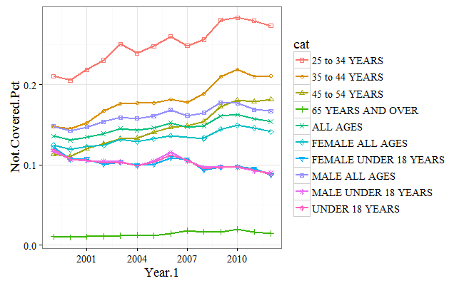
So far, we have looked at ways in which we can explore any linear trends which may be inherent in our data. That provided a solid foundation for the next step, prediction. Now we will begin to look at how we can perform some actual forecasting.
As a preparation step, we will use the ts function to convert our dataframe to a time series object. It is important that the time series be equally spaced before converting to a ts object. At a minimum, you supply the time series variable, and start and end dates as arguments to the ts function.
After creating a new object, x, run a str() function to verify that all of the 14 time series from 1999 to 2012 have been created:
# only extract the 'ALL' timeseries
x <- ts(x2$Not.Covered.Pct[1:14], start = c(1999), end = c(2012), frequency = 1)

str(x)
>  Time-Series [1:14] from 1999 to 2012: 0.154 0.157 0.163 0c.161 0.149 ...
A simple moving average will simply take the sum of the time series variable for the last k periods and then will divide it by the number of periods. In this sense, it is identical to the calculation for the mean. However, what makes it different from a simple mean is the following:
- The average will shift for every additional time period. Moving averages are backward-looking, and every time a time period shifts, so will the average. That is why they are called moving. Moving averages are sometimes called rolling averages.
- The look backwards period can shift. That is the second characteristic of a moving average. A 10-period moving average will take the average of the last 10 data elements, while a 20-period moving average will take the sum of the last 20 data points, and then divide by 20.
It is always important to be able to verify calculation, to ensure that the values have been performed correctly, and to promote understanding.
In the case of the SMA function, we can switch to the console, and calculate the value of the SMA function for the last five data points.
First, we calculate the sum of the elements and then divide by the number of data points in the moving average (5):
sum(x[10:14])/5
> [1] 0.1373023
That matches exactly with the column given for the SMA for time period 14.
For a simple moving average (SMA), equal weight is given to all data points, regardless of how old they are or how recently they occurred. An exponential moving average (EMA) gives more weight to recent data, under the assumption that the future is more likely to look like the recent past, rather than the older past.
The EMA is actually a much simpler calculation. An EMA begins by calculating a simple moving average. When it reaches the specified number of lookback periods (n), it computes the current value by assigning different weights to the current value,and to the previous value.
This weighting is specified by the smoothing (or ratio) factor. When ratio=1, the predicted value is entirely based upon the last time value. For ratios b=0, the prediction is based upon the average of the entire lookback period. Therefore, the closer the smoothing factor is to 1, the more weight it will give to recent data. If you want to give additional weight to older data, decrease...
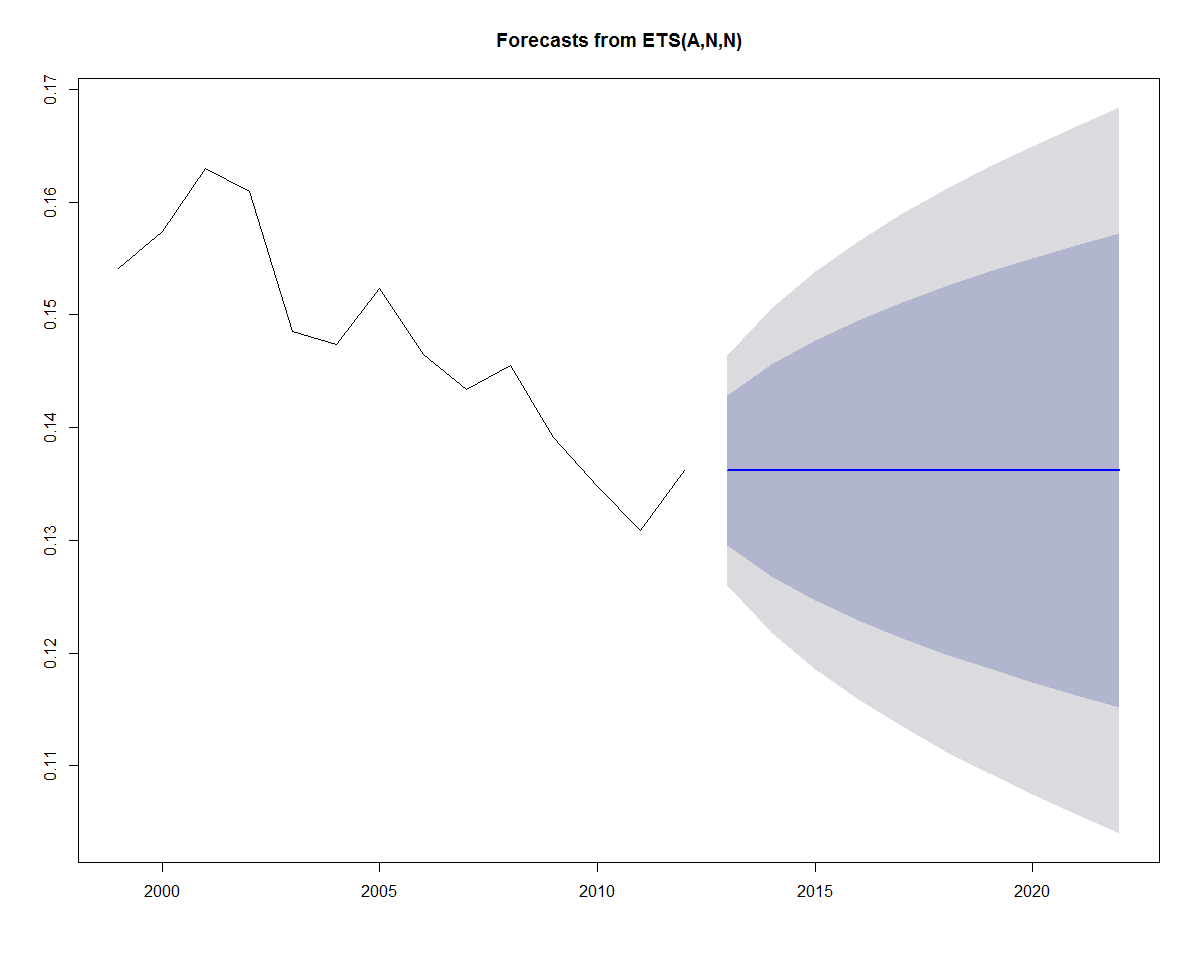
While moving averages re extremely useful, they are only one component of what is known as an exponential smoothed state space model, which has many options to define the optimal smoothing factor, as well as enabling you to define the type of trend and seasonality via the parameters. To implement this model we will use the ets() function from the forecast package to model the Not-Covered Percent variable for the "ALL AGES" category.
The ets() function is flexible in that it can also incorporate trend, as well as seasonality for its forecasts.
We will just be illustrating a simple exponentially smoothed model (ANN). However, for completeness, you should know that you specify three letters when calling the ets() function, and you should be aware of what each letter represents. Otherwise, it will model based upon the default parameters.
Here is the description as specified by the package author, Hydman:
The first letter denotes the error type ("A", "M", or "Z")
The second...
The following code will perform the following steps:
First, it will filter the data so that it only includes the
ALL AGEScategory.Then, it creates a time series object.
Finally, it runs a simple exponential model, using the
ets()function.
Note that we did not specify a smoothing factor. The ets() function calculates the optimal smoothing factor (alpha, shown via the summary() function (in bold below)), which in this case is .99, which means that model time series takes about 99% of the previous value to incorporate into the next time series prediction:
library(dplyr)
>
> Attaching package: 'dplyr'
> The following objects are masked from 'package:stats':
>
>     filter, lag
> The following objects are masked from 'package:base':
>
>     intersect, setdiff, setequal, union
library(forecast)
> Loading required package: zoo
>
> Attaching package: 'zoo'
> The following objects are masked from 'package:base':
>
>  ...

The forecast method contains many objects that you can display, such as the fitted value, original values, confidence intervals, and residuals. Use str(forecast(fit)) to see which objects are available.
We will use cbind to print out the original data point, fitted data point, and model fitting method.
cbind(forecast(fit)$method,forecast(fit)$x,forecast(fit)$fitted,forecast(fit)$residuals)
Time Series:
Start = 1999
End = 2012
Frequency = 1
     forecast(fit)$method   forecast(fit)$x forecast(fit)$fitted forecast(fit)$residuals
1999           ETS(A,N,N)  0.15412470117969    0.154120663632029    4.03754766081788e-06
2000           ETS(A,N,N) 0.157413125646824    0.154124700770241     0.00328842487658335
2001           ETS(A,N,N) 0.162942355969924    0.157412792166205     0.00552956380371911
2002           ETS(A,N,N) 0.160986044554207    0.162941795214416      -0.001955750660209
2003 ETS(A,N,N) 0.148533847659868 0.160986242887746 -0.0124523952278778...Use the plot function to plot future predictions. Notice that the prediction for the last value encompasses upper and lower confidence bands surrounding a horizontal prediction line. But why a horizontal prediction line? This is saying that there is no trend or seasonality for the exponential model, and that the best prediction is based upon the last value of the smoothed average. However, we can see that there is significant variation to the prediction, based upon the confidence bands. The confidence bands will also increase in size as the forecast period increases, to reflect the uncertainty associated with the forecast:
plot(forecast(fit))
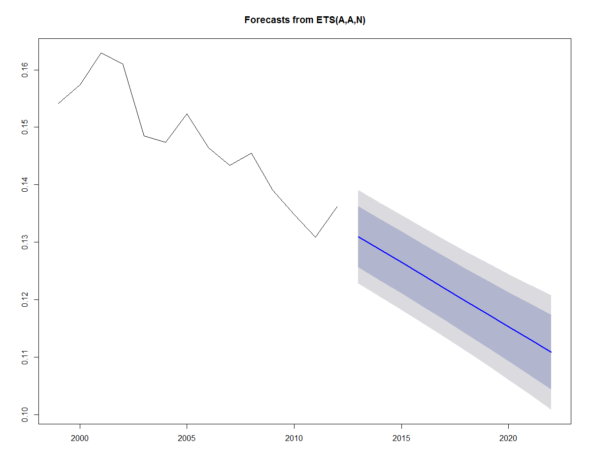
Earlier, we added a linear trend line to the data. If we wanted to incorporate a linear trend into the forecast as well, we can substitute A for the second parameter (trend parameter), which yields an "AAN" model (Holt's linear trend). This type of method allows exponential smoothing with a trend:
fit <- ets(x, model = "AAN")
summary(fit)
> ETS(A,A,N)
>
> Call:
> ets(y = x, model = "AAN")
>
> Smoothing parameters:
> alpha = 0.0312
> beta = 0.0312
>
> Initial states:
> l = 0.1641
> b = -0.0021
>
> sigma: 0.0042
>
> AIC AICc BIC
> -108.5711 -104.1267 -106.0149
>
> Training set error measures:
> ME RMSE MAE MPE MAPE
> Training set -0.000290753 0.004157744 0.003574276 -0.2632899 2.40212
> MASE ACF1
> Training set 0.7709083 0.05003007
Plotting the forecast yields the plot below:
plot(forecast(fit))
Now that we have run an ets model on one category, we can construct some code to automate model construction over all of the categories.
In the process, we will also save some of the accuracy measures so that we can see how our models performed:
First, sort the dataframe by category, and then by year.
Then, initialize a new dataframe (
onestep.df) that we will use to store the accuracy results for each moving window prediction of test and training data.Then, process each of the groups, all of which have 14 time periods, as an iteration in a
forloop.For each iteration, extract a test and training dataframe.
Fit a simple exponential smoothed model for the training dataset.
Apply a model fit to the test dataset.
Apply the accuracy function in order to extract the validation statistics.
Store each of them in the
onestep.dfdataframe that was initialized in the previous step:
df <- x2 %>% arrange(cat, Year.1)

# create results data...
The onestep.df object produced from the for loop contains all of the accuracy measure for all of the groups. Take a look at the first 6. You can see that the accuracy measure rmse, mae, and mape are captured for each of the categories:
head(onestep.df)
>              cat        rmse           mae      mape      acf1
> 1 18 to 24 YEARS    0.013772470 0.009869590 3.752381 1.0000552
> 2 25 to 34 YEARS    0.004036661 0.003380938 1.217612 1.0150588
> 3 35 to 44 YEARS    0.006441549 0.004790155 2.231886 0.9999469
> 4 45 to 54 YEARS    0.004261185 0.003129072 1.734022 0.9999750
> 5 55 to 64 YEARS    0.005160212 0.004988592 3.534093 0.7878765
> 6 65 YEARS AND OVER 0.002487451 0.002096323 12.156875 0.9999937
cbind(fit$x, fit$fitted, fit$residuals)
> Time Series:
> Start = 1999
> End = 2008
> Frequency = 1
>            fit$x fit$fitted fit$residuals
 > 1999 0.11954420  0.1056241  0.0139200744
 > 2000 0.10725759  0.1056255...
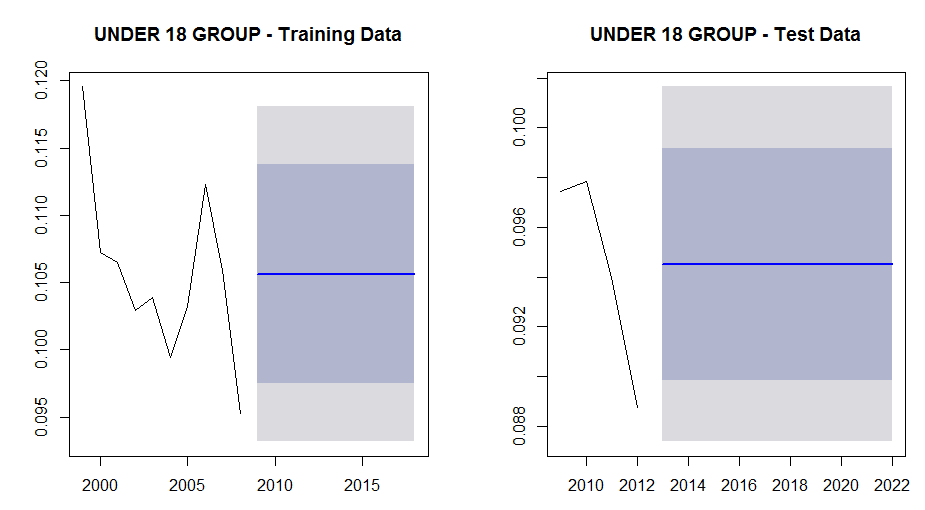
We can also examine the plots for the training and test groups for this sub segment to see if anything is really going on:
par(mfrow = c(1, 2))
plot(forecast(fit))
plot(forecast(fit2))
From the following plots we can see that although there is a decline in the not-covered percentage for this group, there is probably not enough data to discern trend so that the projections are set at the mean values.
For the test data plot we can also see why the absolute residual plot dropped in xxx as it transitioned from a local peak in 2010 (when the Affordable Care Act was enacted) to the start of a decline in 2011:
Using the residuals, we can measure the error from the predicted and actual values based upon three popular accuracy measures:
Mean absolute error (MAE): This measure takes the mean of the absolute values of all of the errors (residuals)
Root-mean-squared error (RMSE): The root mean square error measures the error by first taking the mean of all of the squared errors, and then takes the square root of the mean, in order to revert back to the original scale. This is a standard statistical method of measuring errors.
Note
Both MAE and RMSE are scale-dependent measures, which means that that they can be used to compare problems with similar scales. When comparing accuracy among models with different scales, other scale-independent measures such as MAPE should be used.
Mean percentage error (MAPE): This is the absolute difference between the actual and forecasted value, expressed as a percentage of the actual value. This is intuitively easy to understand and is a very popular measure...
This chapter introduced time series analysis by reading in and exploring Health Care Enrollment Data from the CMS website. Then we moved on to defining some basic Time Series concepts such as Simple and Exponential Moving Averages. Finally we worked with the R "forecast" package to work with some exponential smoothed state space models, and showed you one way to produce automated forecasts for your data. We also showed various plotting methods using the ggplot, lattice package, as well as native R graphics.