Reader small image

You're reading from  Mastering Matplotlib 2.x

Product typeBook
Published inNov 2018
Reading LevelBeginner
PublisherPackt
ISBN-139781789617696
Edition1st Edition
Languages
Right arrow
Author (1)
Benjamin Walter Keller
author image
Benjamin Walter Keller

Benjamin Walter Keller is currently a PhD candidate at McMaster University and gained his BSc in physics with a minor in computer science from the University of Calgary in 2011. His current research involves numerical modeling of galaxy evolution over cosmological timescales. As an undergraduate at the U of C, he worked on stacking radio polarization to examine faint extragalactic sources. He also worked in the POSSUM Working Group 2 to determine the requirements for stacking applications for the Australian SKA Pathfinder (ASKAP) radio telescope. He is particularly interested in questions involving stellar feedback (supernovae, stellar winds, and so on) and its impact on galaxies and their surrounding intergalactic medium.
Read more about Benjamin Walter Keller

Right arrow

Drawing on Plots

Till now, we have studied how to use style sheets to customize plot appearances, and how to tweak multi-panel plots to give more complex and appealing layouts for different kinds of plotting applications.

Matplotlib allows you to make plots that really show your own individual style. We will learn how to draw on plots to provide the viewer with visual guides that point them toward the important features of data. We will discuss adding horizontal and vertical lines, along with tweaking a background grid.

Versatile annotating adds arrows and some text to these arrows to the plots in order to customize the appearance of these annotations.

In this chapter, we will look at the following topics:

  • How to put lines in place
  • How to add text on plots
  • How to play with polygons and shapes
  • How to add different kinds of annotations
...

Putting lines in place

This section describes adding horizontal and vertical lines along with adding and tweaking a background grid.

Adding horizontal and vertical lines

We will begin by importing our required libraries, as shown:

import numpy as np
import matplotlib as mpl
import matplotlib.pyplot as plt
%matplotlib inline
# Set up figure size and DPI for screen demo
plt.rcParams['figure.figsize'] = (6,4)
plt.rcParams['figure.dpi'] = 150
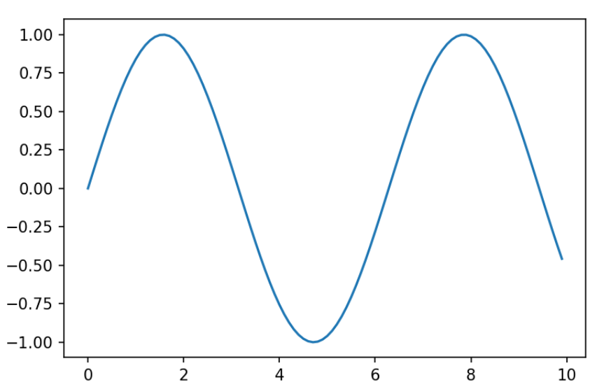
  1. We will create the simple sine plot that we saw in Chapter 1, Heavy Customization, as follows:
# Adding a horizontal and vertical line
nums = np.arange(0,10,0.1)
plt.plot(nums, np.sin(nums))

We will get the following output:

  1. Now, to add an annotation, say, a line that splits...

Adding text on your plots

This section describes how we can add text to both the axis and figure objects, including adding text in multi-panel figures and configuring the appearance of text.

Adding text to both axis and figure objects

Let's start by importing everything we need:

import numpy as np
import matplotlib as mpl
import matplotlib.pyplot as plt
%matplotlib inline
# Set up figure size and DPI for screen demo
plt.rcParams['figure.figsize'] = (6,4)
plt.rcParams['figure.dpi'] = 150
  1. Next, bring up the standard sine curve that we have been using:
# Add some text
nums = np.arange(0,10,0.1)
plt.plot(nums, np.sin(nums))

We will get the following output:

  1. We will add some text, say, right in the middle...

Playing with polygons and shapes

This section talks about how to add polygons and other shapes and the different built-in shapes that Matplotlib provides.

Adding polygons and shapes to our plots

We will begin by importing what we need to from Matplotlib, as shown here:

import numpy as np
import matplotlib as mpl
import matplotlib.pyplot as plt
%matplotlib inline
# Set up figure size and DPI for screen demo
plt.rcParams['figure.figsize'] = (6,4)
plt.rcParams['figure.dpi'] = 150
nums = np.arange(0,10,0.1)
plt.plot(nums, np.sin(nums))

We will use the same sign plot as in the earlier section, Adding text to both axis and figure objects. As shown in the following output, this is the most basic sine plot and no annotations...

Versatile annotating

We will import everything we need to bring up the simple sine plot:

import numpy as np
import matplotlib as mpl
import matplotlib.pyplot as plt
%matplotlib inline
# Set up figure size and DPI for screen demo
plt.rcParams['figure.figsize'] = (6,4)
plt.rcParams['figure.dpi'] = 150

Adding arrows to our plots with the annotate method

The annotate method has a lot of arguments, as seen in the following code:

# Add an arrow
nums = np.arange(0,10,0.1)
plt.plot(nums, np.sin(nums))
plt.annotate("", xy=(np.pi/2, 1), xytext=(5,0), arrowprops=dict(facecolor='k'))

The first argument in the preceding code is an empty string that will be displayed. xy tells us where the data coordinates...

Summary

In this chapter, we learned how to add lines, boxes, texts, different kinds of shapes, and polygons, as well as arrows in descriptions with annotate. We also focused on the viewer's attention on whatever kinds of data the plot is showing to make the insights.

In the next chapter, we will learn about special-purpose plots, which you can use for different kinds of data that haven't fallen into the sorts of plots we've seen so far.

lock icon
The rest of the chapter is locked
You have been reading a chapter from
Mastering Matplotlib 2.x
Published in: Nov 2018Publisher: PacktISBN-13: 9781789617696
Register for a free Packt account to unlock a world of extra content!
A free Packt account unlocks extra newsletters, articles, discounted offers, and much more. Start advancing your knowledge today.
undefined
Unlock this book and the full library FREE for 7 days
Get unlimited access to 7000+ expert-authored eBooks and videos courses covering every tech area you can think of
Renews at $15.99/month. Cancel anytime

Author (1)

author image
Benjamin Walter Keller

Benjamin Walter Keller is currently a PhD candidate at McMaster University and gained his BSc in physics with a minor in computer science from the University of Calgary in 2011. His current research involves numerical modeling of galaxy evolution over cosmological timescales. As an undergraduate at the U of C, he worked on stacking radio polarization to examine faint extragalactic sources. He also worked in the POSSUM Working Group 2 to determine the requirements for stacking applications for the Australian SKA Pathfinder (ASKAP) radio telescope. He is particularly interested in questions involving stellar feedback (supernovae, stellar winds, and so on) and its impact on galaxies and their surrounding intergalactic medium.
Read more about Benjamin Walter Keller