Reader small image

You're reading from  Learning Tableau 2019 - Third Edition

Product typeBook
Published inMar 2019
PublisherPackt
ISBN-139781788839525
Edition3rd Edition
Tools
Right arrow
Author (1)
Joshua N. Milligan
Joshua N. Milligan
author image
Joshua N. Milligan

Joshua N. Milligan is a Hall of Fame Tableau Zen Master and 2017 Iron Viz Global finalist. His passion is training, mentoring, and helping people gain insights and make decisions based on their data through data visualization using Tableau and data cleaning and structuring using Tableau Prep. He is a principal consultant at Teknion Data Solutions, where he has served clients in numerous industries since 2004.
Read more about Joshua N. Milligan

Right arrow

Advanced Visualizations, Techniques, Tips, and Tricks

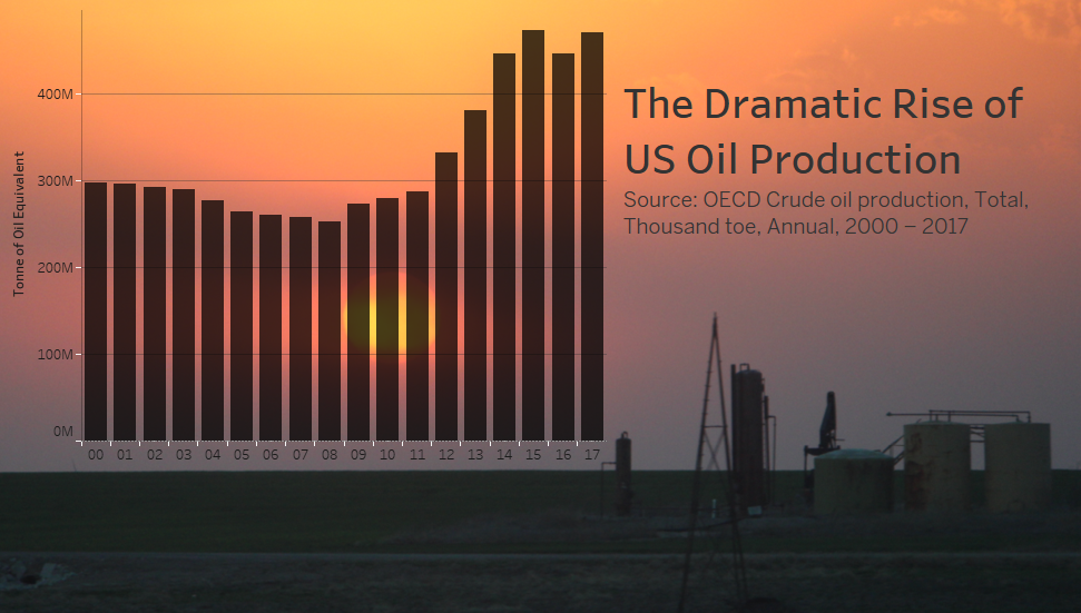
With a solid understanding of the fundamental principles, it is possible to push the limits with Tableau. In addition to exploring, discovering, analyzing, and communicating data, members of the Tableau community have used the software to create and do amazing things, such as simulate an enigma machine, play Tic-Tac-Toe or Battleship, generate fractals with only two records of data, and much more! You shouldn't feel pressure in a business setting to create anything so complex, but it is always good to know that Tableau really is a blank canvas. The only limits are your creativity and imagination.

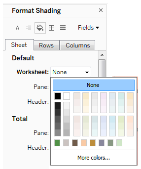
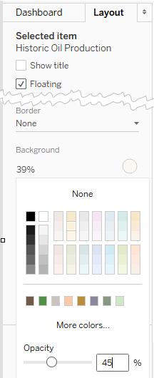
In this chapter, we'll take a look at some advanced techniques in a practical context. You'll learn things such as creating advanced visualizations, dynamically swapping views on a dashboard, using custom images, and...

Advanced visualizations

We took a look in Chapter 3, Venturing on to Advanced Visualizations, at variations of some fundamental visualizations, such as bar charts, time series, distributions, and scatterplots. Now, we'll consider some non-standard visualization types. These are only examples of Tableau's amazing flexibility and are meant to inspire you to think through new ways of seeing, understanding, and communicating your data. These are not designed as complex charts for the sake of complexity, but rather to spark creativity and interest to effectively communicate the data.

Each of the following visualizations are created using the supplied Superstore data. Instead of providing step-by-step instructions, we'll point out specific advanced techniques used to create each chart type. The goal is not to memorize steps but to understand how to creatively leverage...

Sheet swapping and dynamic dashboards

Sheet swapping, sometimes also called sheet selection, is a technique in which views are dynamically shown and hidden on a dashboard, often with the appearance of swapping one view for another. The dynamic hiding and showing of views on a dashboard has an even broader application. When combined with floating objects and layout containers, this technique allows you to create rich and dynamic dashboards.

The basic principles are simple:

  • A view Collapses on a dashboard when at least one field is on Rows or Columns and a combination of filters or hiding prevents any marks from being rendered
  • Titles and captions do not collapse but can be hidden so that the view collapses entirely

Let's consider a simple example with a view showing profit by Department and Category with a Department quick filter. The dashboard has been formatted (from the...

Mapping techniques

We've touched on geographic visualization throughout the book. You've seen symbol maps and filled maps. Here, we'll take a look at supplying your own geocoded data, along with creating custom territories.

Supplementing the standard in geographic data

We saw in Chapter 1, Taking Off with Tableau, that Tableau generates Latitude and Longitude fields when the data source contains geographic fields that Tableau can match with its internal geographic database. Fields such as country, state, zip code, MSA, and congressional district are contained in Tableau's internal geography. As Tableau continues to add geographic capabilities, you'll want to consult the documentation to determine specifics...

Using background images

Background images allow you to plot data on top of any image. Consider the possibilities! You could plot ticket sales by seat on an image of a stadium, room occupancy on the floor plan of an office building, the number of errors by piece of equipment on a network diagram, or meteor impacts on the surface of the moon.

In this example, we'll plot the number of patients per month in various rooms in a hospital. We'll use two images of floorplans for the ground floor and second floor of the hospital. The data source is located in the Chapter 11 directory and is named Hospital.xlsx. It consists of two tabs: one for patient counts and another for room locations based on the x/y coordinates mapped to the images. We'll consider shortly how that works. You can view the completed example in the Chapter 11 Complete.twbx workbook or start from scratch...

Animation

Animated visualizations can bring data storytelling to life by revealing patterns that happen over time or emphasize dramatic events. Adding a field to the Pages shelf will show playback controls that allow you to page through each value of that field. You can do this manually, or click the Play button to watch the visualization as values change automatically.

The Chapter 11 Completed workbook contains an example that animates the hospital floorplan shown earlier. You can create the same effect by adding the Month field to the Pages shelf (as a month date value). Then watch as the circles change size month by month.

Experiment with the Show History options to see how you can view marks for previous pages.

When you use multiple views on a dashboard, each having the same combination of fields on the Pages shelf, you can synchronize the playback controls (using the caret...

Transparency

In newer versions of Tableau, you may set transparency for visualizations used on dashboards. This enables all kinds of innovative approaches, such as layering visualizations on top of each other or over background images.

You'll find the following example in the Chapter 11 Complete workbook:

The dashboard consists of an image, a transparent chart over the image, and a title.

To make a visualization transparent, go to Format Shading and set the Worksheet shading to None:

Once you have set the shading to None, the visualization will be transparent when used on a dashboard. At this point, you can also achieve a semi-transparent effect by selecting the visualization on the dashboard, switching to the Layout tab, and adjusting the background to have a color with Opacity:

Be careful that your use of transparency does not detract from the data story. Background...

Summary

We've covered a wide variety of techniques in this chapter! We looked at advanced visualizations, sheet swapping, dynamic dashboards, some advanced mapping techniques, including supplementing geographic data, custom territories, spatial objects, and using custom background images. We concluded by considering possibilities with animation and transparency.

There is no way to cover every possible visualization type or technique or way of solving problems. Instead, the idea has been to demonstrate some of what can be accomplished using a few advanced techniques. The examples in this chapter build on the foundations laid in the preceding chapters. From here, you will be able to creatively modify and combine techniques in new and innovative ways to solve problems and achieve incredible results! Next, we'll turn our focus to how to share those results.

...
lock icon
The rest of the chapter is locked
You have been reading a chapter from
Learning Tableau 2019 - Third Edition
Published in: Mar 2019Publisher: PacktISBN-13: 9781788839525
Register for a free Packt account to unlock a world of extra content!
A free Packt account unlocks extra newsletters, articles, discounted offers, and much more. Start advancing your knowledge today.
undefined
Unlock this book and the full library FREE for 7 days
Get unlimited access to 7000+ expert-authored eBooks and videos courses covering every tech area you can think of
Renews at $15.99/month. Cancel anytime

Author (1)

author image
Joshua N. Milligan

Joshua N. Milligan is a Hall of Fame Tableau Zen Master and 2017 Iron Viz Global finalist. His passion is training, mentoring, and helping people gain insights and make decisions based on their data through data visualization using Tableau and data cleaning and structuring using Tableau Prep. He is a principal consultant at Teknion Data Solutions, where he has served clients in numerous industries since 2004.
Read more about Joshua N. Milligan