Search icon
Arrow left icon
All Products
Best Sellers
New Releases
Books
Videos
Audiobooks
Learning Hub
Newsletters
Free Learning
Arrow right icon
Learning SAP Analytics Cloud

You're reading from  Learning SAP Analytics Cloud

Product type Book
Published in Jul 2017
Publisher Packt
ISBN-13 9781788290883
Pages 420 pages
Edition 1st Edition
Languages

Table of Contents (11) Chapters

Preface Getting Started with SAP Analytics Cloud Models in SAP Analytics Cloud Planning model Creating Stories Using Charts Extending Stories with KPI, Filters, and Other Handy Objects Analyzing Data Using Geomaps and Other Objects Working with Tables and Grids Collaboration Digital Boardroom System Administration

Creating Stories Using Charts

Stories are used in SAP Analytics Cloud to present data graphically using charts, tables, geo maps, text, images, and shapes. In this chapter as well as in the next few chapters, you will learn the use of different types of charts and other objects to create a story page, as illustrated in the following figure:

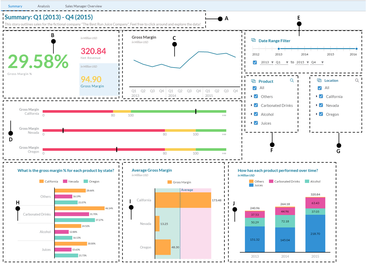
Here are the briefs of the illustrated story page:

  • A: This is the title of the story page that describes its purpose.
  • B: These are three separate tiles added to demonstrate how to create Numeric Point charts to dynamically render numeric data in different colors using custom-defined thresholds.
  • C: The gross margin chart will be created using a line chart.
  • D: The key performance indicator (KPI) is a type of success metric. Based on user-defined thresholds, KPI indicates the status of a measure.
  • E, F, and G: These data filters will be created...

Demo models

This chapter and some subsequent chapters will use a couple of demo analytic models (Best Run and Planned Events) that come with the trial version. The Best Run model is used because it is a comprehensive model and contains more data than the Bocage analytical model (created in Chapter 2, Models in SAP Analytics Cloud) to evaluate different scenarios. The Planned Events model, on the other hand, is an associate model, which demonstrates how to create linked dimensions using the two models that you will learn in Chapter 6, Analyzing Data Using Geo Maps and Other Objects. For now, let's go through these two models to get an overview. To access these models, click on the main menu, and then go to Browse | Models.

The Best Run demo model

...

The calculation editor

In stories, you usually select measures (for example, gross margin or original sales price from the Account dimensions as depicted in the previous screenshot) from your model to display on your charts. In addition to selecting measures from your model, you also have the option of creating new measures based on some sort of calculation to visualize the result. In SAP Analytics Cloud, you can create custom calculations for use in a chart or table via the Calculation Editor interface. You can then use these calculations in your charts or tables.

You can create the following types of calculation in the Calculation Editor interface:

  • Calculated Measures: In this type, you perform a calculation on one or more members of either the Account dimension or the Calculations dimension. A new calculated member of the selected dimension is created as a result. Calculated...

Apply conditional formatting using thresholds

In this exercise, you will add thresholds to the Numeric Point chart. Thresholds are used to provide visual cues for your information. By defining thresholds on your objects you can see at a glance what areas are performing well, and what areas need improvements. By default, you get three default ranges with the following labels and colors. However, you can use as many or as few ranges as you like, and you can change the label names and colors, too:

  1. From the Tools section in the toolbar, click the Conditional Formatting icon. Then, click the Add Threshold link in the Conditional Formatting panel to your right. Using the Conditional Formatting feature, you can add thresholds and assign colors to highlight information, such as low sales in an area:
  1. Ensure that the BestRun model is selected in the Model section. If not, select the...

Presenting data with a line chart in a story

In this example, you will learn how to use a line chart that shows a trend in the data values, especially for dimensions that are time-based, such as year or the progression of your data and possible patterns.

  1. Click on the Chart icon to insert a blank chart.
  2. Select the line chart option from the trend list.
  3. Select Gross Margin as the measure for this chart.
  4. Add the Date dimension from the Dimensions section.

  1. After adding the Date dimension, click on the filter icon, and then select Filter by Member from its menu:

Applying filters to the time dimension

In SAP Analytics cloud, you can apply filters to your story and page to narrow down the scope of your analysis. In addition...

Summary

A story is the most significant component of SAP Analytics Cloud, where you visually analyze your data using different types of objects. In this chapter, you got hands-on exposure to this imperative subject and learned how to populate your story canvases by adding and configuring different types of charts. Here's a brief summary of the topics you went through in this chapter:

  • An introduction to and creation of a story
  • A brief about the two demo models that you will also utilize in subsequent chapters
  • Using Numeric Point charts to display summarized information in bold-faced dynamic numbers
  • Learning how to use the Calculation Editor interface to create your own formulas
  • Adding thresholds to your charts to present the status of values in different colors
  • Styling your charts with the help of options provided in the styling tab
  • Using Numeric Point, Line, Bar, and Stacked...
lock icon The rest of the chapter is locked
You have been reading a chapter from
Learning SAP Analytics Cloud
Published in: Jul 2017 Publisher: Packt ISBN-13: 9781788290883
Register for a free Packt account to unlock a world of extra content!
A free Packt account unlocks extra newsletters, articles, discounted offers, and much more. Start advancing your knowledge today.
Unlock this book and the full library FREE for 7 days
Get unlimited access to 7000+ expert-authored eBooks and videos courses covering every tech area you can think of
Renews at $15.99/month. Cancel anytime}