Reader small image

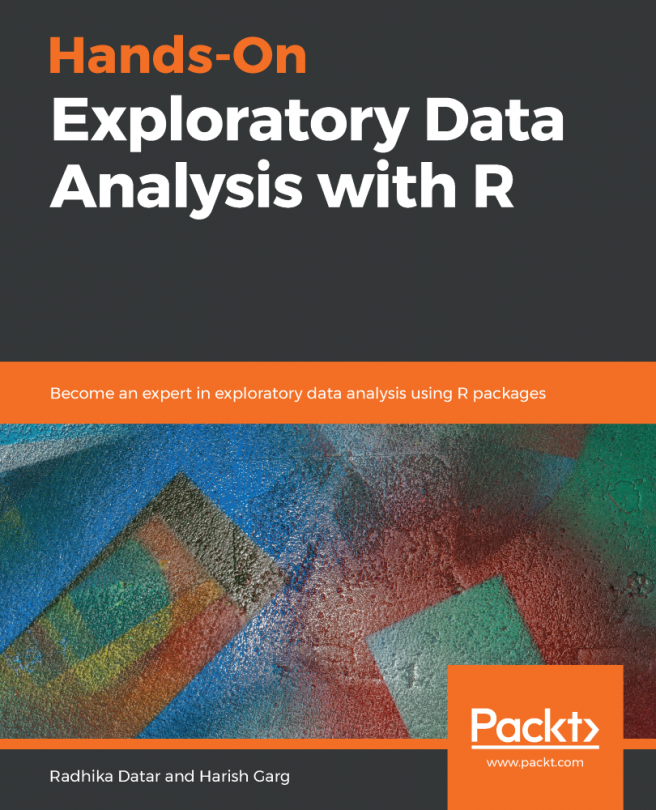
You're reading from  Hands-On Exploratory Data Analysis with R

Product typeBook
Published inMay 2019
Reading LevelIntermediate
PublisherPackt
ISBN-139781789804379
Edition1st Edition
Languages
Tools
Right arrow
Authors (2):
Radhika Datar
Radhika Datar
author image
Radhika Datar

Radhika Datar has more than 5 years' experience in software development and content writing. She is well versed in frameworks such as Python, PHP, and Java, and regularly provides training on them. She has been working with Educba and Eduonix as a training consultant since June 2016, while also working as a freelance academic writer in data science and data analytics. She obtained her master's degree from the Symbiosis Institute of Computer Studies and Research and her bachelor's degree from K. J. Somaiya College of Science and Commerce.
Read more about Radhika Datar

Harish Garg
Harish Garg
author image
Harish Garg

Harish Garg is a Principal Software Developer, author, and co-founder of a software development and training company, Bignumworks. Harish has more than 19 years of experience in a wide variety of technologies, including blockchain, data science and enterprise software. During this time, he has worked for companies such as McAfee, Intel, etc.
Read more about Harish Garg

View More author details
Right arrow

Exploration using graphics

In this section, we will focus on exploring the dataset graphically using a scatter plot, 6-plot, linear correlation plot, linear intercept plot, linear slope plot, and linear residual standard deviation plot.

We will implement the following steps to begin exploration of the data using a graphical structure:

  1. This step is intended to depict the scatter plot in two ways. The following scatter plot shows the relationship between the refractive index and the sodium content of glass types:
> plot(GlassDataset$Na , GlassDataset$RI, xlab = 'Sodium Content', ylab = 'Refractive Index', main = 'Scatter plot for sodium content')

This gives us the following output plot:

  1. The other way to depict the scatter plot is with the help of the ggplot2 package or library, which is achieved by executing the following command:
> library...
lock icon
The rest of the page is locked
Previous PageNext Page
You have been reading a chapter from
Hands-On Exploratory Data Analysis with R
Published in: May 2019Publisher: PacktISBN-13: 9781789804379

Authors (2)

author image
Radhika Datar

Radhika Datar has more than 5 years' experience in software development and content writing. She is well versed in frameworks such as Python, PHP, and Java, and regularly provides training on them. She has been working with Educba and Eduonix as a training consultant since June 2016, while also working as a freelance academic writer in data science and data analytics. She obtained her master's degree from the Symbiosis Institute of Computer Studies and Research and her bachelor's degree from K. J. Somaiya College of Science and Commerce.
Read more about Radhika Datar

author image
Harish Garg

Harish Garg is a Principal Software Developer, author, and co-founder of a software development and training company, Bignumworks. Harish has more than 19 years of experience in a wide variety of technologies, including blockchain, data science and enterprise software. During this time, he has worked for companies such as McAfee, Intel, etc.
Read more about Harish Garg