Reader small image

You're reading from  Learning Tableau 2022 - Fifth Edition

Product typeBook
Published inAug 2022
PublisherPackt
ISBN-139781801072328
Edition5th Edition
Tools
Right arrow
Author (1)
Joshua N. Milligan
Joshua N. Milligan
author image
Joshua N. Milligan

Joshua N. Milligan is a Hall of Fame Tableau Zen Master and 2017 Iron Viz Global finalist. His passion is training, mentoring, and helping people gain insights and make decisions based on their data through data visualization using Tableau and data cleaning and structuring using Tableau Prep. He is a principal consultant at Teknion Data Solutions, where he has served clients in numerous industries since 2004.
Read more about Joshua N. Milligan

Right arrow

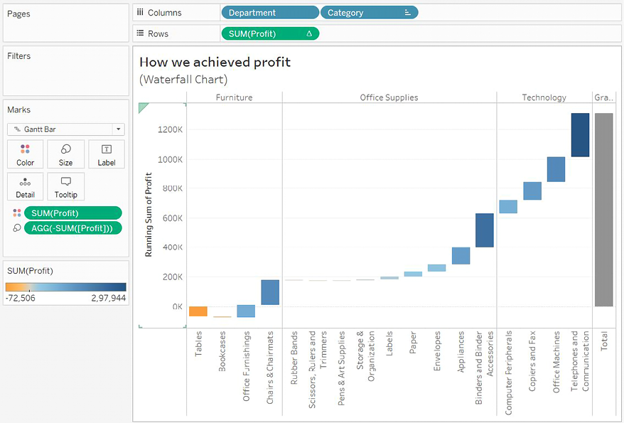
Advanced Visualizations

We’ve explored many different types of visualizations and considered which types of questions they best answer. For example, bar charts aid in comparing values; line charts can show changes and trends over time; stacked bars and treemaps help us see part-to-whole relationships; box plots help us understand distributions and outliers. We’ve also seen how to enhance our understanding and data storytelling with calculations, annotations, formatting, and reference lines. With this knowledge as a foundation, we’ll expand the possibilities of data analysis with some advanced visualizations.

These are only examples of Tableau’s amazing flexibility and are meant to inspire you to think through new ways of seeing, understanding, and communicating your data. These are not designed as complex charts for the sake of complexity, but rather to spark creativity and interest to effectively communicate data.

We’ll consider the following...

Advanced visualizations – when and why to use them

The visualization types we’ve seen up to this point will answer many, if not most, of the questions you have about your data. If you are asking questions of when?, then a time series is the most likely solution. If you are asking how much?, a bar chart gives a good, quick result. But there are times when you’ll ask questions that are better answered with a different type of visualization. For example, movement or flow might be best represented with a Sankey diagram. How many? might be best answered with a unit or symbol chart.

Comparing changes in ranks or absolute values might be best accomplished with a slope or bump chart. The visualizations that follow are not what you will use as you first explore the data. But as you dive deeper into your analysis and want to know or communicate more, you might consider some of the options in this chapter.

Each of the visualizations in this chapter is created using...

Slope charts and bump charts

A slope chart shows a change of values from one period or status to another. For example, here is a slope chart demonstrating the change in sales rank for each state in the South region from 2016 to 2017:

Figure 10.1: A slope chart is useful to compare the change of rank or absolute values from one period or status to another

Here are some features and techniques used to create the preceding slope chart:

  • The table calculation Rank(SUM(Sales)) is computed by (addressed by) State, meaning that each state is ranked within the partition of a single year.
  • Grid Lines and Zero Lines for Rows have been set to None.
  • The axis has been reversed (right-click the axis and select Edit, then check the option to reverse). This allows rank #1 to appear at the top and lower ranks to appear in descending order.
  • The axis has been hidden (right-click the axis and uncheck Show Header).
  • Labels have been edited (by clicking on Label...

Waterfall charts

A waterfall chart is useful when you want to show how parts successively build up to a whole. In the following screenshot, for example, a waterfall chart shows how profit builds up to a grand total across Department and Category of products. Sometimes profit is negative, so at that point, the waterfall chart takes a dip, while positive values build up toward the total:

Figure 10.3: This waterfall chart shows how each Category adds (or subtracts) profit to build toward the total

Here are the features and techniques used to build the chart:

  • The SUM(Profit) field on Rows is a Running Total table calculation (created using a Quick Table Calculation from the drop-down menu) and is computed across the table.
  • Row Grand Totals have been added to the view (dragged and dropped from the Analytics pane).
  • The mark type is set to Gantt Bar and an ad hoc calculation is used with code: SUM(Profit) for the size. This may seem a bit odd at first...

Step lines and jump lines

With a mark type of Line, click the Path shelf and you’ll see three options for Line Type:

Figure 10.4: Change the type of Line by clicking Path on the Marks card

The three options are:

  1. Linear: Use angled lines to emphasize movement or transition between values. This is the default and every example of a line chart in this book so far has made use of this line type.
  2. Step lines: Remain connected but emphasize discrete steps of change. This is useful when you want to communicate that there is no transition between values or that the transition is a discrete step in value. For example, you might want to show the number of generators running over time. The change from 7 to 8 is a discrete change that might be best represented by a step line.
  3. Jump lines: Are not connected, and when a value changes, a new line starts. Jump lines are useful when you want to show values that indicate a certain state that may exist for a...

Sparklines

Sparklines are visualizations that use multiple small line graphs that are designed to be read and compared quickly. The goal of sparklines is to give a visualization that can be understood at a glance. You aren’t trying to communicate exact values, but rather give the audience the ability to quickly understand trends, movements, and patterns.

Among various uses of this type of visualization, you may have seen sparklines used in financial publications to compare the movement of stock prices. Recall, that in Chapter 1, Taking Off with Tableau, we considered the initial start of a sparklines visualization as we looked at iterations of line charts. Here is a far more developed example:

Figure 10.6: Spark Lines give you a quick glance at the “shape” of change over time across multiple categories

You can build a chart like this by following these steps:

  1. Start with a simple view of SUM(Sales) by Quarter of Order Date (as a date...

Dumbbell charts

A dumbbell chart is a variation of the circle plot that compares two values for each slice of data, emphasizing the distance between the two values.

Here, for example, is a chart showing the Difference in Profit between East and West regions for each Category of products:

Figure 10.7: A dumbbell chart emphasizes the distance/difference between two values

This chart was built using the following features and techniques:

  • A synchronized dual axis of SUM(Profit) has been used with one set to mark the type of Circle and the other set to Line
  • Category has been sorted by Profit descending (the sort sums the profit for both the East and West regions)
  • Region has been placed on the Path shelf for the line to tell Tableau to draw a line between the two Regions

    The Path shelf is available for Line and Polygon mark types. When you place a field on the Path shelf, it tells Tableau the order to connect the points (following...

Unit/symbol charts

A unit chart can be used to show individual items, often using shapes or symbols to represent each individual. These charts can elicit a powerful emotional response because the representations of the data are less abstract and more easily identified as something real. For example, here is a chart showing how many customers had late shipments for each Region:

Figure 10.8: Each image represents a real person and is less abstract than circles or squares

The view was created with the following techniques:

  • The view is filtered where Late Shipping is True. Late Shipping is a calculated field that determines if it took more than 14 days to ship an order. The code is as follows:
    DATEDIFF('day', [Order Date], [Ship Date]) > 14 
    
  • Region has been sorted by the distinct count of Customer ID in descending order.
  • Customer ID has been placed on Detail so that there is a mark for each distinct customer.
  • The mark...

Marimekko charts

A Marimekko chart (sometimes alternately called a Mekko chart) is similar to a vertically stacked bar chart, but additionally uses varying widths of bars to communicate additional information about the data. Here, for example, is a Marimekko chart showing the breakdown of sales by region and department.

The width of the bars communicates the total Sales for Region, while the height of each segment gives you the percentage of sales for the Department within the Region:

Figure 10.11: The amount of sales per Department is indicated by the height of each segment, while the width of each bar indicates the overall sales per Region

Creating a Marimekko chart in Tableau leverages the ability to fix the width of bars according to the axis’ units.

Clicking the Size shelf when a continuous (green) field is on Columns (thus defining a horizontal axis) and the mark type is set to Bar reveals options for a fixed size. You can manually enter a...

Animated visualizations

Previous versions of Tableau allowed rudimentary animation using the Pages shelf with playback controls. Newer versions of Tableau include Mark Animation, which means marks smoothly transition when you apply filters, sorting, or page changes. Consider leveraging animation to extend your analytical potential in a couple of ways:

  1. Turn it on while exploring and analyzing your data. This allows you to gain analytical insights you might otherwise miss, such as seeing how far and in which direction marks in a scatterplot move as a filter changes.
  2. Use it strategically to enhance the data story. Animation can be used to capture interest, draw attention to important elements, or build suspense toward a conclusion.

We’ll consider both approaches to animation in the following examples.

Enhancing analysis with animation

Consider the following bar chart, which shows the correlation of Sales and Profit for each Department:

Figure 10.12: Sales and profit per Department

Notice the Region filter. Change the filter selection a few times in the Chapter 10 workbook. You’ll observe the standard behavior that occurs without animations: the circle marks are immediately redrawn at the new location determined by the filter. This works well, but there is a bit of a disconnect between filter settings. As you switch between regions, notice the mental difficulty in keeping track of where a mark was versus where it is with the new selection. Did one region’s mark increase in profit? Did it decrease in sales?

Now, turn on animations for the view. To do this, use the menu to select Format | Animations…. The Animations format pane will show on the left. Use it to turn On for the Selected Sheet:

Figure 10.13: The Animations format pane gives...

Enhancing data storytelling with animation

Beyond providing analytical insight as you perform your data discovery and analysis, you can also leverage animation to more effectively drive interest and highlight decision points, opportunities, or risks in your data stories.

As an example, consider this view in the Chapter 10 workbook:

Figure 10.14: O2 Tank 1 and 2 pressure readings over time during the Apollo 13 mission

The view tells a part of the story of Apollo 13 and the disaster that crippled the spacecraft. It does this by making use of both the Pages shelf and smooth animation. Experiment with the animation speed and playback controls in the Chapter 10 workbook. Consider how animation can be used to heighten awareness, drive interest, or even create suspense.

When you use multiple views on a dashboard, each having the same combination of fields on the Pages shelf, you can synchronize the playback controls (using the caret drop-down menu on the playback...

Summary

We’ve covered a wide variety of advanced visualization types in this chapter! We’ve considered slope and bump charts that show changes in rank or value, step and jump lines that show discretely changing values, and unit charts that help materialize abstract concepts.

There is no way to cover every possible visualization type. Instead, the aim was to demonstrate some of what can be accomplished and spark new ideas and creativity. As you experiment and iterate through new ways of looking at data, you’ll become more confident in how to best communicate the stories contained in the data. Next, we’ll return briefly to the topic of dashboards to see how some advanced techniques can make them truly dynamic.

Join our community on Discord

Join our community’s Discord space for discussions with the author and other readers: https://packt.link/ips2H

lock icon
The rest of the chapter is locked
You have been reading a chapter from
Learning Tableau 2022 - Fifth Edition
Published in: Aug 2022Publisher: PacktISBN-13: 9781801072328
Register for a free Packt account to unlock a world of extra content!
A free Packt account unlocks extra newsletters, articles, discounted offers, and much more. Start advancing your knowledge today.
undefined
Unlock this book and the full library FREE for 7 days
Get unlimited access to 7000+ expert-authored eBooks and videos courses covering every tech area you can think of
Renews at $15.99/month. Cancel anytime

Author (1)

author image
Joshua N. Milligan

Joshua N. Milligan is a Hall of Fame Tableau Zen Master and 2017 Iron Viz Global finalist. His passion is training, mentoring, and helping people gain insights and make decisions based on their data through data visualization using Tableau and data cleaning and structuring using Tableau Prep. He is a principal consultant at Teknion Data Solutions, where he has served clients in numerous industries since 2004.
Read more about Joshua N. Milligan