


Profiling data using the ydata-profiling library
In this section, let us explore the dataset and generate a profiling report with various statistics using the ydata-profiling library (https://docs.profiling.ydata.ai/4.5/).
The ydata-profiling library is a Python library for easy EDA, profiling, and report generation.
Let us see how to use ydata-profiling for fast and efficient EDA:
- Install the
ydata-profilinglibrary usingpipas follows:pip install ydata-profiling
- First, let us import the Pandas profiling library as follows:
from ydata_profiling import ProfileReport
Then, we can use Pandas profiling to generate reports.
- Now, we will read the Income dataset into the Pandas DataFrame:
df=pd.read_csv('adult.csv',na_values=-999) - Let us run the
upgradecommand to make sure we have the latest profiling library:%pip install ydata-profiling --upgrade
- Now let us run the following commands to generate the profiling report:
report = ProfileReport(df)
report
We can also generate the report using the profile_report() function on the Pandas DataFrame.
After running the preceding cell, all the data loaded in df will be analyzed and the report will be generated. The time taken to generate the report depends on the size of the dataset.
The output of the preceding cell is a report with sections. Let us understand the report that is generated.
The generated profiling report contains the following sections:
- Overview
- Variables
- Interactions
- Correlations
- Missing values
- Sample
- Duplicate rows
Under the Overview section in the report, there are three tabs:
- Overview
- Alerts
- Reproduction
As shown in the following figure, the Overview tab shows statistical information about the dataset – that is, the number of columns (number of variables) in the dataset; the number of rows (number of observations), duplicate rows, and missing cells; the percentage of duplicate rows and missing cells; and the number of Numeric and Categorical variables:
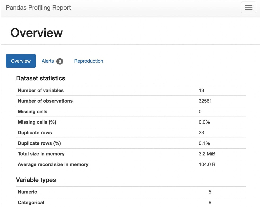
Figure 1.25 – Statistics of the dataset
The Alerts tab under Overview shows all the variables that are highly correlated with each other and the number of cells that have zero values, as follows:
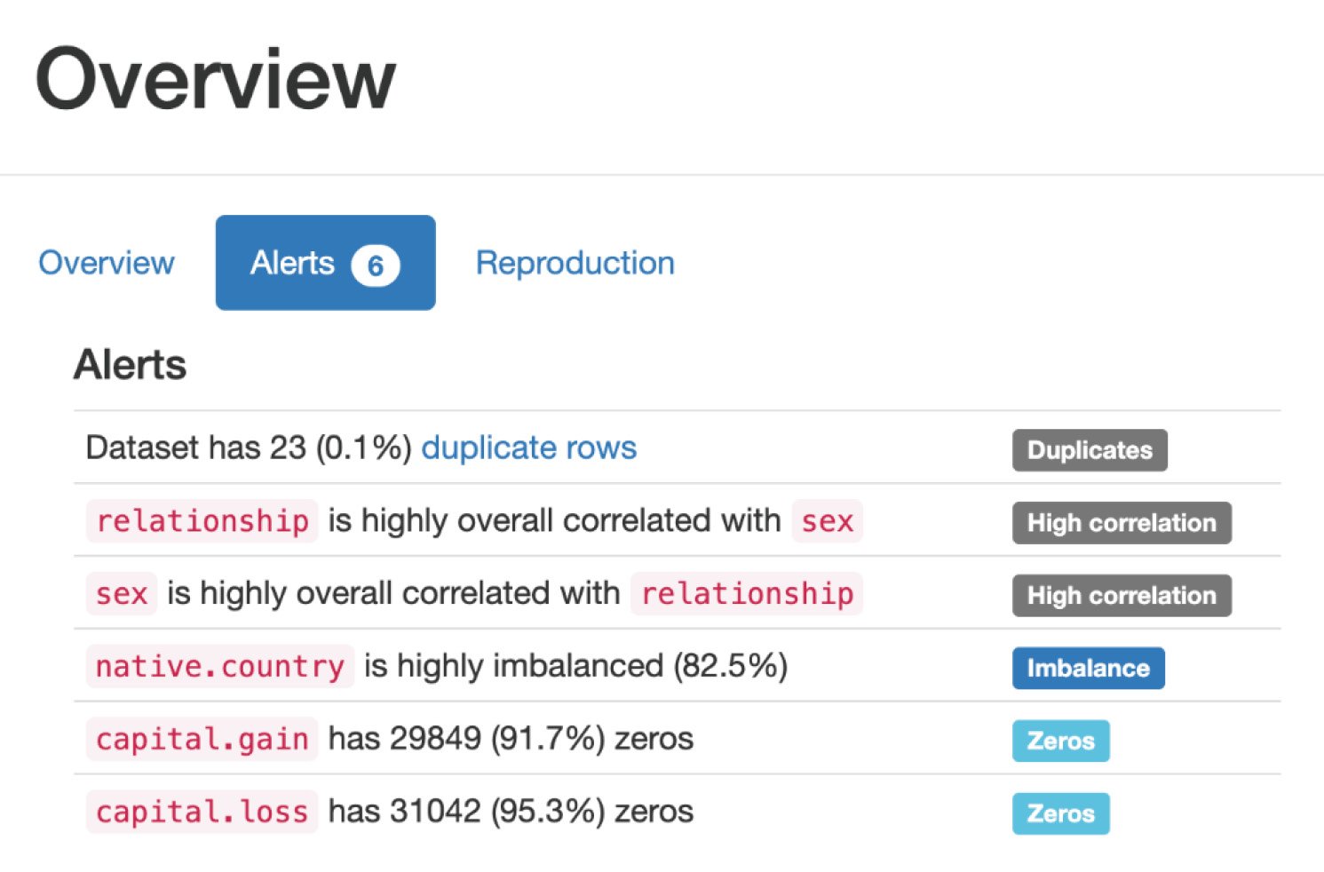
Figure 1.26 – Alerts
The Reproduction tab under Overview shows the duration it took for the analysis to generate this report, as follows:
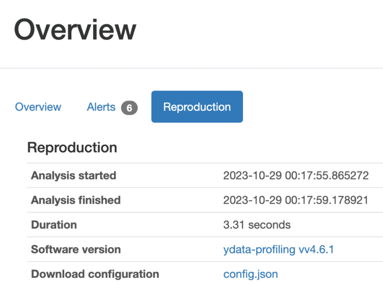
Figure 1.27 – Reproduction
Variables section
Let us walk through the Variables section in the report.
Under the Variables section, we can select any variable in the dataset under the dropdown and see the statistical information about the dataset, such as the number of unique values for that variable, missing values for that variable, the size of that variable, and so on.
In the following figure, we selected the age variable in the dropdown and can see the statistics about that variable:
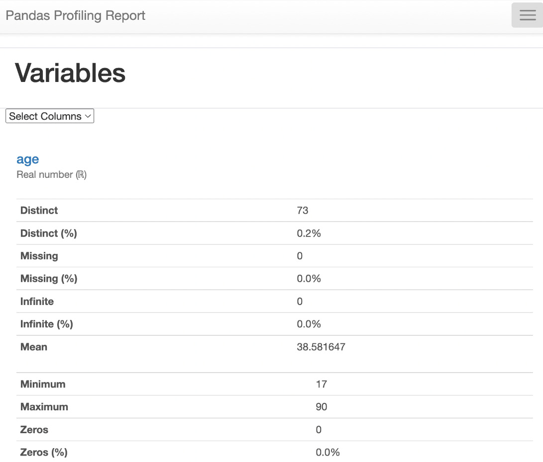
Figure 1.28 – Variables
Interactions section
As shown in the following figure, this report also contains the Interactions plot to show how one variable relates to another variable:
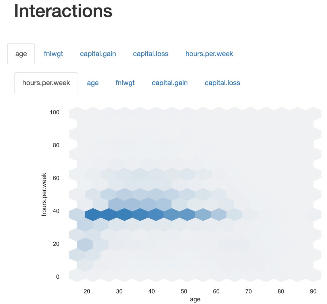
Figure 1.29 – Interactions
Correlations
Now, let's see the Correlations section in the report; we can see the correlation between various variables in Heatmap. Also, we can see various correlation coefficients in the Table form.
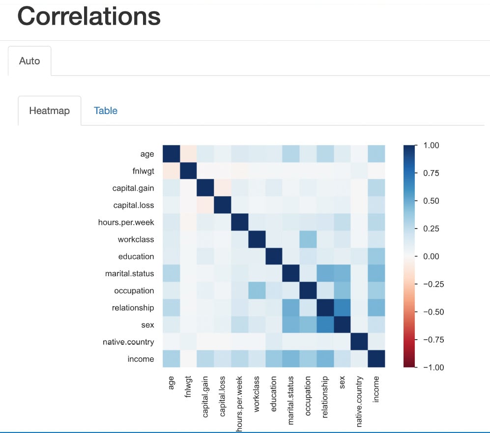
Figure 1.30 – Correlations
Heatmaps use color intensity to represent values. The colors typically range from cool to warm hues, with cool colors (e.g., blue or green) indicating low values and warm colors (e.g., red or orange) indicating high values. Rows and columns of the matrix are represented on both the x axis and y axis of the heatmap. Each cell at the intersection of a row and column represents a specific value in the data.
The color intensity of each cell corresponds to the magnitude of the value it represents. Darker colors indicate higher values, while lighter colors represent lower values.
As we can see in the preceding figure, the intersection cell between income and hours per week shows a high-intensity blue color, which indicates there is a high correlation between income and hours per week. Similarly, the intersection cell between income and capital gain shows a high-intensity blue color, indicating a high correlation between those two features.
Missing values
This section of the report shows the counts of total values present within the data and provides a good understanding of whether there are any missing values.
Under Missing values, we can see two tabs:
- The Count plot
- The Matrix plot
Count plot
In Figure 1.31, the shows that all variables have a count of 32,561, which is the count of rows (observations) in the dataset. That indicates that there are no missing values in the dataset.
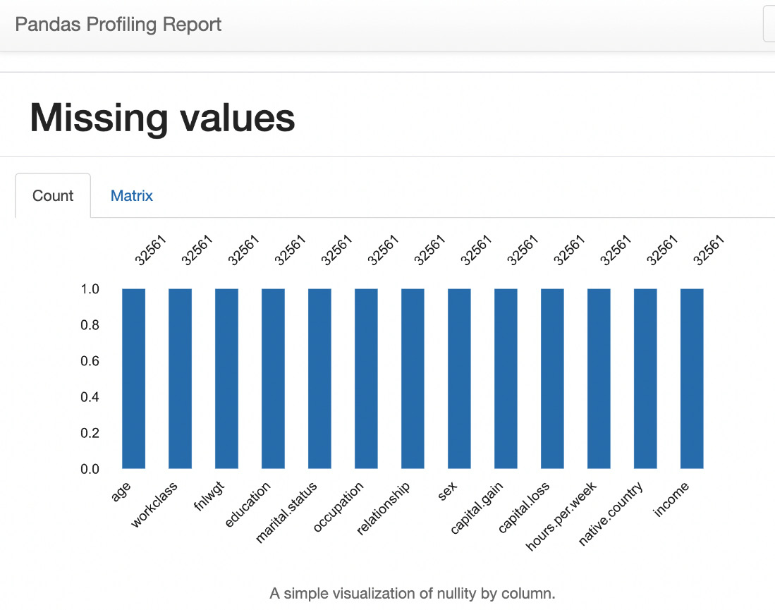
Figure 1.31 – Missing values count
Matrix plot
The following Matrix plot indicates where the missing values are (if there are any missing values in the dataset):
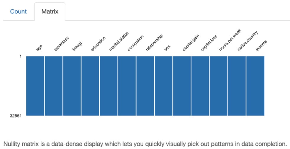
Figure 1.32 – Missing values matrix
Sample data
This section shows the sample data for the first 10 rows and the last 10 rows in the dataset.
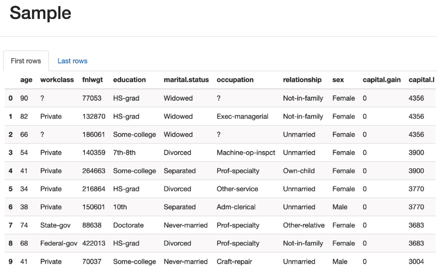
Figure 1.33 – Sample data
This section shows the most frequently occurring rows and the number of duplicates in the dataset.
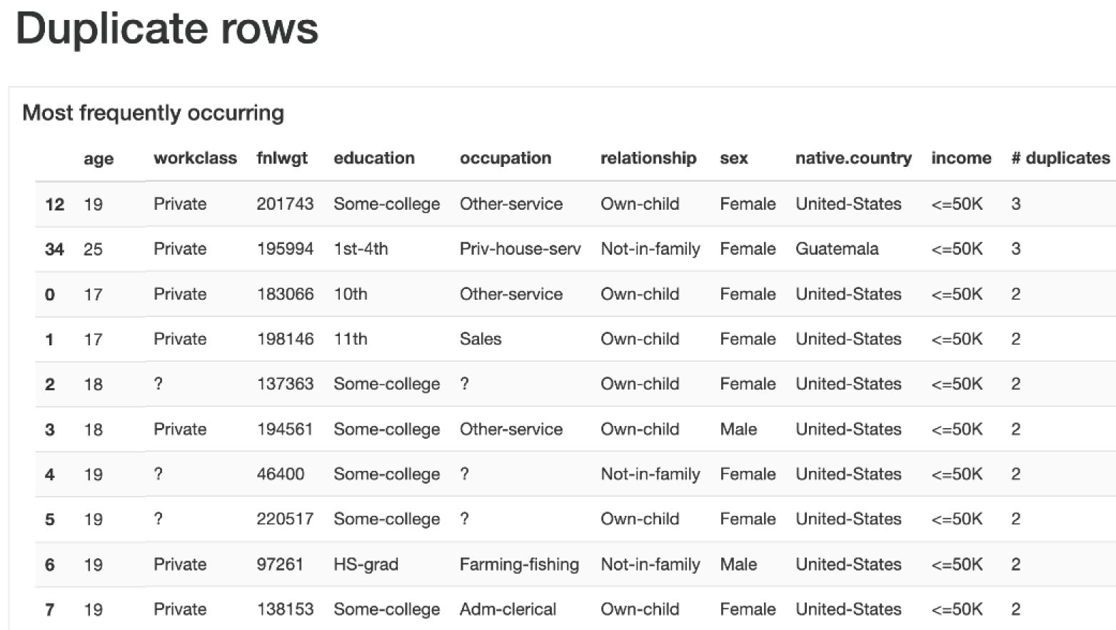
Figure 1.34 – Duplicate rows
We have seen how to analyze the data using Pandas and then how to visualize the data by plotting various plots such as bar charts and histograms using sns, seaborn, and pandas-ydata-profiling. Next, let us see how to perform data analysis using OpenAI LLM and the LangChain Pandas Dataframe agent by asking questions with natural language.