

Overview of Statistics
Statistics is a combination of the analysis, collection, interpretation, and representation of numerical data. Probability is a measure of the likelihood that an event will occur and is quantified as a number between 0 and 1.
A probability distribution is a function that provides the probability for every possible event. A probability distribution is frequently used for statistical analysis. The higher the probability, the more likely the event. There are two types of probability distributions, namely discrete and continuous.
A discrete probability distribution shows all the values that a random variable can take, together with their probability. The following diagram illustrates an example of a discrete probability distribution. If we have a six-sided die, we can roll each number between 1 and 6. We have six events that can occur based on the number that's rolled. There is an equal probability of rolling any of the numbers, and the individual probability of any of the six events occurring is 1/6:
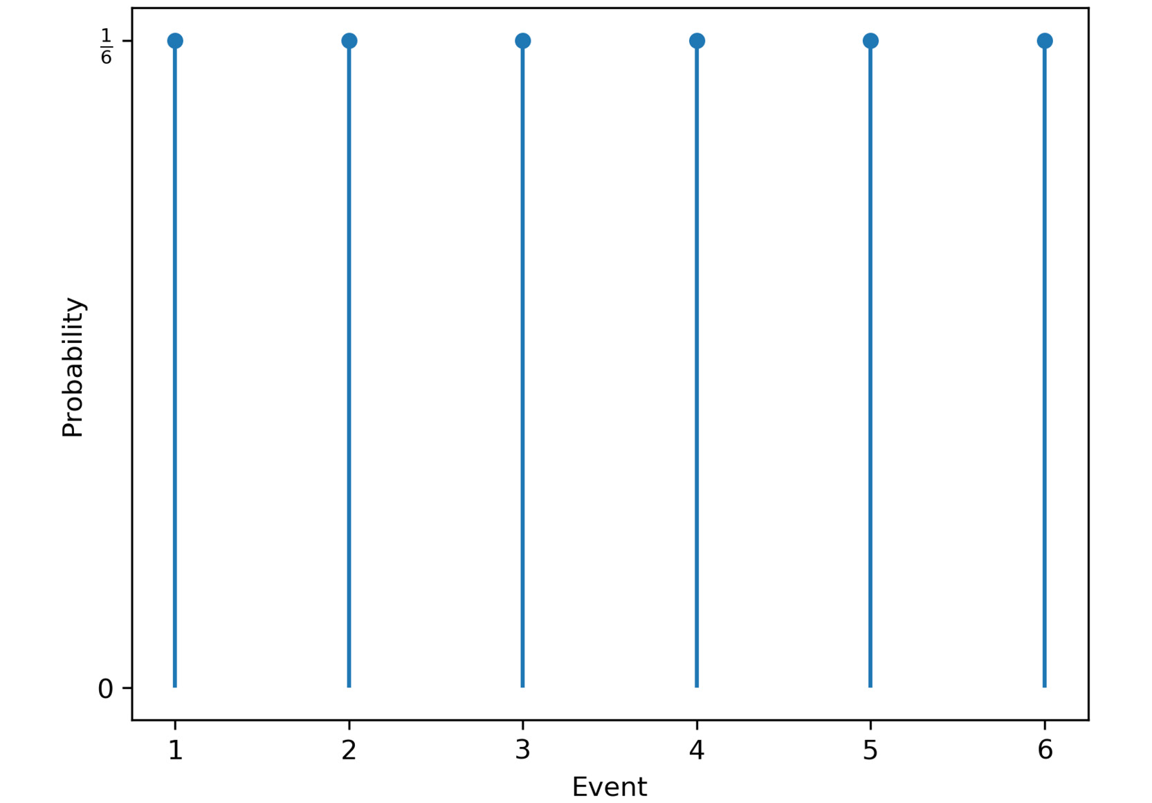
Figure 1.3: Discrete probability distribution for die rolls
A continuous probability distribution defines the probabilities of each possible value of a continuous random variable. The following diagram provides an example of a continuous probability distribution. This example illustrates the distribution of the time needed to drive home. In most cases, around 60 minutes is needed, but sometimes, less time is needed because there is no traffic, and sometimes, much more time is needed if there are traffic jams:
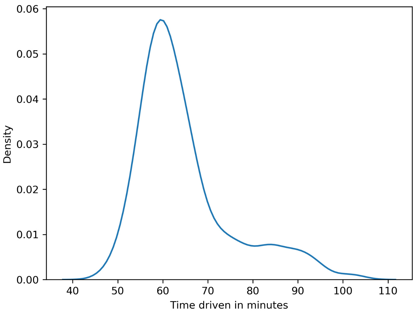
Figure 1.4: Continuous probability distribution for the time taken to reach home
Measures of Central Tendency
Measures of central tendency are often called averages and describe central or typical values for a probability distribution. We are going to discuss three kinds of averages in this chapter:
- Mean: The arithmetic average is computed by summing up all measurements and dividing the sum by the number of observations. The mean is calculated as follows:

Figure 1.5: Formula for mean
- Median: This is the middle value of the ordered dataset. If there is an even number of observations, the median will be the average of the two middle values. The median is less prone to outliers compared to the mean, where outliers are distinct values in data.
- Mode: Our last measure of central tendency, the mode is defined as the most frequent value. There may be more than one mode in cases where multiple values are equally frequent.
For example, a die was rolled 10 times, and we got the following numbers: 4, 5, 4, 3, 4, 2, 1, 1, 2, and 1.
The mean is calculated by summing all the events and dividing them by the number of observations: (4+5+4+3+4+2+1+1+2+1)/10=2.7.
To calculate the median, the die rolls have to be ordered according to their values. The ordered values are as follows: 1, 1, 1, 2, 2, 3, 4, 4, 4, 5. Since we have an even number of die rolls, we need to take the average of the two middle values. The average of the two middle values is (2+3)/2=2.5.
The modes are 1 and 4 since they are the two most frequent events.
Measures of Dispersion
Dispersion, also called variability, is the extent to which a probability distribution is stretched or squeezed.
The different measures of dispersion are as follows:
- Variance: The variance is the expected value of the squared deviation from the mean. It describes how far a set of numbers is spread out from their mean. Variance is calculated as follows:

Figure 1.6: Formula for mean
- Standard deviation: This is the square root of the variance.
- Range: This is the difference between the largest and smallest values in a dataset.
- Interquartile range: Also called the midspread or middle 50%, this is the difference between the 75th and 25th percentiles, or between the upper and lower quartiles.
Correlation
The measures we have discussed so far only considered single variables. In contrast, correlation describes the statistical relationship between two variables:
- In a positive correlation, both variables move in the same direction.
- In a negative correlation, the variables move in opposite directions.
- In zero correlation, the variables are not related.
Note
One thing you should be aware of is that correlation does not imply causation. Correlation describes the relationship between two or more variables, while causation describes how one event is caused by another. For example, consider a scenario in which ice cream sales are correlated with the number of drowning deaths. But that doesn't mean that ice cream consumption causes drowning. There could be a third variable, say temperature, that may be responsible for this correlation. Higher temperatures may cause an increase in both ice cream sales and more people engaging in swimming, which may be the real reason for the increase in deaths due to drowning.
Example
Consider you want to find a decent apartment to rent that is not too expensive compared to other apartments you've found. The other apartments (all belonging to the same locality) you found on a website are priced as follows: $700, $850, $1,500, and $750 per month. Let's calculate some values statistical measures to help us make a decision:
- The mean is ($700 + $850 + $1,500 + $750) / 4 = $950.
- The median is ($750 + $850) / 2 = $800.
- The standard deviation is
 .
. - The range is $1,500 - $700 = $800.
As an exercise, you can try and calculate the variance as well. However, note that compared with all the above values, the median value ($800) is a better statistical measure in this case since it is less prone to outliers (the rent amount of $1,500). Given that all apartments belong to the same locality, you can clearly see that the apartment costing $1500 is definitely priced much higher as compared with other apartments. A simple statistical analysis helped us to narrow down our choices.
Types of Data
It is important to understand what kind of data you are dealing with so that you can select both the right statistical measure and the right visualization. We categorize data as categorical/qualitative and numerical/quantitative. Categorical data describes characteristics, for example, the color of an object or a person's gender. We can further divide categorical data into nominal and ordinal data. In contrast to nominal data, ordinal data has an order.
Numerical data can be divided into discrete and continuous data. We speak of discrete data if the data can only have certain values, whereas continuous data can take any value (sometimes limited to a range).
Another aspect to consider is whether the data has a temporal domain – in other words, is it bound to time or does it change over time? If the data is bound to a location, it might be interesting to show the spatial relationship, so you should keep that in mind as well. The following flowchart classifies the various data types:
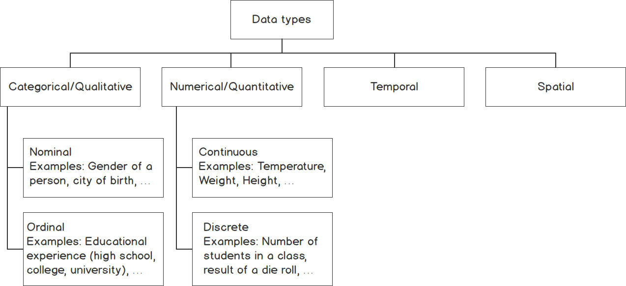
Figure 1.7: Classification of types of data
Summary Statistics
In real-world applications, we often encounter enormous datasets. Therefore, summary statistics are used to summarize important aspects of data. They are necessary to communicate large amounts of information in a compact and simple way.
We have already covered measures of central tendency and dispersion, which are both summary statistics. It is important to know that measures of central tendency show a center point in a set of data values, whereas measures of dispersion show how much the data varies.
The following table gives an overview of which measure of central tendency is best suited to a particular type of data:
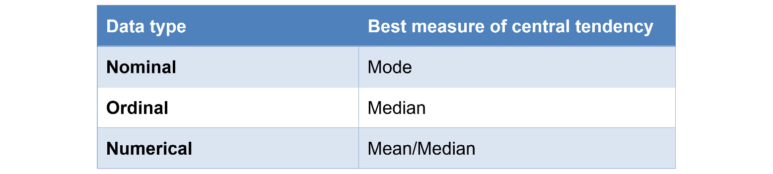
Figure 1.8: Best suited measures of central tendency for different types of data
In the next section, we will learn about the NumPy library and implement a few exercises using it.