Introduction
Unlike machines, people are usually not equipped for interpreting a large amount of information from a random set of numbers and messages in each piece of data. Out of all our logical capabilities, we understand things best through the visual processing of information. When data is represented visually, the probability of understanding complex builds and numbers increases.
Python has recently emerged as a programming language that performs well for data analysis. It has applications across data science pipelines that convert data into a usable format (such as pandas), analyzes it (such as NumPy), and extract useful conclusions from the data to represent it in a visually appealing manner (such as Matplotlib or Bokeh). Python provides data visualization libraries that can help you assemble graphical representations efficiently.
In this book, you will learn how to use Python in combination with various libraries, such as NumPy, pandas, Matplotlib, seaborn, and geoplotlib, to create impactful data visualizations using real-world data. Besides that, you will also learn about the features of different types of charts and compare their advantages and disadvantages. This will help you choose the chart type that's suited to visualizing your data.
Once we understand the basics, we can cover more advanced concepts, such as interactive visualizations and how Bokeh can be used to create animated visualizations that tell a story. Upon completing this book, you will be able to perform data wrangling, extract relevant information, and visualize your findings descriptively.
Introduction to Data Visualization
Computers and smartphones store data such as names and numbers in a digital format. Data representation refers to the form in which you can store, process, and transmit data.
Representations can narrate a story and convey fundamental discoveries to your audience. Without appropriately modeling your information to use it to make meaningful findings, its value is reduced. Creating representations helps us achieve a more precise, more concise, and more direct perspective of information, making it easier for anyone to understand the data.
Information isn't equivalent to data. Representations are a useful apparatus to derive insights from the data. Thus, representations transform data into useful information.
The Importance of Data Visualization
Instead of just looking at data in the columns of an Excel spreadsheet, we get a better idea of what our data contains by using visualization. For instance, it's easy to see a pattern emerge from the numerical data that's given in the following scatter plot. It shows the correlation between body mass and the maximum longevity of various animals grouped by class. There is a positive correlation between body mass and maximum longevity:
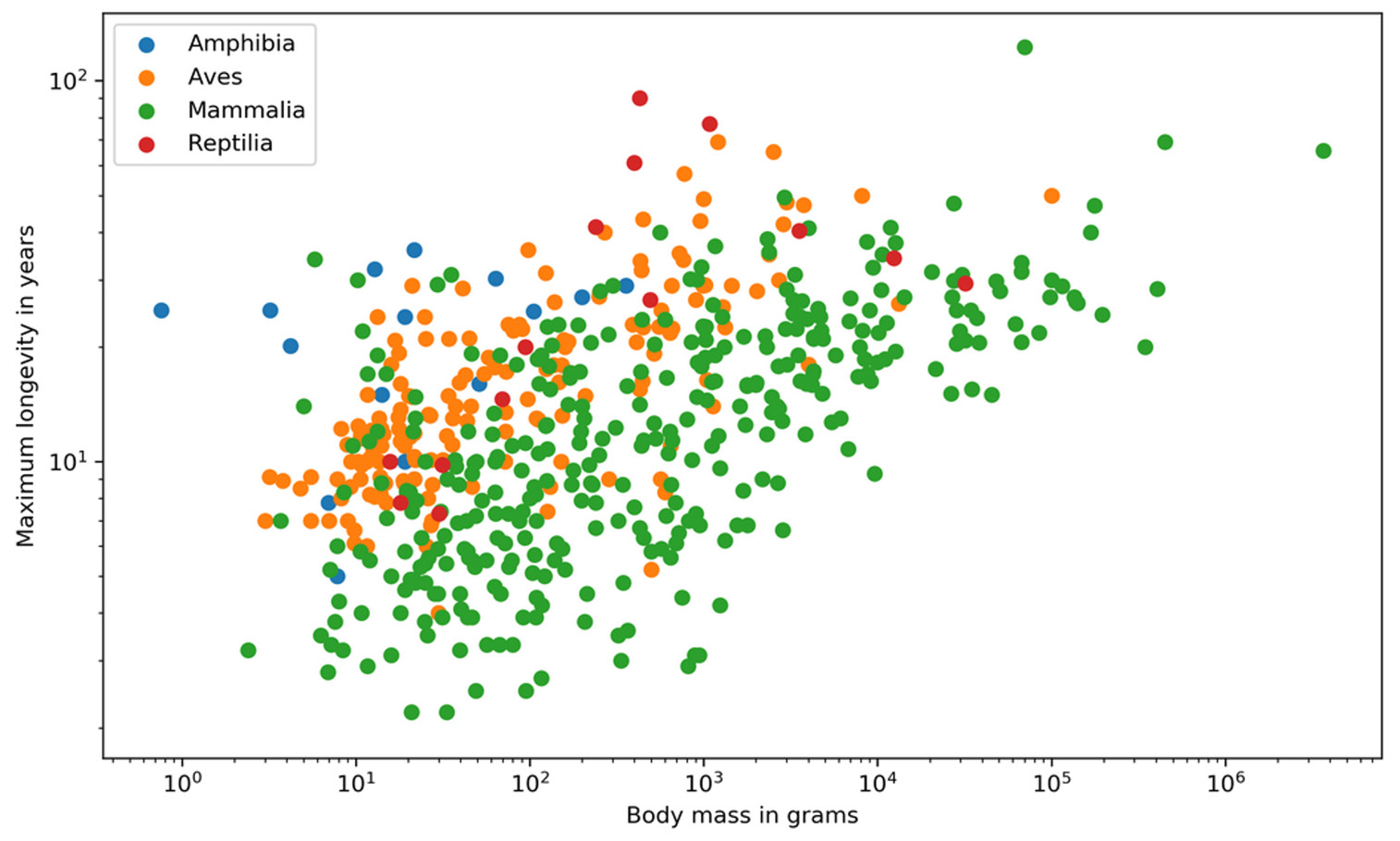
Figure 1.1: A simple example of data visualization
Visualizing data has many advantages, such as the following:
- Complex data can be easily understood.
- A simple visual representation of outliers, target audiences, and futures markets can be created.
- Storytelling can be done using dashboards and animations.
- Data can be explored through interactive visualizations.
Data Wrangling
Data wrangling is the process of transforming raw data into a suitable representation for various tasks. It is the discipline of augmenting, cleaning, filtering, standardizing, and enriching data in a way that allows it to be used in a downstream task, which in our case is data visualization.
Look at the following data wrangling process flow diagram to understand how accurate and actionable data can be obtained for business analysts to work on:
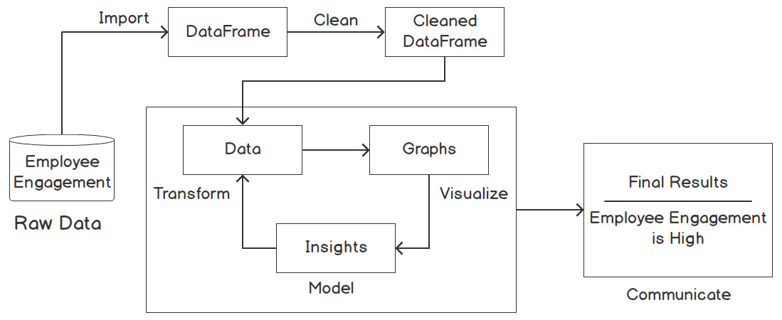
Figure 1.2: Data wrangling process to measure employee engagement
In relation to the preceding figure, the following steps explain the flow of the data wrangling process:
- First, the Employee Engagement data is in its raw form.
- Then, the data gets imported as a DataFrame and is later cleaned.
- The cleaned data is then transformed into graphs, from which findings can be derived.
- Finally, we analyze this data to communicate the final results.
For example, employee engagement can be measured based on raw data gathered from feedback surveys, employee tenure, exit interviews, one-on-one meetings, and so on. This data is cleaned and made into graphs based on parameters such as referrals, faith in leadership, and scope of promotions. The percentages, that is, information derived from the graphs, help us reach our result, which is to determine the measure of employee engagement.
Tools and Libraries for Visualization
There are several approaches to creating data visualizations. Depending on your requirements, you might want to use a non-coding tool such as Tableau, which allows you to get a good feel for your data. Besides Python, which will be used in this book, MATLAB and R are widely used in data analytics.
However, Python is the most popular language in the industry. Its ease of use and the speed at which you can manipulate and visualize data, combined with the availability of a number of libraries, make Python the best choice for data visualization.
Note
MATLAB (https://www.mathworks.com/products/matlab.html), R (https://www.r-project.org), and Tableau (https://www.tableau.com) are not part of this book; we will only cover the relevant tools and libraries for Python.