Reader small image

You're reading from  Python for Finance Cookbook

Product typeBook
Published inJan 2020
Reading LevelIntermediate
PublisherPackt
ISBN-139781789618518
Edition1st Edition
Languages
Right arrow
Author (1)
Eryk Lewinson
Eryk Lewinson
author image
Eryk Lewinson

Eryk Lewinson received his master's degree in Quantitative Finance from Erasmus University Rotterdam. In his professional career, he has gained experience in the practical application of data science methods while working in risk management and data science departments of two "big 4" companies, a Dutch neo-broker and most recently the Netherlands' largest online retailer. Outside of work, he has written over a hundred articles about topics related to data science, which have been viewed more than 3 million times. In his free time, he enjoys playing video games, reading books, and traveling with his girlfriend.
Read more about Eryk Lewinson

Right arrow

Building an interactive dashboard for TA

In this recipe, we show how to build an interactive dashboard for technical analysis in Jupyter Notebook. Of course, the same result could be achieved without any interactivity, by writing the initial code, and then changing the parameter values inline multiple times. However, we believe it is much better to create an interactive tool that can ease the pain, as well as reduce the number of potential mistakes.

In order to do so, we leverage a tool called IPython widgets (ipywidgets), in combination with plotly and cufflinks. We select a few US tech stocks and three indicators (Bollinger Bands, MACD, and RSI) for the dashboard, but this selection can be extended to many more.

Getting ready

After installing the ipywidgets library, we need to run the following line in Terminal to enable the extension:

jupyter nbextension enable --py widgetsnbextension

How to do it...

Execute the following steps to create an interactive dashboard inside Jupyter Notebook.

  1. Import the libraries:
import ipywidgets as wd
import cufflinks as cf
import pandas as pd
import yfinance as yf
from plotly.offline import iplot, init_notebook_mode
from ipywidgets import interact, interact_manual

init_notebook_mode()
  1. Define the possible values for assets and technical indicators:
stocks = ['TWTR', 'MSFT', 'GOOGL', 'FB', 'TSLA', 'AAPL']
indicators = ['Bollinger Bands', 'MACD', 'RSI']
  1. Define a function for creating the interactive plot:
def ta_dashboard(asset, indicator, start_date, end_date, 
bb_k, bb_n, macd_fast, macd_slow, macd_signal,
rsi_periods, rsi_upper, rsi_lower):


df = yf.download(asset,
start=start_date,
end=end_date,
progress=False,
auto_adjust=True)

qf = cf.QuantFig(df, title=f'TA Dashboard - {asset}',
legend='right', name=f'{asset}')

if 'Bollinger Bands' in indicator:
qf.add_bollinger_bands(periods=bb_n,
boll_std=bb_k)
if 'MACD' in indicator:
qf.add_macd(fast_period=macd_fast,
slow_period=macd_slow,
signal_period=macd_signal)
if 'RSI' in indicator:
qf.add_rsi(periods=rsi_periods,
rsi_upper=rsi_upper,
rsi_lower=rsi_lower,
showbands=True)

return qf.iplot()
  1. Define the selectors:
stocks_selector = wd.Dropdown(
options=stocks,
value=stocks[0],
description='Asset'
)

indicator_selector = wd.SelectMultiple(
description='Indicator',
options=indicators,
value=[indicators[0]]
)

start_date_selector = wd.DatePicker(
description='Start Date',
value=pd.to_datetime('2018-01-01'),
continuous_update=False
)

end_date_selector = wd.DatePicker(
description='End Date',
value=pd.to_datetime('2018-12-31'),
continuous_update=False
)
  1. Define a label, and group the selectors inside a container:
main_selector_label = wd.Label('Main parameters', 
layout=wd.Layout(height='45px'))

main_selector_box = wd.VBox(children=[main_selector_label,
stocks_selector,
indicator_selector,
start_date_selector,
end_date_selector])
  1. Define the secondary selectors for the Bollinger Bands:
bb_label = wd.Label('Bollinger Bands')

n_param = wd.IntSlider(value=20, min=1, max=40, step=1,
description='N:', continuous_update=False)

k_param = wd.FloatSlider(value=2, min=0.5, max=4, step=0.5,
description='k:', continuous_update=False)

bollinger_box = wd.VBox(children=[bb_label, n_param, k_param])
  1. Define the secondary selectors for the MACD:
macd_label = wd.Label('MACD')

macd_fast = wd.IntSlider(value=12, min=2, max=50, step=1,
description='Fast avg:',
continuous_update=False)

macd_slow = wd.IntSlider(value=26, min=2, max=50, step=1,
description='Slow avg:',
continuous_update=False)

macd_signal = wd.IntSlider(value=9, min=2, max=50, step=1,
description='MACD signal:',
continuous_update=False)

macd_box = wd.VBox(children=[macd_label, macd_fast,
macd_slow, macd_signal])
  1. Define the secondary selectors for the RSI:
rsi_label = wd.Label('RSI')

rsi_periods = wd.IntSlider(value=14, min=2, max=50, step=1,
description='RSI periods:',
continuous_update=False)

rsi_upper = wd.IntSlider(value=70, min=1, max=100, step=1,
description='Upper Thr:',
continuous_update=False)

rsi_lower = wd.IntSlider(value=30, min=1, max=100, step=1,
description='Lower Thr:',
continuous_update=False)

rsi_box = wd.VBox(children=[rsi_label, rsi_periods,
rsi_upper, rsi_lower])
  1. Create the labels and group the selectors into containers:
sec_selector_label = wd.Label('Secondary parameters', 
layout=wd.Layout(height='45px'))
blank_label = wd.Label('', layout=wd.Layout(height='45px'))

sec_box_1 = wd.VBox([sec_selector_label, bollinger_box, macd_box])
sec_box_2 = wd.VBox([blank_label, rsi_box])

secondary_selector_box = wd.HBox([sec_box_1, sec_box_2])
  1. Group the boxes and prepare the interactive output:
controls_dict = {'asset':stocks_selector, 
'indicator':indicator_selector,
'start_date':start_date_selector,
'end_date':end_date_selector,
'bb_k':k_param,
'bb_n':n_param,
'macd_fast': macd_fast,
'macd_slow': macd_slow,
'macd_signal': macd_signal,
'rsi_periods': rsi_periods,
'rsi_upper': rsi_upper,
'rsi_lower': rsi_lower}

ui = wd.HBox([main_selector_box, secondary_selector_box])
out = wd.interactive_output(ta_dashboard, controls_dict)
  1. Display the dashboard:
display(ui, out)

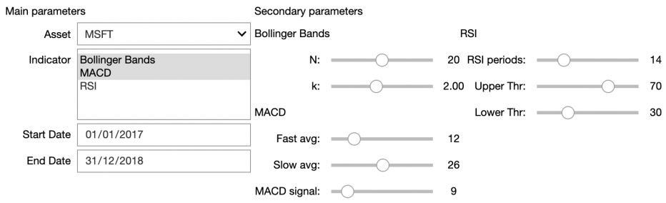
Running the last line displays the following graphical user interface (GUI):

By selecting values of interest in the GUI, we can influence the interactive chart, for example, by changing the technical indicators we want to display.

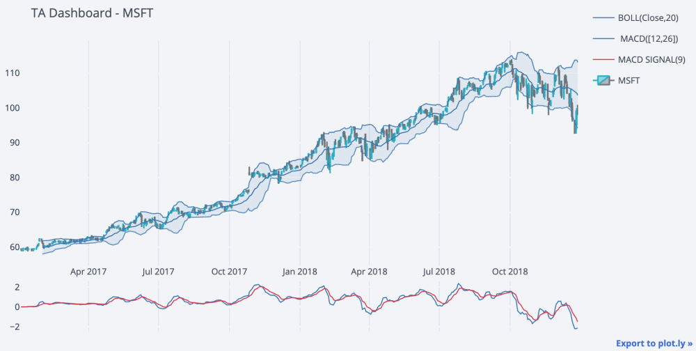
This time, we plotted both the Bollinger Bands and the MACD on top of the candlestick chart. Inside of the Notebook, we can zoom in on areas of interest, to further inspect the patterns.

How it works...

After importing the libraries, we defined lists of possible assets (represented by their tickers), and the technical indicators from which to select.

In Step 3, we defined a function called ta_dashboard, which took as input all parameters we made configurable: asset, technical indicators, range of dates, and indicator-specific parameters. The function itself downloaded historical stock prices from Yahoo Finance and used cufflinks to draw a candlestick chart, as we presented in the Creating a candlestick chart recipe. Then, we added additional indicators to the figure, by using methods such as add_bollinger_bands and providing the required arguments. For a list of all supported technical indicators, please refer to the cufflinks documentation.

Having prepared the function, we started defining the elements of the GUI. In Step 4 and Step 5, we defined the main selectors (such as the asset, technical indicators, and start/end dates for downloading the data) and grouped them inside a vertical box (VBox), which serves as storage for smaller elements and makes it easier to design the GUI. To indicate which selectors belonged to a given box, we provided a list of the objects as the children argument.

In Steps 6 to 9, we created the secondary container, this time with all the parameters responsible for tuning the technical indicators. Some general notes about using selectors and boxes are:

  • We can turn off the continuous updating of sliders with continuous_update=False, so the plot only updates when a new value is set, not while moving it around.
  • We can define the default value for a selector by providing the value argument.
  • We can use blank labels (without any text) to align the elements of the boxes.

In Step 10, we used the wd.interactive_output, to indicate that the output of the ta_dashboard function would be modified by the interactive widgets (in a dictionary, we assigned widgets to certain arguments of the function). Lastly, we ran display(ui, out) to display the GUI, which in turn generated the plot.

There's more...

The main advantage of the dashboard presented in this recipe is that it is embedded within Jupyter Notebook. However, we might want to move it outside of the local notebook and make it available for everyone as a web application. To do so, we could use Dash, which is Python's equivalent of R's vastly popular Shiny framework.

Previous PageNext Chapter
You have been reading a chapter from
Python for Finance Cookbook
Published in: Jan 2020Publisher: PacktISBN-13: 9781789618518
Register for a free Packt account to unlock a world of extra content!
A free Packt account unlocks extra newsletters, articles, discounted offers, and much more. Start advancing your knowledge today.
undefined
Unlock this book and the full library FREE for 7 days
Get unlimited access to 7000+ expert-authored eBooks and videos courses covering every tech area you can think of
Renews at $15.99/month. Cancel anytime

Author (1)

author image
Eryk Lewinson

Eryk Lewinson received his master's degree in Quantitative Finance from Erasmus University Rotterdam. In his professional career, he has gained experience in the practical application of data science methods while working in risk management and data science departments of two "big 4" companies, a Dutch neo-broker and most recently the Netherlands' largest online retailer. Outside of work, he has written over a hundred articles about topics related to data science, which have been viewed more than 3 million times. In his free time, he enjoys playing video games, reading books, and traveling with his girlfriend.
Read more about Eryk Lewinson