Search icon
Arrow left icon
All Products
Best Sellers
New Releases
Books
Videos
Audiobooks
Learning Hub
Newsletters
Free Learning
Arrow right icon
Learning SAP Analytics Cloud

You're reading from  Learning SAP Analytics Cloud

Product type Book
Published in Jul 2017
Publisher Packt
ISBN-13 9781788290883
Pages 420 pages
Edition 1st Edition
Languages

Table of Contents (11) Chapters

Preface Getting Started with SAP Analytics Cloud Models in SAP Analytics Cloud Planning model Creating Stories Using Charts Extending Stories with KPI, Filters, and Other Handy Objects Analyzing Data Using Geomaps and Other Objects Working with Tables and Grids Collaboration Digital Boardroom System Administration

Analyzing Data Using Geomaps and Other Objects

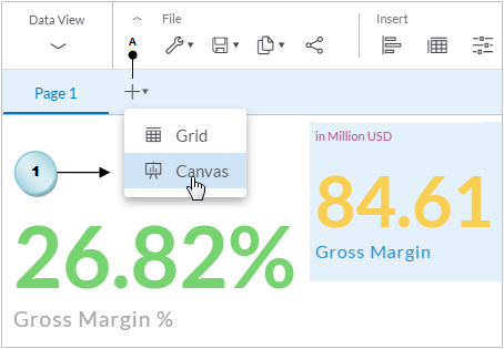
You completed the first page of your story and saved it with its default name (Page 1) in the previous chapter. In this chapter, you will create another page entitled "Analysis". The page will comprise a geomap, a scatter plot chart, and a few more charts. As these objects will be created on a new page, you have to first learn how to add pages to your story and replace their default names with some meaningful names.

Here's a list of topics covered in this chapter:

  • Adding new pages to a story and providing expressive names to your story pages. You will also learn about the other options available to manipulate pages, such as delete, copy, duplicate, and so on.
  • Sharing your views about the page content with other users by adding comments.
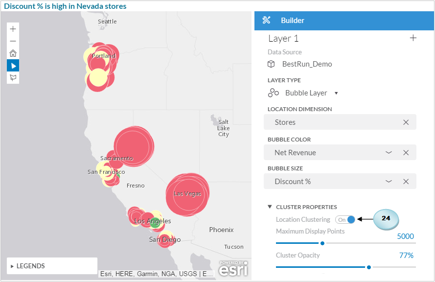
  • Visualizing data in geomaps using different types of layers.
  • Using location clustering...

Working with story pages

You can segregate your story on multiple pages according to the subject. In this exercise, you will learn how to add and rename pages and will be introduced to other topics related to story pages:

  1. Hover your mouse pointer in the page name area to see the Add New Page icon (A). Clicking on this icon displays two options: Grid and Canvas. Choose the Canvas option. As you click on the Canvas option, a new page labeled Page 2 will be added beside Page 1. Repeat this step to create one more page:
  1. Move your mouse pointer over Page 1. A tiny arrow (B) will appear next to the page name. Click on this arrow to see a menu (C). From this menu, select the Rename option (D). In the Rename Page dialog box, enter Summary (E) for the page name, and click on OK. The page name will change. Repeat this step for Page 2 and Page 3, and enter Analysis and Sales Manager...

Location clustering in geomaps

The initial view of this map, as illustrated in the following screenshot, is crowded with bubbles, and you cannot interpret the results from this view. With the help of location clustering, you can make the map easier to work with.

Execute the following steps to see how location clustering works:

  1. Select the map, and expand the Cluster Properties section located at the bottom of the Builder panel. Note that if you arrive from another story location to this page and click on the map, you see the map layers information on the Builder tab. In the content layers section, click on the Edit icon next to Layer 1 to access the Cluster Properties section:
  1. If not turned on, switch Location Clustering to the On position.

  2. Double-click on the existing Maximum Display Points number (5,000), and replace it with 10.

  3. Set Cluster Opacity to 100%, and, if needed...

Applying a filter to a geomap

The vertical toolbar in a geomap is equipped with a filtering option using which you can filter your data directly on the map by drawing a shape, a polygon, circle, or square a around the data points you want to focus on. Execute the following step to see how filters can be applied to a geomap:

  1. Select the polygon shape from the vertical toolbar, and draw a shape on the geomap, as illustrated in the following screenshot:

After drawing the shape, you are provided with a few options. The first option (A) lets you filter the selected data points, the second one (B) excludes the selected data points, and the third one (C) removes the filter. The outputs of the first two options are illustrated in the following screenshots. When you apply the filter to the selected data points, other data points on the map vanish (see View-1). If you opt for the second...

Linking different models

In your stories, you can display data from multiple models in a single chart by linking dimensions in those models. In this exercise, you will link the two models (BestRun_Demo and Planned_Events) to view the data from both models in a scatter plot chart.

Here are the steps to link dimensions:

  1. Click on the Link Dimensions option in the More menu. On wider screens, this option is listed in the data toolbar section (A). Alternatively, you can find this option in the Data Source area of the Builder panel when you are creating or editing a chart:
  1. The Link Dimensions dialog box appears. In this dialog box, you have to link dimension from the primary model on the left with those from the secondary model on the right. Expand the drop-down list in the left pane, and click on the Add model option. In the Select Models To Add dialog box, select the existing...

Creating a combination column and a line chart

A combination chart is used to compare two different types of data in the same chart. In this exercise, you will create a combination column and line chart to show the percentage of discount provided against net revenue. The initial chart view will provide this information for the three states. The chart will allow you to drill-down, either using the legend or via the state's links, to see relevant details. If you drill-down via legends, you see the data for all eighteen cities in the three states. On the other hand, if you drill-down on a state, you get city data for that state only. Here are the steps:

  1. Add a blank chart from the Insert toolbar.
  2. Set Data Source to the BestRun_Demo model.
  3. Select combination column and line chart from the Comparison category.
  1. In the Measures section, click on the Add Measure link, and select...

Using predictive forecasting through a trend time series chart

Time series forecasting is only supported for planning models. So, you need planning rights and a planning license to run a predictive time-series forecast. However, you can add predictive forecast by creating a trend time series chart based on an analytical model to estimate future values. In this exercise, you will use a trend time series chart to view net revenue trends throughout the range of a year. A predictive time-series forecast runs an algorithm on historical data to predict future values for specific measures. For this type of chart, you can forecast a maximum of three different measures, and you have to specify the time for the prediction and the past time periods to use as historical data.

Add a blank chart from the Insert toolbar.

  1. Set Data Source to the BestRun_Demo model.
  2. Select the Time Series chart...

Summary

This chapter provided hands-on exposure to some of the very important topics of SAP Analytics Cloud. You created second page in your story and named it Analysis of your story. New pages are added to a story to segregate the analysis.

You also learned how to provide expressive names to your story pages and, at the same time, learned about some other page manipulation options that allow you to add, delete, rename, hide, and move a page. Then, you learned how to share your views about the analysis provided on a story page with other users by adding comments. You created bubble and choropleth layers to visualize data in geomaps and applied location clustering to better visualize the data in the map.

You also learned about the different types of filters you can apply to a geomap to restrict your analysis to specific regions. You connected two different models via linked dimensions...

lock icon The rest of the chapter is locked
You have been reading a chapter from
Learning SAP Analytics Cloud
Published in: Jul 2017 Publisher: Packt ISBN-13: 9781788290883
Register for a free Packt account to unlock a world of extra content!
A free Packt account unlocks extra newsletters, articles, discounted offers, and much more. Start advancing your knowledge today.
Unlock this book and the full library FREE for 7 days
Get unlimited access to 7000+ expert-authored eBooks and videos courses covering every tech area you can think of
Renews at $15.99/month. Cancel anytime}