Reader small image

You're reading from  Interactive Data Visualization with Python - Second Edition

Product typeBook
Published inApr 2020
Reading LevelIntermediate
Publisher
ISBN-139781800200944
Edition2nd Edition
Languages
Right arrow
Authors (4):
Abha Belorkar
Abha Belorkar
author image
Abha Belorkar

Abha Belorkar is an educator and researcher in computer science. She received her bachelor's degree in computer science from Birla Institute of Technology and Science Pilani, India and her Ph.D. from the National University of Singapore. Her current research work involves the development of methods powered by statistics, machine learning, and data visualization techniques to derive insights from heterogeneous genomics data on neurodegenerative diseases.
Read more about Abha Belorkar

Sharath Chandra Guntuku
author image
Sharath Chandra Guntuku

Sharath Chandra Guntuku is a researcher in natural language processing and multimedia computing. He received his bachelor's degree in computer science from Birla Institute of Technology and Science, Pilani, India and his Ph.D. from Nanyang Technological University, Singapore. His research aims to leverage large-scale social media image and text data to model social health outcomes and psychological traits. He uses machine learning, statistical analysis, natural language processing, and computer vision to answer questions pertaining to health and psychology in individuals and communities.
Read more about Sharath Chandra Guntuku

Shubhangi Hora
Shubhangi Hora
author image
Shubhangi Hora

Shubhangi Hora is a data scientist, Python developer, and published writer. With a background in computer science and psychology, she is particularly passionate about healthcare-related AI, including mental health. Shubhangi is also a trained musician.
Read more about Shubhangi Hora

Anshu Kumar
Anshu Kumar
author image
Anshu Kumar

Anshu Kumar is a data scientist with over 5 years of experience in solving complex problems in natural language processing and recommendation systems. He has an M.Tech. from IIT Madras in computer science. He is also a mentor at SpringBoard. His current interests are building semantic search, text summarization, and content recommendations for large-scale multilingual datasets.
Read more about Anshu Kumar

View More author details
Right arrow

1. Introduction to Visualization with Python – Basic and Customized Plotting

Learning Objectives

By the end of this chapter, you will be able to:

  • Explain the concept of data visualization
  • Analyze and describe the pandas DataFrame
  • Use the basic functionalities of the pandas DataFrame
  • Create distributional plots using matplotlib
  • Generate visually appealing plots using seaborn

In this chapter, we will explore the basics of data visualization using Python programming.

Introduction

Data visualization is the art and science of telling captivating stories with data. Today's developers and data scientists, irrespective of their operational domain, agree that communicating insights effectively using data visualization is very important.

Data scientists are always looking for better ways to communicate their findings through captivating visualizations. Depending on their domain, the type of visualization varies, and often, this means employing specific libraries and tools that will best suit the visualization needs. Thus, developers and data scientists are looking for a comprehensive resource containing quick, actionable information on this topic. The resources for learning interactive data visualization are scarce. Moreover, the available materials either deal with tools other than Python (for example, Tableau) or focus on a single Python library for visualization. This book is designed to be accessible for anyone who is well-versed in Python.

Why Python? While most languages have associated packages and libraries built specifically for visualization tasks, Python is uniquely empowered to be a convenient tool for data visualization. Python performs advanced numerical and scientific computations with libraries such as numpy and scipy, hosts a wide array of machine learning methods owing to the availability of the scikit-learn package, provides a great interface for big data manipulation due to the availability of the pandas package and its compatibility with Apache Spark, and generates aesthetically pleasing plots and figures with libraries such as seaborn, plotly, and more.

The book will demonstrate the principles and techniques of effective interactive visualization through relatable case studies and aims to enable you to become confident in creating your own context-appropriate interactive data visualizations using Python. Before diving into the different visualization types and introducing interactivity features (which, as we will see in this book, will play a very useful role in certain scenarios), it is essential to go through the basics, especially with the pandas and seaborn libraries, which are popularly used in Python for data handling and visualization.

This chapter serves as a refresher and one-stop resource for reviewing these basics. Specifically, it illustrates creating and handling pandas DataFrame, the basics of plotting with pandas and seaborn, and tools for manipulating plotting style and enhancing the visual appeal of your plots.

Note

Some of the images in this chapter have colored notations, you can find high-quality color images used in this chapter at: https://github.com/TrainingByPackt/Interactive-Data-Visualization-with-Python/tree/master/Graphics/Lesson1.

Handling Data with pandas DataFrame

The pandas library is an extremely resourceful open source toolkit for handling, manipulating, and analyzing structured data. Data tables can be stored in the DataFrame object available in pandas, and data in multiple formats (for example, .csv, .tsv, .xlsx, and .json) can be read directly into a DataFrame. Utilizing built-in functions, DataFrames can be efficiently manipulated (for example, converting tables between different views, such as, long/wide; grouping by a specific column/feature; summarizing data; and more).

Reading Data from Files

Most small-to medium-sized datasets are usually available or shared as delimited files such as comma-separated values (CSV), tab-separated values (TSV), Excel (.xslx), and JSON files. Pandas provides built-in I/O functions to read files in several formats, such as, read_csv, read_excel, and read_json, and so on into a DataFrame. In this section, we will use the diamonds dataset (hosted in book GitHub repository).

Note

The datasets used here can be found in https://github.com/TrainingByPackt/Interactive-Data-Visualization-with-Python/tree/master/datasets.

Exercise 1: Reading Data from Files

In this exercise, we will read from a dataset. The example here uses the diamonds dataset:

  1. Open a jupyter notebook and load the pandas and seaborn libraries:
    #Load pandas library
    import pandas as pd 
    import seaborn as sns
  2. Specify the URL of the dataset:
    #URL of the dataset 
    diamonds_url = "https://raw.githubusercontent.com/TrainingByPackt/Interactive-Data-Visualization-with-Python/master/datasets/diamonds.csv"
  3. Read files from the URL into the pandas DataFrame:
    #Yes, we can read files from a URL straight into a pandas DataFrame!
    diamonds_df = pd.read_csv(diamonds_url)
    # Since the dataset is available in seaborn, we can alternatively read it in using the following line of code
    diamonds_df = sns.load_dataset('diamonds')

    The dataset is read directly from the URL!

    Note

    Use the usecols parameter if only specific columns need to be read.

The syntax can be followed for other datatypes using, as shown here:

diamonds_df_specific_cols = pd.read_csv(diamonds_url, usecols=['carat','cut','color','clarity'])

Observing and Describing Data

Now that we know how to read from a dataset, let's go ahead with observing and describing data from a dataset. pandas also offers a way to view the first few rows in a DataFrame using the head() function. By default, it shows 5 rows. To adjust that, we can use the argument n—for instance, head(n=5).

Exercise 2: Observing and Describing Data

In this exercise, we'll see how to observe and describe data in a DataFrame. We'll be again using the diamonds dataset:

  1. Load the pandas and seaborn libraries:
    #Load pandas library
    import pandas as pd 
    import seaborn as sns
  2. Specify the URL of the dataset:
    #URL of the dataset 
    diamonds_url = "https://raw.githubusercontent.com/TrainingByPackt/Interactive-Data-Visualization-with-Python/master/datasets/diamonds.csv"
  3. Read files from the URL into the pandas DataFrame:
    #Yes, we can read files from a URL straight into a pandas DataFrame!
    diamonds_df = pd.read_csv(diamonds_url)
    # Since the dataset is available in seaborn, we can alternatively read it in using the following line of code
    diamonds_df = sns.load_dataset('diamonds')
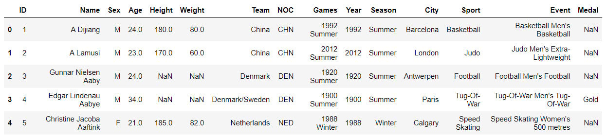
  4. Observe the data by using the head function:
    diamonds_df.head()

    The output is as follows:

    Figure 1.1: Displaying the diamonds dataset
    Figure 1.1: Displaying the diamonds dataset

    The data contains different features of diamonds, such as carat, cut quality, color, and price, as columns. Now, cut, clarity, and color are categorical variables, and x, y, z, depth, table, and price are continuous variables. While categorical variables take unique categories/names as values, continuous values take real numbers as values.

    cut, color, and clarity are ordinal variables with 5, 7, and 8 unique values (can be obtained by diamonds_df.cut.nunique(), diamonds_df.color.nunique(), diamonds_df.clarity.nunique() – try it!), respectively. cut is the quality of the cut, described as Fair, Good, Very Good, Premium, or Ideal; color describes the diamond color from J (worst) to D (best). There's also clarity, which measures how clear the diamond is—the degrees are I1 (worst), SI1, SI2, VS1, VS2, VVS1, VVS2, and IF (best).

  5. Count the number of rows and columns in the DataFrame using the shape function:
    diamonds_df.shape

    The output is as follows:

    (53940, 10)

    The first number, 53940, denotes the number of rows and the second, 10, denotes the number of columns.

  6. Summarize the columns using describe() to obtain the distribution of variables, including mean, median, min, max, and the different quartiles:
    diamonds_df.describe()

    The output is as follows:

    Figure 1.2: Using the describe function to show continuous variables
    Figure 1.2: Using the describe function to show continuous variables

    This works for continuous variables. However, for categorical variables, we need to use the include=object parameter.

  7. Use include=object inside the describe function for categorical variables ( cut, color, clarity):
    diamonds_df.describe(include=object)

    The output is as follows:

    Figure 1.3: Use the describe function to show categorical variables
    Figure 1.3: Use the describe function to show categorical variables

    Now, what if you would want to see the column types and how much memory a DataFrame occupies?

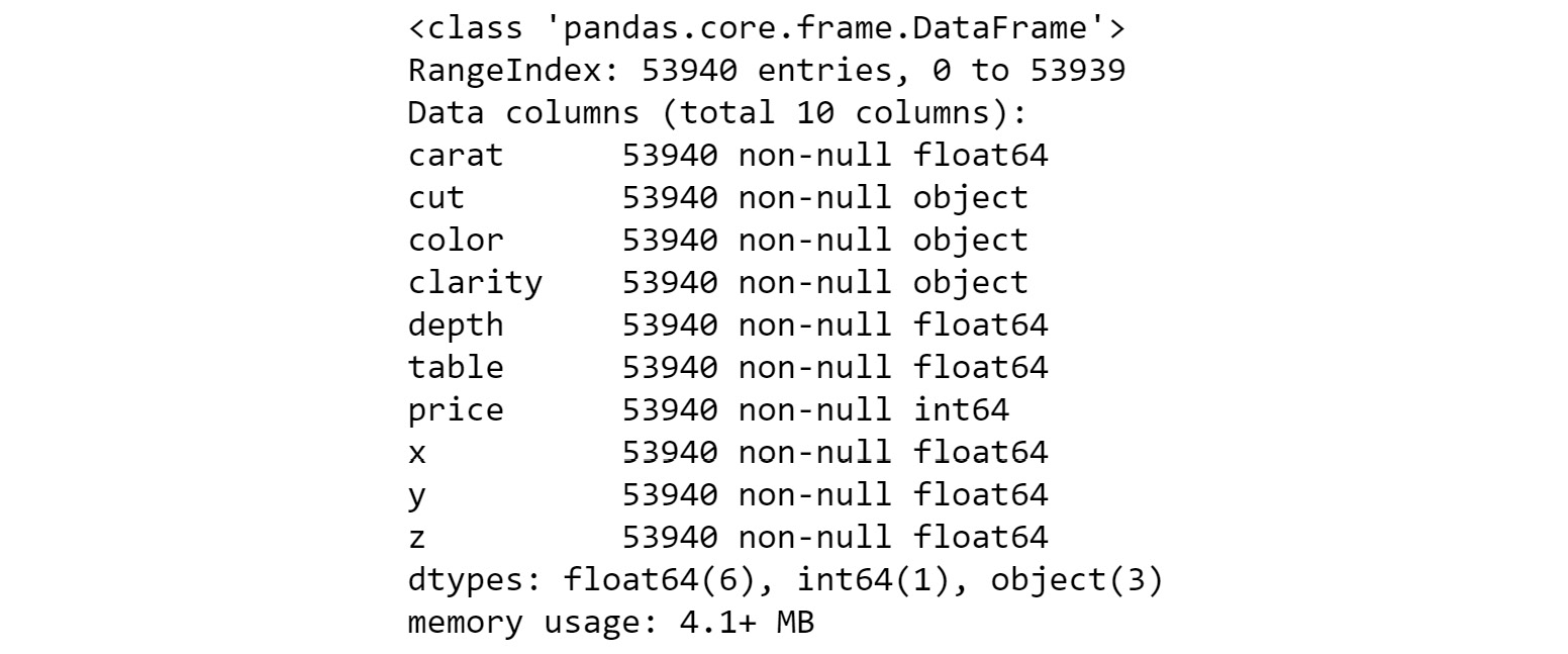
  8. To obtain information on the dataset, use the info() method:
    diamonds_df.info()

    The output is as follows:

Figure 1.4: Information on the diamonds dataset

The preceding figure shows the data type (float64, object, int64..) of each of the columns, and memory (4.1MB) that the DataFrame occupies. It also tells the number of rows (53940) present in the DataFrame.

Selecting Columns from a DataFrame

Let's see how to select specific columns from a dataset. A column in a pandas DataFrame can be accessed in two simple ways: with the . operator or the [ ] operator. For example, we can access the cut column of the diamonds_df DataFrame with diamonds_df.cut or diamonds_df['cut']. However, there are some scenarios where the . operator cannot be used:

  • When the column name contains spaces
  • When the column name is an integer
  • When creating a new column

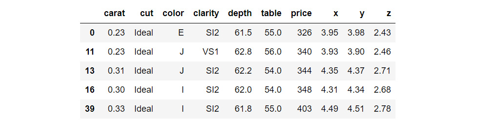
Now, how about selecting all rows corresponding to diamonds that have the Ideal cut and storing them in a separate DataFrame? We can select them using the loc functionality:

diamonds_low_df = diamonds_df.loc[diamonds_df['cut']=='Ideal']
diamonds_low_df.head()

The output is as follows:

Figure 1.5: Selecting specific columns from a DataFrame

Here, we obtain indices of rows that meet the criterion:

[diamonds_df['cut']=='Ideal' and then select them using loc.

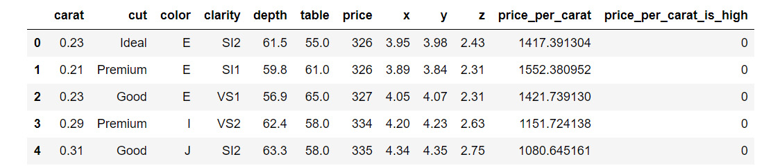
Adding New Columns to a DataFrame

Now, we'll see how to add new columns to a DataFrame. We can add a column, such as, price_per_carat, in the diamonds DataFrame. We can divide the values of two columns and populate the data fields of the newly added column.

Exercise 3: Adding New Columns to the DataFrame

In this exercise, we are going to add new columns to the diamonds dataset in the pandas library. We'll start with the simple addition of columns and then move ahead and look into the conditional addition of columns. To do so, let's go through the following steps:

  1. Load the pandas and seaborn libraries:
    #Load pandas library
    import pandas as pd 
    import seaborn as sns
  2. Specify the URL of the dataset:
    #URL of the dataset 
    diamonds_url = "https://raw.githubusercontent.com/TrainingByPackt/Interactive-Data-Visualization-with-Python/master/datasets/diamonds.csv"
  3. Read files from the URL into the pandas DataFrame:
    #Yes, we can read files from a URL straight into a pandas DataFrame!
    diamonds_df = pd.read_csv(diamonds_url)
    # Since the dataset is available in seaborn, we can alternatively read it in using the following line of code
    diamonds_df = sns.load_dataset('diamonds')

    Let's look at simple addition of columns.

  4. Add a price_per_carat column to the DataFrame:
    diamonds_df['price_per_carat'] = diamonds_df['price']/diamonds_df['carat']
  5. Call the DataFrame head function to check whether the new column was added as expected:
    diamonds_df.head()

    The output is as follows:

    Figure 1.6: Simple addition of columns
    Figure 1.6: Simple addition of columns

    Similarly, we can also use addition, subtraction, and other mathematical operators on two numeric columns.

    Now, we'll look at conditional addition of columns. Let's try and add a column based on the value in price_per_carat, say anything more than 3500 as high (coded as 1) and anything less than 3500 as low (coded as 0).

  6. Use the np.where function from Python's numpy package:
    #Import numpy package for linear algebra
    import numpy as np
    diamonds_df['price_per_carat_is_high'] = np.where(diamonds_df['price_per_carat']>3500,1,0)
    diamonds_df.head()

    The output is as follows:

Figure 1.7: Conditional addition of columns

Therefore, we have successfully added two new columns to the dataset.

Applying Functions on DataFrame Columns

You can apply simple functions on a DataFrame column—such as, addition, subtraction, multiplication, division, squaring, raising to an exponent, and so on. It is also possible to apply more complex functions on single and multiple columns in a pandas DataFrame. As an example, let's say we want to round off the price of diamonds to its ceil (nearest integer equal to or higher than the actual price). Let's explore this through an exercise.

Exercise 4: Applying Functions on DataFrame columns

In this exercise, we'll consider a scenario where the price of diamonds has increased and we want to apply an increment factor of 1.3 to the price of all the diamonds in our record. We can achieve this by applying a simple function. Next, we'll round off the price of diamonds to its ceil. We'll achieve that by applying a complex function.Let's go through the following steps:

  1. Load the pandas and seaborn libraries:
    #Load pandas library
    import pandas as pd 
    import seaborn as sns
  2. Specify the URL of the dataset:
    #URL of the dataset 
    diamonds_url = "https://raw.githubusercontent.com/TrainingByPackt/Interactive-Data-Visualization-with-Python/master/datasets/diamonds.csv"
  3. Read files from the URL into the pandas DataFrame:
    #Yes, we can read files from a URL straight into a pandas DataFrame!
    diamonds_df = pd.read_csv(diamonds_url)
    # Since the dataset is available in seaborn, we can alternatively read it in using the following line of code
    diamonds_df = sns.load_dataset('diamonds')
  4. Add a price_per_carat column to the DataFrame:
    diamonds_df['price_per_carat'] = diamonds_df['price']/diamonds_df['carat']
  5. Use the np.where function from Python's numpy package:
    #Import numpy package for linear algebra
    import numpy as np
    diamonds_df['price_per_carat_is_high'] = np.where(diamonds_df['price_per_carat']>3500,1,0)
  6. Apply a simple function on the columns using the following code:
    diamonds_df['price']= diamonds_df['price']*1.3
  7. Apply a complex function to round off the price of diamonds to its ceil:
    import math
    diamonds_df['rounded_price']=diamonds_df['price'].apply(math.ceil)
    diamonds_df.head()

    The output is as follows:

    Figure 1.8:Dataset after applying simple and complex functions
    Figure 1.8: Dataset after applying simple and complex functions

    In this case, the function we wanted for rounding off to the ceil was already present in an existing library. However, there might be times when you have to write your own function to perform the task you want to accomplish. In the case of small functions, you can also use the lambda operator, which acts as a one-liner function taking an argument. For example, say you want to add another column to the DataFrame indicating the rounded-off price of the diamonds to the nearest multiple of 100 (equal to or higher than the price).

  8. Use the lambda function as follows to round off the price of the diamonds to the nearest multiple of 100:
    import math
    diamonds_df['rounded_price_to_100multiple']=diamonds_df['price'].apply(lambda x: math.ceil(x/100)*100)
    diamonds_df.head()

    The output is as follows:

    Figure 1.9: Dataset after applying the lambda function
    Figure 1.9: Dataset after applying the lambda function

    Of book, not all functions can be written as one-liners and it is important to know how to include user-defined functions in the apply function. Let's write the same code with a user-defined function for illustration.

  9. Write code to create a user-defined function to round off the price of the diamonds to the nearest multiple of 100:
    import math
    def get_100_multiple_ceil(x):
        y = math.ceil(x/100)*100
        return y
        
    diamonds_df['rounded_price_to_100multiple']=diamonds_df['price'].apply(get_100_multiple_ceil)
    diamonds_df.head()

    The output is as follows:

    Figure 1.10: Dataset after applying a user-defined function
Figure 1.10: Dataset after applying a user-defined function

Interesting! Now, we had created an user-defined function to add a column to the dataset.

Exercise 5: Applying Functions on Multiple Columns

When applying a function on multiple columns of a DataFrame, we can similarly use lambda or user-defined functions. We will continue to use the diamonds dataset. Suppose we are interested in buying diamonds that have an Ideal cut and a color of D (entirely colorless). This exercise is for adding a new column, desired to the DataFrame, whose value will be yes if our criteria are satisfied and no if not satisfied. Let's see how we do it:

  1. Import the necessary modules:
    import seaborn as sns
    import pandas as pd
  2. Import the diamonds dataset from seaborn:
    diamonds_df_exercise = sns.load_dataset('diamonds')
  3. Write a function to determine whether a record, x, is desired or not:
    def is_desired(x):
        bool_var = 'yes' if (x['cut']=='Ideal' and x['color']=='D') else 'no'
        return bool_var
  4. Use the apply function to add the new column, desired:
    diamonds_df_exercise['desired']=diamonds_df_exercise.apply(is_desired, axis=1)
    diamonds_df_exercise.head()

    The output is as follows:

    Figure 1.11: Dataset after applying the function on multiple columns
Figure 1.11: Dataset after applying the function on multiple columns

The new column desired is added!

Deleting Columns from a DataFrame

Finally, let's see how to delete columns from a pandas DataFrame. For example, we will delete the rounded_price and rounded_price_to_100multiple columns. Let's go through the following exercise.

Exercise 6: Deleting Columns from a DataFrame

In this exercise, we will delete columns from a pandas DataFrame. Here, we'll be using the diamonds dataset:

  1. Import the necessary modules:
    import seaborn as sns
    import pandas as pd
  2. Import the diamonds dataset from seaborn:
    diamonds_df = sns.load_dataset('diamonds')
  3. Add a price_per_carat column to the DataFrame:
    diamonds_df['price_per_carat'] = diamonds_df['price']/diamonds_df['carat']
  4. Use the np.where function from Python's numpy package:
    #Import numpy package for linear algebra
    import numpy as np
    diamonds_df['price_per_carat_is_high'] = np.where(diamonds_df['price_per_carat']>3500,1,0)
  5. Apply a complex function to round off the price of diamonds to its ceil:
    import math
    diamonds_df['rounded_price']=diamonds_df['price'].apply(math.ceil)
  6. Write a code to create a user-defined function:
    import math
    def get_100_multiple_ceil(x):
        y = math.ceil(x/100)*100
        return y
        
    diamonds_df['rounded_price_to_100multiple']=diamonds_df['price'].apply(get_100_multiple_ceil)
  7. Delete the rounded_price and rounded_price_to_100multiple columns using the drop function:
    diamonds_df=diamonds_df.drop(columns=['rounded_price', 'rounded_price_to_100multiple'])
    diamonds_df.head()

    The output is as follows:

    Figure 1.12: Dataset after deleting columns
Figure 1.12: Dataset after deleting columns

Note

By default, when the apply or drop function is used on a pandas DataFrame, the original DataFrame is not modified. Rather, a copy of the DataFrame post modifications is returned by the functions. Therefore, you should assign the returned value back to the variable containing the DataFrame (for example, diamonds_df=diamonds_df.drop(columns=['rounded_price', 'rounded_price_to_100multiple'])).

In the case of the drop function, there is also a provision to avoid assignment by setting an inplace=True parameter, wherein the function performs the column deletion on the original DataFrame and does not return anything.

Writing a DataFrame to a File

The last thing to do is write a DataFrame to a file. We will be using the to_csv() function. The output is usually a .csv file that will include column and row headers. Let's see how to write our DataFrame to a .csv file.

Exercise 7: Writing a DataFrame to a File

In this exercise, we will write a diamonds DataFrame to a .csv file. To do so, we'll be using the following code:

  1. Import the necessary modules:
    import seaborn as sns
    import pandas as pd
  2. Load the diamonds dataset from seaborn:
    diamonds_df = sns.load_dataset('diamonds')
  3. Write the diamonds dataset into a .csv file:
    diamonds_df.to_csv('diamonds_modified.csv')
  4. Let's look at the first few rows of the DataFrame:
    print(diamonds_df.head())

    The output is as follows:

    Figure 1.13: The generated .csv file in the source folder
    Figure 1.13: The generated .csv file in the source folder

    By default, the to_csv function outputs a file that includes column headers as well as row numbers. Generally, the row numbers are not desirable, and an index parameter is used to exclude them:

  5. Add a parameter index=False to exclude the row numbers:
    diamonds_df.to_csv('diamonds_modified.csv', index=False)

And that's it! You can find this .csv file in the source directory. You are now equipped to perform all the basic functions on pandas DataFrames required to get started with data visualization in Python.

In order to prepare the ground for using various visualization techniques, we went through the following aspects of handling pandas DataFrames:

  • Reading data from files using the read_csv( ), read_excel( ), and readjson( ) functions
  • Observing and describing data using the dataframe.head( ), dataframe.tail( ), dataframe.describe( ), and dataframe.info( ) functions
  • Selecting columns using the dataframe.column__name or dataframe['column__name'] notation
  • Adding new columns using the dataframe['newcolumnname']=... notation
  • Applying functions to existing columns using the dataframe.apply(func) function
  • Deleting columns from DataFrames using the _dataframe.drop(column_list) function
  • Writing DataFrames to files using the _dataframe.tocsv() function

These functions are useful for preparing data in a format suitable for input to visualization functions in Python libraries such as seaborn.

Plotting with pandas and seaborn

Now that we have a basic sense of how to load and handle data in a pandas DataFrame object, let's get started with making some simple plots from data. While there are several plotting libraries in Python (including matplotlib, plotly, and seaborn), in this chapter, we will mainly explore the pandas and seaborn libraries, which are extremely useful, popular, and easy to use.

Creating Simple Plots to Visualize a Distribution of Variables

matplotlib is a plotting library available in most Python distributions and is the foundation for several plotting packages, including the built-in plotting functionality of pandas and seaborn. matplotlib enables control of every single aspect of a figure and is known to be verbose. Both seaborn and pandas visualization functions are built on top of matplotlib. The built-in plotting tool of pandas .is a useful exploratory tool to generate figures that are not ready for primetime but useful to understand the dataset you are working with. seaborn, on the other hand, has APIs to draw a wide variety of aesthetically pleasing plots.

To illustrate certain key concepts and explore the diamonds dataset, we will start with two simple visualizations in this chapter—histograms and bar plots.

Histograms

A histogram of a feature is a plot with the range of the feature on the x-axis and the count of data points with the feature in the corresponding range on the y-axis.

Let's look at the following exercise of plotting a histogram with pandas.

Exercise 8: Plotting and Analyzing a Histogram

In this exercise, we will create a histogram of the frequency of diamonds in the dataset with their respective carat specifications on the x-axis:

  1. Import the necessary modules:
    import seaborn as sns
    import pandas as pd
  2. Import the diamonds dataset from seaborn:
    diamonds_df = sns.load_dataset('diamonds')
  3. Plot a histogram using the diamonds dataset where x axis = carat:
    diamonds_df.hist(column='carat')

    The output is as follows:

    Figure 1.14: Histogram plot
    Figure 1.14: Histogram plot

    The y axis in this plot denotes the number of diamonds in the dataset with the carat specification on the x-axis.

    The hist function has a parameter called bins, which literally refers to the number of equally sized bins into which the data points are divided. By default, the bins parameter is set to 10 in pandas. We can change this to a different number, if we wish.

  4. Change the bins parameter to 50:
    diamonds_df.hist(column='carat', bins=50)

    The output is as follows:

    Figure 1.15: Histogram with bins = 50
    Figure 1.15: Histogram with bins = 50

    This is a histogram with 50 bins. Notice how we can see a more fine-grained distribution as we increase the number of bins. It is helpful to test with multiple bin sizes to know the exact distribution of the feature. The range of bin sizes varies from 1 (where all values are in the same bin) to the number of values (where each value of the feature is in one bin).

  5. Now, let's look at the same function using seaborn:
    sns.distplot(diamonds_df.carat)

    The output is as follows:

    Figure 1.16: Histogram plot using seaborn
    Figure 1.16: Histogram plot using seaborn

    There are two noticeable differences between the pandas hist function and seaborn distplot:

    • pandas sets the bins parameter to a default of 10, but seaborn infers an appropriate bin size based on the statistical distribution of the dataset.
    • By default, the distplot function also includes a smoothed curve over the histogram, called a kernel density estimation.

      The kernel density estimation (KDE) is a non-parametric way to estimate the probability density function of a random variable. Usually, a KDE doesn't tell us anything more than what we can infer from the histogram itself. However, it is helpful when comparing multiple histograms on the same plot. If we want to remove the KDE and look at the histogram alone, we can use the kde=False parameter.

  6. Change kde=False to remove the KDE:
    sns.distplot(diamonds_df.carat, kde=False)

    The output is as follows:

    Figure 1.17: Histogram plot with KDE = false
    Figure 1.17: Histogram plot with KDE = false

    Also note that the bins parameter seemed to render a more detailed plot when the bin size was increased from 10 to 50. Now, let's try to increase it to 100.

  7. Increase the bins size to 100:
    sns.distplot(diamonds_df.carat, kde=False, bins=100)

    The output is as follows:

    Figure 1.18: Histogram plot with increased bin size
    Figure 1.18: Histogram plot with increased bin size

    The histogram with 100 bins shows a better visualization of the distribution of the variable—we see there are several peaks at specific carat values. Another observation is that most carat values are concentrated toward lower values and the tail is on the right—in other words, it is right-skewed.

    A log transformation helps in identifying more trends. For instance, in the following graph, the x-axis shows log-transformed values of the price variable, and we see that there are two peaks indicating two kinds of diamonds—one with a high price and another with a low price.

  8. Use a log transformation on the histogram:
    import numpy as np
    sns.distplot(np.log(diamonds_df.price), kde=False)

    The output is as follows:

Figure 1.19: Histogram using a log transformation

That's pretty neat. Looking at the histogram, even a naive viewer immediately gets a picture of the distribution of the feature. Specifically, three observations are important in a histogram:

  • Which feature values are more frequent in the dataset (in this case, there is a peak at around 6.8 and another peak between 8.5 and 9—note that log(price) = values, in this case,
  • How many peaks exist in the data (the peaks need to be further inspected for possible causes in the context of the data)
  • Whether there are any outliers in the data

Bar Plots

Another type of plot we will look at in this chapter is the bar plot.

In their simplest form, bar plots display counts of categorical variables. More broadly, bar plots are used to depict the relationship between a categorical variable and a numerical variable. Histograms, meanwhile, are plots that show the statistical distribution of a continuous numerical feature.

Let's see an exercise of bar plots in the diamonds dataset. First, we shall present the counts of diamonds of each cut quality that exist in the data. Second, we shall look at the price associated with the different types of cut quality (Ideal, Good, Premium, and so on) in the dataset and find out the mean price distribution. We will use both pandas and seaborn to get a sense of how to use the built-in plotting functions in both libraries.

Before generating the plots, let's look at the unique values in the cut and clarity columns, just to refresh our memory.

Exercise 9: Creating a Bar Plot and Calculating the Mean Price Distribution

In this exercise, we'll learn how to create a table using the pandas crosstab function. We'll use a table to generate a bar plot. We'll then explore a bar plot generated using the seaborn library and calculate the mean price distribution. To do so, let's go through the following steps:

  1. Import the necessary modules and dataset:
    import seaborn as sns
    import pandas as pd
  2. Import the diamonds dataset from seaborn:
    diamonds_df = sns.load_dataset('diamonds')
  3. Print the unique values of the cut column:
    diamonds_df.cut.unique()

    The output will be as follows:

    array(['Ideal', 'Premium', 'Good', 'Very Good', 'Fair'], dtype=object)
  4. Print the unique values of the clarity column:
    diamonds_df.clarity.unique()

    The output will be as follows:

    array(['SI2', 'SI1', 'VS1', 'VS2', 'VVS2', 'VVS1', 'I1', 'IF'],
          dtype=object)

    Note

    unique() returns an array. There are five unique cut qualities and eight unique values in clarity. The number of unique values can be obtained using nunique() in pandas.

  5. To obtain the counts of diamonds of each cut quality, we first create a table using the pandas crosstab() function:
    cut_count_table = pd.crosstab(index=diamonds_df['cut'],columns='count')
    cut_count_table

    The output will be as follows:

    Figure 1.20: Table using the crosstab function
    Figure 1.20: Table using the crosstab function
  6. Pass these counts to another pandas function, plot(kind='bar'):
    cut_count_table.plot(kind='bar')

    The output will be as follows:

    Figure 1.21: Bar plot using a pandas DataFrame
    Figure 1.21: Bar plot using a pandas DataFrame

    We see that most of the diamonds in the dataset are of the Ideal cut quality, followed by Premium, Very Good, Good, and Fair. Now, let's see how to generate the same plot using seaborn.

  7. Generate the same bar plot using seaborn:
    sns.catplot("cut", data=diamonds_df, aspect=1.5, kind="count", color="b")

    The output will be as follows:

    Figure 1.22: Bar plot using seaborn
    Figure 1.22: Bar plot using seaborn

    Notice how the catplot() function does not require us to create the intermediate count table (using pd.crosstab()), and reduces one step in the plotting process.

  8. Next, here is how we obtain the mean price distribution of different cut qualities using seaborn:
    import seaborn as sns
    from numpy import median, mean
    sns.set(style="whitegrid")
    ax = sns.barplot(x="cut", y="price", data=diamonds_df,estimator=mean)

    The output will be as follows:

    Figure 1.23: Bar plot with the mean price distribution
    Figure 1.23: Bar plot with the mean price distribution

    Here, the black lines (error bars) on the rectangles indicate the uncertainty (or spread of values) around the mean estimate. By default, this value is set to 95% confidence. How do we change it? We use the ci=68 parameter, for instance, to set it to 68%. We can also plot the standard deviation in the prices using ci=sd.

  9. Reorder the x axis bars using order:
    ax = sns.barplot(x="cut", y="price", data=diamonds_df, estimator=mean, ci=68, order=['Ideal','Good','Very Good','Fair','Premium'])

    The output will be as follows:

    Figure 1.24: Bar plot with proper order
Figure 1.24: Bar plot with proper order

Grouped bar plots can be very useful for visualizing the variation of a particular feature within different groups. Now that you have looked into tweaking the plot parameters in a grouped bar plot, let's see how to generate a bar plot grouped by a specific feature.

Exercise 10: Creating Bar Plots Grouped by a Specific Feature

In this exercise, we will use the diamonds dataset to generate the distribution of prices with respect to color for each cut quality. In Exercise 9, Creating a Bar Plot and Calculating the Mean Price Distribution, we looked at the price distribution for diamonds of different cut qualities. Now, we would like to look at the variation in each color:

  1. Import the necessary modules—in this case, only seaborn:
    #Import seaborn
    import seaborn as sns
  2. Load the dataset:
    diamonds_df = sns.load_dataset('diamonds')
  3. Use the hue parameter to plot nested groups:
    ax = sns.barplot(x="cut", y="price", hue='color', data=diamonds_df)

    The output is as follows:

Figure 1.25: Grouped bar plot with legends

Here, we can observe that the price patterns for diamonds of different colors are similar for each cut quality. For instance, for Ideal diamonds, the price distribution of diamonds of different colors is the same as that for Premium, and other diamonds.

Tweaking Plot Parameters

Looking at the last figure in our previous section, we find that the legend is not appropriately placed. We can tweak the plot parameters to adjust the placements of the legends and the axis labels, as well as change the font-size and rotation of the tick labels.

Exercise 11: Tweaking the Plot Parameters of a Grouped Bar Plot

In this exercise, we'll tweak the plot parameters, for example, hue, of a grouped bar plot. We'll see how to place legends and axis labels in the right places and also explore the rotation feature:

  1. Import the necessary modules—in this case, only seaborn:
    #Import seaborn
    import seaborn as sns
  2. Load the dataset:
    diamonds_df = sns.load_dataset('diamonds')
  3. Use the hue parameter to plot nested groups:
    ax = sns.barplot(x="cut", y="price", hue='color', data=diamonds_df)

    The output is as follows:

    Figure 1.26: Nested bar plot with the hue parameter
    Figure 1.26: Nested bar plot with the hue parameter
  4. Place the legend appropriately on the bar plot:
    ax = sns.barplot(x='cut', y='price', hue='color', data=diamonds_df)
    ax.legend(loc='upper right',ncol=4)

    The output is as follows:

    Figure 1.27: Grouped bar plot with legends placed appropriately
    Figure 1.27: Grouped bar plot with legends placed appropriately

    In the preceding ax.legend() call, the ncol parameter denotes the number of columns into which values in the legend are to be organized, and the loc parameter specifies the location of the legend and can take any one of eight values (upper left, lower center, and so on).

  5. To modify the axis labels on the x axis and y axis, input the following code:
    ax = sns.barplot(x='cut', y='price', hue='color', data=diamonds_df)
    ax.legend(loc='upper right', ncol=4)
    ax.set_xlabel('Cut', fontdict={'fontsize' : 15})
    ax.set_ylabel('Price', fontdict={'fontsize' : 15})

    The output is as follows:

    Figure 1.28: Grouped bar plot with modified labels
    Figure 1.28: Grouped bar plot with modified labels
  6. Similarly, use this to modify the font-size and rotation of the x axis of the tick labels:
    ax = sns.barplot(x='cut', y='price', hue='color', data=diamonds_df)
    ax.legend(loc='upper right',ncol=4)
    # set fontsize and rotation of x-axis tick labels
    ax.set_xticklabels(ax.get_xticklabels(), fontsize=13, rotation=30)

    The output is as follows:

Figure 1.29: Grouped bar plot with the rotation feature of the labels

The rotation feature is particularly useful when the tick labels are long and crowd up together on the x axis.

Annotations

Another useful feature to have in plots is the annotation feature. In the following exercise, we'll make a simple bar plot more informative by adding some annotations.Suppose we want to add more information to the plot about ideally cut diamonds. We can do this in the following exercise:

Exercise 12: Annotating a Bar Plot

In this exercise, we will annotate a bar plot, generated using the catplot function of seaborn, using a note right above the plot. Let's see how:

  1. Import the necessary modules:
    import matplotlib.pyplot as plt
    import seaborn as sns
  2. Load the diamonds dataset:
    diamonds_df = sns.load_dataset('diamonds')
  3. Generate a bar plot using catplot function of the seaborn library:
    ax = sns.catplot("cut", data=diamonds_df, aspect=1.5, kind="count", color="b")

    The output is as follows:

    Figure 1.30: Bar plot with seaborn's catplot function
    Figure 1.30: Bar plot with seaborn's catplot function
  4. Annotate the column belonging to the Ideal category:
    # get records in the DataFrame corresponding to ideal cut
    ideal_group = diamonds_df.loc[diamonds_df['cut']=='Ideal']
  5. Find the location of the x coordinate where the annotation has to be placed:
    # get the location of x coordinate where the annotation has to be placed
    x = ideal_group.index.tolist()[0]
  6. Find the location of the y coordinate where the annotation has to be placed:
    # get the location of y coordinate where the annotation has to be placed
    y = len(ideal_group)
  7. Print the location of the x and y co-ordinates:
    print(x)
    print(y)

    The output is:

    0
    21551
  8. Annotate the plot with a note:
    # annotate the plot with any note or extra information
    sns.catplot("cut", data=diamonds_df, aspect=1.5, kind="count", color="b")
    plt.annotate('excellent polish and symmetry ratings;\nreflects almost all the light that enters it', xy=(x,y), xytext=(x+0.3, y+2000), arrowprops=dict(facecolor='red'))

    The output is as follows:

    Figure 1.31: Annotated bar plot
Figure 1.31: Annotated bar plot

Now, there seem to be a lot of parameters in the annotate function, but worry not! Matplotlib's https://matplotlib.org/3.1.0/api/_as_gen/matplotlib.pyplot.annotate.html official documentation covers all the details. For instance, the xy parameter denotes the point (x,y) on the figure to annotate. xytext denotes the position (x,y) to place the text at. If None, it defaults to xy. Note that we added an offset of .3 for x and 2000 for y (since y is close to 20,000) for the sake of readability of the text. The color of the arrow is specified using the arrowprops parameter in the annotate function.

There are several other bells and whistles associated with visualization libraries in Python, some of which we will see as we progress in the book. At this stage, we will go through a chapter activity to revise the concepts in this chapter.

So far, we have seen how to generate two simple plots using seaborn and pandas—histograms and bar plots:

  • Histograms: Histograms are useful for understanding the statistical distribution of a numerical feature in a given dataset. They can be generated using the hist() function in pandas and distplot() in seaborn.
  • Bar plots: Bar plots are useful for gaining insight into the values taken by a categorical feature in a given dataset. They can be generated using the plot(kind='bar') function in pandas and the catplot(kind='count'), and barplot() functions in seaborn.

With the help of various considerations arising in the process of plotting these two types of visualizations, we presented some basic concepts in data visualization:

  • Formatting legends to present labels for different elements in the plot with loc and other parameters in the legend function
  • Changing the properties of tick labels, such as font-size, and rotation, with parameters in the set_xticklabels() and set_yticklabels() functions
  • Adding annotations for additional information with the annotate() function

Activity 1: Analyzing Different Scenarios and Generating the Appropriate Visualization

We'll be working with the 120 years of Olympic History dataset acquired by Randi Griffin from https://www.sports-reference.com/ and made available on the GitHub repository of this book. Your assignment is to identify the top five sports based on the largest number of medals awarded in the year 2016, and then perform the following analysis:

  1. Generate a plot indicating the number of medals awarded in each of the top five sports in 2016.
  2. Plot a graph depicting the distribution of the age of medal winners in the top five sports in 2016.
  3. Find out which national teams won the largest number of medals in the top five sports in 2016.
  4. Observe the trend in the average weight of male and female athletes winning in the top five sports in 2016.

High-Level Steps

  1. Download the dataset and format it as a pandas DataFrame.
  2. Filter the DataFrame to only include the rows corresponding to medal winners from 2016.
  3. Find out the medals awarded in 2016 for each sport.
  4. List the top five sports based on the largest number of medals awarded. Filter the DataFrame one more time to only include the records for the top five sports in 2016.
  5. Generate a bar plot of record counts corresponding to each of the top five sports.
  6. Generate a histogram for the Age feature of all medal winners in the top five sports (2016).
  7. Generate a bar plot indicating how many medals were won by each country's team in the top five sports in 2016.
  8. Generate a bar plot indicating the average weight of players, categorized based on gender, winning in the top five sports in 2016.

The expected output should be:

After Step 1:

Figure 1.32: Olympics dataset

After Step 2:

Figure 1.33: Filtered Olympics DataFrame

After Step 3:

Figure 1.34: The number of medals awarded

After Step 4:

Figure 1.35: Olympics DataFrame

After Step 5:

Figure 1.36: Generated bar plot

After Step 6:

Figure 1.37: Histogram plot with the Age feature

After Step 7:

Figure 1.38: Bar plot with the number of medals won

After Step 8:

Figure 1.39: Bar plot with the average weight of players

The bar plot indicates the highest athlete weight in rowing, followed by swimming, and then the other remaining sports. The trend is similar across both male and female players.

Note

The solution steps can be found on page 254.

Summary

In this chapter, we covered the basics of handling pandas DataFrames to format them as inputs for different visualization functions in libraries such as pandas , seaborn and more, and we covered some essential concepts in generating and modifying plots to create pleasing figures.

The pandas library contains functions such as read_csv(), read_excel(), and read_json() to read structured text data files. Functions such as describe() and info() are useful to get information on the summary statistics and memory usage of the features in a DataFrame. Other important operations on pandas DataFrames include subletting based on user-specified conditions/constraints, adding new columns to a DataFrame, transforming existing columns with built-in Python functions as well as user-defined functions, deleting specific columns in a DataFrame, and writing a modified DataFrame to a file on the local system.

Once equipped with knowledge of these common operations on pandas DataFrames, we went over the basics of visualization and learned how to refine the visual appeal of the plots. We illustrated these concepts with the plotting of histograms and bar plots. Specifically, we learned about different ways of presenting labels and legends, changing the properties of tick labels, and adding annotations.

In the next chapter, we will learn about some popular visualization techniques and understand the interpretation, strengths, and limitations of each.

lock icon
The rest of the chapter is locked
You have been reading a chapter from
Interactive Data Visualization with Python - Second Edition
Published in: Apr 2020Publisher: ISBN-13: 9781800200944
Register for a free Packt account to unlock a world of extra content!
A free Packt account unlocks extra newsletters, articles, discounted offers, and much more. Start advancing your knowledge today.
undefined
Unlock this book and the full library FREE for 7 days
Get unlimited access to 7000+ expert-authored eBooks and videos courses covering every tech area you can think of
Renews at $15.99/month. Cancel anytime

Authors (4)

author image
Abha Belorkar

Abha Belorkar is an educator and researcher in computer science. She received her bachelor's degree in computer science from Birla Institute of Technology and Science Pilani, India and her Ph.D. from the National University of Singapore. Her current research work involves the development of methods powered by statistics, machine learning, and data visualization techniques to derive insights from heterogeneous genomics data on neurodegenerative diseases.
Read more about Abha Belorkar

author image
Sharath Chandra Guntuku

Sharath Chandra Guntuku is a researcher in natural language processing and multimedia computing. He received his bachelor's degree in computer science from Birla Institute of Technology and Science, Pilani, India and his Ph.D. from Nanyang Technological University, Singapore. His research aims to leverage large-scale social media image and text data to model social health outcomes and psychological traits. He uses machine learning, statistical analysis, natural language processing, and computer vision to answer questions pertaining to health and psychology in individuals and communities.
Read more about Sharath Chandra Guntuku

author image
Shubhangi Hora

Shubhangi Hora is a data scientist, Python developer, and published writer. With a background in computer science and psychology, she is particularly passionate about healthcare-related AI, including mental health. Shubhangi is also a trained musician.
Read more about Shubhangi Hora

author image
Anshu Kumar

Anshu Kumar is a data scientist with over 5 years of experience in solving complex problems in natural language processing and recommendation systems. He has an M.Tech. from IIT Madras in computer science. He is also a mentor at SpringBoard. His current interests are building semantic search, text summarization, and content recommendations for large-scale multilingual datasets.
Read more about Anshu Kumar