
The Grammar of Graphics is the language used to describe the various components of a graphic that represent the data in a visualization. Here, we will explore a few aspects of the Grammar of Graphics, building upon some of the features in the graphics that we created in the previous topic. For example, a typical histogram has various components, as follows:
- The data itself (x)
- Bars representing the frequency of x at different values of x
- The scaling of the data (linear)
- The coordinate system (Cartesian)
All of these aspects are part of the Grammar of Graphics, and we will change these aspects to provide better visualization. In this chapter, we will work with some of the aspects; we will explore them further in the next chapter.
Note
Read more about the Grammar of Graphics at https://cfss.uchicago.edu/dataviz_grammar_of_graphics.html.
In a histogram, data is grouped into intervals, or ranges of values, called bins. ggplot has a certain number of bins by default, but the default may not be the best choice every time. Having too many bins in a histogram might not reveal the shape of the distribution, while having too few bins might distort the distribution. It is sometimes necessary to rebin a histogram, in order to get a smooth distribution.
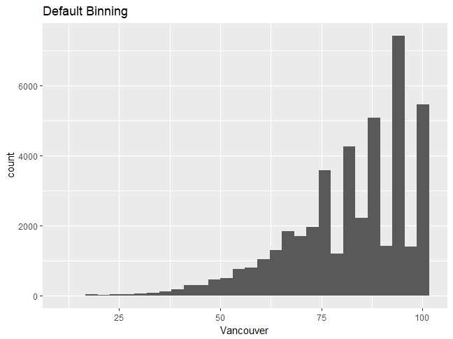
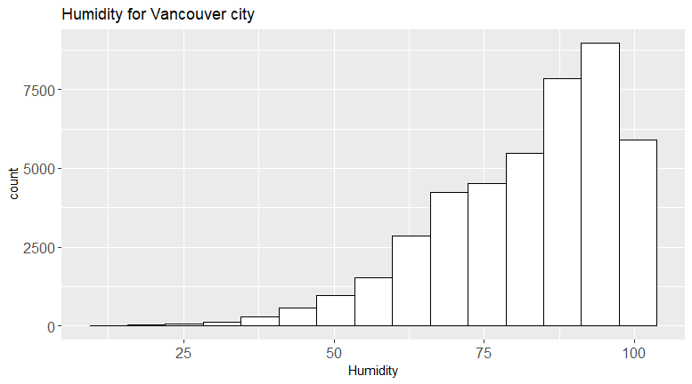
Let's use the humidity data and the first plot that we created. It looks like the humidity values are discrete, which is why you can see discrete peaks in the data. In this section, we'll analyze the differences between unbinned and binned histograms.
Let's begin by implementing the following steps:
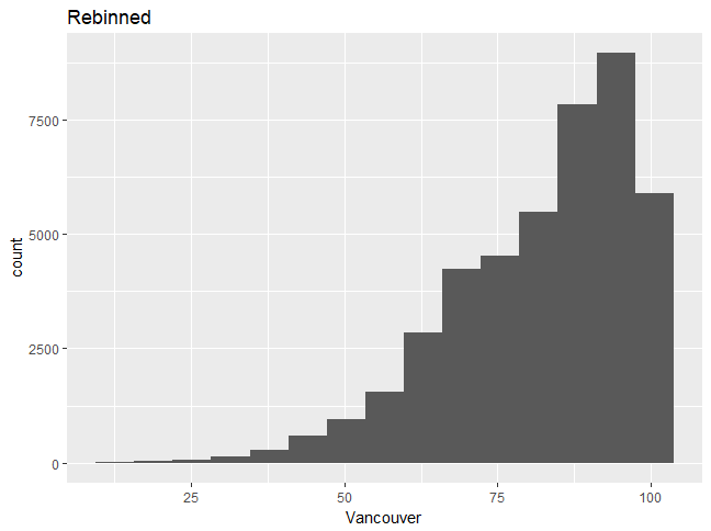
- Choosing a different type of binning can make the distribution more continuous; use the following code:
ggplot(df_hum,aes(x=Vancouver))+geom_histogram(bins=15)
You'll get the following output. Graph 1:
Graph 2:
Note
Choosing a different type of binning can make the distribution more continuous, and one can then better understand the distribution shape. We will now build upon the graph, changing some features and adding more layers.
- Change the fill color to white by using the following command:
ggplot(df_hum,aes(x=Vancouver))+geom_histogram(bins=15,fill="white",color=1)
- Add a title to the histogram by using the following command:
+ggtitle("Humidity for Vancouver city")
- Change the x-axis label and label sizes, as follows:
+xlab("Humidity")+theme(axis.text.x=element_text(size = 12),axis.text.y=element_text(size=12))
You should see the following output:
Note
The full command should look as follows:ggplot(df_hum,aes(x=Vancouver))+geom_histogram(bins=15,fill="white",color=1)+ggtitle("Humidity for Vancouver city")+xlab("Humidity")+theme(axis.text.x=element_text(size= 12),axis.text.y=element_text(size=12))
We can see that the second plot is a visual improvement, due to the following factors:
- There is a title
- The font sizes are visible
- The histogram looks more professional in white
To see what else can be changed, type ?theme.
In this section, we'll use the Grammar of Graphics to change defaults and create a better visualization.
Let's begin by implementing the following steps:
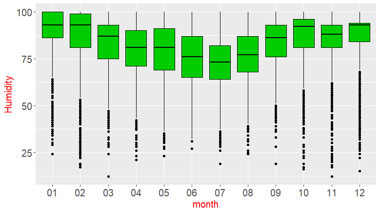
- Use the humidity data to create the same boxplot seen in the previous section, for plotting monthly data.
- Change the x- and y-axis labels appropriately (the x-axis is the month and the y-axis is the humidity).
- Type
?geom_boxplotin the command line, then look for the aesthetics, including the color and the fill color. - Change the color to black and the fill color to green (try numbers from 1-6).
- Type
?themeto find out how to change the label size to 15. Change thex- and y-axis titles to size 15 and the color to red.
The outcome will be the complete code and the graphic with the correct changes:
Note
Refer to the complete code at https://goo.gl/tu7t4y.
Scenario
In the previous activity, you made a judicious choice of a geometric object (bar chart or histogram) for a given variable. In this activity, you will see how to improve a visualization. If you are producing plots to look at privately, you might be okay using the default settings. However, when you are creating plots for publication or giving a presentation, or if your company requires a certain theme, you will need to produce more professional plots that adhere to certain visualization rules and guidelines. This activity will help you to improve visuals and create a more professional plot.
Aim
To create improved visualizations by using the Grammar of Graphics.
Steps for Completion
- Create two of the plots from the previous activity.
- Use the Grammar of Graphics to improve your graphics by layering upon the base graphic.
Note
Refer to the complete code at https://goo.gl/tu7t4y.
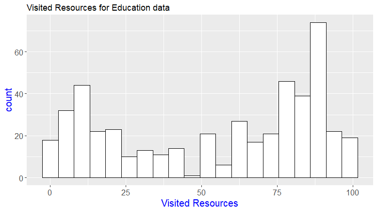
Take a look at the following output, histogram 1:
Histogram 2: