
Creating and Formatting Visualizations
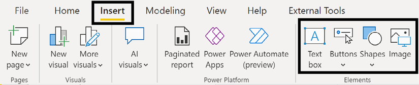
With the report planning and design phases described in the previous chapter completed, this chapter dives into report development. This includes the creation and formatting of standard Power BI visuals such as slicers, cards, and maps as well as supporting elements such as text boxes, buttons, shapes, and images.
Visualizations are the building blocks of reports. A combination of distinct visuals, each with their own formatting and data represented at different granularities and filter contexts, enables Power BI reports to generate insights and to support data story telling. The ability to create and apply formatting to visualizations is fundamental knowledge for all report authors.
In this chapter, we review the following topics:
- The Visualizations pane
- Slicers
- Single-value visuals
- Map visuals
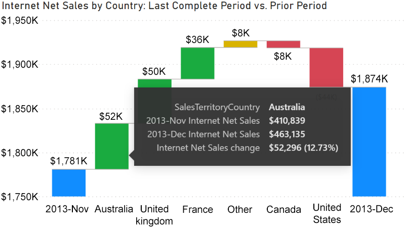
- Waterfall charts
- Power Platform visuals
- Premium visuals
- Elements
- Formatting visualizations...