Reader small image

You're reading from  Data Modeling with Microsoft Excel

Product typeBook
Published inNov 2023
PublisherPackt
ISBN-139781803240282
Edition1st Edition
Right arrow
Author (1)
Bernard Obeng Boateng
author image
Bernard Obeng Boateng

Bernard Obeng Boateng is a Microsoft Excel MVP, Microsoft Certified Trainer, with over 10 years work experience in Banking, Insurance and Business Development. He is founder of Finex Skills Hub an approved Training Provider of the Financial Modeling Institute, Canada. Finex Skills Hub runs the Finex Project in Ghana, a pro bono student training outreach program for students in Data Analytics and Financial Modeling. Bernard also provides consultancy services for SMEs (start-ups and existing) in Financial Management, Business Planning and Research. He has an active audience online with about 17,000 followers on his LinkedIn Account. where he shares tips and tricks on Microsoft Excel and other Office Apps.
Read more about Bernard Obeng Boateng

Right arrow

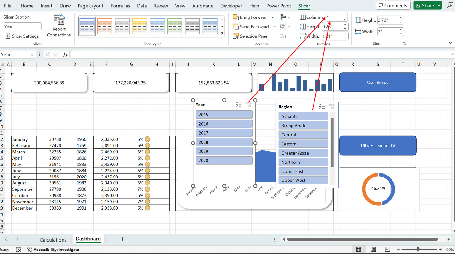
Visualization Elements for Your Dashboard – Slicers, PivotCharts, Conditional Formatting, and Shapes

In the previous chapter, we learned about the elements of a typical dashboard in Excel. In this chapter, we’re rolling up our sleeves and diving into the real stuff. We’re going hands-on, step by step, showing you exactly how to create those dashboard elements. And the cool part? We’re using some of the calculations we created earlier, so it’s like putting the pieces of a puzzle together. We’ll walk you through the art of structuring your dashboard using mockups or wireframes. Plus, we’ll show you how to add regular shapes that transform into cards – neat little containers to showcase the important numbers on your dashboard.

But we’re not stopping there. We’ll spice things up with sparklines and conditional formatting. It’s like giving your dashboard a splash of color and style, making it more than just...

Laying out your dashboard using mockups or wireframes

A dashboard is more than just a collection of numbers and graphs; it’s a visual story waiting to be told. Each element on the canvas plays a vital role in weaving that narrative. A properly orchestrated layout ensures that these elements harmoniously coexist, allowing users to grasp insights swiftly, make informed decisions, and uncover hidden patterns. Imagine entering a well-organized library, where each book resides exactly where you expect it to be. You instinctively know where to find the desired piece of knowledge. In the same vein, the layout of your dashboard holds the key to ease and comprehension. A well-structured layout serves as a guiding path that leads your audience through a sea of information to a clear destination.

Our goal in this chapter is to create the following dashboard from the data we have analyzed in previous chapters. It all starts with properly laying out the elements of the dashboard using...

Using shapes as cards in your dashboards

After setting the stage with our mockup, we will now bring in the first element of our dashboard: a card that displays the calculations for revenue, cost, profit, and profit margin.

Before we proceed with this, let’s quickly go over these calculations.

We will switch to the Calculations sheet.

The calculations for these metrics can be done using PivotTables or cube functions. Both options have advantages and disadvantages. Let’s look at both options.

To use PivotTables, follow this process:

  1. Select any cell, preferably cell B3.
  2. Go to Insert > PivotTable > Data Model.
Figure 8.11 – Inserting a PivotTable from a data model

Figure 8.11 – Inserting a PivotTable from a data model

  1. Choose Existing Worksheet in the dialog box that follows to insert the PivotTable directly in cell B3.
  2. Go to the field list of the PivotTable and, under My Measures, check the box for Revenue, and this will be added to the Values section...

Inserting conditional formatting and sparklines

In this section, we will learn how to add sparklines and conditional formatting to our dashboard.

Sparklines

In the previous chapter, we learned that sparklines are mini charts placed in single cells, each representing a row of data in your selection.

In our dashboard, we want to use a sparkline to determine the seasonality or pattern of revenue for our branches during the twelve months of the year. Instead of using a bulky chart, the sparkline will allow us to fit a mini 12-column chart in a selected cell.

To do this, we have to create the PivotTable that will provide the data.

We will insert a new PivotTable in the calculation sheet that will break down revenue by the months of the year using the following steps:

  1. Select cell B10 of the Calculation sheet.
  2. Go to Insert > PivotTable > From Data Model > Existing Worksheet.
  3. Drag the Revenue measure to the Values section.
  4. On the Calendar Table,...

Adding and formatting charts

Next up are charts. In this dashboard, we are going to insert two popular charts. We will add some formats to enhance how they appear in our dashboard.

The first chart is the area chart. This chart falls into the group of charts that are useful for visualizing trends. We are going to use this chart to show the trend of profits for the period that we select.

We will go through these steps:

  1. Create a PivotTable in the Calculations sheet in cell Q10.
  2. Put Months in the Row section and the Profit measure in the Values section.

This should give us the following PivotTable:

Figure 8.35 – Creating a PivotTable report on monthly profit

Figure 8.35 – Creating a PivotTable report on monthly profit

From here, we will select any cell in the PivotTable we just created and insert a PivotChart. In the chart options, we will select the Area chart:

Figure 8.36 – Inserting an area chart

Figure 8.36 – Inserting an area chart

We will reduce the clutter on the PivotChart by removing...

Inserting slicers for interaction

We have now created all the primary components of our dashboard. At this point, the visuals are not formatted, and they are only flat displays without any interaction.

To bring in some interaction, we will insert slicers to help users dice and slice to bring out some insights from these charts.

We can insert the slicers directly from the data model. To do that, go to Insert > Slicer > Data Model.

Figure 8.55 – Inserting slicers for interaction

Figure 8.55 – Inserting slicers for interaction

This should bring up all the tables in our data model.

For this dashboard, we want users to slice using Year from the Calendar table and Region from the Location table.

This should bring up the two slicers:

Figure 8.56 – Aligning your slicers

Figure 8.56 – Aligning your slicers

We can split the buttons into columns representing the number of items we have in each slicer. So, we set 6 columns for the Year slicer and 10 for the Region slicer. You can always...

Summary

In this chapter, we have applied some of the elements you can use to create your dashboard. You are now familiar with how to use mockups and layouts to set the stage for your dashboard. You learned how to use shapes and cards to project the key indicators in your dashboard. Apart from shapes, we covered how you can create sparklines, which are in-cell charts that can be used when you have limited space to present your visual.

The chapter also discussed the use of conditional formatting to apply icons to your values. We also covered some creative ways to enhance regular charts such as doughnut and area charts and how you can add slicers to add some interaction to your dashboard.

These concepts will give you a good foundation to build more complex dashboards. In the next chapter, we will add some color to what we have built so far.

lock icon
The rest of the chapter is locked
You have been reading a chapter from
Data Modeling with Microsoft Excel
Published in: Nov 2023Publisher: PacktISBN-13: 9781803240282
Register for a free Packt account to unlock a world of extra content!
A free Packt account unlocks extra newsletters, articles, discounted offers, and much more. Start advancing your knowledge today.
undefined
Unlock this book and the full library FREE for 7 days
Get unlimited access to 7000+ expert-authored eBooks and videos courses covering every tech area you can think of
Renews at £13.99/month. Cancel anytime

Author (1)

author image
Bernard Obeng Boateng

Bernard Obeng Boateng is a Microsoft Excel MVP, Microsoft Certified Trainer, with over 10 years work experience in Banking, Insurance and Business Development. He is founder of Finex Skills Hub an approved Training Provider of the Financial Modeling Institute, Canada. Finex Skills Hub runs the Finex Project in Ghana, a pro bono student training outreach program for students in Data Analytics and Financial Modeling. Bernard also provides consultancy services for SMEs (start-ups and existing) in Financial Management, Business Planning and Research. He has an active audience online with about 17,000 followers on his LinkedIn Account. where he shares tips and tricks on Microsoft Excel and other Office Apps.
Read more about Bernard Obeng Boateng