


Use an Ellipsis to Indicate That There’s a Further Step
If your user sees a “Remove” button, how do they know if pressing it will:
- Remove the thing they’re looking at?
- Ask which thing needs to be removed?
- Ask them if they really want to remove the thing?
- Instantly remove all their stuff?
Label the button “Remove…” and the user will have a good idea that there’s another step before all their stuff is removed. Most users will infer from this that the button is the first part of a multi-part process and there will be a second step to confirm or cancel the action. If a control requires an extra step to perform its action, include an ellipsis (...) in the control:
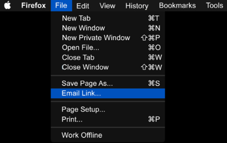
Figure 12.1: New Tab just opens a new tab, while Email Link… will ask for more information in the next step
These little dots are a great example of invisible design: most users will never have even noticed them...
Make Interactive Elements Obvious and Discoverable
The flat design aesthetic, born out of Microsoft’s Metro user interface, rose to near ubiquity in the late 2000s. In iOS 7 and Android’s Material Design, these extremely minimal visuals are still the go-to look for modern web applications. Although, the flat design of the late 2000s has “softened” over the years to introduce more visual affordances. Flat design has performed poorly in user testing over the years. It’s style over substance and it forces your users to think more about every interaction they make with your product. Stop making it hard for your customers to find the buttons:
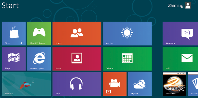
Figure 13.1: The “Metro” user interface in all its “what is clickable?” splendor
There are parts of your UI that can be interacted with, but your user neither knows which parts these are, nor wants to spend time learning this. They have used buttons in real life, many times...
Make Buttons a Sensible Size And Group Them Together by Function
The US psychologist Paul Fitts wrote a paper in 1954 called The information capacity of the human motor system in controlling the amplitude of movement (https://www.ncbi.nlm.nih.gov/pubmed/13174710), which was published in the Journal of Experimental Psychology. Fitts’ work would go on to be one of the most well-studied models of human motion.
To dumb Fitts’ law down for us UX people, rather than psychologists, the core concept that applies to us is:
The time required to rapidly move to a target area is a function of the ratio between the distance to the target and the size of the target.
If you’re building a user interface, it’s really simple to do this: make buttons big enough, and placed in such a way that users can efficiently find them and move between them—ideally grouped by function:

Figure 14.1: Which is easier to use and less prone to a misclick...
Don’t Invent New, Arbitrary Controls
These could be:
- An isometric pseudo-3D wheel to choose the color of your car
- A volume dial that you must click and drag up-and-down to “rotate”
- A button you must click and hold for a few seconds to indicate that you really want to do this action
Just don’t invent them. As designers, we already have a rich palette of existing controls to choose from. If you’re thinking about making a new UI control, please stop and think about how hard it will be for users to learn yet another interface pattern. I promise you this—there’s already a way to do what you want to do.
However, every now and then, something new comes along that is genuinely an advance in UI. Back in 2008, Loren Brichter made a Twitter app called Tweetie, with a unique pull-to-refresh interaction. Pulling the view down would show “release to refresh” and releasing would show a spinner. The...
Search Should Be a Text Field with a Button Labeled “Search”
The search function has, over the years, been over-designed. One common anti-pattern is hiding search behind a control to activate it. Slowing the user down and adding an extra step might remove an input field from your view, but at the expense of familiarity and ease of use.
If you’re offering your users a search function, then show them a text field with a search button. If you’re using an icon, then use a “magnifying glass” icon. This is the archetype and using anything else no longer makes any sense.

Figure 17.1: The “gold standard”
The placeholder text (“type to search” in the above example) is a vital and often overlooked piece of UI copy. In a couple of well-chosen words, the UX designer can give valuable hints and context to the user. For example: “type to search” indicates to the user they’re searching...
Sliders Should Be Used for Non-Quantifiable Values Only
Designer: “Oh, cool, this UI kit has a nice-looking slider; let’s use it for everything!”
User (trying to set a value): *smashes up phone*
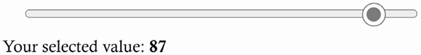
Figure 18.1: I was trying to select 86
If you’ve ever fiddled with a tiny touchscreen while trying to set a value with a slider, you’ll be familiar with the preceding scenario. Even on a desktop screen with a mouse, it’s a pain.
Slider controls should never be used for setting specific numeric values. They are, however, great for volume controls, brightness, and color mix values, where the slider can be used to pick a value in a more qualitative way, and the actual numeric value itself doesn’t need to be precise.
For precise numbers, refer to #19, Use Numeric Entry Fields For Precise Integers.
Learning points
- Slider controls should never be used for setting specific numeric values
- Use sliders for...
Use Numeric Entry Fields for Precise Integers
If you’re trying to get an integer (a whole number) from a user—for example the number of widgets they want to order or the number of days an event runs for—it makes no sense to offer them a free text input field where they can enter “a few” or an emoji. A numeric entry field in HTML is:
<input type="number">
This will display slightly differently on different devices—and that’s the whole point. By adapting to the control system of the client’s device, the user gets a simpler entry and makes fewer mistakes. You also get fewer emojis in your database.
Users abandon forms because:
- they’re too long,
- they ask for too many details, or
- because it’s difficult to enter information into the form.
Therefore, a huge benefit here is that this will improve your form conversion rates by giving users on both desktop and...
Don’t Use a Drop-Down Menu If You Only Have a Few Options
A drop-down menu in the user interface is designed to expand when clicked and present a range of options. This is fine for customization, where there genuinely are plenty of options.
There is, however, an overhead to operating a drop-down menu: the user needs to click to open, scroll to the correct item, and then click to select. On a mobile device, this can be even slower, as the user will be using a smaller screen.
If you only have two or three options, then don’t jump to using a drop-down straightaway. Consider whether the options could be better presented to users with a different kind of control (radio buttons—for single choices, sliders, and so on).

Figure 20.1: The anti-pattern: this should clearly be a cheese toggle, not a cheese drop-down
Sort your options into a sensible order—alphabetical or numerical—rather than random. Don’t be the app that asks users...
Allow Users to Undo Destructive Actions
The ohnosecond (https://en.oxforddictionaries.com/definition/ohnosecond) is the split second when you realize you’ve made a terrible mistake. Your stomach sinks, your trembling hands lift from the keyboard, and you freeze. This moment of horror could be deleting a customer’s records, emailing what you really think of your boss directly to your boss, or hitting “buy now” on 111 items when you only wanted one.
The best apps allow users to back out of such actions, either with undo controls or by giving users the ability to edit actions before they’re final. Google’s Gmail has had an optional “undo send” feature for quite some time. This stores your sent message in a “buffer” for 20 seconds, giving you that short grace period to cancel sending. If you just ignore it, you know the message will be sent shortly. This particular feature has saved me many times.
Users will...
Optimize Your Interface for Mobile
The experience of using mobile apps (and mobile-optimized websites) can be either a joy or a deep frustration for users. This principle aims to summarize other points from across this book into a “UX for mobile cheatsheet” to help you deliver better mobile experiences.
Much of the frustration experienced by mobile users stems from the constraints the devices place on us. They have a much smaller screen, their touchscreens are more error-prone, and they’re typically on lower bandwidth connections than desktop computers. As a result, getting information out of the device and getting user input into the interface are both higher friction processes than would be the case on a desktop screen with a keyboard and mouse. The UI of these devices attempts to mitigate these constraints with the device-native features listed below.
Device-native features
The two main mobile operating systems (iOS and Android) have a great number...
 © 2022 Packt Publishing Limited All Rights Reserved
Author (1)