In Android development, having a slide between pages is very common, with a significant use case being onboarding or even when you are trying to display specific data in a tabbed, carousel way. In this recipe, we will build a simple horizontal pager in Compose and see how we can utilize the new knowledge to build better and more modern Android apps.
Getting ready
In this example, we will build a horizontal pager that changes colors when selected to show the state is selected. We will look into states in Chapter 3, Handling the UI State in Jetpack Compose and Using Hilt, for better understanding. Open the Compose Basics project to get started.
How to do it…
Follow these steps to build your tab carousel:
- Add the following pager dependencies to
build.gradle(Module:app):
implementation "com.google.accompanist:accompanist-pager:0.x.x"
implementation "com.google.accompanist:accompanist-pager-indicators:0.x.x"
implementation 'androidx.Compose.material:material:1.x.x'
Jetpack Compose offers Accompanist, a group of libraries that aims to support it with commonly required features by developers – for instance, in our case, the pager.
- In the same project from previous recipes, let’s create a package and call it
pagerexample; inside it, create a Kotlin file and call it CityTabExample; inside this file, create a composable function and call it CityTabCarousel:
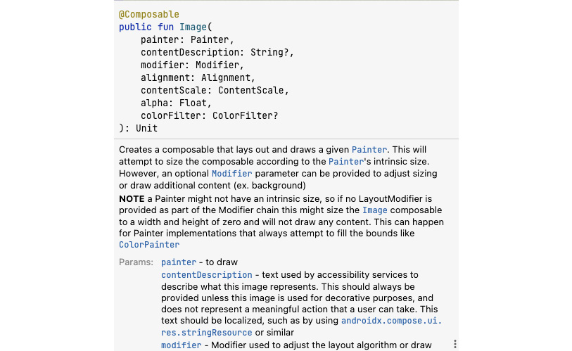
@Composable
fun CityTabCarousel(){}
- Now, let us go ahead and build our
CityTabCarousel; for our example, we will create a dummy list of pages with our cities from the previous project:
@Composable
fun CityTabCarousel(
    pages: MutableList<String> = arrayListOf(
        "Spain",
        "New York",
        "Tokyo",
        "Switzerland",
        "Singapore",
        "Paris" )) {. . .}
- We will need to change the color of the button based on the state, and to do this; we need to use
LocalContext, which provides the context we can use. We will also need to create a var pagerState = rememberPagerState(), which will remember our pager state, and finally, when clicked, we will need to move to the next city in our pager, which will be very helpful. Hence, go ahead and add the following to the CityTabCarousel composable function:
val context = LocalContext.current
var pagerState = rememberPagerState()
val coroutineScope = rememberCoroutineScope()
- Now, let’s create the
Column element and add our ScrollableTabRow() composable function:
Column {
    ScrollableTabRow(
        selectedTabIndex = pagerState.currentPage,
        indicator = { tabPositions ->
            TabRowDefaults.Indicator(...)
        },
        edgePadding = 0.dp,
        backgroundColor = Color(
            context.resources.getColor(R.color.white,
                null)),
    ) {
        pages.forEachIndexed { index, title ->
            val isSelected =
                pagerState.currentPage == index
            TabHeader(
                title,
                isSelected,
                onClick = { coroutineScope.launch {
                pagerState.animateScrollToPage(index)
                } },
            )
        }
    }
- Add
Text() and TabHeader() for HorizontalPager:
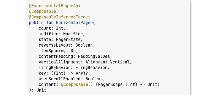
    HorizontalPager(
        count = pages.size,
        state = pagerState,
        modifier = Modifier
            .fillMaxWidth()
            .fillMaxHeight()
            .background(Color.White)
    ) { page ->
        Text(
            text = "Display City Name:
                ${pages[page]}",
            modifier = Modifier.fillMaxWidth(),
            style = TextStyle(
                textAlign = TextAlign.Center
            )
        )
    }
- Please download the entire code for this recipe by following the link provided in the Technical requirements section to add all the required code. Finally, run the
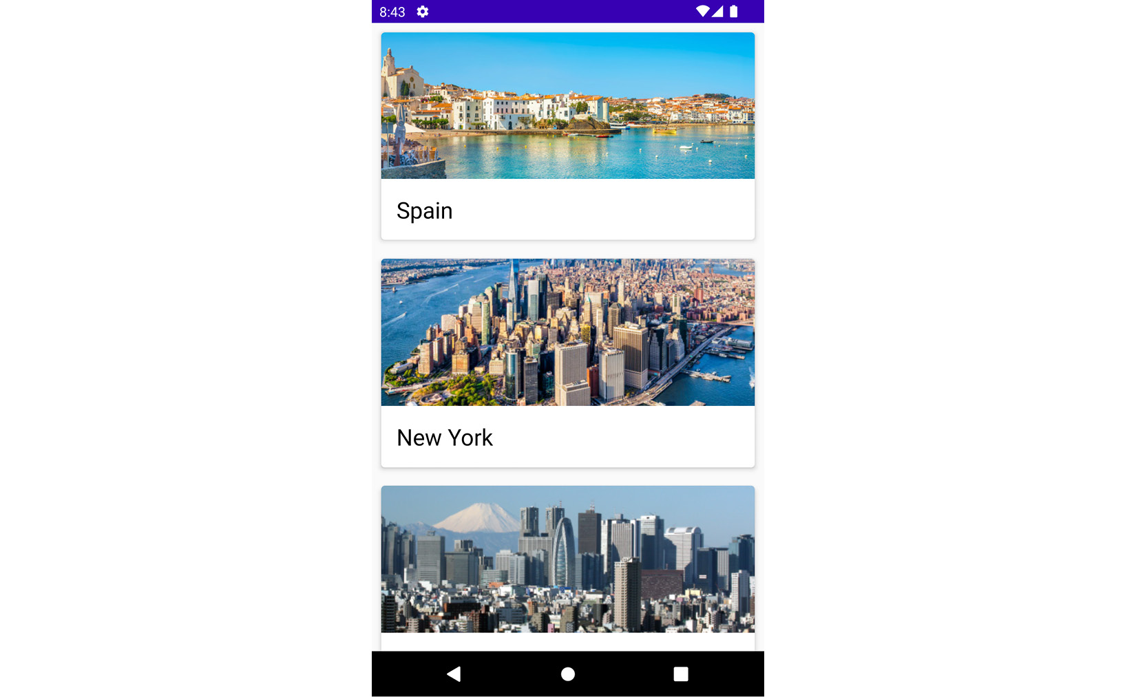
@Preview function, and your app should look like Figure 2.8.
Figure 2.8 – Tabs with cities
How it works…
Accompanist comes with some significant libraries – for example, System UI Controller, AppCompact Compose Theme Adapter, Material Theme Adapter, Pager, Drawable Painter, and Flow Layouts, just to mention a few.
The ScrollableTabRow() that we use inside Column in the CityTabCarousel function contains a row of tabs and helps display an indicator underneath the currently focused or selected tab. In addition, as the name suggests, it enables scrolling and you do not have to implement further scrolling tooling. It also places its tab offsets at the starting edge, and you can quickly scroll tabs that are off-screen, as you will see when you run the @Preview function and play around with it.
When we invoke remember(), in Compose, this means we keep any value consistent across recomposition. Compose provides this function to help us store single objects in memory. When we trigger our application to run, remember() stores the initial value. As the word means, it simply retains the value and returns the stored value so that the composable function can use it.
Furthermore, whenever the stored value changes, you can update it, and the remember() function will keep it. The next time we trigger another run in our app and recomposition occurs, the remember() function will provide the latest stored value.
You will also notice our MutableList<String> is indexed at each position, and we do this to check which is selected. It is within this Lambda that we call TabHeader and showcase the selected tab pages. forEachIndexed performs the given action on each element, providing a sequential index of elements. We also ensure when a user clicks on a specific tab, we are on the right page:
onClick = { coroutineScope.launch { pagerState.animateScrollToPage(index) } }
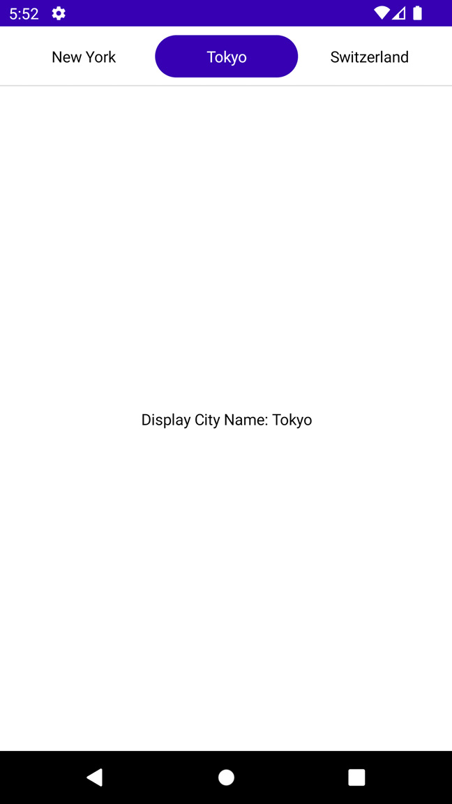
HorizontalPager is a horizontally scrolling layout that allows our users to flip between items from left to right. It takes in several inputs, but we supply it with the count, state, and modifier to decorate it in our use case. In the Lambda, we display text – in our example, showing which page we are on, which helps when navigating, as shown in Figure 2.9:
Figure 2.9 – HorizontalPager
Our TabHeader composable function has a Box(); a box in Jetpack Compose will always size itself to fit the content, and this is subject to the specified constraints. In our example, we decorate our Box with the selectable modifier, which configures components to be selectable as part of a mutually exclusive group, allowing each item to be selected only once at any given time.
Important note
Ensure your target and compile SDK targets 33. In addition, you will notice that most Accompanist’s libraries are experimental, which means they can change. There is debate on whether to use this in your production, so you should always consult your team on these APIs. To see the entire list of libraries supported by Accompanist, you can follow this link: https://github.com/google/accompanist.
 Argentina
 Australia
 Austria
 Belgium
 Brazil
 Bulgaria
 Canada
 Chile
Chile
 Colombia
 Cyprus
 Czechia
 Denmark
 Ecuador
 Egypt
Egypt
 Estonia
 Finland
 France
 Germany
 Great Britain
 Greece
 Hungary
 India
India
 Indonesia
 Ireland
 Italy
Italy
 Japan
Japan
 Latvia
 Lithuania
 Luxembourg
 Malaysia
 Malta
Malta
 Mexico
 Netherlands
 New Zealand
 Norway
 Philippines
 Poland
 Portugal
 Romania
 Russia
 Singapore
 Slovakia
 Slovenia
 South Africa
 South Korea
 Spain
Spain
 Sweden
 Switzerland
 Taiwan
 Thailand
 Turkey
 Ukraine
 United States


 Filter


