


Implementing declarative graphics using Jetpack Compose
In Android development, your application might have a different need, and this need might be building your own custom graphics for an intended purpose. This is very common in many stable and large Android code bases. The essential part of any custom view is its appearance. Furthermore, custom drawing can be a very easy or complex task based on the needs of your application. In Modern Android Development, Jetpack Compose makes it easier to work with custom graphics simply because the demand is immense. For example, many applications may need to control what happens on their screen accurately; the use case might be as simple as putting a circle on the screen or building more complex graphics to handle known use cases.
Getting ready
Open the Compose Basics project to get started with this recipe. You can find the entire code in the Technical requirements section.
How to do it…
In our project, let us create a new package and call it circularexample; inside this package, create a Kotlin file and call it DrawCircleCompose; inside the file, create a CircleProgressIndicatorExample composable function. You will not need to import anything for now:
- Let us now go ahead and define our composable function. Since, in our example, we want to display a tracker in a circle, we need to float to fill in our circle. We will also define the colors to help us identify the progress:
@Composable fun CircleProgressIndicatorExample(tracker: Float, progress: Float) { val circleColors = listOf( colorResource(id = R.color.purple_700), colorResource(id = R.color.teal_200) ) - Now, let’s call
Canvasto draw our arc. We give our circle the size of200.dpwith8.dppadding. Where it gets interesting is inonDraw.startAngleis set at-90; the start angle is set in degrees to understand it better.
The zero represents 3 o’clock, and you can also play around with your start angle to see how -90 translates. The useCenter Boolean indicates whether arc is to close the center of the bounds. Hence, in our case, we set it to false. Then, finally, we set the style, which can be anything based on our preference:
Canvas(
    modifier = Modifier
        .size(200.dp)
        .padding(8.dp),
    onDraw = {
        this.drawIntoCanvas {
            drawArc(
                color = colorSecondary,
                startAngle = -90f,
                sweepAngle = 360f,
                useCenter = false,
                style = Stroke(width = 55f, cap =
                    StrokeCap.Butt),
                size = Size(size.width, size.height)
            )
colorResource(id = R.color.teal_200)
 . . .
- We have just drawn the first part of the circle; now, we need to draw the progress with a
Brush, which utilizeslinearGradient:drawArc( brush = Brush.linearGradient(colors = circleColors), startAngle = -90f, sweepAngle = progress(tracker, progress), useCenter = false, style = Stroke(width = 55f, cap = StrokeCap.Round), size = Size(size.width, size.height) ) . . . . . .
- Finally, our
progressfunction tellssweepAnglewhere our progress should be based on our tracking abilities:private fun progress(tracker: Float, progress: Float): Float { val totalProgress = (progress * 100) / tracker return ((360 * totalProgress) / 100) } . . . - Run the
previewfunction, and you should see a circular progress indicator as in Figure 2.11.
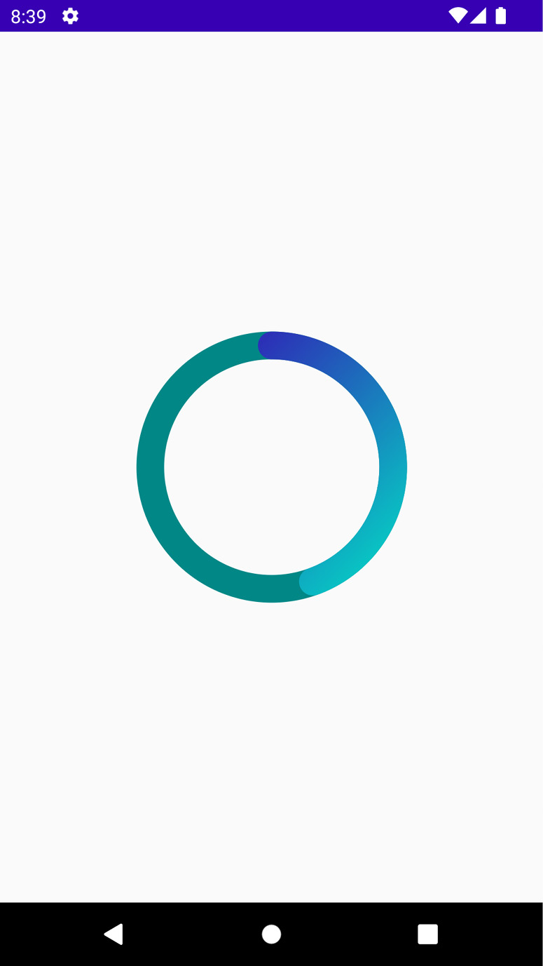
Figure 2.11 – Showing a circular progress image
The Canvas composable function uses Canvas to Compose an object, which, in turn, creates and helps manage a view-base Canvas. It is also important to mention that Compose makes it easier for developers by maintaining the state and creating and freeing any necessary helper objects.
How it works…
Generally, Canvas allows you to specify an area on the screen where you want to draw. In the old way of building Android applications, we also utilized Canvas, and now in Compose, it is more powerful and valuable.
linearGradient create a linear gradient with the specified colors along the provided start and end coordinates. For our example, we give it simple colors that come with the project.
The drawing functions have instrumental default parameters that you can use. For instance, by default, drawArc, as you can see, takes in several inputs:
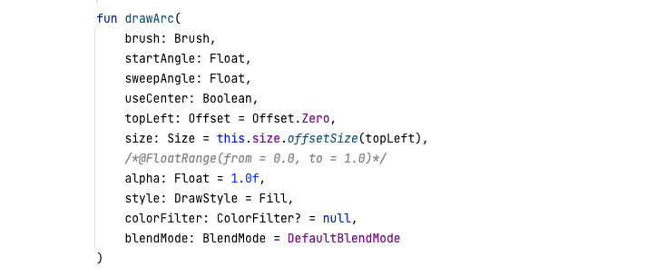
Figure 2.12 – Showing what drawArc takes as input
sweepAngle in our example, which is the size of the arc in the degree that is drawn clockwise relative to startAngle, returns a function that calculates progress. This function can be customized to fit your needs. In our example, we pass in a tracker and progress and return a float.
Since we want to fill the circle, we create cal totalProgress, which checks progress * 100 divided by the tracker, and we return 360 (circle) * our progress divided by 100. You can customize this function to fit your needs. You can also write code to listen to where you are and make the progress move based on your input value from a listener you create.
There’s more…
There is more you can do with Canvas and custom drawing. One amazing way to enhance your knowledge on the topic is to look into old solutions posted on Stack Overflow, such as drawing a heart or any other shape, and see whether you can do the same in Compose.