Search icon
Arrow left icon
All Products
Best Sellers
New Releases
Books
Videos
Audiobooks
Learning Hub
Newsletters
Free Learning
Arrow right icon
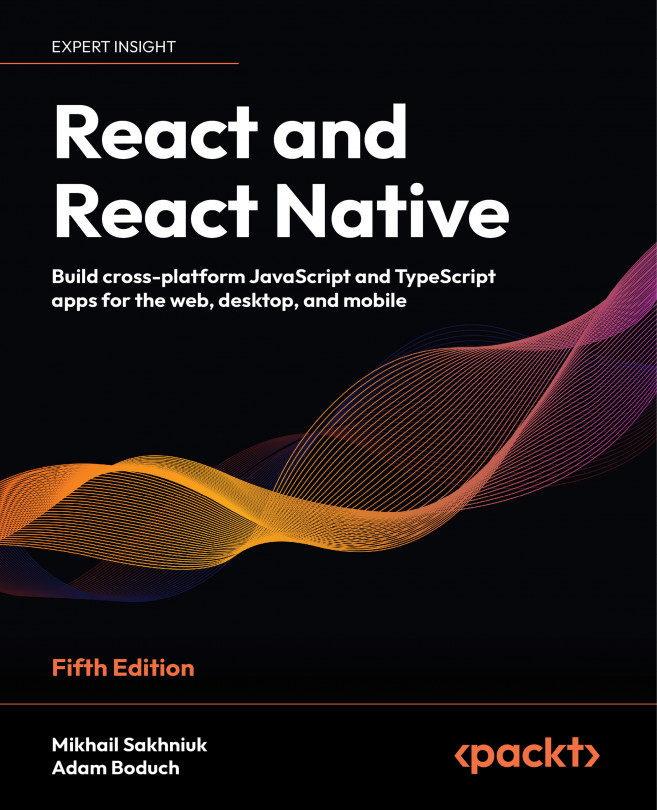
React and React Native - Fifth Edition

You're reading from  React and React Native - Fifth Edition

Product type Book
Published in Apr 2024
Publisher Packt
ISBN-13 9781805127307
Pages 508 pages
Edition 5th Edition
Languages
Authors (2):
Mikhail Sakhniuk Mikhail Sakhniuk
Profile icon Mikhail Sakhniuk
Adam Boduch Adam Boduch
Profile icon Adam Boduch
View More author details

Table of Contents (33) Chapters

Preface 1. Part I: React
2. Why React? 3. Rendering with JSX 4. Understanding React Components and Hooks 5. Event Handling in the React Way 6. Crafting Reusable Components 7. Type-Checking and Validation with TypeScript 8. Handling Navigation with Routes 9. Code Splitting Using Lazy Components and Suspense 10. User Interface Framework Components 11. High-Performance State Updates 12. Fetching Data from a Server 13. State Management in React 14. Server-Side Rendering 15. Unit Testing in React 16. Part II: React Native
17. Why React Native? 18. React Native under the Hood 19. Kick-Starting React Native Projects 20. Building Responsive Layouts with Flexbox 21. Navigating Between Screens 22. Rendering Item Lists 23. Geolocation and Maps 24. Collecting User Input 25. Responding to User Gestures 26. Showing Progress 27. Displaying Modal Screens 28. Using Animations 29. Controlling Image Display 30. Going Offline 31. Other Books You May Enjoy
32. Index

User Interface Framework Components

When you are developing a React application, it’s typical to rely on an existing UI library rather than building one from scratch. There are lots of React UI component libraries available to choose from, and there’s no wrong choice, as long as the components make your life simpler.

In this chapter, we delve into the Material UI React library, a popular choice for React development. Material UI stands out due to its comprehensive suite of customizable components, adherence to Google’s Material Design principles, and extensive documentation, making it an optimal choice for developers seeking efficiency and aesthetic coherence in their UI design. Here are the specific topics that we’ll cover:

  • Layout and UI organization
  • Using navigation components
  • Collecting user input
  • Working with styles and themes

Technical requirements

You can find the code files present in this chapter on GitHub at https://github.com/PacktPublishing/React-and-React-Native-5E/tree/main/Chapter09.

You can also find more information about Material UI components and its API at https://mui.com/material-ui/.

Layout and organization

Material UI excels in simplifying the complex process of designing application layouts. By offering a robust set of components, specifically containers and grids, it empowers developers to efficiently structure and organize UI elements. Containers serve as the foundation, providing a flexible way to encapsulate and align content within the overall layout. Grids, on the other hand, allow more granular control, enabling precise placement and alignment of components across different screen sizes, ensuring responsiveness and consistency.

This section aims to unpack the functionality of containers and grids within Material UI. We’ll explore how these tools can be leveraged to create intuitive and aesthetically pleasing layouts, which are crucial for enhancing user experience.

Using containers

Aligning components horizontally on a page often presents a significant challenge due to the intricate balance required between spacing, alignment, and responsiveness...

Using navigation components

Once we have an idea of how the layout of our application is going to look and work, we can start to think about the navigation. This is an important piece of our UI because it’s how the user gets around the application, and it will be used frequently. In this section, we’ll learn about two of the navigational components offered by Material UI.

Navigating with drawers

The Drawer component, just like a physical drawer, slides open to reveal content that is easily accessed. When we’re finished, the drawer closes again. This works well for navigation because it stays out of the way, allowing more space on the screen for the active task that the user is engaged with. Let’s look at an example, starting with the App component:

<BrowserRouter>
  <Button onClick={toggleDrawer}>Open Nav</Button>
  <section>
    <Routes>
      <Route path="/first" element={<First />} />
 ...

Collecting user input

Collecting input from users can be difficult. There are many nuanced things about every field that we need to consider if we plan on getting the user experience right. Thankfully, the Form components available in Material UI take care of a lot of usability concerns for us. In this section, you’ll get a brief sampling of the input controls that you can use.

Checkboxes and radio buttons

Checkboxes are useful for collecting true/false answers from users, while radio buttons are useful for getting the user to select an option from a short number of choices. Let’s take a look at an example of these components in Material UI:

export default function Checkboxes() {
  const [checkbox, setCheckbox] = React.useState(false);
  const [radio, setRadio] = React.useState("First");
  return (
    <div>
      <FormControlLabel
        label={'Checkbox ${checkbox ? "(checked)" : ""}'}
        control={...

Working with styles and themes

Included with Material UI are systems for extending the styles of UI components and extending theme styles that are applied to all components. In this section, you’ll learn about using both of these systems.

Making styles

Material UI comes with a styled() function that can be used to create styled components based on JavaScript objects. The return value of this function is a new component with the new styles applied.

Let’s take a closer look at this approach:

const StyledButton = styled(Button)(({ theme }) => ({
  "&.MuiButton-root": { margin: theme.spacing(1) },
  "&.MuiButton-contained": { borderRadius: 50 },
  "&.MuiButton-sizeSmall": { fontWeight: theme.typography.fontWeightLight },
}));
export default function App() {
  return (
    <>
      <StyledButton>First</StyledButton>
      <StyledButton variant="contained">Second</StyledButton...

Summary

This chapter was a very brief introduction to Material UI, the most popular React UI framework. We started by looking at the components used to assist with the layout of our pages. We then looked at components that can help the user navigate around your application. Next, you learned how to collect user input using Material UI form components. Finally, you learned how to style your Material UI using styles and modifying themes.

The insights gained from this chapter allow you to build complex interfaces without the overhead of developing UI components from scratch, accelerating your development process. Furthermore, React application development inherently relies on the synergistic use of various auxiliary libraries. A deep understanding of the React ecosystem and its key libraries empowers developers to rapidly prototype and iterate on their applications, making development effective.

In the next chapter, we’ll look at ways to improve the efficiency of your...

lock icon The rest of the chapter is locked
You have been reading a chapter from
React and React Native - Fifth Edition
Published in: Apr 2024 Publisher: Packt ISBN-13: 9781805127307
Register for a free Packt account to unlock a world of extra content!
A free Packt account unlocks extra newsletters, articles, discounted offers, and much more. Start advancing your knowledge today.
Unlock this book and the full library FREE for 7 days
Get unlimited access to 7000+ expert-authored eBooks and videos courses covering every tech area you can think of
Renews at €14.99/month. Cancel anytime}