


Visualforce charting allows custom charts to be embedded into any Visualforce page using standard components, only server-side code is required. A key difference from the standard charting functionality available in reports and dashboards is that the data is provided by the Visualforce page controller and can be derived from any number of sObjects, regardless of whether any relationships between the sObjects exist.
Note
Visualforce charts became Generally Available in the Winter '13 release of Salesforce. Prior to this, custom charts required use of a JavaScript framework, such as Dojo Charting or Google Charts.
In this chapter, we will create a number of Visualforce charts of increasing complexity, add a chart to a standard Salesforce record view page, and generate a number of charts on a single page, much like a standard Salesforce dashboard.
Bar charts allow easy comparison of groups of data. A typical use in Salesforce is to view performance on a month-by-month basis; for example, to identify the effectiveness of a process improvement.
In this recipe, we will create a Visualforce page containing a bar chart that displays the total value of won opportunities per month for the previous 12 months. This allows a sales manager to view at a glance whether sales are increasing or decreasing, and to identify any problem months that require further analysis.
This recipe makes use of a custom controller, so this must be created before the Visualforce page.
Navigate to the Apex Classes setup page by clicking on Your Name | Setup | Develop | Apex Classes.
Click on the New button.
Paste the contents of the
BarChartController.clsApex class from the code download into the Apex Class area.Click on the Save button.
Next, create the Visualforce page by navigating to the Visualforce setup page by clicking...
Line charts are useful to demonstrate changes in data over time. A typical use in Salesforce is to view the number of records with a particular characteristic over a period of time.
In this recipe, we will create a Visualforce page containing a line chart that displays the total number of closed cases per month for the previous 12 months.
This recipe makes use of a custom controller, so this will need to be created before the Visualforce page.
First, create the custom controller by navigating to the Apex Classes setup page by clicking on Your Name | Setup | Develop | Apex Classes.
Click on the New button.
Paste the contents of the
LineChartController.clsApex class from the code download into the Apex Class area.Click on the Save button.
Next, create the Visualforce page by navigating to the Visualforce setup page by clicking on Your Name | Setup | Develop | Pages.
Click on the New button.
Enter
LineChartin the Label field.Accept the default LineChart...
Visualforce charts are highly customizable; colors, markers, line widths, highlighting, legends, labels, and more are under the control of the developer.
In this recipe we will create a Visualforce page containing a bar chart displaying the total value of won opportunities per month for the last year.
The chart will be customized to display horizontal bars in a custom dark blue color that do not highlight when the user hovers over a bar. Finally, a legend will be displayed to show the user what the bars represent.
This recipe relies on the custom controller from the Creating a bar chart recipe in this chapter. If you have already completed that recipe, you can skip this section.
Navigate to the Apex Classes setup page by clicking on Your Name | Setup | Develop | Apex Classes.
Click on the New button.
Paste the contents of the
BarChartController.clsApex class from the code download into the Apex Class area.Click on the Save button.
In the previous recipes in this chapter, each chart contained a single series. Visualforce charts are not limited to this and can plot multiple sets of data, regardless of whether there is a relationship between the data sets.
In this recipe we will create a Visualforce page containing a chart that plots two series against the month for the last year. The first is a bar series of the number of opportunities lost in the month, while the second is a line series of the number of opportunities won in the month. This allows a sales director to see if the won/lost ratio is improving over time.
This recipe makes use of a custom controller, so this must be present before the Visualforce page can be created.
Stacked bar charts allow the contributing parts of data to be compared to the whole. An example of this is displaying a bar that represents the total number of opportunities that are currently open, with sections of the bar displaying the count of opportunity records that are in each stage of the sales process.
In this recipe, we will create a Visualforce page containing a stacked bar chart where each bar displays the total opportunity value that closed that month, both won and lost, for the last 12 months. Each bar is divided into two segments: the lower segment shows the total value of opportunities lost in a month, while the upper segment shows the total value won.
This recipe makes use of a custom controller, so this must be present before the Visualforce page can be created.
Plotting multiple series on a single graph can be problematic if the values of the two series vary widely. For example, if the total value of won opportunities were plotted against the record count of won opportunities, the total value number would be likely to be several hundred thousand times the record count number. Plotting these on a single chart would result in the record count plot being as close to zero as to be indistinguishable from zero.
The solution to this problem is to display a third axis. The axis is scaled appropriately to the data set that is plotted against it.
In this recipe we will create a Visualforce page containing a chart that displays the total value of the won and lost opportunities per month for the last year. The won/lost information is displayed as a stacked bar chart. The chart also displays a line series chart where each point on the line series is the number of opportunities that were won/lost in that month. As the number of opportunities...
Visualforce charts can be generated wherever a Visualforce page can be displayed, including sidebar components, the homepage, and in standard record view pages.
In this recipe, we will create a Visualforce page containing a chart that displays a stacked bar chart containing the total number of activities carried out with a contact per month for the last year. The stacked bars contain a segment for the events and tasks that make up the activity total. This Visualforce page is embedded into the standard contact record view page to allow a sales manager to see at a glance whether a contact is being neglected or receiving more than its fair share of attention.
This recipe makes use of a controller extension that must be present before the Visualforce page can be created.
A common use case for Visualforce charting is producing a number of custom charts arranged into rows and columns, much like a standard dashboard. Simply adding chart components to HTML table cells results in all the charts being displayed in the top-left cell of the table, as shown in the following screenshot:
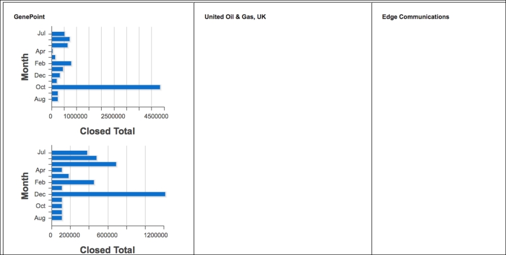
The solution to this is to use the chart
renderTo attribute to specify the DOM component that the chart should be rendered inside.
In this recipe we will create a Visualforce page that displays a table of bar charts. Each bar chart displays the total won opportunity value per month for the last year for a specific account.
This recipe makes use of a custom controller, so this will need to be present before the Visualforce page can be created.