


In this chapter, we will explore the various ways in which we can extend the accordion widget to accommodate a number of scenarios. The accordion widget offers a lot of out-of-the-box functionality. For example, without any configuration, we get a themed container widget that groups contents into sections.
We'll focus on use cases that shed light on the inner workings of the accordion widget. Keyboard events are one way to navigate the page, and we can enhance the accordion's support for these events. Some magic happens behind the scene to come up with each section's height, when expanded. We'll see how we can work with these configurations, especially when the section height changes on the fly.
Also on the topic of height, we can let the user control the height of individual sections, or, from a theme perspective, we can control the space between the accordion components. Finally, we'll look at some of the more advanced accordion usage where we give the user the freedom to sort their accordion sections and to drag sections from one accordion to another.
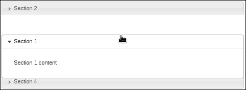
In most desktop environments, the Tab key is a secret weapon in navigation—one tool that many users are accustomed to. Likewise, we can utilize the Tab key in HTML5 applications using the tabindex property. This tells the browser the order in which to focus elements, each time the key is pressed.
Unfortunately, this isn't as straightforward as it looks with accordion widgets. We can't specify a tabindex value in each section header and expect the Tab key events to work as expected. Instead, the default widget implementation provides a different kind of key navigation—the up and down arrow keys. Ideally, it would be useful to give users the ability to navigate through the accordion sections using the Tab key that they're familiar with, while preserving the default key navigation provided by the widget.
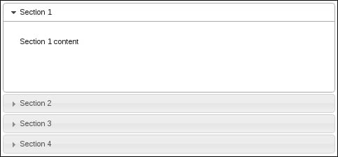
To get started, we'll want a basic accordion; ideally, something simple that has basic content within each section, so that we can visually see how the Tab key behavior works before we implement custom events, and afterward.
As a guide, here is my basic accordion markup:
<div id="accordion">
    <h3>Section 1</h3>
    <div>
        <p>Section 1 content</p>
    </div>
    <h3>Section 2</h3>
    <div>
        <p>Section 2 content</p>
    </div>
    <h3>Section 3</h3>
    <div>
        <p>Section 3 content</p>
    </div>
    <h3>Section 4</h3>
    <div>
        <p>Section 4 content</p>
    </div>
</div>
And, here is the code used to instantiate the accordion widget:
$(function() {

    $( "#accordion" ).accordion({
        collapsible: true
    });

});
Tip
Downloading the example code
You can download the example code files for all Packt books you have purchased from your account at http://www.packtpub.com. If you purchased this book elsewhere, you can visit http://www.packtpub.com/support and register to have the files e-mailed directly to you.
We now have a basic collapsible accordion widget that we can look at in the browser. The reason we're adding the collapsible option here is so that we can experiment with the key navigation—we get a better view of which section is in focus when all are collapsed. You can see how the up and down arrow keys allow the user to traverse through the accordion sections while the Tab key has no effect. Let's change that.
We're going to extend the accordion widget to include an event handler for keypress events. The default accordion implementation has keypress events for dealing with the up, down, left, right, and Enter keys. We don't need to change that. Instead, we add our own handler that understands what to do when the Tab key and Shift + Tab keys are pressed.
Look at the following code:
(function( $, undefined ) {

$.widget( "ab.accordion", $.ui.accordion, {

    _create: function () {

        this._super( "_create" );
        this._on( this.headers, { keydown: "_tabkeydown" } );

    },

    _tabkeydown: function ( event ) {

        if ( event.altKey || event.ctrlKey ) {
            return;
         }

        if ( event.keyCode !== $.ui.keyCode.TAB ) {
            return;
        }

        var headers = this.headers,
            headerLength = headers.length,
            headerIndex = headers.index( event.target ),
            toFocus = false;

        if ( event.shiftKey && headerIndex - 1 >= 0 ) {
            toFocus = headers[ headerIndex - 1 ];
        }

        if ( !event.shiftKey && headerIndex + 1 < headerLength ) {
            toFocus = headers[ headerIndex + 1 ];
        }

        if ( toFocus ) {

            $( event.target ).attr( "tabIndex", -1 );
            $( toFocus ).attr( "tabIndex", 0 );
            toFocus.focus();
            event.preventDefault();

        }

    }

});

})( jQuery );

$(function() {

    $( "#accordion" ).accordion({
        collapsible: true
    });

});We're creating a new accordion widget here by extending the default accordion widget. The advantage to this approach of extending the accordion widget is that we're not tinkering with instances of the widget; all accordion instances will acquire this new behavior.
The _create() method is replaced with our new implementation of it. The first thing we do in this replacement method is call the original _create() method. We don't want to prevent the default setup actions of the accordion widget from taking place. So, using _super() we're able to do that. The next thing we do is bind our new
tabkeydown() event handler to the keydown event.
The tabkeydown() handler is a simplified version of the keydown event handler provided in the original accordion implementation. If the Alt or the Ctrl key was pressed in combination with another key, we ignore the event. If the key press was anything other than a Tab, we ignore the event too, since we're only interested in altering the Tab key behavior when one of the accordion headers is in focus.
The guts of the handler determine what should happen when the Tab key is pressed. In which direction should we move the accordion header focus? When do we ignore the event and let the default browser behavior take over? The trick is, figuring out our current index position. If we're on the first header and the user presses Shift + Tab, meaning they want to traverse backward, then we don't do anything. Likewise, if we're on the last header and the user presses Tab, we pass control back to the browser so as not to interfere with the expected functionality.
Accordions are containers that are used to organize and display other UI elements. Thinking about each accordion section as static content is a mistake. The contents of accordion sections do change. For example, a user-triggered event might lead to the creation of a new element within the section. In all likelihood, the components inside a section will change size dynamically, and that's the part we need to be aware of. Why does it matter that accordion contents change size? Since this is an accordion, we'll likely have several sections (or at least a few). Does it make sense to have all of them with a uniform height? It does, until the height of one section grows too large. Then the section heights are no longer uniform. When this happens, we need to take a look at the accordion section height when they change, and potentially adjust some of the height settings on the fly.
Let's use the following markup to create an accordion widget:
<div id="accordion">
    <h3>Section 1</h3>
    <div>
        <p>Section 1 content</p>
    </div>
    <h3>Section 2</h3>
    <div>
        <p>Section 2 content</p>
    </div>
    <h3>Section 3</h3>
    <div>
        <p>Section 3 content</p>
    </div>
    <h3>Section 4</h3>
     <div>
        <ul>
            <li>First item</li>
            <li>Second item</li>
            <li>Third item</li>
            <li>Fourth item</li>
        </ul>
     </div>
</div>
We'll create the accordion using all the default option values as follows:
$(function() {
$("#accordion").accordion();
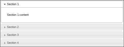
});Now, this is where we'll notice a slight inconsistency with regards to height. Here is what the first section looks like. It has minimal content, but uses more space than required.
This is due to the default value of the
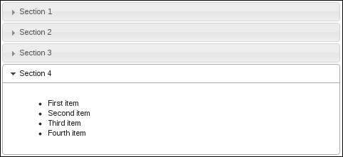
heightStyle option, which says that the height of every section in the accordion will be equal to that of the tallest section. Thus, we have wasted space in the first section. Let's look at the fourth section in the following screenshot to see why this happens:
We can see that the first section is as tall as the fourth section. This is due to the auto value of heightStyle. In this particular example, the difference isn't all that great. That is, the first section doesn't waste too much empty space. Therefore, it would probably make sense to keep this accordion configuration where each section has the same height.
The challenge arises when we're dealing with an application that is dynamically feeding content into a particular accordion section, and at some point where a certain threshold is reached, it no longer makes sense to keep the auto heightStyle configuration.
Setting the heightStyle to auto solves the problem for us, as each section will only use the height necessary to display the content. However, it would be nice if we were able to change this property of the accordion when the height of the content itself changes.
(function( $, undefined ) {

$.widget( "ab.accordion", $.ui.accordion, {

    refresh: function() {

        this._super( "refresh" );

        if ( this.options.heightStyle !== "content" ) {
            return;
        }

        this.headers.next().each( function() {

            if ( $( this ).css( "height" ) ) {
                $( this ).css( "height", "" );
            }

        });

    }

});

})(jQuery);

$(function() {

    $( "#accordion" ).accordion();

    for ( var i=0; i<20; i++ ){
        $( "ul" ).append( "<li>nth item</li>" );
    }

    $( "#accordion" ).accordion( "option", "heightStyle", "content" )
                     .accordion( "refresh" );

});What we've done here is extend the accordion widget's
refresh() method to allow the heightStyle option to be changed to content on the fly. The default implementation doesn't allow this. To illustrate this idea, consider the code above where we're creating the accordion widget and adding 20 new items to the last content section. We're using the default section height here, that is, auto. So, had we not extended the refresh() method to allow this behavior after populating the fourth section, we would have seen a scrollbar here.
Resizable content sections allow the user to adjust the height by dragging the bottom of the section. This is a nice alternative having to rely on the heightStyle property. Thus, if each section of the accordion can be adjusted by the user, they have the freedom to tailor the accordion layout. For example, if the accordion has a tall section, with wasted space at the bottom, the user might choose to shrink the height of that section to gain a better view of the accordion, and other components of the UI for that matter.
We'll extend the default accordion's
_create() method by making each content's div within the accordion resizable using the resizable interaction widget.
( function( $, undefined ) {
$.widget( "ab.accordion", $.ui.accordion, {
_create: function () {
this._super( "_create" );
this.headers.next()
.resizable( { handles: "s" } )
.css( "overflow", "hidden" );
},
_destroy: function () {
this._super( "_destroy" );
this.headers.next()
.resizable( "destroy" )
.css( "overflow", "" );
}
});
})( jQuery );
$( function() {
$( "#accordion" ).accordion();
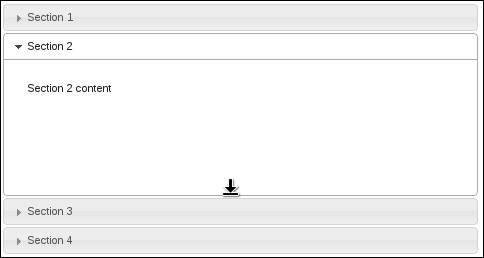
});You'll see something similar to the following. Notice that the second section has been dragged down and has the resize mouse cursor.
Our new version of the _create() method works by first invoking the default accordion's _create() method. Once that completes, we find all content sections of the accordion and apply the
resizable() widget. You'll notice, too, that we've told the resizable widget to only show a south handle. This means that the user will only be able to drag any given content section of the accordion up or down, using the cursor at the bottom of the section.
This specialization of an accordion also provides a new implementation of the _delete() method. Once again, we're calling the original accordion's _delete(), after which we're cleaning up the new resizable components we added. This includes removing the
overflow CSS property.
We can extend our resizable behavior within the accordion by providing a means to turn it off. We'll add a simple
resizable option to the accordion that checks whether or not to make the accordion sections resizable.
(function( $, undefined ) {

$.widget( "ab.accordion", $.ui.accordion, {

    options: {
        resizable: true
    },

    _create: function () {

        this._super( "_create" );

        if ( !this.options.resizable ) {
            return;
        }

        this.headers.next()
                    .resizable( { handles: "s" } )
                    .css( "overflow", "hidden" );
    },

    _destroy: function () {

        this._super( "_destroy" );

        if ( !this.options.resizable ) {
            return;
        }

        this.headers.next()
                    .resizable( "destroy" )
                    .css( "overflow", "" );

    },

});

})( jQuery );

$(function() {

    $( "#accordion" ).accordion( { resizable: false } );

});The space between accordion sections is controlled by the CSS theme framework. In particular, the visual structure for the accordion is defined by a set of CSS rules that can be modified to control the spacing between accordion sections. We could override the accordion theme CSS to adjust for more or less spacing between sections.
We're going to supply an additional CSS module to our UI—one that overrides the accordion structure supplied in the theme we happen to be using. There's no need to fret, however, our change is a simple one. We're going to update the
margin-top property. In a new CSS file called
theme.accordion.css, let's add the following style rules:
.ui-accordion .ui-accordion-header {
    margin-top: 4px;
}
Now that we have the CSS, we need to include it in our HTML header. It should look something like this:
We're copying the same CSS selector as is found in any jQuery UI theme. The particular property we've just changed alters the space between the accordion sections. Since we're overriding the default theme value, it's important to include our CSS files after the default theme file. This allows us to override the default theme instead of the default theme overriding our modifications.
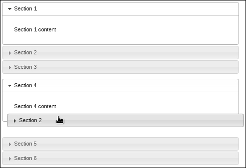
Using the sortable interaction widget, we're able to transform a static accordion section layout into something specified by the user. That is, sortable interaction widgets take a container element, and allow all child elements to be sorted in place. The user does this by dragging the element to the desired order.
We'll look at how we can extend the accordion capabilities so that the sortable section functionality is encapsulated, and can be switched on by a configuration option at the time of creation.
We have to perform several actions when the accordion widget is created, and when the accordion is destroyed. Here is how we extend the widget:
( function( $, undefined ) {

$.widget( "ab.accordion", $.ui.accordion, {

    options: {
        sortable: false
    },

    _create: function () {

        this._super( "_create" );

        if ( !this.options.sortable ) {
            return;
        }

        this.headers.each( function() {
            $( this ).next()
                     .addBack()
                     .wrapAll( "<div/>" );
        });

        this.element.sortable({
            axis: "y",
            handle: "h3",
            stop: function( event, ui ) {
                ui.item.children( "h3" )
                       .triggerHandler( "focusout" );
            }
        });

    },

    _destroy: function () {

        if ( !this.options.sortable ) {
            this._super( "_destroy" );
            return;
        }

        this.element.sortable( "destroy" );

        this.headers.each( function () {
            $( this ).unwrap( "<div/>" );
        });

        this._super( "_destroy" );

    }

});

})( jQuery );

$( function() {

    $( "#accordion" ).accordion( { sortable: true } );

});
With our new accordion widget marked as sortable, users now have the ability to drag header sections around within the accordion. For instance, if the first accordion section belongs to the bottom, the user just drags it to the bottom.
With the help of the
sortable() interaction widget, we're able to extend the default accordion widget implementation to include sorting capabilities. As with any jQuery UI widget enhancements, we don't actually need to extend the widget in question; the new capabilities can always be tacked-on after the widget has been instantiated. However, as you'll see throughout this book, the best practice is to encapsulate customizations and present them to the widget client as a set of options.
Here, we've extended the set of available accordion options to include a sortable option. This is how we turn our customization on or off (it is a boolean value). The customized version of _create() that we've implemented will call the default version of the accordion's _create() method. Afterward, we'll see if the sortable behavior is turned off (in which case we have nothing to do, and so return). Likewise, our custom _delete() function checks if the sortable behavior has been turned on after calling the original delete functionality.
The tricky part of implementing sortable accordion sections is the fact that we have to make a slight DOM manipulation inside the accordion element. This is necessary in order to use the sortable interaction widget. Accordion widget markup is structured such that all sections are adjacent to one another. That is, we have an h3 element, followed by a div element. This is one section, and is followed by another h3 and another div, and so on. It is a flat structure. There are two ways to deal with this: alter the markup required to create the widget, or inject some slight DOM modifications, and the widget client is none-the-wiser. We're going the latter route and not requiring the client to change their code. This is another best practice, to keep the existing widget client code functional when providing customizations.
In our customized version of _create(), we're iterating over each accordion header and wrapping the header element and the corresponding content element in a div element so as to bundle them together. This way, the sortable widget knows how to move this bundle around. Had we not done this, the user would only be able to move the header section, thus severing it from its content. Finally, we're creating the sortable widget, restricting movement to the y-axis and setting the movable handle as the accordion header.
Our customized _destroy() function undoes our modifications before calling the original
_destroy() method. This entails unwrapping our new div element and destroying the sortable widget.
Some applications require a more fluid layout than others, not just from a screen resolution perspective, but from a functional one too. The accordion widget is a static grouping component that is used to organize smaller components into sections. We can hide all the irrelevant material simply by expanding the section we're interested in. As we have seen in the Sorting accordion sections recipe, we can provide an accordion whose structure can be manipulated by the user. Indeed, this has become the expectation of the users en masse—UI configuration by drag-and-drop.
The sortable accordion focuses on a single accordion. In the spirit of giving users freedom within the confines of the application of course, why don't we see if we can support moving an accordion section to a new accordion?
For this experiment, we'll need two basic accordions. The markup should assume a form along the lines of the following:
<div id="target-accordion" style="width: 30%">
    <h3>Section 1</h3>
    <div>
        <p>Section 1 content</p>
    </div>
    <h3>Section 2</h3>
    <div>
        <p>Section 2 content</p>
    </div>
    <h3>Section 3</h3>
    <div>
        <p>Section 3 content</p>
    </div>
</div>
<p></p>
<div id="accept-accordion" style="width: 30%">
    <h3>Section 4</h3>
    <div>
        <p>Section 4 content</p>
    </div>
    <h3>Section 5</h3>
    <div>
        <p>Section 5 content</p>
    </div>
    <h3>Section 6</h3>
    <div>
        <p>Section 6 content</p>
    </div>
</div>With that in place, let's turn this markup into two accordions. We'll first extend the accordion widget with some fancy drag-and-drop behavior. The intent is to allow the user to drag accordion sections from the first widget to the second. Here is how it's done:
(function( $, undefined ) {

$.widget( "ui.accordion", $.ui.accordion, {

    options: {
         target: false,
         accept: false,
         header: "> h3, > div > h3"
    },

    _teardownEvents: function( event ) {

        var self = this,
            events = {};

        if ( !event ) {
            return;
        }

        $.each( event.split(" "), function( index, eventName ) {
            self._off( self.headers, eventName );
        });

    },

    _createTarget: function() {

        var self = this,
            draggableOptions = {
                handle: "h3",
                helper: "clone",
                connectToSortable: this.options.target,
            };

        this.headers.each( function() {
            $( this ).next()
                     .addBack()
                     .wrapAll( "<div/>" )
                     .parent()
                     .draggable( draggableOptions );
        });
    },

    _createAccept: function() {

        var self = this,
            options = self.options,
            target = $( options.accept ).data( "uiAccordion" );

        var sortableOptions = {

            stop: function ( event, ui ) {

                var dropped       = $(ui.item),
                    droppedHeader = dropped.find("> h3"),
                    droppedClass  = "ui-draggable",
                    droppedId;

                if ( !dropped.hasClass( droppedClass ) ) {
                    return;
                }

                // Get the original section ID, reset the cloned ID.
                droppedId = droppedHeader.attr( "id" );
                droppedHeader.attr( "id", "" );

                // Include dropped item in headers
                self.headers = self.element.find( options.header )

                // Remove old event handlers
                self._off( self.headers, "keydown" );
                self._off( self.headers.next(), "keydown" );
                self._teardownEvents( options.event );

                // Setup new event handlers, including dropped item.
                self._hoverable( droppedHeader );
                self._focusable( droppedHeader );
                self._on( self.headers, { keydown: "_keydown" } );
                self._on( self.headers.next(), { keydown: "_panelKeyDown" } );
                self._setupEvents( options.event );
// Perform cleanup
$( "#" + droppedId ).parent().fadeOut( "slow", function() {
$( this ).remove();
target.refresh();
});
dropped.removeClass( droppedClass );
}
};
this.headers.each( function() {
$(this).next()
.addBack()
.wrapAll( "<div/>" );
});
this.element.sortable( sortableOptions );
},
_create: function() {
this._super( "_create" );
if ( this.options.target ) {
this._createTarget();
}
if ( this.options.accept ) {
this._createAccept();
}
},
_destroy: function() {
this._super( "_destroy" );
if ( this.options.target || this.options.accept ) {
this.headers.each( function() {
$( this ).next()
.addBack()
.unwrap( "<div/>" );
});
}
}
});
})( jQuery );
$(function() {
$( "#target-accordion" ).accordion({
target: "#accept-accordion"
});
$( "#accept-accordion" ).accordion({
accept: "#target-accordion"
});
});We now have two basic-looking accordion widgets. However, if the user is so inclined, they can drag a section of the first accordion into the second.
This might seem like a lot of code at the first glance, but for relatively little (approximately 130 lines), we're able to drag accordion sections out of one accordion and into another. Let's break this down further.
We're adding two accordion options with this widget extension: target and accept. Target allows us to specify the destination of sections of this accordion. In the example, we used the second accordion as the target for the first accordion, meaning that we can drag from target-accordion and drop into accept-accordion. But, in order to make that happen, the second accordion needs to be told where to accept sections from; in this case, it is target-accordion. We're essentially using these two options to establish a drag-and-drop contract between the two widgets.
This example uses two interaction widgets: draggable and sortable. target-accordion uses draggable. If the target option was specified, the _createTarget() method gets called. The _createTarget() method goes through the accordion sections, wraps them in a div element, and creates a draggable() widget. This is how we're able to drag sections out of the first accordion.
If the accept option was specified, the _createAccept() method gets called. This follows the same pattern of wrapping each accordion header with its content in a div element. Except here, we're making the entire accordion widget sortable().
This may seem counterintuitive. Why would we make the second accordion that wants to accept new sections into sortable? Would it not make more sense to use droppable? We could go down that route, but it would involve a lot of work where we're utilizing the connectToSortable option instead. This is a draggable option specified in _createTarget() where we say that we would like to drop these draggable items into a sortable widget. In this example, sortable is the second accordion.
This solves the problem of deciding on where exactly to drop the accordion section relative to other sections (the sortable widget knows how to handle that). However, an interesting constraint with this approach is that we must clone the dragged item. That is, the section that ultimately gets dropped into the new accordion is just a clone, not the original. So we must deal with that at drop time.
As part of the sortable options defined in _createAccept(), we provide a stop callback. This callback function is fired when we've dropped a new accordion section into the accordion. Actually, this gets fired for any sorting activity, including new sections being dropped. So, we must take care to check what we're actually working with. We do so by checking whether the item has a draggable class attached to it, and if so, we can assume we're dealing with a new accordion section.
Keep in mind that this newly dropped accordion section is simply a clone of the original, so some interesting things need to happen before we can start inserting it into the accordion. First, this new section has the same ID as the original. Eventually, we're going to remove the original from the first accordion, so we store that ID for later use. Once we have it, we can get rid of the dropped section's ID so as to avoid duplicates.
With that taken care of, we have the new DOM element in place, but the accordion widget knows nothing about it. This is where we reload the headers, including the newly-dropped header. The new accordion section still isn't functional because it doesn't handle events properly, so expanding the new section will not work, for example. To avoid strange behavior, we turn off all event handlers and rebind them. This puts the new accordion in its new context while the events are turned on.
We now have a new section in accept-accordion. But we can't forget about the original section. It still needs to be removed. Recall that we stored the original section's DOM ID, and we can now safely remove that section and refresh the accordion to adjust the height.


