


Web developers use styles effectively to make web pages look professional. HTML is the structural backbone behind user interfaces viewed on the Web. We can do a lot of interesting things with the look and feel of the Web user experience. We can take an otherwise boring user interface and breathe some life into it.
Giving a web page a look and feel poses the same problem faced by any other software development discipline—how do we prevent ourselves from reinventing the wheel while maintaining usability? We build themeable user interfaces to overcome obstacles such as these.
In this chapter, we will learn the following:
What are themes and widgets and how do they relate?
How to create a basic widget and apply styles to it
Applying basic theming concepts to CSS styles
The basic ideas behind the jQuery UI framework
So let's get on with it.
Themes represent consistency and familiarity in graphical user interfaces. That is to say, a user interface shouldn't contradict itself by looking vastly different in various contexts. The concept of themes applies to many things humans interact with. This includes both computer user interfaces, as well as those found in the real world.
All kinds of real-world things have a theme. Groups of related things share some similarity or another. This also means that they are consistent in some respect. A product line generally has a theme.
A car is a good example of a themed object. Have you ever seen a car in the distance and thought "that is unmistakably Ford"? You don't put a lot of thought into what makes it a Ford, it "just looks like one". This feeling of familiarity is true of different car types. Ford cars and Ford trucks still look like Ford.
This goes beyond the branding that the company logo on the product gives. There are subtleties that give us visual cues that this is a Ford or this is a Mercedes. When either of the companies comes up with a new car, you would instantly know where it came from.
These hidden subtleties that are constant throughout a product line are an example of a theme. Going back to the car example, it is usually the overall shape of the car that give it it's distinctiveness. The small grooves in the body are usually consistent across different models from the manufacture.
The color of a product alone doesn't necessarily dictate the theme in the real world. Seeing the same Subaru wagon in red doesn't hinder our ability to identify the make.
Your desktop user interface is also themeable. Desktops are made up of windows and other elements within them. The look and feel these elements provide vary with different operating systems. But the function, or the purpose, of say, a button, is universal.
We can change the look and feel of most popular desktop environments by simply changing a preference setting. We can select from a list of available themes that ship with the operating system or we can download a third-party theme someone has created.
We can design desktop themes because there is an API to do this. If a theme author wants to change the border color of all desktop windows, they can do this without changing what a window does. The window looks different but doesn't behave differently.
User interfaces built for Web applications don't share the same flexibility as those built for the desktop. There is really no limitation that says we can't build themes that are portable enough to work with more than one application in a web browser. The underlying functionality that gives the desktop applications their look and feel isn't very different from that of a web application.
We can drastically alter the look and feel of a web application with styles. Style can be applied to a single HTML element or a range of elements. We have the flexibility to pick and choose which elements we change.
With HTML, there are a variety of ways to achieve the same visual result. For instance, creating portable themes that work across applications. If there was a consistent structure we could apply style to, themes become much simpler to develop, and keep portable. As with the desktop environment, widgets are used in a web environment to make user interfaces themeable.
Before we start creating our own widgets and styling them, let's take a moment to discuss what widgets actually are. A widget, in the user interface sense, is a portion of anything displayed on the screen. Widgets can be large and complex, or small and simplistic. They usually have at least some structural element that is defined by the developer. A block of text isn't a widget; the developer doesn't specify the shape of each character. Understanding what widgets are and how they relate to themes is important for building themeable user interfaces. For example, the date picker widget solves a common problem—allowing the user to select a date. Themes control how the date picker looks.
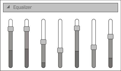
Widgets aren't just a single, opaque whole. jQuery UI widgets are structured as assemblies of parts. For instance, below is an equalizer widget. You can see it is made up of several components – the header, and individual sliders for controlling the widget:
So what are the individual parts that make up a widget? Is there a predefined set of fields that a user interface component must have in order to be considered a widget? There are no qualifying attributes that make something a widget. The fields that define a widget structure are up to the widget creator. They can have a single field and the widget does the rest, or, they can have dozens of fields that allow for a lot of flexibility and are harder to use.
Widgets can contain other widgets. These subordinate widgets can contain others, and so on. We can continue down this path, moving ever further down the ladder until we finally reach the lowest level HTML element. In practice, however, we don't want a complex widget structure that is difficult to style.
So how does the structure of a widget, or widgets in general for that matter, relate to themes? Applying a style to a standard HTML element is easy to do. However, in order to share themes, to make them portable, we need to share structure. Theme authors don't design themes for one specific application. They're intended to be used and reused with different applications. The same idea is true for widgets, jQuery UI widgets, Dojo widgets, and so on; they're all intended for reuse.
Portability is an important attribute of widgets. Applying styles to widgets, changing their look and feel, isn't all that different from styling plain old HTML elements. The difference is that the consistency with which the styles are applied to widgets remains the same across applications.
Creating styles that change the look and feel of web application is the reason CSS exists. The many presentation properties that define a style are stored in a style sheet, separate from the structural elements of the user interface. We could directly apply styles to the element as a style attribute. By doing this, we lose all portability; the style is forever bound to the element.
There is more to defining the look and feel of your application when it comes to styling user interfaces. A big part of style creation is structuring your CSS in such a way that they aren't restrictive. Let's take a closer look at what is involved with styling user interfaces.
Now that we have a general idea of what a widget is and how they relate to themes, let's create one. We're going to create a todo list widget. This widget isn't going to be built for any particular application. We want to reuse it somewhere else, should the need arise. The requirements of this todo list widget are pretty straightforward. It will display the title of the list along with the list items.
Create a new
index.htmlfile with the following content and save it:<html xmlns="http://www.w3.org/1999/xhtml"> <head> <title>Todo List</title> <link href="style.css" rel="stylesheet" type="text/css" /> </head> <body> <div id="container"> <h3 id="todo-title">TODO</h3> <ul id="todo-list"> <li>Design user interface</li> <li>Implement form validation</li> <li>Deploy</li> </ul> </div> </body> </html>In the same directory which has the
index.htmlfile, create a newstyle.cssfile and save it:#container { background: #f2f5f7; border: 3px solid #dddddd; width: 25%; padding: 3px; } #todo-title { font-family: Lucida Grande, Lucida Sans, Arial, sans-serif; color: #222222; padding-left: 5%; } #todo-list { font-family: Lucida Grande, Lucida Sans, Arial, sans-serif; font-size: 0.8em; color: #362b36; list-style-type: square; }Open
index.htmlin a web browser. In most operating systems, you should be able to right-click the file and see an option to open the file with the default browser. Alternatively, you can choose File | Open to selectindex.html:
Let's walk through the code and see exactly what we've just created.
The index.html file defines the structure of our todo list widget. The title element sets the page title to Todo List. The following link element imports the CSS file style.css. This is where the styles for our todo list widget are defined.
Inside the body tag is the actual todo list widget. The beginning of our widget is the div element with the id attribute container. Next is the todo list title. The widget title is inside the h3 element with the id attribute todo-title. Finally, the main purpose of the widget is the list of todo items. The list is the ul element with the id attribute todo-list. Inside the list are all the list items, defined with li elements.
The style.css file creates the look and feel of our todo list widget. There are three styles here that are applied to our widget.
The #container style creates a light blue background using the background property. The border is displayed as solid gray color using the border property. The width is set to 25% of the page using the width property. We give the container's contents some additional space with the padding property.
The #todo-title style sets the font of the todo list title using the font-family property. The font color is set to a dark grey using the color property. We give a little space to the left-hand side of the title using the padding-left property.
The #todo-list style sets the font the same as the #todo-title style, using the font-family property. The font size is set to be slightly smaller than normal with the font-size property. The color is a dark violet and we tell the list to use squares as the bullets.
All these styles are applied to elements by the id attribute. This is what the # symbol denotes. So the #container style applies to the outer div element of our todo list.
The styles we've just applied to our widget affect the colors of the widget in more ways than one. We set the background, the font, and the border colors of the todo list. You've probably noticed that all colors used are a variant of blue. You might call this style a blue style. The different shades of blue we've chosen complement one another. That is, different border color stands out from the background. It stands out in a complementary way. We could have chosen a different shade of blue that would have been contradictory.
Being able to identify our widget style as "blue" style is a good thing. If our widget had rounded corners, we might identify our style as a "round" style. When we can identify certain traits of a style, we're describing a theme.
This is how the pre-built themes available with jQuery UI are named. The name of each theme describes, as best as it can using a word or two, how the theme looks. For example, the darkness theme uses dark colors while the lightness theme uses light colors. Theme descriptions aren't limited to color shade, they can also describe an analogy in the real-world such as weather, sunny, or overcast. The key idea is this – your user interface styles should be unified and consistent in one way or another, be it color, textures, shapes, or something else entirely.
The font style defines has a big impact on the look and feel of the element it is applied to. Text in a user interface is one of the first things the user sees. Humans are drawn to text because it informs them of what they're looking at. If readability is important (and it is), some fonts are better suited than others for a web application.
The font type is the most effective way to change how the text is read. Our todo list widget, we set the font type using the font-family style property. We use this property to specify a list of font types we want to use in the style. It would be nice if all fonts were supported on every operating system. browsers. Sadly, this isn't the case. New fonts can be installed on your computer using operating system utilities, and some fonts will be installed automatically by applications such as Word or Photoshop. Our font type preference should be placed toward the beginning of the list.
Note
Our todo list widget styles also changed the size of the font. This is also an important property to set when readability is a concern. Fonts that are too large don't use space effectively. Fonts that are too small leave too much empty space. In both cases, they're difficult to read.
Both the font type and font size you choose to use in your styles should be consistent. Web applications shouldn't use different font families. Using different font sizes should emphasize the level of importance different sections of text have. Headings should always be larger than the rest of the text. Paragraph-level text should always be the same size. Consistent font types along with consistent font sizes are the basis for formatting text with themes.
Our todo list widget has some basic styles applied to it. We've changed the font, the background and foreground colors, as well as the border. The widget also has some spacing applied to it. These style properties changed the look and feel of the widget from something plain to something that looks appealing.
The styles were applied to the HTML elements of the todo list by ID. There is a one-to-one correspondence using this method. The #container style can only apply to page elements with a container ID. This is a limitation we can do without. Reserving a style for a single element isn't ideal when designing theme styles. This approach leads to redundancy.
Let's make some changes to our todo list example. We can start by removing some duplicate code in our style definitions. We do this by applying a style to a group of elements instead of just a single element:
Open the
style.cssfile we created in the previous todo list example and replace the contents with the following:#container { background: #f2f5f7; border: 3px solid #dddddd; width: 25%; padding: 3px; } #todo-title { color: #222222; padding-left: 5%; } #todo-list { font-size: 0.8em; color: #362b36; list-style-type: square; } h3, ul { font-family: Lucida Grande, Lucida Sans, Arial, sans-serif; }Open the
index.htmlfile from our todo list example in a web browser. You'll notice the page hasn't changed in appearance.
Let's walk through the code and see what we've done. In style.css, you'll notice we have a new style definition: h3, ul.
The h3, ul style sets the font-family property. The value of the property hasn't changed from the previous example. The font type will stay the same. This style is applied to the h3 and ul elements in our todo list widget.
The #container style hasn't changed at all. The #todo-title and #todo-list styles no longer define a font-family property. This is now handled by our new h3, ul style and is only set once instead of twice.
We saw how we can eliminate a repetitive style property. By creating a new style that is applied to more than one element, we only need to define a property once. Our todo list is a simple widget, without many parts. Imagine we had something more complex with 10 or more HTML elements. If they all shared a common style property, such as font-family, we wouldn't want to set the property ten times.
Not only is this an inconvenience for the theme author, it also leads to bugs in our styles. If we have to remember to change a property more than once to change the look and feel of a single widget, this widens the opportunity for error. Redundant style properties also lead to a larger stylesheet. Not only does it look bad, but these files need to be downloaded. Compactness is a virtue.
The new style we just added to our todo list widget, h3, ul, is actually two CSS selectors. The comma between the h3 and ul in the style definition is a separator between selectors. It tells the web browser to apply the properties of this style to each selector. Grouped styles are applied in multiple steps, in our case two. First, the h3 elements are styled, followed by the ul elements. This process repeats itself for however many selectors we have grouped together. We can have as many selectors grouped together as we please. In practice, however, we don't want more than a few because your styles will be hard to maintain.
Themes for Web user interfaces can use grouped CSS selectors to share common style properties. Our todo list widget used group selectors to set the font-family in one place, while maintaining consistency. However, group selectors have their drawbacks. We are able to remove a redundant style property from our todo list styles, but we introduced a new style. We now have four styles for our widget instead of three. This means we have another style to maintain instead of keeping the properties in an encapsulated unit. Another problem with our approach is that we're applying styles by element type instead of by ID. This means that all h3 and ul elements on the page will be affected by our style, which may not be what we want. A better approach might be to reference elements by class rather than element ID or element type.
The last changes we made to our todo list example showed us how to remove duplicate CSS properties. We have a better control of how we apply styles to our widget, if we can classify the HTML elements within. Our todo list widget has an outer container that holds the widget content. Let's see if we can use this to our advantage:
Open the
index.htmlfile we created in our todo list example and replace the contents with the following:<html xmlns="http://www.w3.org/1999/xhtml"> <head> <title>Todo List</title> <link href="style.css" rel="stylesheet" type="text/css" /> </head> <body> <div class="todo-list"> <h3>TODO</h3> <ul> <li>Design user interface</li> <li>Implement form validation</li> <li>Deploy</li> </ul> </div> </body> </html>Open the
style.cssfile we created in our todo list example and replace the contents with the following:.todo-list { font-family: Lucida Grande, Lucida Sans, Arial, sans-serif; background: #f2f5f7; border: 3px solid #dddddd; width: 25%; padding: 3px; } .todo-list h3 { color: #222222; padding-left: 5%; } .todo-list ul { font-size: 0.8em; color: #362b36; list-style-type: square; }Open the
index.htmlfile from our todo list example in a web browser. You'll notice that nothing has changed in appearance.
Let's walk through the code and see what we've changed.
In index.html, we've removed all id attributes. The container div, the title h3, and the list ul elements can no longer be referenced by ID. Instead, we've added a class attribute with the value of todo-list to the container div.
In style.css, we have three new styles for our todo list widget that have replaced the old ones. These are actually the same styles with new CSS selectors.
The .todo-list style replaces the #container style. It has the same style properties with the addition of the font-family property. We set the font-family property here because it will cascade downward, all contained elements will inherit the font style.
The .todo-list h3 style replaces the #todo-title style. It sets the color and padding-left style properties of our todo list title.
The .todo-list ul style replaces the #todo-list style. It sets the color, the font-size, and list-style-type style properties of our todo list items.
We've made some pretty drastic changes to our todo list widget with the latest modifications. We can no longer reference our elements by ID. We can, however, reference the widget HTML elements by class. This is what the dot in front of our style names denotes.
Nested selectors allow us to start with a general category and refine the selector criteria. The general category can apply style properties that are shared amongst elements nested within that general category. For instance, the .todo-list style is a general category that will select all elements with a todo-list class attribute. What if we want to define style properties for specific elements inside the .todo-list container? The general selector can is refined by adding a nesting level. The space in the selector indicates the latter element is nested in the former.
Classifying HTML elements that are widget components and using nested CSS selectors are an important aspect of theming web user interfaces. The .todo-list style ensures that the font-family property is consistent for all todo list widgets. We could take this a step further and create a class that is used not only by todo list widgets, but all widgets in our application. A generic style that applies to all widgets is the essence of theme style design.
Our todo list widget only uses two levels of nesting in its styles. This is because there are only two levels of nesting in the HTML elements that we want to style. We have a container div and directly beneath, we have a h3 and ul element. If we wanted to style the individual todo list items, we could define a style that looks like .todo-list ul li. This style has three levels of nesting and is still readable. Beyond that, things become more difficult to maintain and comprehend. Moreover, it becomes a performance problem, as the deeper the nesting, the slower the browser becomes, as it needs to drill down and apply the styles accordingly.
If you find that you're starting to add more than two or three levels of nesting to your style definitions, it's probably time to rethink your HTML structure. Alternatively, you may want to think about generalizing more style properties into a top-level CSS class that is applied to all your widgets. This is precisely how theme styles work.
Try creating a nested class style. For example, try giving the ul element in our todo list its own class. Modify the .todo-list ul style to reference the new class instead of the ul element.
How do you remove a duplicate CSS style property?
A duplicate CSS property can be reduced to a single property by creating a group selector that applies the property to multiple elements.
Simplify the HTML structure so that it doesn't require duplicate CSS properties.
Use classes instead of Ids to reference the HTML elements in your style definitions.
What are some of the drawbacks to using group selectors?
A group selector introduces new style definitions, as opposed to a smaller number of styles to maintain.
Group selectors introduce a noticeable performance loss in the web browser.
Group selectors require the same type of HTML element for each member of the group.
What is the role of a generic style when using nested selectors?
A generic, top-level style ensures consistency with style properties while the nested styles within set more specific style properties that aren't shared between the widget's elements.
Generic selectors are too limiting because the properties they define can't be overridden.
Cascading styles are only valid when they reference elements by ID.
Widgets in a web user interface aren't placed randomly on the page. Instead, they're in a predictable order, relative to other widgets. Alignment, spacing, position—these are all layout aspects that need to be considered when designing a theme.
More important than the page layout as a whole, theme layout is more concerned with the placement of HTML elements inside widgets. Our todo list widget contains HTML elements and we've given them padding. This is part of the widget layout. Here we will take a closer look at the role layout plays in themes.
Let's modify our todo list widget to include a due date. It's great to have a todo list; it's even better if it eventually gets done. We'll update our widget theme styles to position the due date element within the widget.
Open the
index.htmlfile from the previous todo list examples and replace the content with the following:<html xmlns="http://www.w3.org/1999/xhtml"> <head> <title>Todo List</title> <link href="style.css" rel="stylesheet" type="text/css" /> </head> <body> <div class="todo-list"> <div class="due-date">Due - Last Week</div> <h3>TODO</h3> <ul> <li>Design user interface</li> <li>Implement form validation</li> <li>Deploy</li> </ul> </div> </body> </html>Open the
style.cssfile from the previous todo list examples and replace the content with the following:.todo-list { font-family: Lucida Grande, Lucida Sans, Arial, sans-serif; background: #f2f5f7; border: 3px solid #dddddd; width: 25%; padding: 3px; } .todo-list h3 { color: #222222; padding-left: 5%; } .todo-list ul { font-size: 0.8em; color: #362b36; list-style-type: square; } .due-date { float: right; font-size: 0.7em; color: #362b36; }Open the
index.htmlfile in a web browser:
Let's walk through the code and see what we've changed.
In index.html, we've added a new div element that holds the due date text. This div has a class attribute due-date.
In style.css, we've created a new style, .due-date. This style sets the float property to right. This will position the due date div to the right-hand side of the todo list container div. The font-size property is set to be slightly smaller than the rest of the font in the widget and the color is set to be the same as the list items.
We've positioned the new feature of our todo list widget, the due date, in the top right-hand side corner. The positioning of this new element is the responsibility of the theme. Before the due date was added, our todo list elements were positioned by the HTML that defines them. Here we're using the float property to move the element to the right of the containing element. If we hadn't specified this property in our theme styles, the due date would be displayed to the left-hand side and above the todo list title.
Note
The float CSS property is a good way to position HTML elements, especially for those that are the constituents of widgets. If there isn't room to position the element to the right-hand side, it will be pushed downward.
We're not restricted in how we choose to position elements in our themes. There are several ways we could have placed the due date where we did. The nice thing about the float property is that there aren't any pixel or percentage values, which increase the chance for inconsistency.
Users don't want to use an application with inconsistent user interface layouts. When a layout is inconsistent, we lose the predictability of where widgets can be found. Once you've been using an application for a day or two, you become familiar with where things are located. This familiarization takes longer if one widget is aligned differently from another widget. For instance, if we had another widget with a due date that was aligned to the left-hand side, this would be hard to digest.
This is where layout in themes come into play. If we were to create another widget that had a due date, we would want to use the .due-date style we created for our todo list widget. The due date in other widgets would get the some fonts, the same colors, but it would also get the layout. This is something that is difficult to get right when trying to align elements in a consistent way using HTML alone.
Try changing the positioning in the .due-date style. For example, the requirements of your theme have changed—the due date for todo list widgets should always be displayed in the bottom right-hand side corner. (Hint: you may need to use position: relative in the .due-date style).
How is using the float property beneficial in comparison to other positioning properties?
The
floatproperty positions elements relative to their container element. This negates the need for pixel or percentage values and reduces the chance of human error.The
floatproperty can only be expressed as a percentage; this is a more accurate way of positioning elements.The
floatproperty has better browser support than other positioning properties such as left and top.
Why is it better to position widget elements in a CSS theme instead of in the HTML?
Different widgets in a user interface can share a style, including layout properties. This makes it easier for theme authors to create a consistent layout.
Themes shouldn't define any layout information, only colors.
Theme layout is the the most important part of a theme, everything else is secondary.
Now that we have a better understanding of what widgets and themes are, and how they relate to one another, we can take a look at the jQuery UI JavaScript framework.
jQuery UI is actually two sub-frameworks. A widget framework consisting of a widget factory and a set of commonly used widgets. A CSS framework that defines the look and feel of all widgets created with the latter. The CSS framework provides the basis to create themes, in addition to the themes that ship with jQuery UI, and is the basis of this book.
The jQuery UI widget framework has a selection of widgets we can choose from. These widgets are general enough to be used in most application categories such as finance or e-commerce. For instance, the tabs widget is useful for navigating the logical sections of your application. The button widget is universally recognized as an action taking place when clicked.
We can also use the widget framework to define our own widgets. For instance, our todo list widget we've been working with in this chapter could be created as a jQuery UI widget by using the widget factory . We can also use the widget factory to extend the capabilities of the existing widgets. For example, we could extend the progress bar widget to behave differently when the user hovers over it.
The jQuery UI CSS framework is a collection of styles. What makes this set of styles a framework is the naming convention used. Each style in the framework is defined as a CSS class. So while these styles can be applied to any element in a web page, they were designed with the intent of being applied to widgets created using the framework.
The naming conventions used by the CSS classes in the framework are how jQuery UI themes are able to function in any jQuery UI application. A widget created with the jQuery UI widget framework has one or more CSS framework classes assigned to its HTML elements. This is how widgets get their look and feel.
Any jQuery UI widget is theme-ready. That is, it honors styles defined within the constraints of the CSS framework. This is only possible because of the separation of the widget and CSS framework. If the styles of each widget were defined in the widgets themselves, it would be difficult, if not impossible, to change the look and feel of the application.
When it comes time to change themes in a jQuery UI application, the widgets aren't even aware that this has happened. The theme is separated into an entirely different layer from that of the widgets. If our todo list widget were to change themes, there would be a lot of work to do. The first problem is that there is no indication that it is actually a widget that is theme-ready. We have to manually ensure that the HTML elements of the widget have the correct classes.
In this chapter, we learned a lot about widgets, themes, and styles in general. These are essential ingredients for creating themeable user interfaces. Widgets are the structural components that user interfaces are made of. Styles change the look and feel of widgets in addition to the layout of the widget elements.
Adding styles to widgets presents problems with consistency and portability. We've seen different ways we can improve our CSS so that we can avoid duplicate property definitions by grouping selectors. We can further increase style reuse by moving CSS properties to a base class and nesting more specific properties within it.
Layout also plays a role in designing themes. The individual HTML elements that make up a widget need to be positioned properly and given appropriate space. These are all things that should be controlled by the theme styles. The HTML structure says what the widget has, while the theme says where it goes.
The jQuery UI framework helps us with all concepts learned in this chapter. The two sub-frameworks provided by jQuery UI give us widgets as well as a CSS framework we can use to create our own themes.
In the next chapter, we'll dig a little deeper into how jQuery UI theming works and get hands-on examples and experience with the framework.