Data Visualization with Matplotlib and Seaborn
Data visualization is undoubtedly an integral part of any data pipeline. Good visualizations can not only help scientists and researchers find unique insights about their data, but also help convey complex, advanced ideas in an intuitive, easy to understand way. In Python, the backend of most of the data visualization tools is connected to the Matplotlib library, which offers an incredibly wide range of options and functionalities, as we will see in this upcoming discussion.
First, to install Matplotlib, simply run either of the following commands, depending on which one is your Python package manager:
$ pip install matplotlib
$ conda install matplotlib
The convention in Python is to import the pyplot package from the Matplotlib library, like so:
>>> import matplotlib.pyplot as plt
This pyplot package, whose alias is now plt, is the main workhorse for any visualization functionality in Python and will therefore be used extensively.
Overall, instead of learning about the theoretical background of the library, in this section, we will take a more hands-on approach and go through a number of different visualization options that Matplotlib offers. In the end, we will obtain practical takeaways that will be beneficial for your own projects in the future.
Scatter Plots
One of the most fundamental visualization methods is a scatter plot – plotting a list of points on a plane (or other higher-dimensional spaces). This is simply done by means of the plt.scatter() function. As an example, say we have a list of five points, whose x- and y-coordinates are stored in the following two lists, respectively:
>>> x = [1, 2, 3, 1.5, 2]
>>> y = [-1, 5, 2, 3, 0]
Now, we can use the plt.scatter() function to create a scatter plot:
>>> import matplotlib.pyplot as plt
>>> plt.scatter(x, y)
>>> plt.show()
The preceding code will generate the following plot, which corresponds exactly to the data in the two lists that we fed into the plt.scatter() function:
Figure 2.3: Scatter plot using Matplotlib
Note the plt.show() command at the end of the code snippet. This function is responsible for displaying the plot that is customized by the preceding code, and it should be placed at the very end of a block of visualization-related code.
As for the plt.scatter() function, there are arguments that we can specify to customize our plots further. For example, we can customize the size of the individual points, as well as their respective colors:
>>> sizes = [10, 40, 60, 80, 100]
>>> colors = ['r', 'b', 'y', 'g', 'k']
>>> plt.scatter(x, y, s=sizes, c=colors)
>>> plt.show()
The preceding code produces the following output:
Figure 2.4: Scatter plots with size and color customization
This functionality is useful when the points you'd like to visualize in a scatter plot belong to different groups of data, in which case you can assign a color to each group. In many cases, clusters formed by different groups of data are discovered using this method.
Note
To see a complete documentation of Matplotlib colors and their usage, you can consult the following web page: https://matplotlib.org/2.0.2/api/colors_api.html.
Overall, scatter plots are used when we'd like to visualize the spatial distribution of the data that we are interested in. A potential goal of using a scatter plot is to reveal any clustering existing within our data, which can offer us further insights regarding the relationship between the attributes of our dataset.
Next, let's consider line graphs.
Line Graphs
Line graphs are another of the most fundamental visualization methods, where points are plotted along a curve, as opposed to individually scattered. This is done via the simple plt.plot() function. As an example, we are plotting out the sine wave (from 0 to 10) in the following code:
>>> import numpy as np
>>> x = np.linspace(0, 10, 1000)
>>> y = np.sin(x)
>>> plt.plot(x, y)
>>> plt.show()
Note that here, the np.linspace() function returns an array of evenly spaced numbers between two endpoints. In our case, we obtain 1,000 evenly spaced numbers between 0 and 10. The goal here is to take the sine function on these numbers and plot them out. Since the points are extremely close to one another, it will create the effect that a true smooth function is being plotted.
This will result in the following graph:
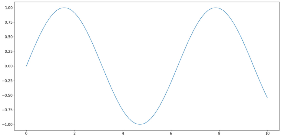
Figure 2.5: Line graphs using Matplotlib
Similar to the options for scatter plots, here, we can customize various elements for our line graphs, specifically the colors and styles of the lines. The following code, which is plotting three separate curves (the y = x graph, the natural logarithm function, and the sine wave), provides an example of this:
x = np.linspace(1, 10, 1000)
linear_line = x
log_curve = np.log(x)
sin_wave = np.sin(x)
curves = [linear_line, log_curve, sin_wave]
colors = ['k', 'r', 'b']
styles = ['-', '--', ':']
for curve, color, style in zip(curves, colors, styles):
    plt.plot(x, curve, c=color, linestyle=style)
plt.show()
The following output is produced by the preceding code:
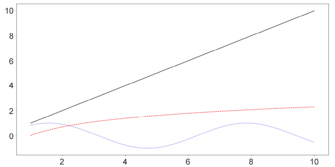
Figure 2.6: Line graphs with style customization
Note
A complete list of line styles can be found in Matplotlib's official documentation, specifically at the following page: https://matplotlib.org/3.1.0/gallery/lines_bars_and_markers/linestyles.html.
Generally, line graphs are used to visualize the trend of a specific function, which is represented by a list of points sequenced in order. As such, this method is highly applicable to data with some sequential elements, such as a time series dataset.
Next, we will consider the available options for bar graphs in Matplotlib.
Bar Graphs
Bar graphs are typically used to represent the counts of unique values in a dataset via the height of individual bars. In terms of implementation in Matplotlib, this is done using the plt.bar() function, as follows:
labels = ['Type 1', 'Type 2', 'Type 3']
counts = [2, 3, 5]
plt.bar(labels, counts)
plt.show()
The first argument that the plt.bar() function takes in (the labels variable, in this case) specifies what the labels for the individual bars will be, while the second argument (counts, in this case) specifies the height of the bars. With this code, the following graph is produced:
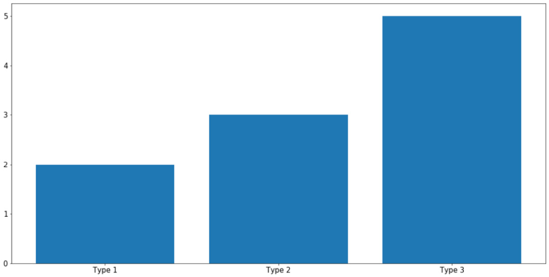
Figure 2.7: Bar graphs using Matplotlib
As always, you can specify the colors of individual bars using the c argument. What is more interesting to us is the ability to create more complex bar graphs with stacked or grouped bars. Instead of simply comparing the counts of different data, stacked or grouped bars are used to visualize the composition of each bar in smaller subgroups.
For example, let's say within each group of Type 1, Type 2, and Type 3, as in the previous example, we have two subgroups, Type A and Type B, as follows:
type_1 = [1, 1]  # 1 of type A and 1 of type B
type_2 = [1, 2]  # 1 of type A and 2 of type B
type_3 = [2, 3]  # 2 of type A and 3 of type B
counts = [type_1, type_2, type_3]
In essence, the total counts for Type 1, Type 2, and Type 3 are still the same, but now each can be further broken up into two subgroups, represented by the 2D list counts. In general, the types here can be anything; our goal is to simply visualize this composition of the subgroups within each large type using a stacked or grouped bar graph.
First, we aim to create a grouped bar graph; our goal is the following visualization:
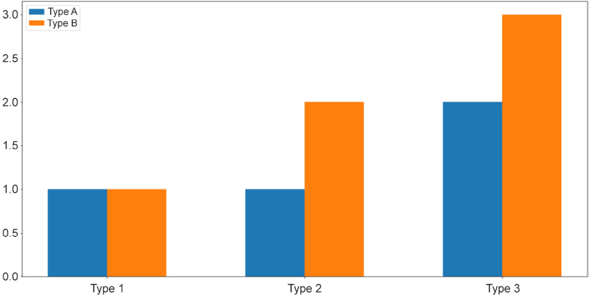
Figure 2.8: Grouped bar graphs
This is a more advanced visualization, and the process of creating the graph is thus more involved. First, we need to specify the individual locations of the grouped bars and their width:
locations = np.array([0, 1, 2])
width = 0.3
Then, we call the plt.bar() function on the appropriate data: once on the Type A numbers ([my_type[0] for my_type in counts], using list comprehension) and once on the Type B numbers ([my_type[1] for my_type in counts]):
bars_a = plt.bar(locations - width / 2,   [my_type[0] for my_type in counts], width=width)
bars_b = plt.bar(locations + width / 2,   [my_type[1] for my_type in counts], width=width)
The terms locations - width / 2 and locations + width / 2 specify the exact locations of the Type A bars and the Type B bars, respectively. It is important that we reuse this width variable in the width argument of the plt.bar() function so that the two bars of each group are right next to each other.
Next, we'd like to customize the labels for each group of bars. Additionally, note that we are also assigning the returned values of the calls to plt.bar() to two variables, bars_a and bars_b, which will then be used to generate the legend for our graph:
plt.xticks(locations, ['Type 1', 'Type 2', 'Type 3'])
plt.legend([bars_a, bars_b], ['Type A', 'Type B'])
Finally, as we call plt.show(), the desired graph will be displayed.
So, that is the process of creating a grouped bar graph, where individual bars belonging to a group are placed next to one another. On the other hand, a stacked bar graph places the bars on top of each other. These two types of graphs are mostly used to convey the same information, but with stacked bars, the total counts of each group are easier to visually inspect and compare.
To create a stacked bar graph, we take advantage of the bottom argument of the plt.bar() function while declaring the non-first groups. Specifically, we do the following:
bars_a = plt.bar(locations, [my_type[0] for my_type in counts])
bars_b = plt.bar(locations, [my_type[1] for my_type in counts], \
                 bottom=[my_type[0] for my_type in counts])
plt.xticks(locations, ['Type 1', 'Type 2', 'Type 3'])
plt.legend([bars_a, bars_b], ['Type A', 'Type B'])
plt.show()
The preceding code will create the following visualization:
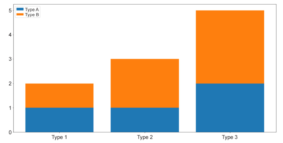
Figure 2.9: Stacked bar graphs
And that concludes our introduction to bar graphs in Matplotlib. Generally, these types of graph are used to visualize the counts or percentages of different groups of values in a categorical attribute. As we have observed, Matplotlib offers extendable APIs that can help generate these graphs in a flexible way.
Now, let's move on to our next visualization technique: histograms.
Histograms
A histogram is a visualization that places multiple bars together, but its connection to bar graphs ends there. Histograms are usually used to represent the distribution of values within an attribute (a numerical attribute, to be more precise). Taking in an array of numbers, a histogram should consist of multiple bars, each spanning across a specific range to denote the amount of numbers belonging to that range.
Say we have an attribute in our dataset that contains the sample data stored in x. We can call plt.hist() on x to plot the distribution of the values in the attribute like so:
x = np.random.randn(100)
plt.hist(x)
plt.show()
The preceding code produces a visualization similar to the following:
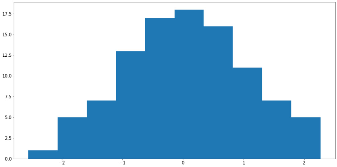
Figure 2.10: Histogram using Matplotlib
Note
Your output might somewhat differ from what we have here, but the general shape of the histogram should be the same—a bell curve.
It is possible to specify the bins argument in the plt.hist() function (whose default value is 10) to customize the number of bars that should be generated. Roughly speaking, increasing the number of bins decreases the width of the range each bin spans across, thereby improving the granularity of the histogram.
However, it is also possible to use too many bins in a histogram and achieve a bad visualization. For example, using the same variable, x, we can do the following:
plt.hist(x, bins=100)
plt.show()
The preceding code will produce the following graph:
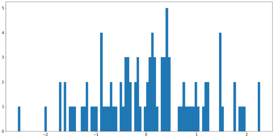
Figure 2.11: Using too many bins in a histogram
This visualization is arguably worse than the previous example as it causes our histogram to become fragmented and non-continuous. The easiest way to address this problem is to increase the ratio between the size of the input data and the number of bins, either by having more input data or using fewer bins.
Histograms are also quite useful in terms of helping us to compare the distributions of more than one attribute. For example, by adjusting the alpha argument (which specifies the opaqueness of a histogram), we can overlay multiple histograms in one graph so that their differences are highlighted. This is demonstrated by the following code and visualization:
y = np.random.randn(100) * 4 + 5
plt.hist(x, color='b', bins=20, alpha=0.2)
plt.hist(y, color='r', bins=20, alpha=0.2)
plt.show()
The output will be as follows:
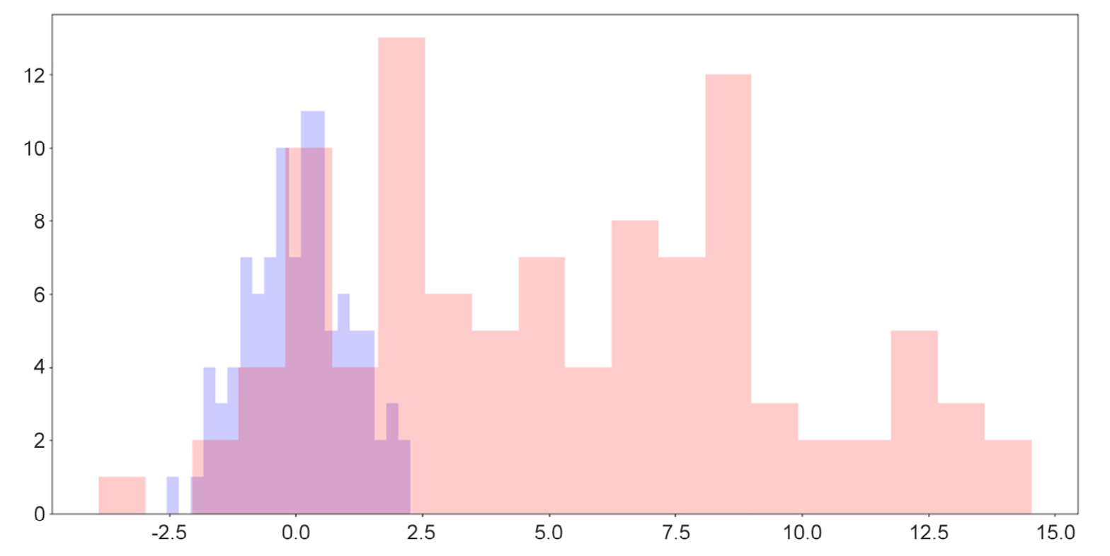
Figure 2.12: Overlaid histograms
Here, we can see that while the two distributions have roughly similar shapes, one is to the right of the other, indicating that its values are generally greater than the values of the attribute on the left.
One useful fact for us to note here is that when we simply call the plt.hist() function, a tuple containing two arrays of numbers is returned, denoting the locations and heights of individual bars in the corresponding histogram, as follows:
>>> plt.hist(x)
(array([ 9.,  7., 19., 18., 23., 12.,  6.,  4.,  1.,  1.]),
    array([-1.86590701, -1.34312205, -0.82033708, -0.29755212,
            0.22523285, 0.74801781,  1.27080278,  1.79358774,
            2.31637271,  2.83915767, 3.36194264]),
  <a list of 10 Patch objects>)
The two arrays include all the histogram-related information about the input data, processed by Matplotlib. This data can then be used to plot out the histogram, but in some cases, we can even store the arrays in new variables and use these statistics to perform further analysis on our data.
In the next section, we will move on to the final type of visualization we will be discussing in this chapter: heatmaps.
Heatmaps
A heatmap is generated with a 2D array of numbers, where numbers with high values correspond to hot colors, and low-valued numbers correspond to cold colors. With Matplotlib, a heatmap is created with the plt.imshow() function. Let's say we have the following code:
my_map = np.random.randn(10, 10)
plt.imshow(my_map)
plt.colorbar()
plt.show()
The preceding code will produce the following visualization:
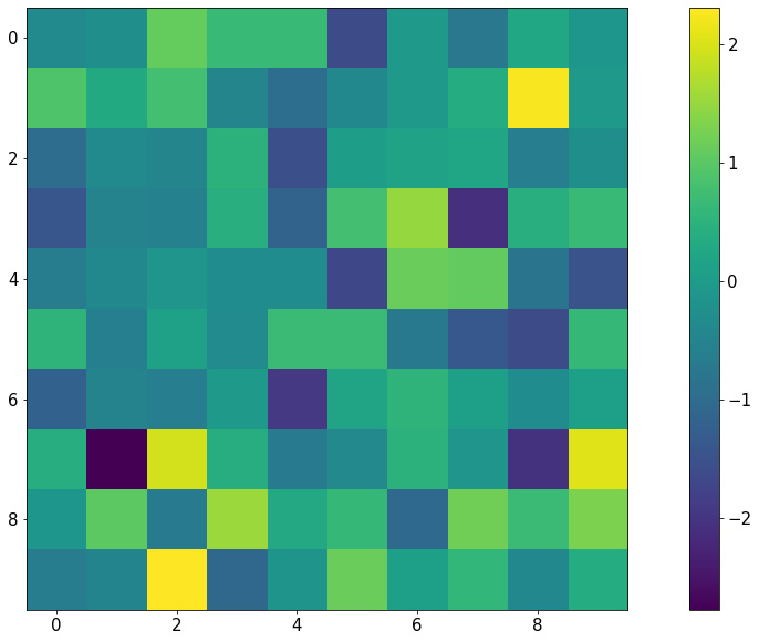
Figure 2.13: Heatmap using Matplotlib
Notice that with this representation, any group structure in the input 2D array (for example, if there is a block of cells whose values are significantly greater than the rest) will be effectively visualized.
An important use of heatmaps is when we consider the correlation matrix of a dataset (which is a 2D array containing a correlation between any given pair of attributes within the dataset). A heatmap will be able to help us pinpoint any and all attributes that are highly correlated to one another.
This concludes our final topic of discussion in this section regarding the visualization library, Matplotlib. The next exercise will help us consolidate the knowledge that we have gained by means of a hands-on example.
Exercise 2.04: Visualization of Probability Distributions
As we briefly mentioned when we talked about sampling, probability distributions are mathematical objects widely used in statistics and machine learning to model real-life data. While a number of probability distributions can prove abstract and complicated to work with, being able to effectively visualize their characteristics is the first step to understanding their usage.
In this exercise, we will apply some visualization techniques (histogram and line plot) to compare the sampling functions from NumPy against their true probability distributions. For a given probability distribution, the probability density function (also known as the PDF) defines the probability of any real number according to that distribution. The goal here is to verify that with a large enough sample size, NumPy's sampling function gives us the true shape of the corresponding PDF for a given probability distribution.
Perform the following steps to complete this exercise:
- From your Terminal, that is, in your Python environment (if you are using one), install the SciPy package. You can install it, as always, using pip:
$ pip install scipy
To install SciPy using Anaconda, use the following command:
$ conda install scipy
SciPy is another popular statistical computing tool in Python. It contains a simple API for PDFs of various probability distributions that we will be using. We will revisit this library in the next chapter.
- In the first code cell of a Jupyter notebook, import NumPy, the
statspackage of SciPy, and Matplotlib, as follows:import numpy as np import scipy.stats as stats import matplotlib.pyplot as plt
- In the next cell, draw 1,000 samples from the normal distribution with a mean of
0and a standard deviation of1using NumPy:samples = np.random.normal(0, 1, size=1000)
- Next, we will create a
np.linspacearray between the minimum and the maximum of the samples that we have drawn, and finally call the true PDF on the numbers in the array. We're doing this so that we can plot these points in a graph in the next step:x = np.linspace(samples.min(), samples.max(), 1000) y = stats.norm.pdf(x)
- Create a histogram for the drawn samples and a line graph for the points obtained via the PDF. In the
plt.hist()function, specify thedensity=Trueargument so that the heights of the bars are normalized to probabilistic values (numbers between 0 and 1), thealpha=0.2argument to make the histogram lighter in color, and thebins=20argument for a greater granularity for the histogram:plt.hist(samples, alpha=0.2, bins=20, density=True) plt.plot(x, y) plt.show()
The preceding code will create (roughly) the following visualization:

Figure 2.14: Histogram versus PDF for the normal distribution
We can see that the histogram for the samples we have drawn fits quite nicely with the true PDF of the normal distribution. This is evidence that the sampling function from NumPy and the PDF function from SciPy are working consistently with each other.
Note
To get an even smoother histogram, you can try increasing the number of bins in the histogram.
- Next, we will create the same visualization for the Beta distribution with parameters (2, 5). For now, we don't need to know too much about the probability distribution itself; again, here, we only want to test out the sampling function from NumPy and the corresponding PDF from SciPy.
In the next code cell, follow the same procedure that we followed previously:
samples = np.random.beta(2, 5, size=1000)
x = np.linspace(samples.min(), samples.max(), 1000)
y = stats.beta.pdf(x, 2, 5)
plt.hist(samples, alpha=0.2, bins=20, density=True)
plt.plot(x, y)
plt.show()
This will, in turn, generate the following graph:

Figure 2.15: Histogram versus PDF for the Beta distribution
- Create the same visualization for the Gamma distribution with parameter α = 1:
samples = np.random.gamma(1, size=1000)
x = np.linspace(samples.min(), samples.max(), 1000)
y = stats.gamma.pdf(x, 1)
plt.hist(samples, alpha=0.2, bins=20, density=True)
plt.plot(x, y)
plt.show()
The following visualization is then plotted:

Figure 2.16: Histogram versus PDF for the Gamma distribution
Throughout this exercise, we have learned to combine a histogram and a line graph to verify a number of probability distributions implemented by NumPy and SciPy. We were also briefly introduced to the concept of probability distributions and their probability density functions.
Note
To access the source code for this specific section, please refer to https://packt.live/3eZrEbW.
You can also run this example online at https://packt.live/3gmjLx8.
This exercise serves as the conclusion for the topic of Matplotlib. In the next section, we will end our discussion in this chapter by going through a number of shorthand APIs, provided by Seaborn and pandas, to quickly create complex visualizations.
Visualization Shorthand from Seaborn and Pandas
First, let's discuss the Seaborn library, the second most popular visualization library in Python after Matplotlib. Though still powered by Matplotlib, Seaborn offers simple, expressive functions that can facilitate complex visualization methods.
After successfully installing Seaborn via pip or Anaconda, the convention programmers typically use to import the library is with the sns alias. Now, say we have a tabular dataset with two numerical attributes, and we'd like to visualize their respective distributions:
x = np.random.normal(0, 1, 1000)
y = np.random.normal(5, 2, 1000)
df = pd.DataFrame({'Column 1': x, 'Column 2': y})
df.head()
Normally, we can create two histograms, one for each attribute that we have. However, we'd also like to inspect the relationship between the two attributes themselves, in which case we can take advantage of the jointplot() function in Seaborn. Let's see this in action:
import seaborn as sns
sns.jointplot(x='Column 1', y='Column 2', data=df)
plt.show()
As you can see, we can pass in a whole DataFrame object to a Seaborn function and specify the elements to be plotted in the function arguments. This process is arguably less painstaking than passing in the actual attributes we'd like to visualize using Matplotlib.
The following visualization will be generated by the preceding code:
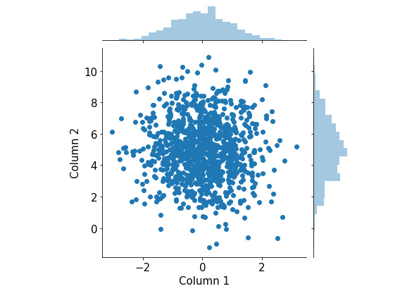
Figure 2.17: Joint plots using Seaborn
This visualization consists of a scatter plot for the two attributes and their respective histograms attached to the appropriate axes. From here, we can observe the distribution of individual attributes that we put in from the two histograms, as well as their joint distribution from the scatter plot.
Again, because this is a fairly complex visualization that can offer significant insights into the input data, it can be quite difficult to create manually in Matplotlib. What Seaborn succeeds in doing is building a pipeline for these complex but valuable visualization techniques and creating simple APIs to generate them.
Let's consider another example. Say we have a larger version of the same student dataset that we considered in Exercise 2.03, The Student Dataset, which looks as follows:
student_df = pd.DataFrame({
    'name': ['Alice', 'Bob', 'Carol', 'Dan', 'Eli', 'Fran', \
             'George', 'Howl', 'Ivan', 'Jack', 'Kate'],\
    'gender': ['female', 'male', 'female', 'male', \
               'male', 'female', 'male', 'male', \
               'male', 'male', 'female'],\
    'class': ['JR', 'SO', 'SO', 'SO', 'JR', 'SR', \
              'FY', 'SO', 'SR', 'JR', 'FY'],\
    'gpa': [90, 93, 97, 89, 95, 92, 90, 87, 95, 100, 95],\
    'num_classes': [4, 3, 4, 4, 3, 2, 2, 3, 3, 4, 2]})
Now, we'd like to consider the average GPA of the students we have in the dataset, grouped by class. Additionally, within each class, we are also interested in the difference between female and male students. This description calls for a grouped/stacked bar plot, where each group corresponds to a class and is broken into female and male averages.
With Seaborn, this is again done with a one-liner:
sns.catplot(x='class', y='gpa', hue='gender', kind='bar', \
            data=student_df)
plt.show()
This generates the following plot (notice how the legend is automatically included in the plot):
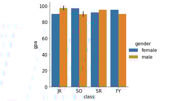
Figure 2.18: Grouped bar graph using Seaborn
In addition to Seaborn, the pandas library itself also offers unique APIs that directly interact with Matplotlib. This is generally done via the DataFrame.plot API. For example, still using our student_df variable we used previously, we can quickly generate a histogram for the data in the gpa attribute as follows:
student_df['gpa'].plot.hist()
plt.show()
The following graph is then created:
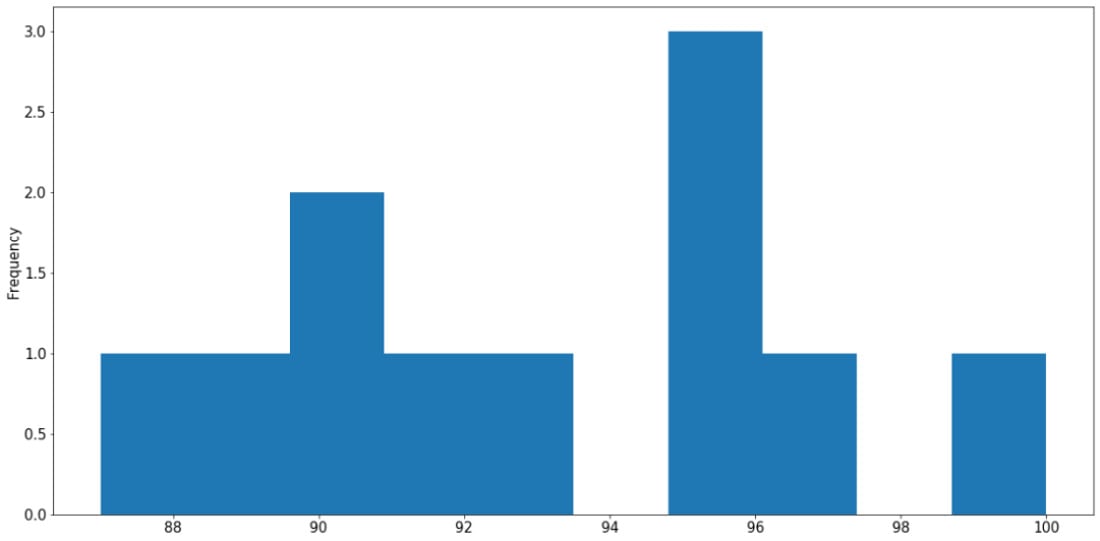
Figure 2.19: Histogram using pandas
Say we are interested in the percentage breakdown of the classes (that is, how much of a portion each class is with respect to all students). We can generate a pie chart from the class count (obtained via the value_counts() method):
student_df['class'].value_counts().plot.pie()
plt.show()
This results in the following output:
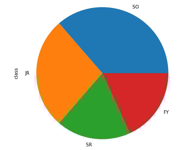
Figure 2.20: Pie chart from pandas
Through these examples, we have an idea of how Seaborn and Matplotlib streamline the process of creating complex visualizations, especially for DataFrame objects, using simple function calls. This clearly demonstrates the functional integration between various statistical and scientific tools in Python, making it one of the most, if not the most, popular modern scientific computing languages.
That concludes the material to be covered in the second chapter of this book. Now, let's go through a hands-on activity with a real-life dataset.
Activity 2.01: Analyzing the Communities and Crime Dataset
In this activity, we will practice some basic data processing and analysis techniques on a dataset available online called Communities and Crime, with the hope of consolidating our knowledge and techniques. Specifically, we will process missing values in the dataset, iterate through the attributes, and visualize the distribution of their values.
First, we need to download this dataset to our local environment, which can be accessed on this page: https://packt.live/31C5yrZ
The dataset should have the name CommViolPredUnnormalizedData.txt. From the same directory as this dataset text file, create a new Jupyter notebook. Now, perform the following steps:
- As a first step, import the libraries that we will be using: pandas, NumPy, and Matplotlib.
- Read in the dataset from the text file using pandas and print out the first five rows by calling the
head()method on theDataFrameobject. - Loop through all the columns in the dataset and print them out line by line. At the end of the loop, also print out the total number of columns.
- Notice that missing values are indicated as
'?'in different cells of the dataset. Call thereplace()method on theDataFrameobject to replace that character withnp.nanto faithfully represent missing values in Python. - Print out the list of columns in the dataset and their respective numbers of missing values using
df.isnull().sum(), wheredfis the variable name of theDataFrameobject. - Using the
df.isnull().sum()[column_name]syntax (wherecolumn_nameis the name of the column we are interested in), print out the number of missing values in theNumStreetandPolicPerPopcolumns. - Compute a
DataFrameobject that contains a list of values in thestateattribute and their respective counts. Then, use theDataFrame.plot.bar()method to visualize that information in a bar graph. - Observe that, with the default scale of the plot, the labels on the x-axis are overlapping. Address this problem by making the plot bigger with the
f, ax = plt.subplots(figsize=(15, 10))command. This should be placed at the beginning of any plotting commands. - Using the same value count
DataFrameobject that we used previously, call theDataFrame.plot.pie()method to create a corresponding pie chart. Adjust the figure size to ensure that the labels for your graph are displayed correctly. - Create a histogram representing the distribution of the population sizes in areas in the dataset (included in the
populationattribute). Adjust the figure size to ensure that the labels for your graph are displayed correctly.
Figure 2.21: Histogram for population distribution
- Create an equivalent histogram to visualize the distribution of household sizes in the dataset (included in the
householdsizeattribute).
Figure 2.22: Histogram for household size distribution
Note
The solution for this activity can be found via this link.