Chapter 2. Working with Out-of-the-box Charts
In the previous chapter, we saw how one can create a chart using the Sencha Charts Surface API. The only issue is that Surface is still a very low-level API providing drawing primitives, which can be used to create any drawing, including charts. We will have to write a lot of code to create a chart using these drawing primitives, handling events, resizing charts, data binding, theming, and so on.
In this chapter, we will move up in terms of API abstraction and look at the chart-related API, which we can use for visual presentation. In this chapter, you will learn the following topics:
Creating cartesian charts—line, bar, area charts
Creating polar charts—pie chart
Creating spacefilling charts—gauge chart
Theming your charts
Engaging users with gestures
Sencha Charts supports the following types of charts:
Cartesian charts: These charts are based on a two-dimensional coordinate system or the cartesian coordinate system. This is where the position of a point is determined based on its (x, y) coordinate. Typical examples are area charts, bar charts, and line charts.
Polar charts: These charts are based on the polar coordinate system. This is a two-dimensional coordinate system where the position of a point in the plane is determined based on its distance from a fixed point and angle from a fixed direction. Typical examples are Pie and Radar.
Spacefilling charts: These charts fill the entire space/area of the chart. For example, Treemap and Gauge.
The following screenshot shows the different types of Sencha Charts:
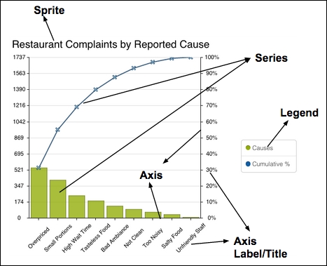
A chart has different areas. Each area has its own name. These names will act as the terminology that Sencha Charts will use and they will be used throughout this book. The following diagram depicts a cartesian chart created using Sencha Charts with its different areas:
Let's take a look at a few of the terminologies highlighted in the preceding figure:
Sprite: This is an object that is rendered on a drawing surface—Ext.draw.Surface—which we discussed in the previous chapter. Sencha Charts offers many different types of sprite, such as arc, circle, rectangle, path, and text, all of which are used internally to create different types of chart. They can also be added directly to a chart. In the preceding diagram, a text sprite is used to show the chart title.
Series: This class is very specific to the type of chart that we want to draw. For example, Sencha Charts uses area series to draw area charts, whereas bar series draw bar charts. Based on the samples/data, the series...
Creating a cartesian chart
We will start by making a cartesian chart. A cartesian chart must have axes and a series along with the dataset:
Create a project using Sencha Cmd with SCE as the application name.
Edit the app/view/main/Main.js file and replace its contents with the following code to create a cartesian chart that shows quarterly sales and quarterly orders:
Pie and Radar are out-of-the-box polar charts provided by Sencha Charts. These charts use the polar coordinate system to draw sprites. Pie series does not require an axes configuration. However, Radar series does require axes configuration, one radial and another angular.
Let's see how we create a polar chart with a pie series.
Create a project using Sencha Cmd with SCE as the application name. Edit the app/view/main/Main.js file and replace its contents with the following code:
Creating a spacefilling chart
A spacefilling chart does not have a coordinate requirement. It occupies the available area with the chart. Treemap, heatmap, and gauge charts are some examples. Treemap and heatmap charts do not come with Sencha Charts. Gauges, however, does come along with it. Let's see how to use it in an application.
Create a project using Sencha Cmd with SCE as the application name. Edit the app/view/main/Main.js file and replace its contents with the following code:
The preceding code uses a spacefilling chart component to show a gauge with a needle.
The following output is produced...
By default, Sencha Charts uses a theme to draw series, axis, labels, and legends. This is the reason we did not have to provide any color or style related configuration to the charts that we created in the earlier topics.
This default theme may not be suitable for your application because the colors do not gel well with your application theme. There are three ways in which we can theme our chart:
Using various style-related configurations: Sencha Charts provides various configurations at different levels to style different sections of a chart. For example, the chart component has configurations such as background, cls, gradients, and style. Similarly, axis has background, grid, style, and renderer. Series has background, animation, colors, markerSubStyle, style, subStyle, useDarkerStrokeColor and renderer. Likewise, label has display, color, font, orientation, and renderer configurations to style it.
Creating a custom theme and applying it to the chart: In this approach...
Engaging users with gestures
Now, we are able to create some great looking charts and style them with our Awesome theme. However, it would be great if we could enable our users to interact with the chart, so they can get more information out of the presentation. For example, to figure out the sales amount for Q2, the user would have to look at the x axis and y axis labels to get the Q2 sales figure. However, if we can intercept the mouseover event on the bar and show the information in a tooltip, getting the same information is quicker.
Sencha Charts provides interactions to build interactivity in your chart. This is implemented by the base abstract class, Ext.chart.interactions.Abstract.
There are various built-in interactions implemented by the framework that we can leverage, such as Crosshair, CrossZoom, ItemHighlight, ItemInfo, PanZoom, Rotate, and RotatePie3D. While Crosshair, CrossZoom, and PanZoom interactions apply to cartesian charts, Rotate applies to polar charts, ItemHighlight...
In this chapter, we discussed the subclasses of the Ext.chart.AbstractChart API—CartesianChart, PolarChart, and SpaceFillingChart—which provide much better abstraction for charting as compared to the low-level Ext.draw.Surface API that we saw in the previous chapter. We looked at the three concrete implementations of the AbstractChart API—CartesianChart, PolarChart, and SpaceFillingChart—and discussed their specific behavior and how we can use them in our application to create different charts. In the latter half of the chapter, we looked at the different ways to style or theme a chart and you learned how to define a custom theme and use the same on a chart. Finally, we made our chart interactive using interactions and tooltip.
In the next chapter, we will delve deeper into the Sencha Charts package and learn its architecture.