Chapter 7. QlikView Inventory Analysis
In this chapter, we will cover the QlikView Inventory tab in the CFO example dashboard for ideas to use in tracking and reporting on Inventory. We will do the following things:
Teach you more about good and bad design choices in dashboard design
Investigate the potential KPI measure: Inventory Turns
Examine the nuts and bolts of the Inventory tab of the CFO example dashboard
Reopening the CFO dashboard
We are going to start with the Inventory sheet of the Executive Dashboard.qvw from the examples we downloaded when we installed QlikView. If it is not open, open it now and navigate to the Inventory tab:
Open QlikView if it is not open already.
Using the File | Open menu in QlikView, navigate to Program Files| QlikView | Examples | Documents and double-click Executive Dashboard.qvw to open it.
Select the last tab: the Inventory tab.
Delving into the four-quadrant layout
Right away, we notice that not only are the controls laid out intuitively like the other tabs, but also this page has a nice four-quadrant layout that is similar to the look we created when we created our new Sales Analysis tab. Four-quadrant layouts are often the easiest visualization for human beings to mentally organize. Each quadrant is essentially the same size, implying that they are of equal importance in the information they provide. More than a handful of items on a single page requires too much thought to quickly prioritize. Humans who are taught to read from left to right will also tend to assume that the upper left-hand side quadrant is the most important. This dashboard is definitely organized to display the most important pieces of information on the top row, but the left-hand bar graph requires more time to register what it represents and to interpret, while the right-hand table, though not as pretty, certainly draws your eyes because...
The good and bad of the Inventory tab
In the left-hand side upper-horizontal bar chart that we have been looking at, we can see Inventory Turns in orange and the total Value of the stock in blue. We also have a vertical bar to establish an average inventory value that we would like to maintain. At least, we assume that is what the bar represents since it is the same color as the horizontal Value bar and since it has the Target label next to it in the same color. Unfortunately, to see all the product lines, we need to use a scrollbar. Perhaps we should either forego the bottom row to add room to display everything, or group our product lines into a few high-level groups that can then be drilled down on for detail.
For example, if I use the bar graph, I can see Dairy, and it stands out because it has the fewest inventory turns. That seems very curious to me as I would expect dairy products to be perishable and require more inventory turns than Frozen Food, the row above Dairy. Also Dairy Products...
The nuts and bolts of the Inventory dashboard
Now, we will look at the object components of the Inventory dashboard. When we click on the white area of our sheet object, we can see that again we have a container object, but this container only contains text and lines and two list boxes, one for the fiscal year and one for the fiscal month. What about the charts? Also, what is that looking like a complicated list box in the right-hand side quadrant?
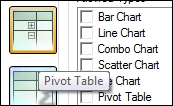
When we open the properties of the object in the upper-right-hand side corner, the Inventory On Hand Report, we can see that the object is actually a Pivot Table. We have not worked with a Pivot Table object before:
Since this is the first time that we have worked with a Pivot Table, open Properties by right-clicking and choosing Properties in the context menu so that we can see what is unique about a Pivot Table object.
On the Dimensions tab, we can see that we are using...
In this section, we examined another four-quadrant dashboard layout and whether the choices on this one were appropriate to convey information about Inventory. You learned about calculating the KPI, Inventory Turns. We examined the Properties of a Pivot Table and how it differs from a list box. We were reminded that we can create our own lists, load them, and use them in dimensions. We also examined a formula for getting the count of unique items in a set.
In the next chapter, we will examine the Order Details dashboard.