Search icon
Arrow left icon
All Products
Best Sellers
New Releases
Books
Videos
Audiobooks
Learning Hub
Newsletters
Free Learning
Arrow right icon
Mastering Numerical Computing with NumPy

You're reading from  Mastering Numerical Computing with NumPy

Product type Book
Published in Jun 2018
Publisher Packt
ISBN-13 9781788993357
Pages 248 pages
Edition 1st Edition
Languages
Authors (3):
Umit Mert Cakmak Umit Mert Cakmak
Profile icon Umit Mert Cakmak
Tiago Antao Tiago Antao
Profile icon Tiago Antao
Mert Cuhadaroglu Mert Cuhadaroglu
Profile icon Mert Cuhadaroglu
View More author details

Table of Contents (11) Chapters

Preface Working with NumPy Arrays Linear Algebra with NumPy Exploratory Data Analysis of Boston Housing Data with NumPy Statistics Predicting Housing Prices Using Linear Regression Clustering Clients of a Wholesale Distributor Using NumPy NumPy, SciPy, Pandas, and Scikit-Learn Advanced Numpy Overview of High-Performance Numerical Computing Libraries Performance Benchmarks Other Books You May Enjoy

Exploratory Data Analysis of Boston Housing Data with NumPy Statistics

Exploratory data analysis (EDA) is a crucial component of a data science project (as shown in Figure Data Science Process). Even though it is a very important step before applying any statistical model or machine learning algorithm to your data, it is often skipped or underestimated by many practitioners:

Data Science Process (https://en.wikipedia.org/wiki/Data_analysis)

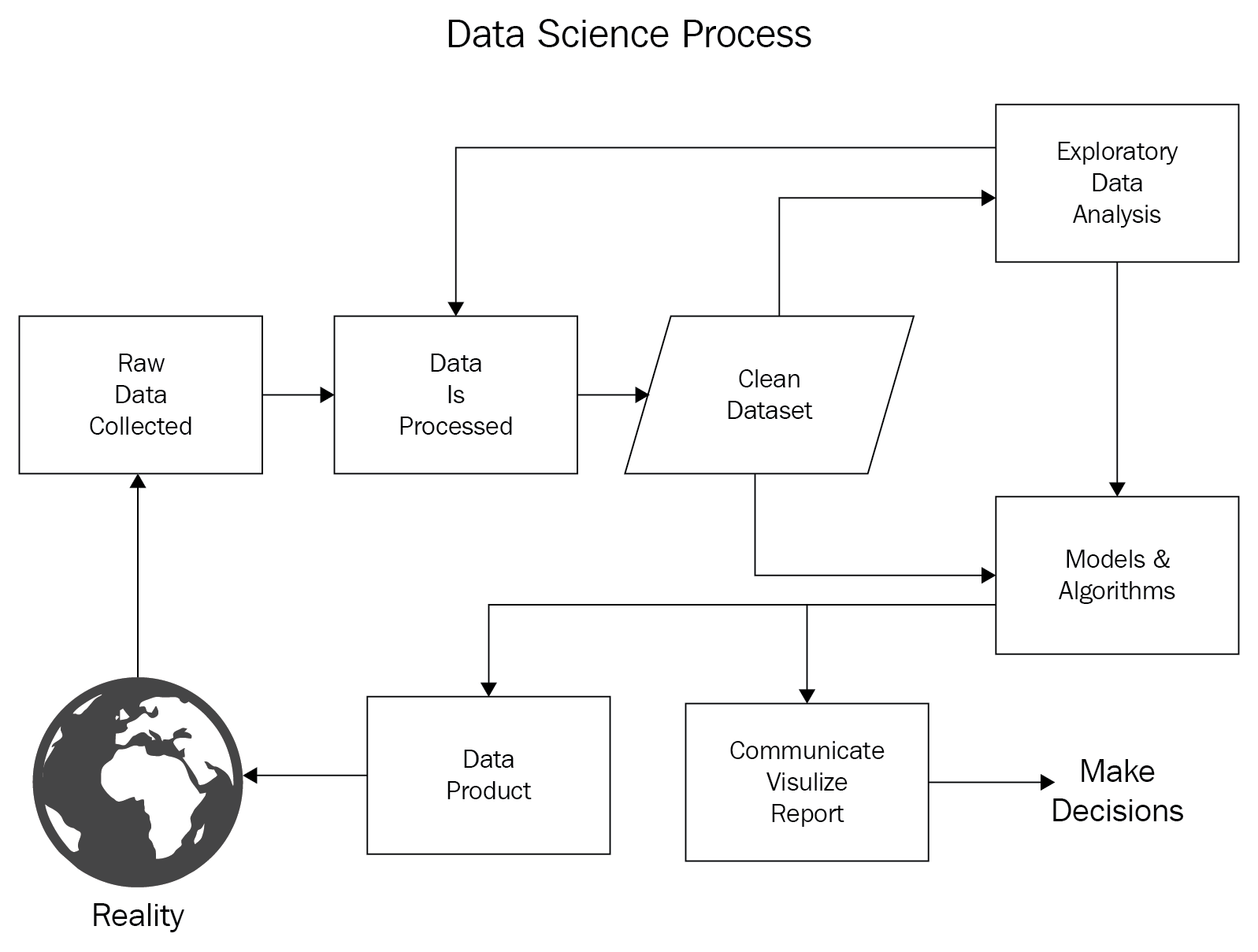
John Wilder Tukey promoted exploratory data analysis in 1977 with his book Exploratory Data Analysis. In his book, he guides statisticians to analyze their datasets statistically by using several different visuals, which will help them to formulate their hypotheses. In addition, EDA is also used to prepare your analysis for advance modeling after you identify the key data characteristics and learn which questions you should ask about your...

Loading and saving files

In this section, you will learn how to load/import your data and save it. There are many different ways of loading data, and the right way depends on your file type. You can load/import text files, SAS/Stata files, HDF5 files, and many others. HDF (Hierarchical Data Format) is one of the popular data formats which is used to store and organize large amounts of data and it is very useful while working with a multidimensional homogeneous arrays. For example, Pandas library has a very handy class named as HDFStore where you can easily work with HDF5 files. While working on data science projects, you will most likely see many of these types of files, but in this book, we will cover the most popular ones, such as NumPy binary files, text files (.txt), and comma-separated values (.csv) files.

If you have a large dataset in memory and on disk to manage, you can...

Exploring our dataset

In this section, you will explore and perform quality checks on the dataset. You will check what your data shape is, as well as its data types, any missing/NaN values, how many feature columns you have, and what each column represents. Let's start by loading the data and exploring it:

In [30]: from sklearn.datasets import load_boston
dataset = load_boston()
samples,label, feature_names = dataset.data , dataset.target , dataset.feature_names
In [31]: samples.shape
Out[31]: (506, 13)
In [32]: label.shape
Out[32]: (506,)
In [33]: feature_names
Out[33]: array(['CRIM', 'ZN', 'INDUS', 'CHAS', 'NOX', 'RM', 'AGE', 'DIS', 'RAD',
'TAX', 'PTRATIO', 'B', 'LSTAT'],
dtype='<U7')

In the...

Looking at basic statistics

In this section, you will start with the first step in statistical analysis by calculating the basic statistics of your dataset. Even though NumPy has limited built-in statistical functions, we can leverage its usage with SciPy. Before we start, let's describe how our analysis will flow. All of the feature columns and label columns are numerical, but you may have noticed that the Charles River dummy variable (CHAS) column has binary values (0,1), which means that it's actually encoded from categorical data. When you analyze your dataset, you can separate your columns into Categorical and Numerical. In order to analyze them all together, one type should be converted to another. If you have a categorical value and you want to convert it into a numeric value, you can do so by converting each category to a numerical value. This process is called...

Computing histograms

A histogram is a visual representation of the distribution of numerical data. Karl Pearson first introduced this concept more than a century ago. A histogram is a kind of bar chart that is used for continuous data, while a bar chart visually represents categorical variables. As a first step, you need to divide your entire range of values into a series of intervals (bins). Each bin has to be adjacent and none of them can overlap. In general, bin sizes are equal, and the rule of thumb for the number of bins to include is 5–20. This means that if you have more than 20 bins, your graph will be hard to read. On the contrary, if you have fewer than 5 bins, then your graph will give very little insight into the distribution of your data:

In [48]: %matplotlib notebook
%matplotlib notebook
import matplotlib.pyplot as plt
NOX = samples...

Explaining skewness and kurtosis

In statistical analysis, a moment is a quantitative measure that describes the expected distance from a reference point. If the reference point is expected, then it's called a central moment. In statistics, the central moments are the moments that are related with the mean. The first and second moments are the mean and the variance, respectively. The mean is the average of your data points. The variance is the total deviation of each data point from the mean. In other words, the variance shows how your data is dispersed from the mean. The third central moment is skewness, which measures the asymmetry of the distribution of the mean. In standard normal distribution, skewness equals zero as it's symmetrical. On the other hand, if mean < median < mode, then there is negative skew, or left skew; likewise, if mode < median < mean...

Trimmed statistics

As you will have noticed in the previous section, the distributions of our features are very dispersed. Handling the outliers in your model is a very important part of your analysis. It is also very crucial when you look at descriptive statistics. You can be easily confused and misinterpret the distribution because of these extreme values. SciPy has very extensive statistical functions for calculating your descriptive statistics in regards to trimming your data. The main idea of using the trimmed statistics is to remove the outliers (tails) in order to reduce their effect on statistical calculations. Let's see how we can use these functions and how they will affect our feature distribution:

In [58]: np.set_printoptions(suppress= True, linewidth= 125)
samples = dataset.data
CRIM = samples[:,0:1]
minimum = np.round(np.amin(CRIM), decimals...

Box plots

Another important visual in exploratory data analysis is the box plot, also known as the box-and-whisker plot. It's built based on the five-number summary, which is the minimum, first quartile, median, third quartile, and maximum values. In a standard box plot, these values are represented as follows:

It's a very convenient way of comparing several distributions. In general, the whiskers of the plot generally extend to the extreme points. Alternatively, you can cut them with the 1.5 interquartile range. Let's check our CRIM and RM features:

In [60]: %matplotlib notebook
%matplotlib notebook
import matplotlib.pyplot as plt
from scipy import stats
samples = dataset.data
fig, (ax1,ax2) = plt.subplots(1,2, figsize =(8,3))
axs = [ax1, ax2]
list_features = ['CRIM', 'RM']
ax1...

Computing correlations

This section is dedicated to bivariate analysis, where you analyze two columns. In such cases, we generally investigate the association between these two variables, which is called correlation. Correlation shows the relationship between two variables and answers questions such as what will happen to variable A if variable B increases by 10%? In this section, we will explain how to calculate the correlation of our data and represent it in a two-dimensional scatter plot.

In general, correlation refers to any statistical dependency. A correlation coefficient is a quantitative value that calculates the measure of correlation. You can think of the relationship between correlation and a correlation coefficient as being of a similar relationship between a hygrometer and humidity. One of the most popular types of correlation coefficient is the Pearson product-moment...

Summary

In this chapter, we covered exploratory data analysis by using the NumPy, SciPy, matplotlib, and Seaborn packages. At the start, we learned how to load and save files and explore our dataset. Then, we explained and calculated important statistical central moments, such as the mean, variance, skewness, and kurtosis. Four important visualizations were used for the graphical representation of univariate and variate analysis, respectively; these were the histogram, box plot, scatter plot, and heatmap. The importance of data trimming was also emphasized using examples.

In the next chapter, we will go one step further and start predicting housing prices using linear regression.

lock icon The rest of the chapter is locked
You have been reading a chapter from
Mastering Numerical Computing with NumPy
Published in: Jun 2018 Publisher: Packt ISBN-13: 9781788993357
Register for a free Packt account to unlock a world of extra content!
A free Packt account unlocks extra newsletters, articles, discounted offers, and much more. Start advancing your knowledge today.
Unlock this book and the full library FREE for 7 days
Get unlimited access to 7000+ expert-authored eBooks and videos courses covering every tech area you can think of
Renews at $15.99/month. Cancel anytime}