

In this chapter, we will cover other important features of Kibana, including Timelion and Dev Tools. We will cover how to use Timelion for time-series data and create different graphs by chaining different functions. Timelion provides us with flexibility, by means of which we can club data from different indices together to plot them on a graph. Using Timelion, we can get some interesting answers to questions that are difficult to answer—such as the difference between the data this Sunday and last Sunday—using default visualizations of Kibana. We can also compare the current data with older data, such as four-hour old data or one-week old data. We can plot on the basis of the moving average over a certain duration; it provides us with a smooth graph if the data plot is not easy to understand. Using Timelion trends, we can plot the trend of data...

Timelion
Timelion is a data visualizer designed to work on time-series data. Timelion works on different independent data sources and can be used to integrate them in a single visualization. In Timelion, we have a relatively simple expression language that helps us to retrieve time-series data, perform mathematical calculations, and change the color, label, and other calculations in order to create complex visualizations that are difficult to create using Kibana visualization. We have a Help link in the top-right corner; we can open the function reference by clicking on the link. The following screenshot shows the function reference:
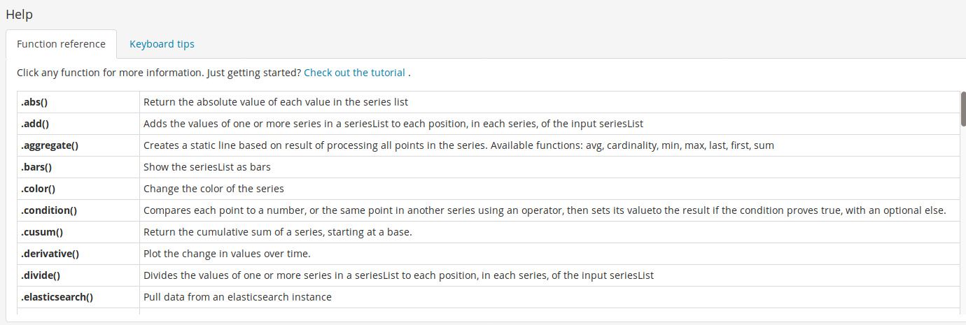
In the screenshot, we can see all available functions in Timelion and, by clicking on the function name, we can get the details, such as available parameters. We can chain these functions to get the desired visualization.
So, we will take the example...
Use cases of Timelion
There are different use cases where we can use Timelion, such as if we want to plot a graph with metrics of a certain field value. Using Timelion, we can plot a graph where, on the same axis, we can show the current data and historical data. This view helps us to track the difference quite easily. Timelion also provides the option to fetch data from different indices for a single visualization, meaning unlike Kibana Visualize, here we can refer multiple Elasticsearch indexes to create a single graph. It has different functions that can work together to create complex data visualizations that cannot be created in Kibana Visualize. Let's look at some examples one by one—we will see how Timelion can be used.
Let's look at an example of Metricbeat data. Suppose we want to see the sum of the total virtual memory the process has. To do that, we...
Dev Tools
Dev Tools provides us with the console option, from which we can execute Elasticsearch queries. We have two panes under the Dev Tools console, one for executing the queries and other to show the results of executed queries. The Dev Tools console provides us the type hint, which makes it quite easy to create an Elasticsearch query. We need to click on the Dev Tools link from the left menu option to open the Dev Tools page. See the following screenshot:

In the screenshot, under the console in the left pane, we can write Elasticsearch queries. After executing the query, the result is shown in the right pane.
Apart from the console, we have two other options under Dev Tools, Search Profiler and Grok Debugger. Using Search Profiler, we can profile any search query of Elasticsearch as it provides details of each query with a query duration for each component, along with the...
Summary
So, in this chapter, we have covered Timelion and Dev Tools, which are quite useful tools of Kibana. We started with a Timelion introduction. Then we looked at the different functions that are available in Timelion, such as the .es() function to set the Elasticsearch data source, and its different parameters including index, metric, split, offset, fit and time field, and so on. After that, have covered other functions such as .static() to create a static line on the x axis, the .points() function to convert the graph into a point display, .color() to change the color of the plot, the .derivetive() function to plot the difference in value over time, .label() to set the label for a data series, .range to limit the graph display between particular min and max ranges, and lastly the .holt() function to forecast the future trend or to get the anomaly in data. For a complete...
The rest of the chapter is locked
You have been reading a chapter from
Kibana 7 Quick Start GuidePublished in: Jan 2019Publisher: PacktISBN-13: 9781789804034
Register for a free Packt account to unlock a world of extra content!
A free Packt account unlocks extra newsletters, articles, discounted offers, and much more. Start advancing your knowledge today.
undefined
Unlock this book and the full library FREE for 7 days
Get unlimited access to 7000+ expert-authored eBooks and videos courses covering every tech area you can think of
Renews at $15.99/month. Cancel anytime