Chapter 4. Data Visualization
Data visualization is concerned with the presentation of data in a pictorial or graphical form. It is one of the most important tasks in data analysis, since it enables us to see analytical results, detect outliers, and make decisions for model building. There are many Python libraries for visualization, of which matplotlib, seaborn, bokeh, and ggplot are among the most popular. However, in this chapter, we mainly focus on the matplotlib library that is used by many people in many different contexts.
Matplotlib produces publication-quality figures in a variety of formats, and interactive environments across Python platforms. Another advantage is that Pandas comes equipped with useful wrappers around several matplotlib plotting routines, allowing for quick and handy plotting of Series and DataFrame objects.
The IPython package started as an alternative to the standard interactive Python shell, but has since evolved into an indispensable tool for data exploration...
The matplotlib API primer
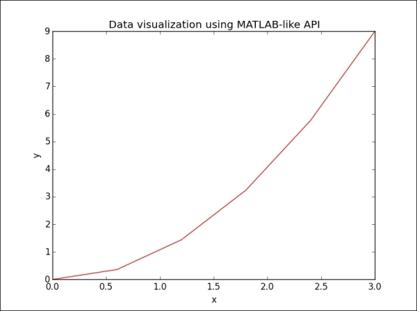
The easiest way to get started with plotting using matplotlib is often by using the MATLAB API that is supported by the package:
The output for the preceding command is as follows:
However, star imports should not be used unless there is a good reason for doing so. In the case of matplotlib, we can use the canonical import:
The preceding example could then be written as follows:
We have looked at how to create simple line plots so far. The matplotlib library supports many more plot types that are useful for data visualization. However, our goal is to provide the basic knowledge that will help you to understand and use the library for visualizing data in the most common situations. Therefore, we will only focus on four kinds of plot types: scatter plots, bar plots, contour plots, and histograms.
A scatter plot is used to visualize the relationship between variables measured in the same dataset. It is easy to plot a simple scatter plot, using the plt.scatter() function, that requires numeric columns for both the x and y axis:
Let's take a look at the command for the preceding output:
A bar plot is used to present grouped data with rectangular bars,...
Legends are an important element that is used to identify the plot elements in a figure. The easiest way to show a legend inside a figure is to use the label argument of the plot function, and show the labels by calling the plt.legend() method:
The output for the preceding command as follows:
The loc argument in the legend command is used to figure out the position of the label box. There are several valid location options: lower left, right, upper left, lower center, upper right, center, lower right, upper right, center right, best, upper center, and center left. The default position setting is upper right. However, when we...
Plotting functions with Pandas
We have covered most of the important components in a plot figure using matplotlib. In this section, we will introduce another powerful plotting method for directly creating standard visualization from Pandas data objects that are often used to manipulate data.
For Series or DataFrame objects in Pandas, most plotting types are supported, such as line, bar, box, histogram, and scatter plots, and pie charts. To select a plot type, we use the kind argument of the plot function. With no kind of plot specified, the plot function will generate a line style visualization by default , as in the following example:
The output for the preceding command is as follows:
Another example will visualize the data of a DataFrame object consisting of multiple columns:
Additional Python data visualization tools
Besides matplotlib, there are other powerful data visualization toolkits based on Python. While we cannot dive deeper into these libraries, we would like to at least briefly introduce them in this session.
Bokeh is a project by Peter Wang, Hugo Shi, and others at Continuum Analytics. It aims to provide elegant and engaging visualizations in the style of D3.js. The library can quickly and easily create interactive plots, dashboards, and data applications. Here are a few differences between matplotlib and Bokeh:
Bokeh achieves cross-platform ubiquity through IPython's new model of in-browser client-side rendering
Bokeh uses a syntax familiar to R and ggplot users, while matplotlib is more familiar to Matlab users
Bokeh has a coherent vision to build a ggplot-inspired in-browser interactive visualization tool, while Matplotlib has a coherent vision of focusing on 2D cross-platform graphics.
The basic steps for creating plots with Bokeh are as follows...
We finished covering most of the basics, such as functions, arguments, and properties for data visualization, based on the matplotlib library. We hope that, through the examples, you will be able to understand and apply them to your own problems. In general, to visualize data, we need to consider five steps- that is, getting data into suitable Python or Pandas data structures, such as lists, dictionaries, Series, or DataFrames. We explained in the previous chapters, how to accomplish this step. The second step is defining plots and subplots for the data object in question. We discussed this in the figures and subplots session. The third step is selecting a plot style and its attributes to show in the subplots such as: line, bar, histogram, scatter plot, line style, and color. The fourth step is adding extra components to the subplots, like legends, annotations and text. The fifth step is displaying or saving the results.
By now, you can do quite a few things with a dataset; for example...