

Congratulations! You have finished an entire book on data visualization with D3. Together we have explored various topics and techniques. At this point you will probably agree that building interactive, accurate, and aesthetically appealing data visualization is not a trivial matter even with the help of a powerful library like D3. It typically takes days or even weeks to finish a professional data visualization project even without counting the effort usually required on the backend. What if you need to build an interactive analytics quickly, or a proof-of-concept before a full-fledged visualization project can be commenced, and you need to do that not in weeks or days, but minutes. In this appendix we will introduce you to two JavaScript libraries that allow you to do that: building quick in-browser interactive multidimensional data analytics in minutes.
Crossfilter is also a library created by D3's author Mike Bostock, initially used to power analytics for Square Register.
Crossfilter is a JavaScript library for exploring large multivariate datasets in browser. Crossfilter supports extremely fast (<30ms) interaction with coordinated views, even with datasets containing a million or more records.
-Crossfilter Wiki (August 2013)
In other words, Crossfilter is a library that you can use to generate data dimensions on large and typically flat multivariate datasets. So what is a data dimension? A data dimension can be considered as a type of data grouping or categorization while each dimensional data element is a categorical variable. Since this is still a pretty abstract concept, let's take a look at the following JSON dataset and see how it can be transformed into dimensional dataset using Crossfilter. Assume that we have the following flat dataset in JSON describing payment transactions in a bar:
[
  {"date": "2011-11-14T01:17:54Z", "quantity": 2, "total": 190, "tip": 100, "type": "tab"},
  {"date": "2011-11-14T02:20:19Z", "quantity": 2, "total": 190, "tip": 100, "type": "tab"},
  {"date": "2011-11-14T02:28:54Z", "quantity": 1, "total": 300, "tip": 200, "type": "visa"},
..
]
Note
Sample dataset borrowed from Crossfilter Wiki: https://github.com/square/crossfilter/wiki/API-Reference.
How many dimensions do we see here in this sample dataset? The answer is: it has as many dimensions as the number of different ways that you can categorize the data. For example, since this data is about customer payment, which is observation on time series, obviously the "date" is a dimension. Secondly, the payment type is naturally a way to categorize data; therefore, "type" is also a dimension. The next dimension is bit tricky since technically we can model any of the field in the dataset as dimension or its derivatives; however, we don't want to make anything as a dimension which does not help us slice the data more efficiently or provide more insight into what the data is trying to say. The total and tip fields have very high cardinality, which usually is an indicator for poor dimension (though tip/total, that is, tip in percentage could be an interesting dimension); however, the "quantity" field is likely to have a relatively small cardinality assuming people don't buy thousands of drinks in this bar, therefore, we choose to use quantity as our third dimension. Now, here is what the dimensional logical model looks like:
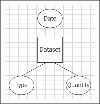
Dimensional Dataset
These dimensions allow us to look at the data from a different angle, and if combined will allow us to ask some pretty interesting questions, for example:
Are customers who pay by tab more likely to buy in larger quantity?
Are customers more likely to buy larger quantity on Friday night?
Are customers more likely to tip when using tab versus cash?
Now, you can see why dimensional dataset is such a powerful idea. Essentially, each dimension gives you a different lens to view your data, and when combined, they can quickly turn raw data into knowledge. A good analyst can quickly use this kind of tool to formulate a hypothesis, hence gaining knowledge from data.
Now, we understand why we would want to establish dimensions with our dataset; let's see how this can be done using Crossfilter:
var timeFormat = d3.time.format.iso;
var data = crossfilter(json); // <-A

var hours = data.dimension(function(d){
  return d3.time.hour(timeFormat.parse(d.date)); // <-B
});
var totalByHour = hours.group().reduceSum(function(d){
  return d.total;
});

var types = data.dimension(function(d){return d.type;});
var transactionByType = types.group().reduceCount();

var quantities = data.dimension(function(d){return d.quantity;});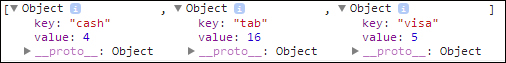
var salesByQuantity = quantities.group().reduceCount();As shown in the preceding section, creating dimensions and groups are quite straight-forward in Crossfilter. First step before we can create anything is to feed our JSON dataset, loaded using D3, through Crossfilter by calling the crossfilter function (line A). Once that's done, you can create your dimension by calling the dimension function and pass in an accessor function that will retrieve the data element that can be used to define the dimension. In the case for type we will simply pass in function(d){return d.type;}. You can also perform data formatting or other task in dimension function (for example, date formatting on line B). After creating the dimensions, we can perform the categorization or grouping by using the dimension, so totalByHour is a grouping that sums up total amount of the sale for each hour, while salesByQuantity is a grouping of counting the number of transactions by quantity. To better understand how group works, we will take a look at what the group object looks like. If you invoke the all function on the transactionsByType group you will get the following objects back:
Crossfilter Group Objects
We can clearly see that transactionByType group is essentially a grouping of the data element by its type while counting the total number of data elements within each group since we had called reduceCount function when creating the group.
The following are the description for functions we used in this example:
crossfilter: Creates a new crossfilter with given records if specified. Records can be any array of objects or primitives.dimension: Creates a new dimension using the given value accessor function. The function must return naturally-ordered values, that is, values that behave correctly with respect to JavaScript's <, <=, >=, and > operators. This typically means primitives: Booleans, numbers, or strings.dimension.group: Creates a new grouping for the given dimension, based on the givengroupValuefunction, which takes a dimension value as input and returns the corresponding rounded value.group.all: Returns all groups, in ascending natural order by key.group.reduceCount: A shortcut function to count the records; returns this group.group.reduceSum: A shortcut function to sum records using the specified value accessor function.
At this point we have everything we want to analyze. Now, let's see how this can be done in minutes instead of hours or days.
We have only touched a very limited number of Crossfilter functions. Crossfilter provides a lot more capability when it comes to how dimension and group can be created; for more information please check out its API reference: https://github.com/square/crossfilter/wiki/API-Reference.
Data Dimension: http://en.wikipedia.org/wiki/Dimension_(data_warehouse)
Cardinality: http://en.wikipedia.org/wiki/Cardinality
Visualizing Crossfilter dimensions and groups is precisely the reason why dc.js was created. This handy JavaScript library was created by your humble author and is designed to allow you to visualize Crossfilter dimensional dataset easily and quickly.
Open your local copy of the following file as reference:
https://github.com/NickQiZhu/d3-cookbook/blob/master/src/appendix-a/dc.html
In this example we will create three charts:
A line chart for visualizing total amount of transaction on time series
A pie chart to visualize number of transactions by payment type
A bar chart showing number of sales by purchase quantity
Here is what the code looks like:
<div id="area-chart"></div>
<div id="donut-chart"></div>
<div id="bar-chart"></div>
…
dc.lineChart("#area-chart")
                .width(500)
                .height(250)
                .dimension(hours)
                .group(totalByHour)
                .x(d3.time.scale().domain([
                 timeFormat.parse("2011-11-14T01:17:54Z"),
                  timeFormat.parse("2011-11-14T18:09:52Z")
]))
                .elasticY(true)
                .xUnits(d3.time.hours)
                .renderArea(true)
                .xAxis().ticks(5);

        dc.pieChart("#donut-chart")
                .width(250)
                .height(250)
                .radius(125)
                .innerRadius(50)
                .dimension(types)
                .group(transactionByType);

        dc.barChart("#bar-chart")
                .width(500)
                .height(250)
                .dimension(quantities)
                .group(salesByQuantity)
                .x(d3.scale.linear().domain([0, 7]))
                .y(d3.scale.linear().domain([0, 12]))
                .centerBar(true);

        dc.renderAll();
This generates a group of coordinated interactive charts:
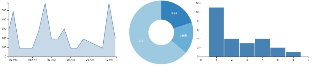
Interactive dc.js charts
When you click or drag your mouse across these charts you will see the underlying Crossfilter dimensions being filtered accordingly on all charts:
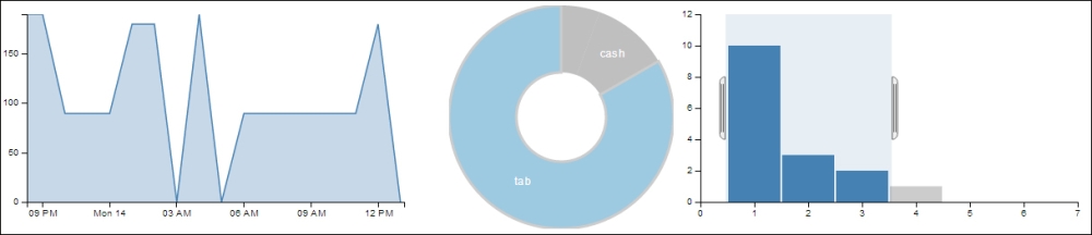
Filtered dc.js charts
As we have seen through this example, dc.js is designed to generate standard chart-based visualization on top of Crossfilter. Each dc.js chart is designed to be interactive so user can apply dimensional filter by simply interacting with the chart. dc.js is built entirely on D3, therefore, its API is very D3-like and I am sure with the knowledge you have gained from this book you will feel quite at home when using dc.js. Charts are usually created in the following steps.
First step creates a chart object by calling one of the chart creation functions while passing in a D3 selection for its anchor element, which in our example is the
divelement to host the chart:<div id="area-chart"></div> ... dc.lineChart("#area-chart")Then we set the
width,height,dimension, andgroupfor each chart:chart.width(500) .height(250) .dimension(hours) .group(totalByHour)For coordinate charts rendered on a Cartesian plane you also need to set the
xandyscale:chart.x(d3.time.scale().domain([ timeFormat.parse("2011-11-14T01:17:54Z"), timeFormat.parse("2011-11-14T18:09:52Z") ])).elasticY(true)In this first case, we explicitly set the x axis scale while letting the chart automatically calculate the y-scale for us. While in the next case we set both x and y scale explicitly.
chart.x(d3.scale.linear().domain([0, 7]))
        .y(d3.scale.linear().domain([0, 12]))
Different charts have different functions for customizing their look-and-feel and you can see the complete API reference at https://github.com/NickQiZhu/dc.js/wiki/API.
Leveraging crossfilter.js and dc.js allows you to build sophisticated data analytics dashboard fairly quickly. The following is a demo dashboard for analyzing the NASDAQ 100 Index for the last 20 years http://nickqizhu.github.io/dc.js/:
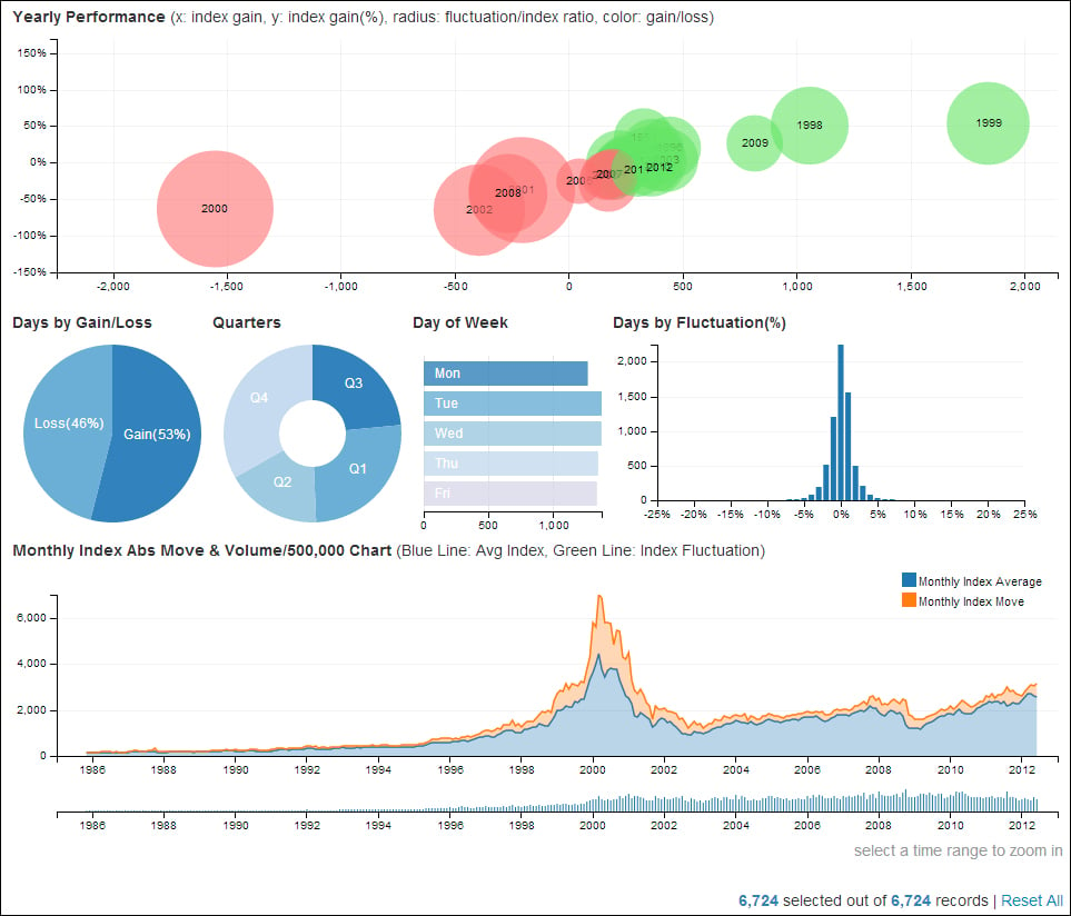
dc.js NASDAQ demo
At the time of writing this book, dc.js supports the following chart types:
Bar chart (stackable)
Line chart (stackable)
Area chart (stackable)
Pie chart
Bubble chart
Composite chart
Choropleth map
Bubble overlay chart
For more information on the dc.js 'library please check out our Wiki page at https://github.com/NickQiZhu/dc.js/wiki.
The following are some other useful D3 based reusable charting libraries. Although, unlike dc.js they are not designed to work with Crossfilter natively nevertheless they tend to be richer and more flexible when tackling general visualization challenges:
NVD3: http://nvd3.org/
Rickshaw: http://code.shutterstock.com/rickshaw/