Search icon
Arrow left icon
All Products
Best Sellers
New Releases
Books
Videos
Audiobooks
Learning Hub
Newsletters
Free Learning
Arrow right icon
Democratizing No-Code Application Development with Bubble

You're reading from  Democratizing No-Code Application Development with Bubble

Product type Book
Published in Apr 2024
Publisher Packt
ISBN-13 9781804610947
Pages 320 pages
Edition 1st Edition
Languages
Author (1):
Caio Calderari Caio Calderari
Profile icon Caio Calderari

Table of Contents (16) Chapters

Preface 1. Chapter 1: Getting Started with Bubble.io – Exploring Bubble’s Features 2. Chapter 2: Navigating the UI Builder Components Tab 3. Chapter 3: Building Blocks – Exploring Bubble’s UI Components 4. Chapter 4: Building Your First Bubble App – The Planning Phase 5. Chapter 5: Layouts and Styles 6. Chapter 6: Building User Interfaces with Bubble 7. Chapter 7: Workflow Automation and Logic 8. Chapter 8: Database Structuring, Relationships, and Security 9. Chapter 9: Extending Functionality with Plugins and APIs 10. Chapter 10: Testing and Debugging Strategies 11. Chapter 11: Deploying and Launching Your App (Publishing) 12. Chapter 12: Monitoring, Maintenance, and Updates (Apps Governance) 13. Chapter 13: Optimizing Performance and Scalability 14. Index 15. Other Books You May Enjoy

Building User Interfaces with Bubble

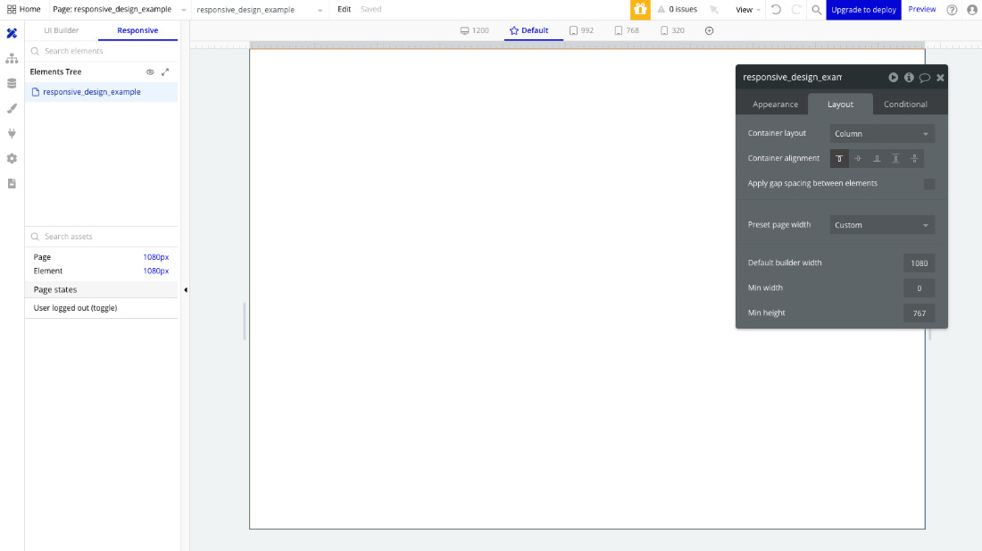
In the previous chapter, you learned how layouts and styles work. In this chapter, you will learn about user interfaces (UIs) and how to build layouts that adapt seamlessly to different devices and screen sizes. We will explore the responsive design features available in the responsive editor, and with this knowledge, you will be able to create pages and UIs that are not only visually appealing but also intuitive and user friendly. Making your layouts responsive and properly configured will allow them to adapt across various devices and screen sizes.

In this chapter, you will learn about the following topics:

  • How to create responsive layouts
  • How to use responsive design features inside Bubble

Getting started with responsive layouts

Inside Bubble, you can build various layouts and pages for your application, but they are not naturally responsive by default, so it is important to make sure you configure it to behave correctly on different screen sizes. First, start by building your desired layout and then you can start making changes to it to make it adapt and behave in a responsive way. Making a layout responsive will depend on how you set up specific container components and the settings you apply to it directly, using the knowledge acquired in the previous chapter, as well as some other settings that are available inside the responsive mode. Let’s learn a little bit about it.

What is responsive design?

Responsive design refers to a design approach used in creating websites or applications that automatically adapt and adjust their layout, content, and features to fit various screen sizes and devices.

An example of different devices and screen sizes are shown...

The Responsive Design tab

When working on the Design tab, the canvas, usually, you are working on the UI Builder tab, choosing components, and adding them to the screen. Now, if you want to check what your layout looks like in different screen sizes, you can do this by simply selecting the Responsive tab, which is also called Responsive mode.

The Bubble interface inside the Responsive tab is shown here:

Figure 6.3: Responsive Mode in Bubble.io

Figure 6.3: Responsive Mode in Bubble.io

Notice that the responsive mode is very similar to the previous mode, but with a few differences – let’s break it down. In this mode, we still have the Elements Tree section, which works the same way as you’ve learned before. We also have a list of elements added to the page and their current size. We have a new section called Page states, where we can see conditional states in our application so we can test different view modes. One that comes by default is User logged out (toggle) so you...

Different ways of previewing your pages

Using the responsive mode is one way of visualizing how your layouts looks in different screen sizes, but it is not the only way. In this section, we are going to take a look at other methods for testing your application in different screen sizes.

Preview mode

As you may already know at this point there is a button called Preview, available at the top bar of your Bubble Editor. If you click it, a new window will open and load the current page you are working on in the editor. With the Preview mode, you can quickly navigate to your page, and by stretching the browser window size, making it smaller or bigger, you can have a sense of how your layout is adapting to the changes.

Browser Inspector

Another way to validate how your page layout looks using your browser is by activating the Browser Inspector feature. After clicking the Preview button, once you are on your desired page, hit the shortcuts on your keyboard, which are command ...

Summary

In this chapter, we’ve covered the essentials of the responsive editor. You learned about responsive design and breakpoints and how to configure them inside Bubble.

You also learned important tips and tricks on how to properly set up your responsive designs and important concepts that will help you understand how to work with responsive layouts while building your no-code applications.

Understanding these concepts will be important for any future project you build. In the next chapter, you are going to learn how to use workflows to give life to your applications.

lock icon The rest of the chapter is locked
You have been reading a chapter from
Democratizing No-Code Application Development with Bubble
Published in: Apr 2024 Publisher: Packt ISBN-13: 9781804610947
Register for a free Packt account to unlock a world of extra content!
A free Packt account unlocks extra newsletters, articles, discounted offers, and much more. Start advancing your knowledge today.
Unlock this book and the full library FREE for 7 days
Get unlimited access to 7000+ expert-authored eBooks and videos courses covering every tech area you can think of
Renews at $15.99/month. Cancel anytime}