Chapter 5. Going Material!
In the last chapter, we looked at the basics of how to style and animate React components. We can make components look how we want them to, but how do we want them to look?
In this chapter, we will look at something called material design. You'll learn how to express our interface not only in terms of components, but in a consistent design language.
You will see a major intersection between component-based design and visual design patterns. Material design is very detailed, as we'll see in this chapter. It describes, in great detail, how each type of component (or surface) must look, feel, and move. It's that core approach of designing in the smallest terms that we've come to understand with React. Now, we get to apply those lessons from a visual standpoint as well.
Understanding material design
For me, the name material design evokes an image of fashion or engineering, where different textures and patterns have distinct visual or technical characteristics. Everything I touch is some kind of material. Everything I see is some kind of material. All of these materials obey the laws of physics and behave in familiar ways.
These senses, of touch and sight, are fundamental to how we interact with the world. They're a broad and unspoken constant. Material design is a language that aims to bridge the gap between the physical and digital world, using material as a metaphor.
In this language, the surfaces and edges of material give us some visual interface cues that are grounded in reality. In this language, components respond immediately to touch in ways that hint at what they can do.
Material design is heavily inspired by print design. Yet all the typography, color, and imagery do more than just look good. They create focus, hierarchy, and meaning. It reinforces...
Each object is represented by a material surface. These objects are sized in device-independent pixels (or dp, for short). This is a great unit to measure user input because it allows designers to design interfaces independent of the screen size.
It can also be converted to absolute units (such as inches or millimeters) depending on the device's screen size.
Surfaces are thought of as 3D objects, having width, height, and depth. All surfaces have a depth of 1 dp, but they can have any width or height. Surfaces also overlap, so they have a vertical offset from each other.
This vertical offset (or elevation) allows layering, creating a sense of depth similar to the real world. The content on a surface, such as typography and images, lies flat on the surface. Think of it like ink on paper, where the paper has a depth that's easier to notice than the ink printed on it.
This layering effect is accentuated...
Keeping your head above water
The first time you read through the material design specification (available at http://www.google.com/design/spec/material-design/introduction.html), you may be a little overwhelmed. There's a lot of detail in there, and knowing where to start is not easy.
The truth is you don't have to keep all of it in mind. I freaked out the first time I read through it, but I've since come to realize that the point is not to memorize it all. Sure, that would help when making every minute choice about your interface, but it isn't meant to be a toolkit or component library.
Material design is a language—a living document. Google has and will continue to adapt it, and when you learn a language, it helps to know some of the words. However, you cannot learn a whole language in a day, nor can you learn it well only by memorizing set phrases.
No, to learn a language, you need to speak it daily. You need to take to heart the grammar and struggle through your mistakes, until one day...
Before we wrap up, I want to share a few resources that you might find helpful.
In this chapter, we used Roboto. More accurately, The MDL instructions told us how to embed a link to Roboto on Google Webfonts. If you would prefer to use your own custom fonts, then you may need to convert them.
You can convert font files at Font Squirrel:
Head over to http://www.fontsquirrel.com/tools/webfont-generator and upload your font files. You'll start to download the converted files with helpful CSS files to get you started. We don't have time to cover all the intricacies of custom fonts, but the example files you download should set you on the right path.
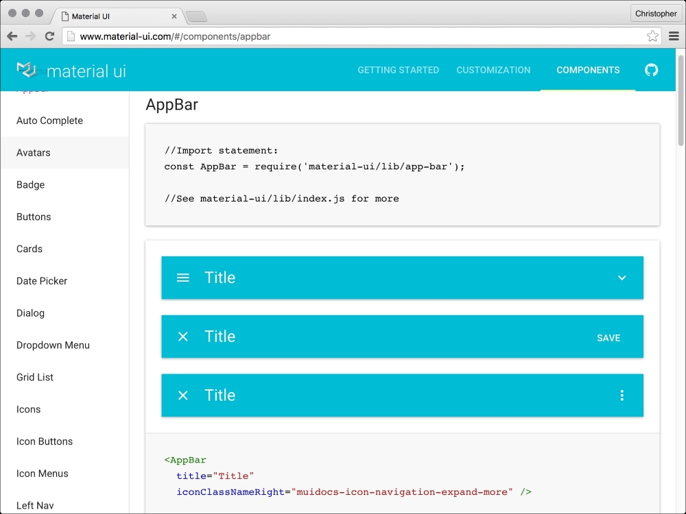
We created a bit of a mash-up between the MDL CSS/JavaScript and React. This might not always work or be as elegant as you would like. In such instances, check out http://www.material-ui.com.
Material UI has a huge range of components to choose from, as we can see in the following screenshot:
It's a catalogue...
In this chapter, we blasted through some of the concepts in material design. You learned to think of it as an ever-changing language that we must learn over time. We implemented a global navigation component using a new form of React component (a function). We also implemented a login page, which is in need of a server-side validation, and we made our PageAdmin component look heaps better!
In the next chapter, we'll look at how to change views without page reloads and some of the neat things we can do to make that experience beautiful.


