


Understanding the variables
We're going to load up a time-series dataset of air pollution, then we are going to do some very basic inspection of variables.
This step is performed on each variable on its own (univariate analysis) and can include summary statistics for each of the variables, histograms, finding missing values or outliers, and testing stationarity.
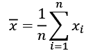
The most important descriptors of continuous variables are the mean and the standard deviation. As a reminder, here are the formulas for the mean and the standard deviation. We are going to build on these formulas later with more complex formulas. The mean usually refers to the arithmetic mean, which is the most commonly used average and is defined as:
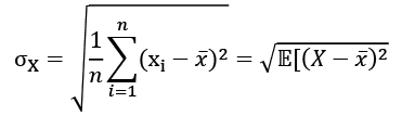
The standard deviation is the square root of the average squared difference to this mean value:
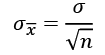
The standard error (SE) is an approximation of the standard deviation of sampled data. It measures the dispersion of sample means around the population mean, but normalized by the root of the sample size. The more data points involved in the calculation, the smaller the standard error tends to be. The SE is equal to the standard deviation divided by the square root of the sample size:
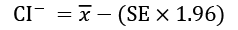
An important application of the SE is the estimation of confidence intervals of the mean. A confidence interval gives a range of values for a parameter. For example, the 95th percentile upper confidence limit,  , is defined as:

Similarly, replacing the plus with a minus, the lower confidence interval is defined as:
The median is another average, particularly useful when the data can't be described accurately by the mean and standard deviations. This is the case when there's a long tail, several peaks, or a skew in one or the other direction. The median is defined as:

This assumes that X is ordered by value in ascending or descending direction. Then, the value that lies in the middle, just at  , is the median. The median is the 50th percentile, which means that it is higher than exactly half or 50% of the points in X. Other important percentiles are the 25th and the 75th, which are also the first quartile and the third quartile. The difference between these two is called the interquartile range.
These are the most common descriptors, but not the only ones even by a long stretch. We won't go into much more detail here, but we'll see a few more descriptors later.
Let's get our hands dirty with some code!
We'll import datetime, pandas, matplotlib, and seaborn to use them later. Matplotlib and seaborn are libraries for plotting. Here it goes:
import datetime
import pandas as pd
import matplotlib.pyplot as plt
Then we'll read in a CSV file. The data is from the Our World in Data (OWID) website, a collection of statistics and articles about the state of the world, maintained by Max Roser, research director in economics at the University of Oxford.
We can load local files or files on the internet. In this case, we'll load a dataset from GitHub. This is a dataset of air pollutants over time. In pandas you can pass the URL directly into the read_csv() method:
pollution = pd.read_csv(
    'https://raw.githubusercontent.com/owid/owid-datasets/master/datasets/Air%20pollution%20by%20city%20-%20Fouquet%20and%20DPCC%20(2011)/Air%20pollution%20by%20city%20-%20Fouquet%20and%20DPCC%20(2011).csv'
)
len(pollution)
331
pollution.columns
Index(['Entity', 'Year', 'Smoke (Fouquet and DPCC (2011))',
       'Suspended Particulate Matter (SPM) (Fouquet and DPCC (2011))'],
      dtype='object')
If you have problems downloading the file, you can download it manually from the book's GitHub repository from the chapter2 folder.
Now we know the size of the dataset (331 rows) and the column names. The column names are a bit long, let's simplify it by renaming them and then carry on:
pollution = pollution.rename(
    columns={
        'Suspended Particulate Matter (SPM) (Fouquet and DPCC (2011))':            'SPM',
           'Smoke (Fouquet and DPCC (2011))' : 'Smoke',
        'Entity': 'City'
    }
)
pollution.dtypes
Here's the output:
City                                object
Year                                 int64
Smoke                              float64
SPM                                float64
dtype: object
pollution.City.unique()
array(['Delhi', 'London'], dtype=object)
pollution.Year.min(), pollution.Year.max()
The minimum and the maximum year are these:
(1700, 2016)
pandas brings lots of methods to explore and discover your dataset – min(), max(), mean(), count(), and describe() can all come in very handy.
City, Smoke, and SPM are much clearer names for the variables. We've learned that our dataset covers two cities, London and Delhi, and over a time period between 1700 and 2016.
We'll convert our Year column from int64 to datetime. This will help with plotting:
pollution['Year'] = pollution['Year'].apply(
    lambda x: datetime.datetime.strptime(str(x), '%Y')
)
pollution.dtypes
City             object
Year     datetime64[ns]
Smoke           float64
SPM             float64
dtype: object
Year is now a datetime64[ns] type. It's a datetime of 64 bits. Each value describes a nanosecond, the default unit.
Let's check for missing values and get descriptive summary statistics of columns:
pollution.isnull().mean()
City                               0.000000
Year                               0.000000
Smoke                              0.090634
SPM                                0.000000
dtype: float64
pollution.describe()
              Smoke    SPM
count    301.000000    331.000000
mean     210.296440    365.970050
std      88.543288     172.512674
min      13.750000     15.000000
25%      168.571429    288.474026
50%      208.214286    375.324675
75%      291.818182    512.609209
max      342.857143    623.376623
The Smoke variable has 9% missing values. For now, we can just focus on the SPM variable, which doesn't have any missing values.
The pandas describe() method gives us counts of non-null values, mean and standard deviation, 25th, 50th, and 75th percentiles, and the range as the minimum and maximum.
A histogram, first introduced by Karl Pearson, is a count of values within a series of ranges called bins (or buckets). The variable is first divided into a series of intervals, and then all points that fall into each interval are counted (bin counts). We can present these counts visually as a barplot.
Let's plot a histogram of the SPM variable:
n, bins, patches = plt.hist(
    x=pollution['SPM'], bins='auto',
    alpha=0.7, rwidth=0.85
)
plt.grid(axis='y', alpha=0.75)
plt.xlabel('SPM')
plt.ylabel('Frequency')
This is the plot we get:
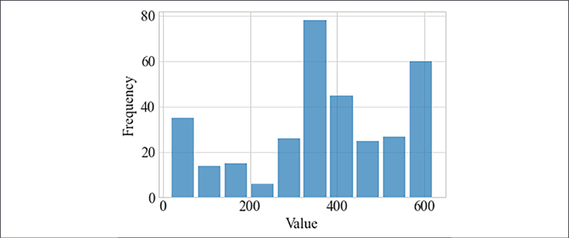
Figure 2.3: Histogram of the SPM variable
A histogram can help if you have continuous measurements and want to understand the distribution of values. Further, a histogram can indicate if there are outliers.
This closes the first part of our TSA. We'll come back to our air pollution dataset later.