In your mathematics class, you likely studied geometry, examining different shapes and the characteristics of those shapes, such as area, perimeter, and other factors. The geometric objects in ggplot2 are visual structures that are used to visualize data. They can be lines, bars, points, and so on.
Geometric objects are constructed from datasets. Before we construct some geometric objects, let's examine some datasets to understand the different kinds of variables.
Analyzing Different Datasets
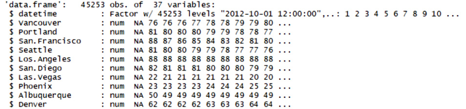
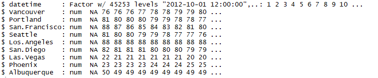
We all love to talk about the weather. So, let's work with some weather-related datasets. The datasets contain approximately five years' worth of high-temporal resolution (hourly measurements) data for various weather attributes, such as temperature, humidity, air pressure, and so on. We'll analyze and compare the humidity and weather datasets.
Let's begin by implementing the following steps:
- Load the humidity dataset by using the following command:
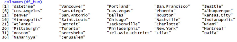
df_hum <- read.csv("data/historical-hourly-weather-data/humidity.csv")- Load the weather description dataset by using the following command:
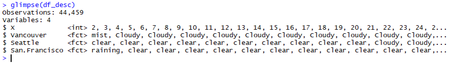
df_desc <- read.csv("data/historical-hourly-weather-data/weather_description.csv")- Compare the two datasets by using the
str command.
The outcome will be the humidity levels of different cities, as follows:
The weather descriptions of different cities are shown as follows:
The different geometric objects that we will be working with in this chapter are as follows:
One-dimensional objects are used to understand and visualize the characteristics of a single variable, as follows:
Two-dimensional objects are used to visualize the relationship between two variables, as follows:
- Bar chart
- Boxplot
- Line chart
- Scatter plot
Although geometric objects are also used in base R, they don't follow the structure of the Grammar of Graphics and have different naming conventions, as compared to ggplot2. This is an important distinction, which we will look at in detail later.
Histograms are used to group and represent numerical (continuous) variables. For example, you may want to know the distribution of voters' ages in an election. A histogram is often confused with a bar chart; however, a bar chart is more general, and we will cover those later. In a histogram, a continuous variable is grouped into bins of specific sizes and the bins have a range that covers the maximum and minimum of the variable in question.
Histograms can be classified as follows:
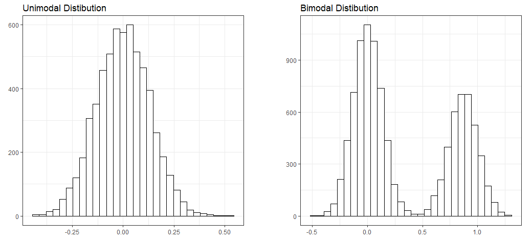
- Unimodal: A distribution with a single maximum or mode; for example, a normal distribution:
- A normal distribution (or a bell-shaped curve) is symmetrical. An example is the grade distribution of students in a class. A unimodal distribution may or may not be symmetrical. It can be positively or negatively skewed, as well.
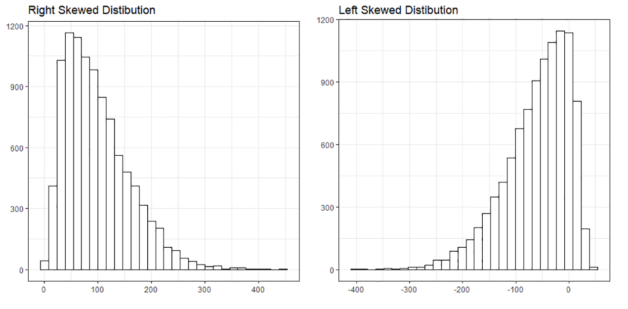
- Positively or negatively skewed (also known as right-skewed or left-skewed): Skewness is a measure of the asymmetry of the probability distribution of a real-valued random variable about its mean. The skewness value can be positive, negative, or undefined.
- A left-skewed distribution has a long tail to the left while a right-skewed distribution has a long tail to the right. An example of a right-skewed distribution might be the US household income, with a long tail of higher-income groups.
- Bimodal: Bimodal distribution resembles the back of a two-humped camel. It shows the outcomes of two processes, with different distributions that are combined into one set of data. For example, you might expect to see a bimodal distribution in the height distribution of an entire population. There would be a peak around the average height of a man, and a peak around the typical height of a woman.
- Unitary distribution: This distribution follows a uniform pattern that has approximately the same number of values in each group. In the real world, one can only find approximately uniform distributions. An example is the speed of a car versus time if moving at constant speed (zero acceleration), or the uniform distribution of heat in a microwave:
Let's take a look at another image:
It's important to study the shapes of distributions, as they can reveal a lot about the nature of data. We will see some real-world examples of histograms in the datasets that we will explore.
We discussed the different kinds of geometric objects that we will be working on, and we created our fist plot using two different methods (qplot and hist). Now, let's use another command: ggplot. We will use the humidity data that we loaded previously.
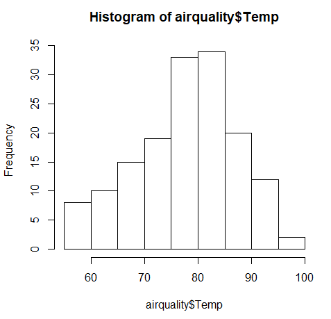
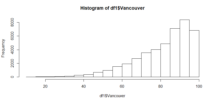
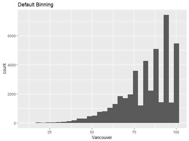
As seen in the preceding section, we can create a default histogram by using one of the commands in the base R package: hist. This is seen in the following command:
hist(df_hum$Vancouver)
The default histogram that will be created is as follows:
Creating a Histogram Using qplot and ggplot
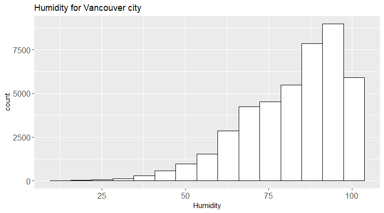
In this section, we want to visualize the humiditydistribution for the city of Vancouver. We'll create a histogram for humidity data using qplot and ggplot.
Let's begin by implementing the following steps:
- Create a plot with RStudio by using the following command:
qplot(df_hum$Vancouver):
- Use ggplot to create the same plot using the following command:
ggplot(df_hum,aes(x=Vancouver))
Note
This command does not do anything; ggplot2 requires the name of the object that we wish to make. To make a histogram, we have to specify the geom type (in other words, a histogram). aes stands for aesthetics, or the quantities that get plotted on thex-andy-axes, and their qualities. We will work on changing the aesthetics later, in order to visualize the plot more effectively.
Notice that there are some warning messages, as follows:
'stat_bin()' using 'bins = 30'. Pick better value with 'binwidth'.
 Warning message:
 Removed 1826 rows containing non-finite values (stat_bin).
You can ignore these messages; ggplot automatically detects and removes null or NA values.
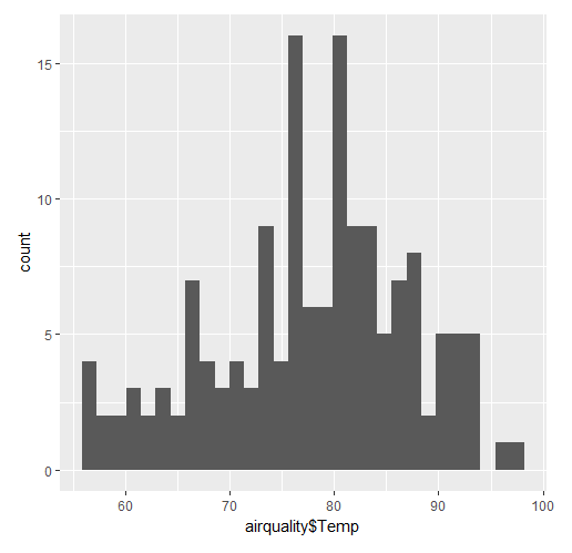
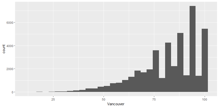
- Obtain the histogram with
ggplot by using the following command:
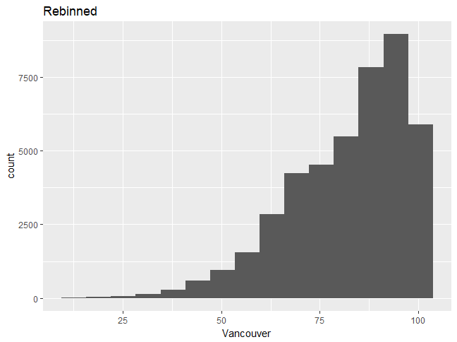
ggplot (df_hum, aes(x=Vancouver)) + geom_histogram()
You'll see the following output:
Here's the output code:
require("ggplot2")
require("tibble")
#Load a data file - Read the Humidity Data
df_hum <- read.csv("data/historical-hourly-weather-data/humidity.csv")
#Display the summary
str(df_hum)
qplot(df_hum$Vancouver)
ggplot(df_hum, aes(x=Vancouver)) + geom_histogram()
Note
Refer to the complete code at https://goo.gl/tu7t4y.In order for ggplot to work, you will need to specify the geometric object. Note that the column name should not be enclosed in strings.
Activity: Creating a Histogram and Explaining its Features
Scenario
Histograms are useful when you want to find the peak and spread in a distribution. For example, suppose that a company wants to see what its client age distribution looks like. A two-dimensional distribution can show relationships; for example, one can create a scatter plot of the incomes and ages of credit card holders.
Aim
To create and analyze histograms for the given dataset.
Prerequisites
You should be able to use ggplot2 to create a histogram.
Note
This is an empty code, wherein the libraries are already loaded. You will be writing your code here.
Steps for Completion
- Use the template code and load the required datasets.
- Create the histogram for two cities.
- Analyze and compare two histograms to determine the point of difference.
Outcome
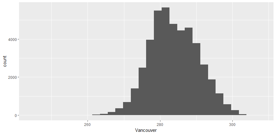
Two histograms should be created and compared. The complete code is as follows:
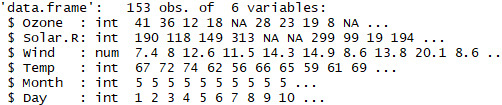
df_t <- read.csv("data/historical-hourly-weather-data/temperature.csv")
ggplot(df_t,aes(x=Vancouver))+geom_histogram()
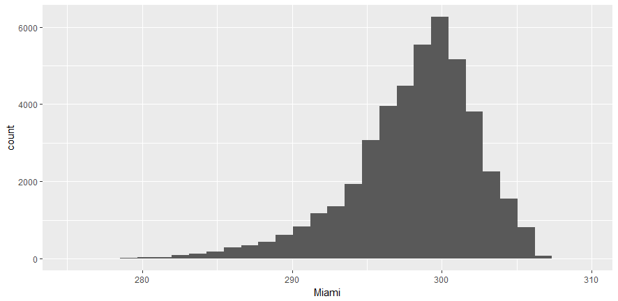
ggplot(df_t,aes(x=Miami))+geom_histogram()
Take a look at the following output histogram:
From the preceding plot, we can determine the following information:
- Vancouver's maximum temperature is around 280.
- It ranges between 260 and 300.
- It's a right-skewed distribution.
Take a look at the following output histogram:
From the preceding plot, we can determine the following information:
- Miami's maximum temperature is around 300
- It ranges between 280 and 308
- It's a left-skewed distribution
Differences
- Miami's temperature plot is skewed to the right, while Vancouver's is to the left.
- The maximum temperature is higher for Miami.
Bar charts are more general than histograms, and they can represent both discrete and continuous data. They can even be used to represent categorical variables. A bar chart uses a horizontal or vertical rectangular bar that levels of at an appropriate level. A bar chart can be used to represent various quantities, such as frequency counts and percentages.
We will use the weather description data to create a bar chart. To create a bar chart, the geometric object used is geom_bar().
The syntax is as follows:
ggplot(….) + geom_bar(…)
If we use the glimpse or str command to view the weather data, we will get the following results:
Note
You cannot use a histogram for a categorical type of variable.
Creating a One-Dimensional Bar Chart
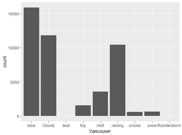
Use the ggplot(df_vanc,aes(x=Vancouver)) + geom_bar() command to obtain the following chart:
Observations
Vancouver has clear weather, for the most part. It rained about 10,000 times for the dataset provided. Snowy periods are much less frequent.
We will now perform two exercises, creating a one-dimensional bar chart and a two-dimensional bar chart. A one-dimensional bar chart can give us the counts or frequency of a given variable. A two-dimensional bar chart can give us the
relationship between the variables.
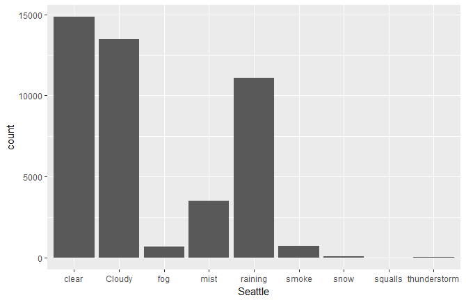
In this section, we'll count the number of times each type of weather occurs in Seattle and compare it to Vancouver.
Let's begin by following these steps:
- Use ggplot2 and
geom_bar in conjunction to create the bar chart. - Use the data frame that we just created, but with Seattle instead of Vancouver, as follows:
ggplot(df_vanc,aes(x=Seattle)) + geom_bar()
- Now, compare the two bar charts and answer the following questions:
- Approximately how many times was Vancouver cloudy? (Round to 2 significant figures.)
- Which of the two cities sees a greater amount of rain?
- What is the percentage of rainy days versus clear days? (Add the two counts and give the percentage of days it rains.)
- According to this dataset, which city gets a greater amount of snow?
You should see the following output:
Answers
- Vancouver was cloudy 13,000 times. (Note that 12,000 is also acceptable.)
- Seattle sees a greater amount of rain.
It rained on approximately 40% of the days.
- Vancouver gets a greater amount of snow.
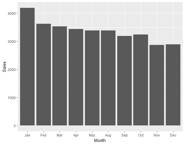
A two-dimensional bar chart can be used to plot the sum of a continuous variable versus a categorical or discrete variable. For example, you might want to plot the total amount of rainfall in different weather conditions, or the total amount of sales in different months.
Creating a Two-Dimensional Bar Chart
In this section, we'll create a two-dimensional bar chart for the total sales of a company in different months.
Let's begin by following these steps:
- Load the data. Add the line
require (Lock5Data) into your code. You should have installed this package previously. - Review the data with the
glimpse(RetailSales) command. - Plot a graph of
Sales versus Month.
Note
Here, Month is a categorical variable, while Sales is a continuous variable of the type <dbl>.
- Use
ggplot + geom_bar(..) to plot this data, as follows:
ggplot(RetailSales,aes(x=Month,y=Sales)) + geom_bar(stat="identity")
A screenshot of the expected outcome is as follows:
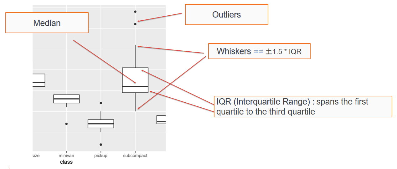
Analyzing and Creating Boxplots
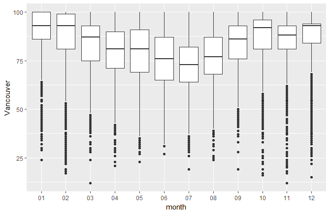
A boxplot (also known as a box and whisker diagram) is a standard way of displaying the distribution of data based on a file-number summary: minimum, first quartile, median, third quartile, and maximum. Boxplots can represent how a continuous variable is distributed for different categories; one of the axes will be a categorical variable, while the other will be a continuous variable. In the default boxplot, the central rectangle spans the first quartile to the third quartile (called the interquartile range, or IQR). A segment inside of the rectangle shows the median, and the lines (whiskers) above and below the box indicate the locations of the minimum and maximum, as shown in the following diagram:
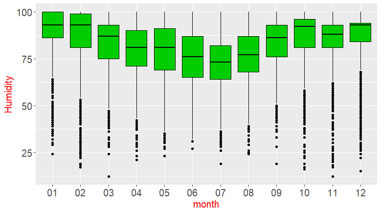
The upper whisker extends from the hinge to the largest and smallest values of ± 1.5 * IQR from the hinge. Here, we can see the humidity data as a function of the month. Data beyond the end of the whiskers are called outliers, and are represented as circles, as seen in the following chart:
You'll get the preceding chart by using the following code:
ggplot(df_hum,aes(x=month,y=Vancouver)) + geom_boxplot()
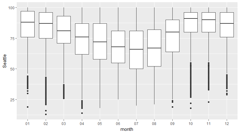
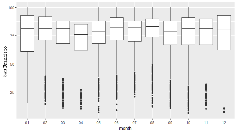
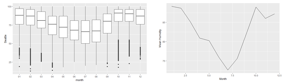
Creating a Boxplot for a Given Dataset
In this section, we'll create a boxplot for monthly temperature data for Seattle and San Francisco, and compare the two (given two points).
Let's begin by implementing the following steps:
- Create the two boxplots.
- Display them side by side in your Word document.
- Provide two points of comparison between the two. You can comment on how the medians compare, how uniform the distributions look, the maximum and minimum humidity, and so on.
The following observations can be noted:
The humidity is more uniform for San Francisco:
The median humidity for San Francisco is about 75:
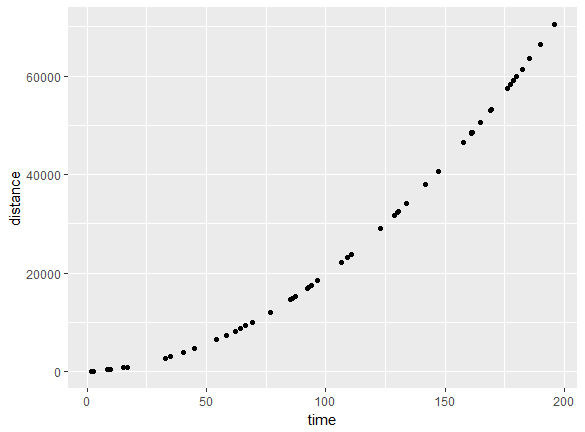
A scatter plot shows the relationship between two continuous variables. Let's create a scatter plot of distance versus time for a car that is accelerating and traveling with an initial velocity. We will generate some random time points according to a function. The relationship between distance and time for a speeding car is as follows:
We can draw a scatter plot to show the relationship between distance and time with the following code:
ggplot(df,aes(x=time,y=distance)) + geom_point()
We can see a positive correlation, meaning that as time increases, distance increases. Take a look at the following code:
a=3.4
v0=27
time <- runif(50, min=0, max=200)
distance <- sapply(time, function(x) v0*x + 0.5*a*x^2)
df <- data.frame(time,distance)
ggplot(df,aes(x=time,y=distance)) + geom_point()
The outcome is a positive correlation: as time increases, distance increases:
The correlation can also be zero (for no relationship) or negative (as x increases, y decreases).
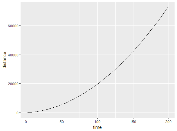
A line chart shows the relationship between two variables; it is similar to a scatter plot, but the points are connected by line segments. One difference between the usage of a scatter plot and a line chart is that, typically, it's more meaningful to use the line chart if the variable being plotted on the x-axis has a one-to-one relationship with the variable being plotted on the y-axis. A line chart should be used when you have enough data points, so that a smooth line is meaningful to see a functional dependence:
We could have also used a line chart for the previous plot. The advantage of using a line chart is that the discrete nature goes away and you can see trends more easily, while the functional form is more effectively visualized.
If there is more than one y value for a givenx, the data needs to be grouped by the x value; then, one can show the features of interest from the grouped data, such as the mean, median, maximum, minimum, and so on. We will use grouping in the next section.
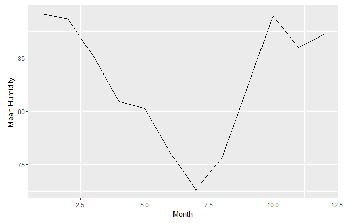
In this section, we'll create a line chart to plot the mean humidity against the month. Lets's begin by implementing the following steps:
- Convert the months into numerical integers, as follows:
df_hum$monthn <- as.numeric(df_hum$month)
- Group the humidity by month and remove NAs, as follows:
gp1 <- group_by(df_hum,monthn)
- Create a summary of the group using the mean and median.
- Now, use the
geom_line() command to plot the line chart (refer to the code).
The following plots are obtained:
Take a look at the output line chart:
Activity: Creating One- and Two-Dimensional Visualizations with a Given Dataset
Scenario
Suppose that we are in a company, and we have been given an unknown dataset and would like to create similar plots. For example, we have some educational data, and we would like to know what courses are the most popular, or the gender distribution among students, or how satisfied the parents/students are with the courses. We will use the new dataset, along with our own knowledge, to get some information on the preceding points.
Aim
To create one- and two-dimensional visualizations for the new dataset and the given variables.
Steps for Completion
- Load the datasets.
- Choose the appropriate visualization.
- Create the desired 1D visualization.
- Create two-dimensional boxplots or scatter plots and note your observations.
Outcome
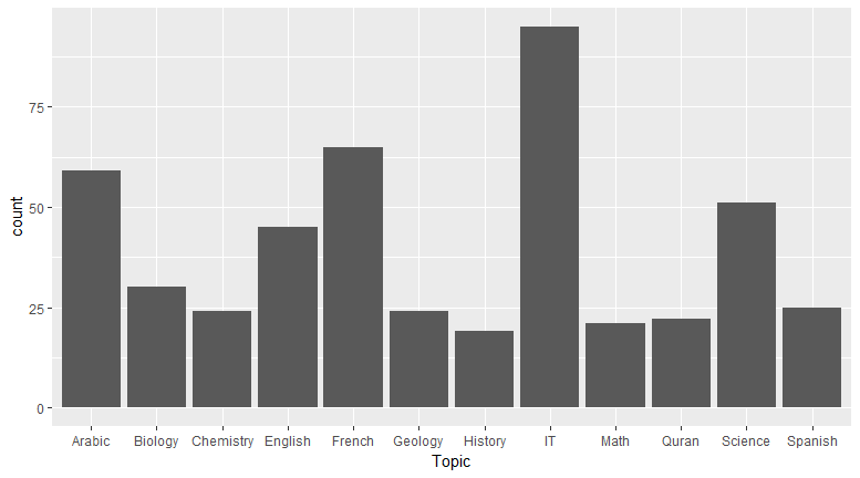
Three one-dimensional plots and three two-dimensional plots should be created, with the following axes (count versus topic) and observations. (Note that the students may provide different observations, so the instructor should verify the answers. The following observations are just examples.)
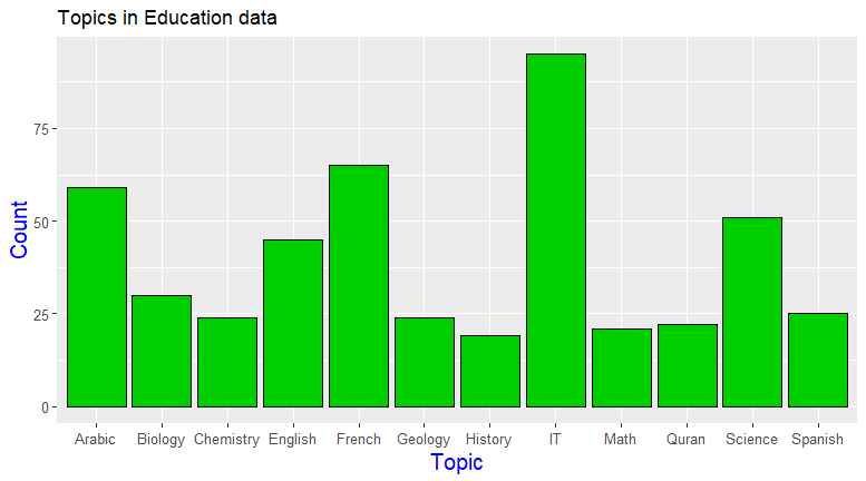
This visual was chosen becauseTopic is a categorical variable, and I wanted to see the frequency of each topic:
Observation
You can see that IT is the most popular subject:
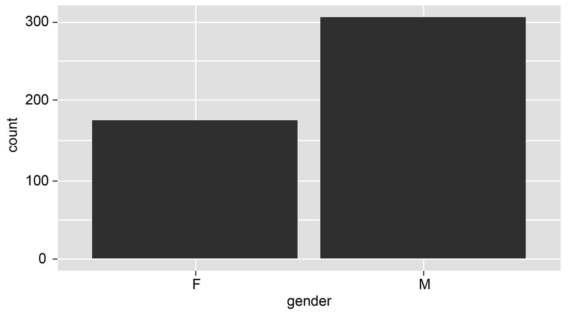
gender is a categorical variable; you can chose a bar chart because you wanted to see the frequency of each topic.
Observation
You can observe that more males are registered in this institute from the following histogram:
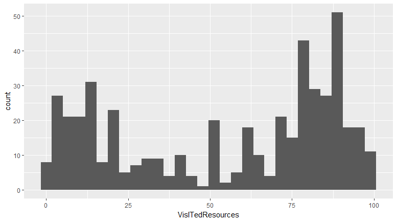
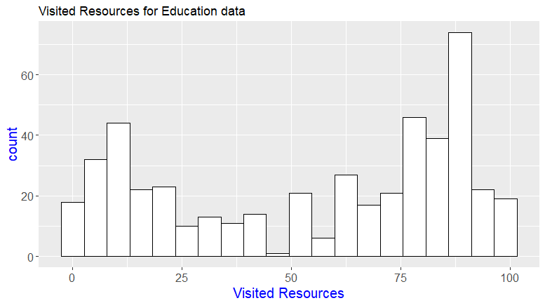
VisitedResources is numerical, so you can choose a histogram to visualize it.
Observation
It's a bimodal histogram with two peaks, around 12 and 85.
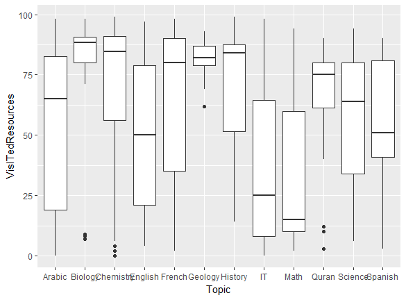
Take a look at the following 2D plots:
Plot 1:
Plot 2:
Plot 3:
Observations
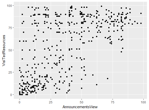
- I see that there is a weak positive correlation between AnnouncementsView and VisitedResources.
- Students in Math hardly visit resources; the median is the lowest, at about 12.5.
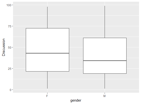
- Females participate in discussions more frequently, as their median and maximum are higher.
- People in Biology visit resources the most.
- The median number of discussions for females is 37.5.
It is also possible to plot using three-dimensional vectors. This creates a three-dimensional plot, which provides enhanced visualization for applications (for example, displaying three-dimensional spaces). Essentially, it is a graph of two functions, embedded into a three-dimensional environment.
 Argentina
 Australia
 Austria
 Belgium
 Brazil
 Bulgaria
 Canada
 Chile
Chile
 Colombia
 Cyprus
 Czechia
 Denmark
 Ecuador
 Egypt
Egypt
 Estonia
 Finland
 France
 Germany
 Great Britain
 Greece
 Hungary
 India
India
 Indonesia
 Ireland
 Italy
Italy
 Japan
Japan
 Latvia
 Lithuania
 Luxembourg
 Malaysia
 Malta
Malta
 Mexico
 Netherlands
 New Zealand
 Norway
 Philippines
 Poland
 Portugal
 Romania
 Russia
 Singapore
 Slovakia
 Slovenia
 South Africa
 South Korea
 Spain
Spain
 Sweden
 Switzerland
 Taiwan
 Thailand
 Turkey
 Ukraine
 United States