Search icon
Arrow left icon
All Products
Best Sellers
New Releases
Books
Videos
Audiobooks
Learning Hub
Newsletters
Free Learning
Arrow right icon
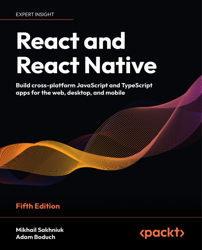
React and React Native - Fifth Edition

You're reading from  React and React Native - Fifth Edition

Product type Book
Published in Apr 2024
Publisher Packt
ISBN-13 9781805127307
Pages 508 pages
Edition 5th Edition
Languages
Authors (2):
Mikhail Sakhniuk Mikhail Sakhniuk
Profile icon Mikhail Sakhniuk
Adam Boduch Adam Boduch
Profile icon Adam Boduch
View More author details

Table of Contents (33) Chapters

Preface 1. Part I: React
2. Why React? 3. Rendering with JSX 4. Understanding React Components and Hooks 5. Event Handling in the React Way 6. Crafting Reusable Components 7. Type-Checking and Validation with TypeScript 8. Handling Navigation with Routes 9. Code Splitting Using Lazy Components and Suspense 10. User Interface Framework Components 11. High-Performance State Updates 12. Fetching Data from a Server 13. State Management in React 14. Server-Side Rendering 15. Unit Testing in React 16. Part II: React Native
17. Why React Native? 18. React Native under the Hood 19. Kick-Starting React Native Projects 20. Building Responsive Layouts with Flexbox 21. Navigating Between Screens 22. Rendering Item Lists 23. Geolocation and Maps 24. Collecting User Input 25. Responding to User Gestures 26. Showing Progress 27. Displaying Modal Screens 28. Using Animations 29. Controlling Image Display 30. Going Offline 31. Other Books You May Enjoy
32. Index

Collecting User Input

In web applications, you can collect user input from standard HTML form elements that look and behave similarly on all browsers. With native UI platforms, collecting user input is more nuanced.

In this chapter, you’ll learn how to work with the various React Native components that are used to collect user input. These include text input, selecting from a list of options, checkboxes, and date/time selectors. All of these are used in every app in cases of register or login flow, as well as the purchase form. The experience of creating such forms is very valuable and this chapter will help you to know how to create any form in your future apps. You’ll learn the differences between iOS and Android and how to implement the appropriate abstractions for your app.

The following topics will be covered in this chapter:

  • Collecting text input
  • Selecting from a list of options
  • Toggling between on and off
  • Collecting date/time...

Technical requirements

You can find the code files for this chapter on GitHub at https://github.com/PacktPublishing/React-and-React-Native-5E/tree/main/Chapter22.

Collecting text input

It turns out that there’s a lot to think about when it comes to implementing text inputs. For example, should it have placeholder text? Is this sensitive data that shouldn’t be displayed on the screen? Should you process text as it’s entered or when the user moves to another field?

In web apps, there is a special <input> HTML element that allows you to collect user inputs. In React Native, for that purpose, we use the TextInput component. Let’s build an example that renders several instances of the <TextInput> component:

function Input(props: InputProps) {
  return (
    <View style={styles.textInputContainer}>
      <Text style={styles.textInputLabel}>{props.label}</Text>
      <TextInput style={styles.textInput} {...props} />
    </View>
  );
}

We have implemented the Input component that we will reuse several times. Let’s take a look at a few use cases of text inputs...

Selecting from a list of options

In web applications, you typically use the <select> element to let the user choose from a list of options. React Native comes with a Picker component, which works on both iOS and Android, but in terms of reducing the React Native app size, the Meta team decided to delete it in future releases and extract Picker to its own package. To use that package, firstly, we install it in a clean project by running this command:

npx expo install @react-native-picker/picker

There is some trickery involved with styling this component based on which platform the user is on, so let’s hide all of this inside a generic Select component. Here’s the Select.ios.js module:

export default function Select(props: SelectProps) {
  return (
    <View style={styles.pickerHeight}>
      <View style={styles.pickerContainer}>
        <Text style={styles.pickerLabel}>{props.label}</Text>
        <Picker style={styles.picker...

Toggling between on and off

Another common element you’ll see in web forms is checkboxes. For example, think of toggling Wi-Fi or Bluetooth on your device. React Native has a Switch component that works on both iOS and Android. Thankfully, this component is a little easier to style than the Picker component. Let’s look at a simple abstraction you can implement to provide labels for your switches:

type CustomSwitchProps = SwitchProps & {
  label: string;
};
export default function CustomSwitch(props: CustomSwitchProps) {
  return (
    <View style={styles.customSwitch}>
      <Text>{props.label}</Text>
      <Switch {...props} />
    </View>
  );
}

Now, let’s learn how we can use a couple of switches to control application state:

export default function TogglingOnAndOff() {
  const [first, setFirst] = useState(false);
  const [second, setSecond] = useState(false);
  return (
    <View style={styles.container}>...

Collecting date/time input

In this final section of this chapter, you’ll learn how to implement date/time pickers. React Native docs suggest using @react-native-community/datetimepicker independent date/time picker components for iOS and Android, which means that it is up to you to handle the cross-platform differences between the components.

To install datetimepicker, run the following command in the project:

npx expo install @react-native-community/datetimepicker

So, let’s start with a DatePicker component for iOS:

export default function DatePicker(props: DatePickerProps) {
  return (
    <View style={styles.datePickerContainer}>
      <Text style={styles.datePickerLabel}>{props.label}</Text>
      <DateTimePicker
        mode="date"
        display="spinner"
        value={props.value}
        onChange={(event, date) => {
          if (date) {
            props.onChange(date);
          }
        }}
 ...

Summary

In this chapter, we learned about the various React Native components that resemble the form elements from the web that we’re used to. We started off by learning about text input and how each text input has its own virtual keyboard to take into consideration. Next, we learned about Picker components, which allow the user to select an item from a list of options. Then, we learned about the Switch component, which is kind of like a checkbox. With these components, you will be able to build a form of any complexity.

In the final section, we learned how to implement generic date/time pickers that work on both iOS and Android. In the next chapter, we’ll learn about modal dialogs in React Native.

lock icon The rest of the chapter is locked
You have been reading a chapter from
React and React Native - Fifth Edition
Published in: Apr 2024 Publisher: Packt ISBN-13: 9781805127307
Register for a free Packt account to unlock a world of extra content!
A free Packt account unlocks extra newsletters, articles, discounted offers, and much more. Start advancing your knowledge today.
Unlock this book and the full library FREE for 7 days
Get unlimited access to 7000+ expert-authored eBooks and videos courses covering every tech area you can think of
Renews at €14.99/month. Cancel anytime}