


 Download code from GitHub
Meet Tkinter
Welcome to the exciting world of GUI programming with Tkinter. This chapter aims to get you acquainted with Tkinter, the built-in Graphical User Interface (GUI) library for all standard Python distributions.
Tkinter (pronounced tea-kay-inter) is the Python interface to Tk, the GUI toolkit for Tcl/Tk.
Tcl (Tool command language), which is pronounced as tickle, is a popular scripting language in the domains of embedded applications, testing, prototyping, and GUI development. On the other hand, Tk is an open source, multiplatform widget toolkit that is used by many different languages to build GUI programs.
The Tkinter interface is implemented as a Python module— Tkinter.py in Python 2.x Versions and tkinter/__init__.py in Python 3.x Versions. If you look at the source code, Tkinter is just a wrapper around a C extension that uses the Tcl/Tk libraries.
Tkinter is suitable for a wide variety of areas, ranging from small desktop applications to scientific modeling and research endeavors across various disciplines.
When a person learning Python needs to graduate to GUI programming, Tkinter seems to be the easiest and fastest way to get the work done.
Tkinter is a great tool for the programming of GUI applications in Python. The features that make Tkinter a great choice for GUI programming include the following:
- It is simple to learn (simpler than any other GUI package for Python)
- Relatively little code can produce powerful GUI applications
- Layered design ensures that it is easy to grasp
- It is portable across all operating systems
- It is easily accessible, as it comes pre-installed with the standard Python distribution
None of the other Python GUI toolkits have all of these features at the same time.
The purpose of this chapter is to make you comfortable with Tkinter. It aims to introduce you to the various components of GUI programming with Tkinter.
We believe that the concepts that you will develop in this chapter will enable you to apply and develop GUI applications in your area of interest.
The key aspects that we want you to learn from this chapter include the following:
- Understanding the concept of a root window and the main loop
- Understanding widgets—the building blocks of programs
- Getting acquainted with a list of available widgets
- Developing layouts by using different geometry managers
- Applying events and callbacks to make a program functional
- Styling widgets by using styling options and configuring the root widget
Technical requirements
We assume a basic working knowledge of Python. You must know how to write and run basic programs in Python.
We will develop our application on the Linux Mint platform. However, since Tkinter is multiplatform, you can follow along with the instructions in this book on Windows, Mac, or any other Linux distribution, without making any modifications to the code.
Project overview
By the end of this chapter, you will have developed several partly functional dummy applications, such as the one shown in the following screenshot:
We call these dummy applications because they are neither fully functional nor do they serve any practical purpose other than to show a particular feature of Tkinter.
Getting started
We will write all our projects using Python Version 3.6.3, which is the latest stable release of Python at the time of writing.
The Python download package and instructions for downloading for different platforms are available at https://www.python.org/downloads/release/python-363/.
The installer binaries for macOS X and the Windows platform are available at the aforementioned link.
If you are following along on Unix, Linux, or BSD, the following procedure will install Python from the source.
First, install tk8.6-dev and python3-tk packages on your computer using your applicable package manager. For instance, on Debian-based systems such as Ubuntu and Mint, run the following two commands from the Terminal:
sudo apt install tk8.6-dev
sudo apt install python3-tk
Download Python 3.6.3 from the preceding link and extract it to any location of your choice. Open a Terminal in the location where you extracted Python and type in the following commands:
./configure
 make
 make test
 sudo make altinstall
This should install Python 3.6.3 on your computer. Now open a command line and enter the following command:
$ python3.6
This will open the Python 3.6 interactive shell. Type in the following command:
>>> import tkinter
This command should execute without any errors. If there are no error messages, the Tkinter module is installed on your Python distribution.
When working with examples from this book, we do not support any Python Version except for Python 3.6.3, which comes bundled with Tkinter Tcl/Tk Version 8.6. However, most of the examples should work out-of-the-box on other minor Python 3 Versions.
To check whether you have the correct Tkinter Version on your Python installation, type the following commands in your IDLE or interactive shell:
>>> import tkinter
>>> tkinter._test()
This should confirm the Tcl/Tk Version as 8.6. We are now ready to build our GUI programs!
The next steps are optional and you may skip them at your discretion. While the preceding steps are sufficient for us to develop our programs, I highly recommend that you use a virtual environment for developing your programs.
Virtual environments provide a secluded environment with no conflicts with system programs, and they can be easily reproduced on any other system.
So now let's set up a virtual environment. First, create a folder where you will keep all projects from this book. Let's call it myTkinterProjects or whatever suits you.
Next, find the location of the Python 3.6 installation on your computer. On my computer, I can find the location of the Python installation by running the following command:
$ which python3.6
Take a note of the location. For me it is /usr/local/bin/python3.6. Now open a Terminal in your myTkinterProjects folder and run the following command:
$ virtualenv -p /location/of /python3.6 myvenv/
This will create a new virtual environment in a folder named myvenv inside your project folder.
Lastly, we need to activate this virtual environment. This is done by running the following command:
$ source myenv/bin/activate
Now if you type the command python, it should pick up Python 3.6.3 from within your virtual environment.
From now onward, every time we have to run a Python script or install a new module, we will first activate the virtual environment using the preceding command and run or install the module within this new virtual environment.
GUI programming – the big picture
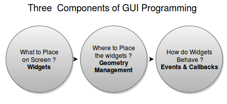
As a GUI programmer, you will generally be responsible for deciding the following three aspects of your program:
- Which components should appear on the screen?
This involves choosing the components that make the user interface. Typical components include things such as buttons, entry fields, checkboxes, radio buttons, and scrollbars. In Tkinter, the components that you add to your GUI are called widgets. Widgets (short for window gadgets) are the graphical components that make up your application's frontend.
- Where should the components go?
This includes deciding the position and the structural layout of various components. In Tkinter, this is referred to as geometry management.
- How do components interact and behave?
This involves adding functionality to each component. Each component or widget does something. For example, a button, when clicked on, does something in response. A scrollbar handles scrolling, and checkboxes and radio buttons enable users to make some choices. In Tkinter, the functionality of various widgets is managed by command binding or event binding using callbacks.
The following diagram shows the three components of GUI programming:
The root window – your drawing board
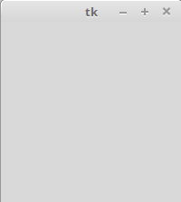
GUI programming is an art, and like all art you need a drawing board to capture your ideas. The drawing board that you will use is called the root window. Our first goal is to get the root window ready.
The following screenshot depicts the root window that we are going to create:
Drawing the root window is easy. You just need the following three lines of code:
import tkinter as tk
root = tk.Tk() #line 2
root.mainloop()
Save this with the .py file extension or check out the code present in the 1.01.py file. Open it in the IDLE window or run it from within your activated virtual environment using the following command:
$ python 1.01.py
Running this program should generate a blank root window, as shown in the preceding screenshot. This window is equipped with functional minimize, maximize, and close buttons, and a blank frame.
You can download the example code files for all Packt books you have purchased from your account at http://www.packtpub.com. Apart from going to Packt's official website, you can also find the code files for this book at https://github.com/PacktPublishing/Tkinter-GUI-Application-Development-Blueprints-Second-Edition. If you purchased this book elsewhere, you can visit http://www.packtpub.com/support and register to have the files emailed directly to you.
The following is a description of the preceding code:
- The first line imported the tkinter module into the namespace with tk as its alias. Now we can access all definitions of the classes, attributes, and methods of Tkinter by appending the alias tk to the name as in tk.Tk().
- The second line created an instance of the tkinter.Tk class. This created what is called the root window, which is shown in the preceding screenshot. According to the conventions, the root window in Tkinter is usually called root, but you are free to call it by any other name.
- The third line executed the mainloop (that is, the event loop) method of the root object. The mainloop method is what keeps the root window visible. If you remove the third line, the window created in line 2 will disappear immediately as soon as the script stops running. This will happen so fast that you will not even see the window appearing on your screen. Keeping the mainloop method running also lets you keep the program running until you press the Close button, which exits mainloop.
- Tkinter also exposed the mainloop method as tkinter.mainloop(). So, you can even call mainloop() directly instead of calling root.mainloop().
Congratulations! You have completed your first objective, which was to draw the root window. You have now prepared your drawing board (root window). Now, get ready to paint it with your imagination!
Widgets – the building blocks of GUI programs
Now that we have our top level or the root window ready, it is time to think over the question: which components should appear in the window? In Tkinter jargon, these components are called widgets.
The syntax that is used to add a widget is as follows:
my_widget = tk.Widget-name (its container window, ** its configuration options)
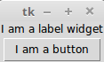
In the following example ( 1.02.py ), we will add two widgets, a label and a button, to the root container. Also, note how all the widgets are added between the skeleton code that we defined in the first example:
import tkinter as tk
root = tk.Tk()
label = tk.Label(root, text="I am a label widget")
button = tk.Button(root, text="I am a button")
label.pack()
button.pack()
root.mainloop()
Running the preceding code(1.02.py) will generate a window with a label and a button widget, as shown in the following screenshot:
The following is a description of the preceding code:
- This code added a new instance named label for the label widget. The first parameter defined root as its parent or container. The second parameter configured its text option to read I am a label widget.
- Similarly, we defined an instance of a Button widget. This is also bound to the root window as its parent.
- We used the pack() method, which is essentially required to position the label and button widgets within the window. We will discuss the pack() method and several other related concepts when exploring the geometry management task. However, you must note that some sort of geometry specification is essential for the widgets to be displayed.
Some important widget features
Note the following few important features that are common to all widgets:
- All widgets are actually objects derived from their respective widget classes. So, a statement such as button = Button(its_parent) actually creates a button instance from the Button class.
- Each widget has a set of options that decides its behavior and appearance. This includes attributes such as text labels, colors, and font size. For example, the Button widget has attributes to manage its label, control its size, change its foreground and background colors, change the size of the border, and more.
- To set these attributes, you can set the values directly at the time of creating the widget, as demonstrated in the preceding example. Alternatively, you can later set or change the options of the widget by using the .config() or .configure() method. Note that the .config() or .configure() methods are interchangeable and provide the same functionality. In fact, the .config() method is simply an alias of the .configure() method.
Ways to create widgets
There are two ways to create widgets in Tkinter.
The first way involves creating a widget in one line and then adding the pack() method (or other geometry managers) in the next line, as follows:
my_label = tk.Label(root, text="I am a label widget")
my_label.pack()
Alternatively, you can write both the lines together, as follows:
tk.Label(root, text="I am a label widget").pack()
You can either save a reference to the widget created ( my_label, as in the first example), or create a widget without keeping any reference to it (as demonstrated in the second example).
You should ideally keep a reference to the widget in case the widget has to be accessed later on in the program. For instance, this is useful in case you need to call one of its internal methods or for its content modification. If the widget state is supposed to remain static after its creation, you need not keep a reference to the widget.
my_label = tk.Label(...)
my_label.pack()
This is one of the most common mistakes committed by beginners.
Getting to know the core Tkinter widgets
Now you will get to know all the core Tkinter widgets. You have already seen two of them in the previous example—the Label and Button widgets. Now, let's explore all the other core Tkinter widgets.
Tkinter includes 21 core widgets, which are as follows:
| Top-level | Label | Button |
| Canvas | Checkbutton | Entry |
| Frame | LabelFrame | Listbox |
| Menu | Menubutton | Message |
| OptionMenu | PanedWindow | Radiobutton |
| Scale | Scrollbar | Spinbox |
| Text | Bitmap | Image |
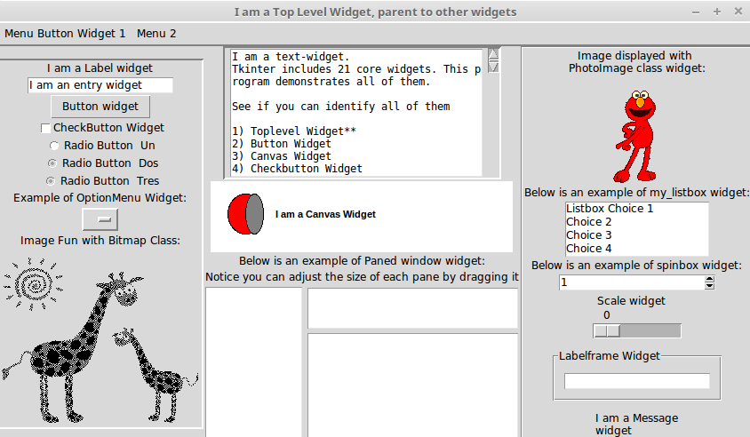
Let's write a program to display all of these widgets in the root window.
Adding widgets to a parent window
The format used to add widgets is the same as the one that we discussed in the previous task. To give you an idea about how it's done, here's some sample code that adds some common widgets:
Label(parent, text="Enter your Password:")
Button(parent, text="Search")
Checkbutton(parent, text="Remember Me", variable=v, value=True)
Entry(parent, width=30)
Radiobutton(parent, text="Male", variable=v, value=1)
Radiobutton(parent, text="Female", variable=v, value=2)
OptionMenu(parent, var, "Select Country", "USA", "UK", "India","Others")
Scrollbar(parent, orient=VERTICAL, command= text.yview)
Can you spot the pattern that is common to each widget? Can you spot the differences?
As a reminder, the syntax for adding a widget is as follows:
Widget-name(its_parent, **its_configuration_options)
Using the same pattern, let's add all the 21 core Tkinter widgets into a dummy application (1.03.py). We do not reproduce the entire code here. A summarized code description for 1.03.py is as follows:
- We create a top-level window and a mainloop, as shown in the earlier examples.
- We add a frame widget and name it menu_bar. Note that frame widgets are just holder widgets that hold other widgets. Frame widgets are great for grouping widgets together. The syntax for adding a frame is the same as that for all the other widgets:
        frame = Frame(root)
        frame.pack()
- Keeping the menu_bar frame as the container, we add two widgets to it:
- Menubutton
- Menu
- We create another frame widget and name it frame. Keeping frame as the container/parent widget, we add the following seven widgets to it:
- Label
- Entry
- Button
- Checkbutton
- Radiobutton
- OptionMenu
- Bitmap Class
- We then proceed to create another frame widget. We add six more widgets to the frame:
- Image Class
- Listbox
- Spinbox
- Scale
- LabelFrame
- Message
- We then create another frame widget. We add two more widgets to the frame:
- Text
- Scrollbar
- We create another frame widget and add two more widgets to it:
- Canvas
- PanedWindow
These constitute the 21 core widgets of Tkinter. Now that you have had a glimpse of all the widgets, let's discuss how to specify the location of these widgets using geometry managers.
The Tkinter geometry manager
You may recall that we used the pack() method to add widgets to the dummy application that we developed in the previous section. The pack() method is an example of geometry management in Tkinter.
The pack() method is not the only way of managing the geometry in your interface. In fact, there are three geometry managers in Tkinter that let you specify the position of widgets inside a top-level or parent window.
The three geometry managers are as follows:
- pack: This is the one that we have used so far. It is simple to use for simpler layouts, but it may get very complex for slightly complex layouts.
- grid: This is the most commonly used geometry manager, and provides a table-like layout of management features for easy layout management.
- place: This is the least popular, but it provides the best control for the absolute positioning of widgets.
Now, let's have a look at some examples of all the three geometry managers in action.
The pack geometry manager
The pack manager can be a bit tricky to explain in words, and it can best be understood by playing with the code base. Fredrik Lundh, the author of Tkinter, asks us to imagine the root as an elastic sheet with a small opening at the center. The pack geometry manager makes a hole in the elastic sheet that is just large enough to hold the widget. The widget is placed along a given inner edge of the gap (the default is the top edge). It then repeats the process till all the widgets are accommodated.
Finally, when all the widgets have been packed in the elastic sheet, the geometry manager calculates the bounding box for all the widgets. It then makes the parent widget large enough to hold all the child widgets.
When packing child widgets, the pack manager distinguishes between the following three kinds of space:
- Unclaimed space
- Claimed but unused space
- Claimed and used space
The most commonly used options in pack include the following:
- side: LEFT, TOP, RIGHT, and BOTTOM (these decide the alignment of the widget)
- fill: X, Y, BOTH, and NONE (these decide whether the widget can grow in size)
- expand: Boolean values such as tkinter.YES/tkinter.NO, 1 / 0, and True/False
- anchor: NW, N, NE, E, SE, S, SW, W, and CENTER (corresponding to the cardinal directions)
- Internal padding ( ipadx and ipady ) for the padding inside widgets and external padding ( padx and pady ), which all default to a value of zero
Let's take a look at demo code that illustrates some of the pack features.
Two of the most commonly used pack options are fill and expand:
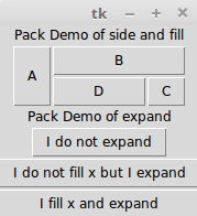
The following code (1.04.py) generates a GUI like the one shown in the preceding screenshot:
import tkinter as tk
root = tk.Tk()
frame = tk.Frame(root)
# demo of side and fill options
tk.Label(frame, text="Pack Demo of side and fill").pack()
tk.Button(frame, text="A").pack(side=tk.LEFT, fill=tk.Y)
tk.Button(frame, text="B").pack(side=tk.TOP, fill=tk.X)
tk.Button(frame, text="C").pack(side=tk.RIGHT, fill=tk.NONE)
tk.Button(frame, text="D").pack(side=tk.TOP, fill=tk.BOTH)
frame.pack()
# note the top frame does not expand or fill in X or Y directions
# demo of expand options - best understood by expanding the root
#vwidget and seeing the effect on all the three buttons below.
tk.Label (root, text="Pack Demo of expand").pack()
tk.Button(root, text="I do not expand").pack()
tk.Button(root, text="I do not fill x but I expand").pack(expand = 1)
tk.Button(root, text="I fill x and expand").pack(fill=tk.X, expand=1)
root.mainloop()
The following is a description of the preceding code:
- When you insert the A button in the root frame, it captures the leftmost area of the frame, expands, and fills the Y dimension. Because the fill option is specified as fill=tk.Y, it claims all the area that it wants and fills the Y dimension of its container frame.
- Because frame is itself packed with a plain pack() method with no mention of a pack option, it takes the minimum space required to accommodate all of its child widgets.
- If you increase the size of the root window by pulling it down or sideways, you will see that all the buttons within the frame do not fill or expand with the root window.
- The positioning of the B, C, and D buttons occurs on the basis of the side and fill options specified for each of them.
- The next three buttons (after B, C, and D) demonstrate the use of the expand option. A value of expand=1 means that the button moves its place on resizing the window. Buttons with no explicit expand options stay in their place and do not respond to changes in the size of their parent container (the root window, in this case).
- The best way to study this piece of code would be to resize the root window to see the effect that it has on various buttons.
- The anchor attribute (not used in the preceding code) provides a means to position a widget relative to a reference point. If the anchor attribute is not specified, the pack manager places the widget at the center of the available space or the packing box. The other options that are allowed include the four cardinal directions (N, S, E, and W) and a combination of any two directions. Therefore, valid values for the anchor attribute are CENTER (the default value), N, S, E, W, NW, NE, SW, and SE.
We will use the pack geometry manager in some of our projects. Therefore, it will be worthwhile to get acquainted with pack and its options.
The pack manager is ideally suited for the following two kinds of situation:
- Placing widgets in a top-down manner
- Placing widgets side by side
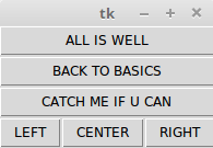
1.05.py shows an example of both of these scenarios:
parent = tk.Frame(root)
# placing widgets top-down
tk.Button(parent, text='ALL IS WELL').pack(fill=tk.X)
tk.Button(parent, text='BACK TO BASICS').pack(fill=tk.X)
tk.Button(parent, text='CATCH ME IF U CAN').pack(fill=tk.X)
# placing widgets side by side
tk.Button(parent, text='LEFT').pack(side=tk.LEFT)
tk.Button(parent, text='CENTER').pack(side=tk.LEFT)
tk.Button(parent, text='RIGHT').pack(side=tk.LEFT)
parent.pack()
The preceding code produces a GUI, as shown in the following screenshot:
For a complete pack reference, type the following command in the Python shell:
>> import tkinter
>>> help(tkinter.Pack)
Besides getting interactive help with documentation, Python's REPL is also a great tool for iterating and quick prototyping of Tkinter programs.
Using the pack manager is somewhat complicated as compared to the grid method, which will be discussed next, but it is a great choice in situations such as the following:
- Having a widget fill the complete container frame
- Placing several widgets on top of each other or side by side (as shown in the preceding screenshot)
Although you can create complicated layouts by nesting widgets in multiple frames, you will find the grid geometry manager more suitable for most complex layouts.
The grid geometry manager
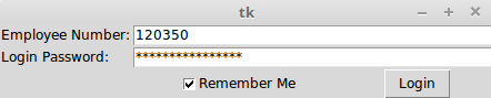
The grid geometry manager is easy to understand and perhaps the most useful geometry manager in Tkinter. The central idea of the grid geometry manager is to organize the container frame into a two-dimensional table that is divided into a number of rows and columns. Each cell in the table can then be targeted to hold a widget. In this context, a cell is an intersection of imaginary rows and columns.
Note that in the grid method, each cell can hold only one widget. However, widgets can be made to span multiple cells.
Within each cell, you can further align the position of the widget using the sticky option. The sticky option decides how the widget is expanded. If its container cell is larger than the size of the widget that it contains, the sticky option can be specified using one or more of the N, S, E, and W options or the NW, NE, SW, and SE options.
Not specifying stickiness defaults stickiness to the center of the widget in the cell.
Let's have a look at demo code that illustrates some features of the grid geometry manager. The code in 1.06.py generates a GUI, as shown in the following screenshot:
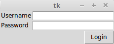
The following code (1.06.py) generates the preceding GUI:
import tkinter as tk
root = tk.Tk()
tk.Label(root, text="Username").grid(row=0, sticky=tk.W)
tk.Label(root, text="Password").grid(row=1, sticky=tk.W)
tk.Entry(root).grid(row=0, column=1, sticky=tk.E)
tk.Entry(root).grid(row=1, column=1, sticky=tk.E)
tk.Button(root, text="Login").grid(row=2, column=1, sticky=tk.E)
root.mainloop()
The following is a description of the preceding code:
- Take a look at the grid position defined in terms of the row and column positions for an imaginary grid table spanning the entire frame. See how the use of sticky=tk.W on both the labels makes them stick on the left-hand side, thus resulting in a clean layout.
- The width of each column (or the height of each row) is automatically decided by the height or width of the widgets in the cell. Therefore, you need not worry about specifying the row or column width as equal. You can specify the width for widgets if you need that extra bit of control.
- You can use the sticky=tk.NSEW argument to make the widget expandable and fill the entire cell of the grid.
In a more complex scenario, your widgets may span across multiple cells in the grid. To make a grid to span multiple cells, the grid method offers handy options such as rowspan and columnspan.
Furthermore, you may often need to provide some padding between cells in the grid. The grid manager provides the padx and pady options to provide padding that needs to be placed around a widget.
Similarly, the ipadx and ipady options are used for internal padding. These options add padding within the widget itself. The default value of external and internal padding is 0.
Let's have a look at an example of the grid manager, where we use most of the common arguments to the grid method, such as row, column, padx, pady, rowspan, and columnspan.
1.07.py produces a GUI, as shown in the following screenshot, to demonstrate how to use the grid geometry manager options:
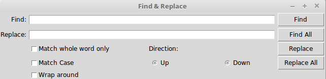
The following code ( 1.07.py ) generates the preceding GUI:
import tkinter as tk
parent = tk.Tk()
parent.title('Find & Replace')
tk.Label(parent, text="Find:").grid(row=0, column=0, sticky='e')
tk.Entry(parent, width=60).grid(row=0, column=1, padx=2, pady=2,
                                sticky='we', columnspan=9)
tk.Label(parent, text="Replace:").grid(row=1, column=0, sticky='e')
tk.Entry(parent).grid(row=1, column=1, padx=2, pady=2, sticky='we',
                       columnspan=9)
tk.Button(parent, text="Find").grid( row=0, column=10, sticky='e' + 'w',
                                padx=2, pady=2)
tk.Button(parent, text="Find All").grid(
                     row=1, column=10, sticky='e' + 'w', padx=2)
tk.Button(parent, text="Replace").grid(row=2, column=10, sticky='e' +
                               'w', padx=2)
tk.Button(parent, text="Replace All").grid(
                     row=3, column=10, sticky='e' + 'w', padx=2)
tk.Checkbutton(parent, text='Match whole word only').grid(
                     row=2, column=1, columnspan=4, sticky='w')
tk.Checkbutton(parent, text='Match Case').grid(
                     row=3, column=1, columnspan=4, sticky='w')
tk.Checkbutton(parent, text='Wrap around').grid(
                     row=4, column=1, columnspan=4, sticky='w')
tk.Label(parent, text="Direction:").grid(row=2, column=6, sticky='w')
tk.Radiobutton(parent, text='Up', value=1).grid(
                     row=3, column=6, columnspan=6, sticky='w')
tk.Radiobutton(parent, text='Down', value=2).grid(
                     row=3, column=7, columnspan=2, sticky='e')
parent.mainloop()
Note how just 14 lines of the core grid manager code generate a complex layout such as the one shown in the preceding screenshot. On the other hand, developing this with the pack manager would have been much more tedious.
Another grid option that you can sometimes use is the widget.grid_forget() method. This method can be used to hide a widget from the screen. When you use this option, the widget still exists at its former location, but it becomes invisible. The hidden widget may be made visible again, but the grid options that you originally assigned to the widget will be lost.
Similarly, there is a widget.grid_remove() method that removes the widget, except that in this case, when you make the widget visible again, all of its grid options will be restored.
For a complete grid reference, type the following command in the Python shell:
>>> import tkinter
>>> help(tkinter.Grid)
The grid manager is a great tool for the development of complex layouts. Complex structures can be easily achieved by breaking the container widget into grids of rows and columns and then placing the widgets in grids where they are wanted. It is also commonly used to develop different kinds of dialog box.
Now we will delve into configuring a grid's column and row sizes.
Different widgets have different heights and widths. So, when you specify the position of a widget in terms of rows and columns, the cell automatically expands to accommodate the widget.
Normally, the height of all the grid rows is automatically adjusted so it's the height of its tallest cell. Similarly, the width of all the grid columns is adjusted so it's equal to the width of the widest widget cell.
If you then want a smaller widget to fill a larger cell or to stay on any one side of the cell, you can use the sticky attribute on the widget to control this aspect.
However, you can override this automatic sizing of columns and rows by using the following code:
w.columnconfigure(n, option=value, ...) AND
w.rowconfigure(n, option=value, ...)
Use these to configure the options for a given widget, w, in either the nth column or the nth row, specifying values for the options, minsize, pad, and weight. Note that the numbering of rows begins from 0 and not 1.
The options available are as follows:
| Options | Descriptions |
|
minsize |
This is the minimum size of a column or row in pixels. If there is no widget in a given column or row, the cell does not appear in spite of this minsize specification. |
|
pad |
This is the external padding in pixels that will be added to the specified column or row over the size of the largest cell. |
|
weight |
This specifies the relative weight of a row or column and then distributes the extra space. This enables making the row or column stretchable. For example, the following code distributes two-fifths of the extra space to the first column and three-fifths to the second column: |
The columnconfigure() and rowconfigure() methods are often used to implement the dynamic resizing of widgets, especially on resizing the root window.
The place geometry manager
The place geometry manager is the most rarely used geometry manager in Tkinter. Nevertheless, it has its uses in that it lets you precisely position widgets within their parent frame by using the (x,y) coordinate system.
The place manager can be accessed by using the place() method on any standard widget.
The important options for place geometry include the following:
- Absolute positioning (specified in terms of x=N or y=N)
- Relative positioning (the key options include relx, rely, relwidth, and relheight)
The other options that are commonly used with place include width and anchor(the default is NW).
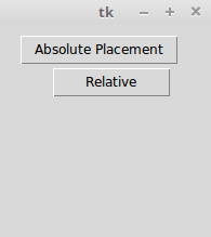
Refer to 1.08.py for a demonstration of common place options:
import tkinter as tk
root = tk.Tk()
# Absolute positioning
tk.Button(root, text="Absolute Placement").place(x=20, y=10)
# Relative positioning
tk.Button(root, text="Relative").place(relx=0.8, rely=0.2, relwidth=0.5,
                              width=10,  anchor=tk.NE)
root.mainloop()
You may not see much of a difference between the absolute and relative positions simply by looking at the code or the window frame. However, if you try resizing the window, you will observe that the Absolute Placement button does not change its coordinates, while the Relative button changes its coordinates and size to accommodate the new size of the root window:
For a complete place reference, type the following command in the Python shell:
>>> import tkinter
>>> help(tkinter.Place)
The place manager is useful in situations where you have to implement custom geometry managers, or where the widget placement is decided by the end user.
While the pack and grid managers cannot be used together in the same frame, the place manager can be used with any geometry manager within the same container frame.
The place manager is rarely used because, if you use it, you have to worry about the exact coordinates. If you make a minor change to a widget, it is very likely that you will have to change the x,y values for other widgets as well, which can be very cumbersome. We will use the place manager in Chapter 7, Piano Tutor.
This concludes our discussion on geometry management in Tkinter.
In this section, you had a look at how to implement the pack, grid, and place geometry managers. You also understood the strengths and weaknesses of each geometry manager.
You learned that pack is suitable for a simple side-wise or top-down widget placement. You also learned that the grid manager is best suited for the handling of complex layouts. You saw examples of the place geometry manager and explored the reasons behind why it is rarely used.
You should now be able to plan and execute different layouts for your programs using these Tkinter geometry managers.
Events and callbacks – adding life to programs
Now that you have learned how to add widgets to a screen and position them where you want, let's turn our attention to the third component of GUI programming.
This addresses the question of how to make widgets functional.
Making widgets functional involves making them responsive to events such as the pressing of buttons, the pressing of keys on a keyboard, and mouse clicks.
This requires associating callbacks with specific events. Callbacks are normally associated with specific widget events using command binding rules, which are discussed in the following section.
Command binding
The simplest way to add functionality to a button is called command binding, whereby a callback function is mentioned in the form of command = some_callback in the widget option. Note that the command option is available only for a few selected widgets.
Take a look at the following sample code:
def my_callback ():
   # do something when button is clicked
After defining the preceding callback, we can connect it to, say, a button with the command option referring to the callback, as follows:
tk.Button(root, text="Click me", command=my_callback)
A callback is a function memory reference ( my_callback in the preceding example) that is called by another function (which is Button in the preceding example) and that takes the first function as a parameter. Put simply, a callback is a function that you provide to another function so that it can calling it.
Note that my_callback is passed without parentheses, (), from within the widget command option, because when the callback functions are set it is necessary to pass a reference to a function rather than actually call it.
If you add parentheses, (), as you would for any normal function, it would be called as soon as the program runs. In contrast, the callback is called only when an event occurs (the pressing of a button in this case).
Passing arguments to callbacks
If a callback does not take any argument, it can be handled with a simple function, such as the one shown in the preceding code. However, if a callback needs to take arguments, we can use the lambda function, as shown in the following code snippet:
def my_callback (argument)
   #do something with argument
Then, somewhere else in the code, we define a button with a command callback that takes some arguments, as follows:
tk.Button(root,text="Click", command=lambda: my_callback ('some argument'))
Python borrows a specific syntax from functional programming, called the lambda function. The lambda function lets you define a single-line, nameless function on the fly.
The format for using lambda is as follows:
lambda arg: #do something with arg in a single line
Here's an example:
square = lambda x: x**2
Now, we can call the square method, as follows:
>> print(square(5)) ## prints 25 to the console
Limitations of the command option
The command option that is available with the Button widget and a few other widgets is a function that can make the programming of a click-of-a-button event easy. Many other widgets do not provide an equivalent command binding option.
By default, the command button binds to the left-click and the spacebar. It does not bind to the Return key. Therefore, if you bind a button by using the command function, it will react to the space bar and not the Return key. This is counter-intuitive for many users. What's worse is that you cannot change the binding of the command function easily. The moral is that command binding, though a very handy tool, is not flexible enough when it comes to deciding your own bindings.
This brings us to the next method for handling events.
Event binding
Fortunately, Tkinter provides an alternative event binding mechanism called bind() to let you deal with different events. The standard syntax used to bind an event is as follows:
widget.bind(event, handler, add=None)
When an event corresponding to the event description occurs in the widget, it calls not only the associated handler, which passes an instance of the event object as the argument, but also the details of the event. If there already exists a binding for that event for this widget, the old callback is usually replaced with the new handler, but you can trigger both the callbacks by passing add='+' as the last argument.
Let's look at an example of the bind() method (code 1.09.py):
import tkinter as tk
root = tk.Tk()
tk.Label(root, text='Click at different\n locations in the frame below').pack()

def callback(event):
    print(dir(event))
    print("you clicked at", event.x, event.y)

frame = tk.Frame(root, bg='khaki', width=130, height=80)
frame.bind("<Button-1>", callback)
frame.pack()
root.mainloop()
The following is a description of the preceding code:
- We bind the Frame widget to the <Button-1> event, which corresponds to the left-click. When this event occurs, it calls the callback function, passing an object instance as its argument.
- We define the callback(event) function. Note that it takes the event object generated by the event as an argument.
- We inspect the event object by using dir(event), which returns a sorted list of attribute names for the event object passed to it. This prints the following list:
[ '__doc__' , '__module__' , 'char' , 'delta' , 'height' , 'keycode' , 'keysym' , keysym_num' , 'num' , 'send_event' , 'serial' , 'state' ,'time' , 'type' , 'widget' , 'width' , 'x' , 'x_root' , 'y' , 'y_root ']
- From the attributes list generated by the object, we use two attributes, event.x and event.y, to print the coordinates of the point of click.
When you run the preceding code (code 1.09.py ), it produces a window, as shown in the following screenshot:
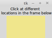
When you left-click anywhere in the yellow colored frame within the root window, it outputs messages to the console. A sample message passed to the console is as follows:
['__doc__', '__module__', 'char', 'delta', 'height', 'keycode', 'keysym', 'keysym_num', 'num', 'send_event', 'serial', 'state', 'time', 'type', 'widget', 'width', 'x', 'x_root', 'y', 'y_root']
 You clicked at 63 36.
Event patterns
In the previous example, you learned how to use the <Button-1> event to denote a left-click. This is a built-in pattern in Tkinter that maps it to a left-click event. Tkinter has an exhaustive mapping scheme that perfectly identifies events such as this one.
Here are some examples to give you an idea of event patterns:
|
The event pattern |
The associated event |
|
<Button-1> |
Left-click of the mouse |
|
<KeyPress-B> |
A keyboard press of the B key |
|
<Alt-Control-KeyPress- KP_Delete> |
A keyboard press of Alt + Ctrl + Del |
In general, the mapping pattern takes the following form:
<[event modifier-]...event type [-event detail]>
Typically, an event pattern will comprise the following:
- An event type: Some common event types include Button, ButtonRelease, KeyRelease, Keypress, FocusIn, FocusOut, Leave (when the mouse leaves the widget), and MouseWheel. For a complete list of event types, refer to the event types section at http://www.tcl.tk/man/tcl8.6/TkCmd/bind.htm#M7.
- An event modifier (optional): Some common event modifiers include Alt, Any (used like <Any-KeyPress>), Control, Double (used like <Double-Button-1> to denote a double-click of the left mouse button), Lock, and Shift. For a complete list of event modifiers, refer to the event modifiers section at http://www.tcl.tk/man/tcl8.6/TkCmd/bind.htm#M6.
- The event detail (optional): The mouse event detail is captured by the number 1 for a left-click and the number 2 for a right-click. Similarly, each key press on the keyboard is either represented by the key letter itself (say, B in <KeyPress-B>) or by using a key symbol abbreviated as keysym. For example, the up arrow key on the keyboard is represented by the keysym value of KP_Up. For a complete keysym mapping, refer to https://www.tcl.tk/man/tcl8.6/TkCmd/bind.htm.
Let's take a look at a practical example of event binding on widgets (refer to code 1.10.py for the complete working example):
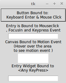
The following is a modified snippet of code; it will give you an idea of commonly
used event bindings:
widget.bind("<Button-1>", callback) #bind widget to left mouse click
widget.bind("<Button-2>", callback) # bind to right mouse click
widget.bind("<Return>", callback)# bind to Return(Enter) Key
widget.bind("<FocusIn>", callback) #bind to Focus in Event
widget.bind("<KeyPress-A>", callback)# bind to keypress A
widget.bind("<KeyPress-Caps_Lock>", callback)# bind to CapsLock keysym
widget.bind("<KeyPress-F1>", callback)# bind widget to F1 keysym
widget.bind("<KeyPress-KP_5>", callback)# bind to keypad number 5
widget.bind("<Motion>", callback) # bind to motion over widget
widget.bind("<Any-KeyPress>", callback) # bind to any keypress
Rather than binding an event to a particular widget, you can also bind it to the top-level window. The syntax remains the same except that now you call it on the root instance of the root window such as root.bind().
Binding levels
In the previous section, you had a look at how to bind an event to an instance of a widget. This can be called an instance-level binding.
However, there may be times when you need to bind events to an entire application. At times, you may want to bind an event to a particular class of widget. Tkinter provides the following levels of binding options for this:
- Application-level binding: Application-level bindings let you use the same binding across all windows and widgets of an application as long as any one window of the application is in focus. The syntax for application-level bindings is as follows:
widget.bind_all(event, callback, add=None)
The typical usage pattern is as follows:
root.bind_all('<F1>', show_help)
Application-level binding here means that, irrespective of the widget that is currently under focus, pressing the F1 key will always trigger the show_help callback as long as the application is in focus.
- Class-level binding: You can also bind events at a particular class level. This is normally used to set the same behavior for all instances of a particular widget class. The syntax for class-level binding is as follows:
w.bind_class(class_name, event, callback, add=None)
The typical usage pattern is as follows:
my_entry.bind_class('Entry', '<Control-V>', paste)
In the preceding example, all the entry widgets will be bound to the <Control-V> event, which will call a method named paste (event).
Most keyboard and mouse events occur at the operating system level. The event propagates hierarchically upward from its source until it finds a window that has the corresponding binding. The event propagation does not stop there. It propagates itself upwards, looking for other bindings from other widgets, until it reaches the root window. If it does reach the root window and no bindings are discovered by it, the event is disregarded.
Handling widget-specific variables
You need variables with a wide variety of widgets. You likely need a string variable to track what the user enters into the entry widget or text widget. You most probably need Boolean variables to track whether the user has checked off the Checkbox widget. You need integer variables to track the value entered in a Spinbox or Slider widget.
In order to respond to changes in widget-specific variables, Tkinter offers its own variable class. The variable that you can use to track widget-specific values must be subclassed from this Tkinter variable class. Tkinter offers some commonly used predefined variables. They are StringVar, IntVar, BooleanVar, and DoubleVar.
You can use these variables to capture and play with the changes in the values of variables from within your callback functions. You can also define your own variable type, if required.
Creating a Tkinter variable is simple. You simply have to call the constructor:
my_string = tk.StringVar()
ticked_yes = tk.BooleanVar()
group_choice = tk.IntVar()
volume = tk.DoubleVar()
Once the variable is created, you can use it as a widget option, as follows:
tk.Entry(root, textvariable=my_string)
tk.Checkbutton(root, text="Remember Me", variable=ticked_yes)
tk.Radiobutton(root, text="Option1", variable=group_choice, value="option1")
tk.Scale(root, label="Volume Control", variable=volume, from =0, to=10)
Additionally, Tkinter provides access to the values of variables via the set() and get() methods, as follows:
my_var.set("FooBar") # setting value of variable
my_var.get() # Assessing the value of variable from say a callback
A demonstration of the Tkinter variable class is available in the 1.11.py code file. The code generates a window, as shown in the following screenshot:
This concludes our brief discussion on events and callbacks. Here's a brief summary of the things that we discussed:
- Command binding, which is used to bind simple widgets to certain functions
- Event binding using the widget.bind_all(event, callback, add=None) method to bind keyboard and mouse events to your widgets and invoke callbacks when certain events occur
- The passing of extra arguments to a callback using the lambda function
- The binding of events to an entire application or to a particular class of widget by using bind_all() and bind_class()
- Using the Tkinter variable class to set and get the values of widget-specific variables
In short, you now know how to make your GUI program responsive to end-user requests!
Event unbinding and virtual events
In addition to the bind method that you previously saw, you might find the following two event-related options useful in certain cases:
- Unbind: Tkinter provides the unbind option to undo the effect of an earlier binding. The syntax is as follows:
widget.unbind(event)
The following are some examples of its usage:
entry.unbind('<Alt-Shift-5>')
root.unbind_all('<F1>')
root.unbind_class('Entry', '<KeyPress-Del>')
- Virtual events: Tkinter also lets you create your own events. You can give these virtual events any name that you want. For example, let's suppose that you want to create a new event called <<commit>>, which is triggered by the F9 key. To create this virtual event on a given widget, use the following syntax:
widget.event_add('<<commit>>', '<KeyRelease-F9>')
You can then bind <<commit>> to a callback by using a normal bind() method, as follows:
widget.bind('<<commit>>', callback)
Other event-related methods can be accessed by typing the following line in the Python Terminal:
>>> import tkinter
>>> help(tkinter.Event)
Now that you are ready to delve into real application development with Tkinter, let's spend some time exploring a few custom styling options that Tkinter offers. We will also have a look at some configuration options that are commonly used with the root window.
Doing it in style
So far, we have relied on Tkinter to provide specific platform-based styling for our widgets. However, you can specify your own styling of widgets, such as their color, font size, border width, and relief. A brief introduction to styling features that are available in Tkinter is supplied in the following section.
You may recall that we can specify widget options at the time of its instantiation, as follows:
my_button = tk.Button(parent, **configuration options)
Alternatively, you can specify the widget options by using configure() in the following way:
my_button.configure(**options)
Styling options are also specified as options to the widgets either at the time of creating the widgets, or later by using the configure option.
Specifying styles
Under the purview of styling, we will cover how to apply different colors, fonts, border widths, reliefs, cursors, and bitmap icons to widgets.
First, let's see how to specify the color options for a widget. You can specify the following two types of color for most widgets:
- The background color
- The foreground color
You can specify the color by using hexadecimal color codes for the proportion of red(r), green(g), and blue(b). The commonly used representations are #rgb (4 bits), #rrggbb (8 bits), and #rrrgggbbb (12 bits).
For example, #fff is white, #000000 is black, #f00 is red (R=0xf, G=0x0 , B=0x0 ), #00ff00 is green (R=0x00, G=0xff, B=0x00), and #000000fff is blue (R=0x000 , G=0x000 , B=0xfff ).
Alternatively, Tkinter provides mapping for standard color names. For a list of predefined named colors, visit http://wiki.tcl.tk/37701 or http://wiki.tcl.tk/16166.
Next, let's have a look at how to specify fonts for our widgets. A font can be represented as a string by using the following string signature:
{font family} fontsize fontstyle
The elements of the preceding syntax can be explained as follows:
- font family: This is the complete font family long name. It should preferably be in lowercase, such as font="{nimbus roman} 36 bold italic".
- fontsize: This is in the printer's point unit (pt) or pixel unit (px).
- fontstyle: This is a mix of normal/bold/italic and underline/overstrike.
The following are examples that illustrate the method of specifying fonts:
widget.configure (font='Times 8')
widget.configure(font='Helvetica 24 bold italic')
If you set a Tkinter dimension in a plain integer, the measurements take place in pixel units. Alternatively, Tkinter accepts four other measurement units, which are m(millimeters), c(centimeters), i(inches), and p(printer's points, which are about 1/72").
For instance, if you want to specify the wrap length of a button in terms of a printer's point, you can specify it as follows:
button.configure(wraplength="36p")
The default border width for most Tkinter widgets is 2 px. You can change the border width for widgets by specifying it explicitly, as shown in the following line:
button.configure(borderwidth=5)
The relief style of a widget refers to the difference between the highest and lowest elevations in a widget. Tkinter offers six possible relief styles—flat, raised, sunken, groove, solid, and ridge:
button.configure(relief='raised')
Tkinter lets you change the style of the mouse cursor when you hover over a particular widget. This is done by using the option cursor, as follows:
button.configure(cursor='cross')
For a complete list of available cursors, refer to https://www.tcl.tk/man/tcl8.6/TkCmd/cursors.htm.
Though you can specify the styling options at each widget level, sometimes it may be cumbersome to do so individually for each widget. Widget-specific styling has the following disadvantages:
- It mixes logic and presentation into one file, making the code bulky and difficult to manage
- Any change in styling has to be applied to each widget individually
- It violates the don't repeat yourself (DRY) principle of effective coding, as you keep specifying the same style for a large number of widgets
Fortunately, Tkinter now offers a way to separate presentation from logic and specify styles in what is called the external option database. This is just a text file where you can specify common styling options.
A typical option database text file looks like this:
*background: AntiqueWhite1
*Text*background: #454545
*Button*foreground: gray55
*Button*relief: raised
*Button*width: 3
In its simplest use, the asterisk (*) symbol here means that the particular style is applied to all the instances of the given widget. For a more complex usage of the asterisk in styling, refer to http://infohost.nmt.edu/tcc/help/pubs/tkinter/web/resource-lines.html.
These entries are placed in an external text (.txt) file. To apply this styling to a particular piece of code, you can simply call it by using the option_readfile() call early in your code, as shown here:
root.option_readfile('optionDB.txt')
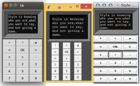
Let's have a look at an example (see code 1.12.py ) of using this external styling text file in a program:
import tkinter as tk
root = tk.Tk()
root.configure(background='#4D4D4D')#top level styling
# connecting to the external styling optionDB.txt
root.option_readfile('optionDB.txt')
#widget specific styling
mytext = tk.Text(root, background='#101010', foreground="#D6D6D6",
              borderwidth=18, relief='sunken',width=17, height=5)
mytext.insert(tk.END, "Style is knowing who you are, what you want to
                   say, and not giving a damn.")
mytext.grid(row=0, column=0, columnspan=6, padx=5, pady=5)
# all the below widgets get their styling from optionDB.txt file
tk.Button(root, text='*').grid(row=1, column=1)
tk.Button(root, text='^').grid(row=1, column=2)
tk.Button(root, text='#').grid(row=1, column=3)
tk.Button(root, text='<').grid(row=2, column=1)
tk.Button(root, text='OK', cursor='target').grid(row=2, column=2)#changing cursor style
tk.Button(root, text='>').grid(row=2, column=3)
tk.Button(root, text='+').grid(row=3, column=1)
tk.Button(root, text='v').grid(row=3, column=2)
tk.Button(root, text='-').grid(row=3, column=3)
for i in range(9):
   tk.Button(root, text=str(i+1)).grid(row=4+i//3, column=1+i%3)
root.mainloop()
The following is a description of the preceding code:
- The code connects to an external styling file called optionDB.txt that defines common styling for the widgets.
- The next segment of code creates a Text widget and specifies styling on the widget level.
- The next segment of code has several buttons, all of which derive their styling from the centralized optionDB.txt file. One of the buttons also defines a custom cursor.
Specifying attributes such as font sizes, the border width, the widget width, the widget height, and padding in absolute numbers, as we have done in the preceding example, can cause some display variations between different operating systems such as Ubuntu, Windows, and Mac respectively, as shown in the following screenshot. This is due to differences in the rendering engines of different operating systems:
Some common root window options
Now that we are done discussing styling options, let's wrap up with a discussion on some commonly used options for the root window:
|
Method |
Description |
|
*root.geometry('142x280+150+200') |
You can specify the size and location of a root window by using a string of the widthxheight + xoffset + yoffset form. |
|
self.root.wm_iconbitmap('mynewicon.ico') OR self.root.iconbitmap('mynewicon.ico ') |
This changes the title bar icon to something that is different from the default Tk icon. |
|
root.overrideredirect(1) |
This removes the root border frame. It |
Let's explain these styling options in more detail:
- root.geometry('142x280+150+200'): Specifying the geometry of the root window limits the launch size of the root window. If the widgets do not fit in the specified size, they get clipped from the window. It is often better not to specify this and let Tkinter decide this for you.
- self.root.wm_iconbitmap('my_icon.ico') or self.root.iconbitmap('my_icon.ico '): This option is only applicable to Windows. Unix-based operating systems do not display the title bar icon.
Getting interactive help
This section applies not only for Tkinter, but also for any Python object for which you may need help.
Let's say that you need a reference to the Tkinter pack geometry manager. You can get interactive help in your Python interactive shell by using the help command, as shown in the following command lines:
>>> import tkinter
>>> help(tkinter.Pack)
This provides detailed help documentation of all the methods defined under the Pack class in Tkinter.
You can similarly receive help for all the other individual widgets. For instance, you can check the comprehensive and authoritative help documentation for the Label widget in the interactive shell by typing the following command:
>>>help(tkinter.Label)
This provides a list of the following:
- All the methods defined in the Label class
- All the standard and widget-specific options for the Label widget
- All the methods inherited from other classes
Finally, when in doubt regarding a method, look into the source code of Tkinter, which is located at <location-of-python-installation>\lib\. For instance, the Tkinter source code is located in the /usr/lib/python3.6.3/tkinter directory on my Linux Mint operating system. You might also find it useful to look at the source code implementation of various other modules, such as the color chooser, file dialogs, and ttk modules, and the other modules located in the aforementioned directory.
Summary
This brings us to end of this chapter. This chapter aimed to provide a high-level overview of Tkinter. We worked our way through all the important concepts that drive a Tkinter program.
You now know what a root window is and how to set it up. You also know the 21 core Tkinter widgets and how to set them up. We also had a look at how to lay out our programs by using the Pack, Grid, and Place geometry managers, and how to make our programs functional by using events and callbacks. Finally, you saw how to apply custom styles to GUI programs.
To summarize, we can now start thinking about making interesting, functional, and stylish GUI programs with Tkinter! In the next chapter, we will build our first real application - a Text editor.
QA section
Before you proceed to the next chapter, make sure you can answer these questions to your satisfaction:
- What is a root window?
- What is the main loop?
- How do you create a root window?
- What are widgets? How do you create widgets in Tkinter?
- Can you list or identify all available widgets in Tkinter?
- What are geometry managers used for?
- Can you name all the available geometry managers in Tkinter?
- What are events in a GUI program?
- What are callbacks? How are callbacks different from regular functions?
- How do you apply callbacks to an event?
- How do you style widgets using styling options?
- What are the common configuration options for the root window?
Further reading
It would be a good idea to modify the examples from this chapter to lay out the widgets in different ways or to tweak the code to function in other ways to get your feet wet.
We recommend that you take a look at the documentation for all three geometry managers in your Python shell using the following commands:
>>> import tkinter
>>> help(tkinter.Pack)
>>> help(tkinter.Grid)
>>> help(tkinter.Place)
You can also find an excellent documentation of Tkinter at http://infohost.nmt.edu/tcc/help/pubs/tkinter/web/index.html.


![The Complete Python Course [Video]](https://static.packt-cdn.com/products/9781839217289/cover/9781839217289-original.jpeg)

![The Art of Doing: Create 10 Python GUIs with Tkinter Today! [Video]](https://static.packt-cdn.com/products/9781801070263/cover/9781801070263-original.png)
