


 Download code from GitHub
Istillremember back when I was a kid, I used to browse the internet with my 56k modem. It seemed terrific at the time! Websites were loading very slowly, but they were designed to minimize the consumption of data we were using since each kbit was calculated as usage (no unlimited internet, ha!). To understand how web design works, I strongly think that we need to know the history behind it, how developers and designers were designing websites when it first started in 1991 with Tim Berners-Lee's first website. The evolution of web design with table-based sites, animated text and GIF images, free page builders, and the introduction of Flash by Macromedia in 1996 was a significant advancement in the world of web design. It will really help you understand the web design principles of why and where it was heading. Let's go through these key aspects to have a precise idea of how web design has evolved and to analyze its importance in our day-to-day life in contemporary society.
In this chapter, we will cover the following:
- The first ever website: The beginning of the World Wide Web
- Table-based layouts: Introducing table markup in HTML
- Introduction of Flash: The renaissance of web design
- CSS—the savior: A new way of designing websites
- Web 2.0: JavaScript—A new intelligence for web
- The rise of the mobile: The boom of mobile web design
- Responsive web design: Designing for mobile and desktop
- Flat design: The rise of a new design trend
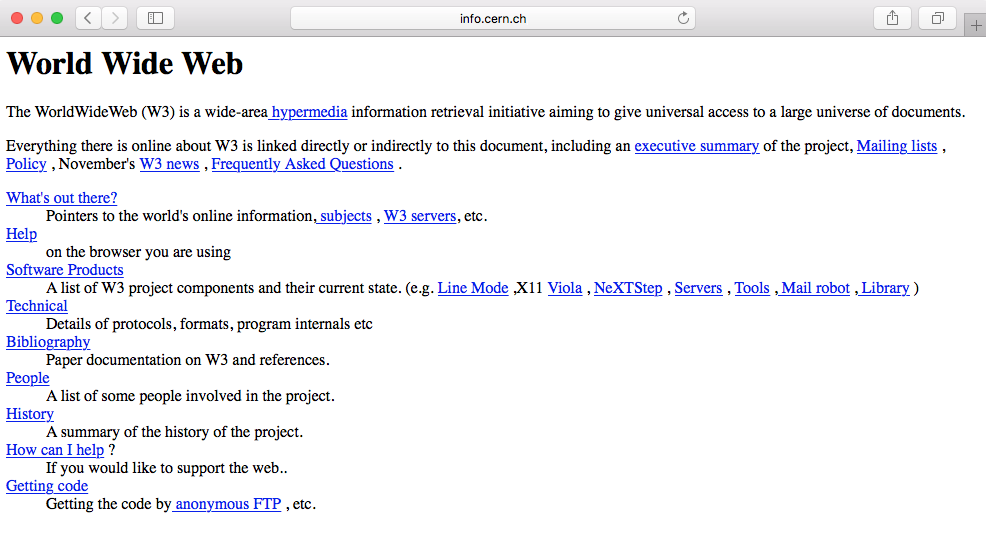
The first ever website was created by a scientist named Sir Tim Berners-Lee in 1990. He was a British computer scientist at CERN, the European Organization for Nuclear Research. It was basically a text-based website with a few links. A copy of the original page from 1992 still exists online. It simply existed to serve and tell people what the World Wide Web (WWW) was:
Most websites to follow were pretty much the same. There were entirely text-based with simple HTML markup:
<h1>for titles<p>for paragraphs<a>for links (we will go through all this markup in our HTML course)
The following version of HTML further allowed people to insert images, <img>, and tables, <table>, thus creating more possibilities.
In 1994, the WWW Consortium (W3C) was formed to set and establish the standard of the web (https://www.w3.org/). It was mainly to discourage and prevent private companies from building their own web language, as it would create chaos on the web. The W3C to this day continues to deliver standards for the open web, such as the new HTML5 or CSS3.
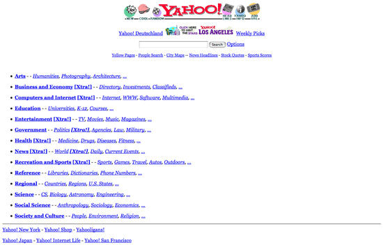
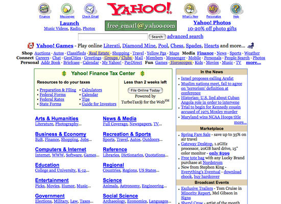
Here are some examples of websites in the 90s. The following screenshot shows how the Yahoo web page used to look back in 1994:
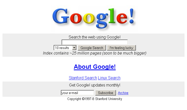
The following screenshot shows how the Google web page used to look back in 1996:
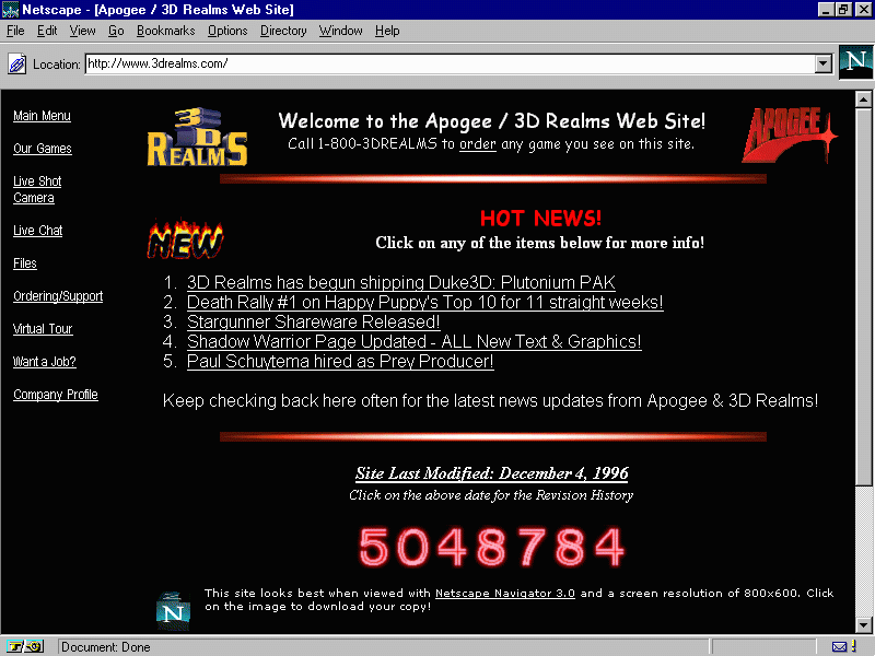
Web design became more interesting with the introduction of table markups in HTML. Web designers saw the opportunity to structure their design with the original table markup (sneaky as they always are). Sites were still text heavy, but at least they could separate the content into different columns, rows, and other navigation elements. The usage of spacer GIFs, introduced in David's Siegel's book Creating Killer Sites in 1996, allowed web designers to play with white space (basically, small transparent GIFs were placed in between the content), and by incorporating a sliced image background, users would have an illusion of a simple structure, whereas in reality there was a table layout behind it. Designers could finally play around with some graphic design elements as it grew rapidly in popularity, such as having visit counters, animated GIFs, and so on. Texts and images were literally dancing across websites everywhere.
We can see this in this website from 3drealms in 1996, which shows all the fancy elements designers used to add to their websites:
We can also see the evolution of the Yahoo web page in 2002:
Flash, previously Macromedia Flash and currently Adobe Flash, was created in 1996. It was like a renaissance for web design. People would probably make fun of you if you built your website with Flash today, but back then it was the killer tool to create interactive and graphics websites. Designers were able to add animation, custom fonts and shapes, 3D buttons, splash pages, and all in one tool-Flash. The whole was encapsulated into one file to be read into the user's browser. It was like magic. Unfortunately, that magic was inconvenient. It was not Search Engine Optimization (SEO)-friendly and was very heavy in terms of resources for your computer.
Flash started to decline when Apple decided to stop supporting Flash in their iOS software back in 2010 (https://www.apple.com/hotnews/thoughts-on-flash/). With the new features of HTML5/CSS3, where you are able to create animation and add multimedia content, designers and developers soon diverted from Flash, at least for web design.
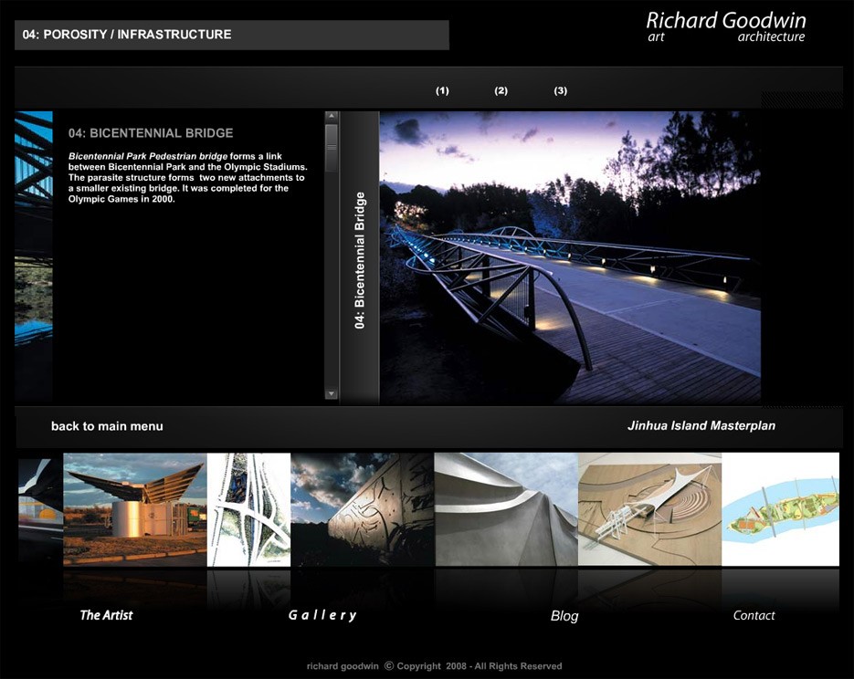
Here are some examples of Flash websites. This screenshot shows a very basic flash website that uses sliders, animations, and interactions. You can check this website at http://www.richard-goodwin.com/flash/indexn.html.
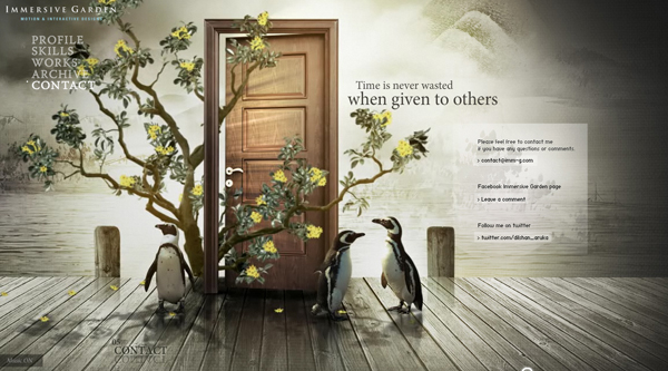
Here's one impressive Flash website that was around when I started web design, Immersive Garden:
Cascading Style Sheets (CSS) became more popular in the 2000s with their increasing support in web browsers. CSS defines how the HTML is displayed, and this has allowed designers to separate the content and the design, making websites easier to maintain and quicker to load. You could change the entire look of a CSS-based website without touching the content.
CSS really made the difference as an alternative to Flash. Recommended by the W3C as a best practice, it provides a cleaner semantic, resulting in better SEO.
However, one downside of CSS was the lack of support from various browsers: one browser would support the newest feature, while another would not. It was a nightmare for developers.
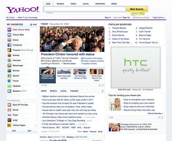
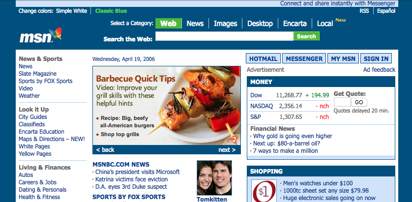
We'll look into this with further details in Chapter 6, Building Your Own Website, of the book. Here are some design changes in Yahoo's website (2009):
The early 2000s saw the rise of JavaScript. This is when things really started to move towards the web we know today. JavaScript was the first means of adding intelligence to the web. Designers were able to add interaction, complex navigation, and multimedia applications to their design.
While the very beginning of the web seemed to focus mainly on design and aesthetics, it soon, however, became user-centered with usability as the main focus. Designers were also more aware of color distribution, placements, attention to typography, and the usage of icons instead of text links. At last, the evolution of Web 2.0 also saw the growth of SEO, as content driving. These techniques, such as keyword optimization, tagging, and inbound and outbound links, are still being used now. The web industry really saw the importance of SEO, and this became the main focus of web design during this time.
Here are some examples of websites:
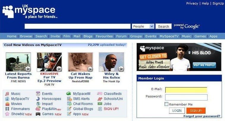
We can see the difference in terms of the design. The layout and content are more structured. With MySpace website, developers started to create applications for people to interact with:
I still remember when the first iPhone came out. It was pretty clear to me that I would not buy one. I clearly didn't know myself at the time. The iPhone ultimately started the boom of mobile browsing. Nobody in the web industry saw this coming; how could users browse a website on a screen so small? It was clearly not user-friendly at all. Web designers started to design a second website that would show only on mobile. I still remember those links started with m.domainname.com. It was definitely a hassle to maintain two websites. People were starting to access websites from their mobile more and more.
In 2016, for the first time in the world, mobile and tablet internet usage exceeded desktop usage:
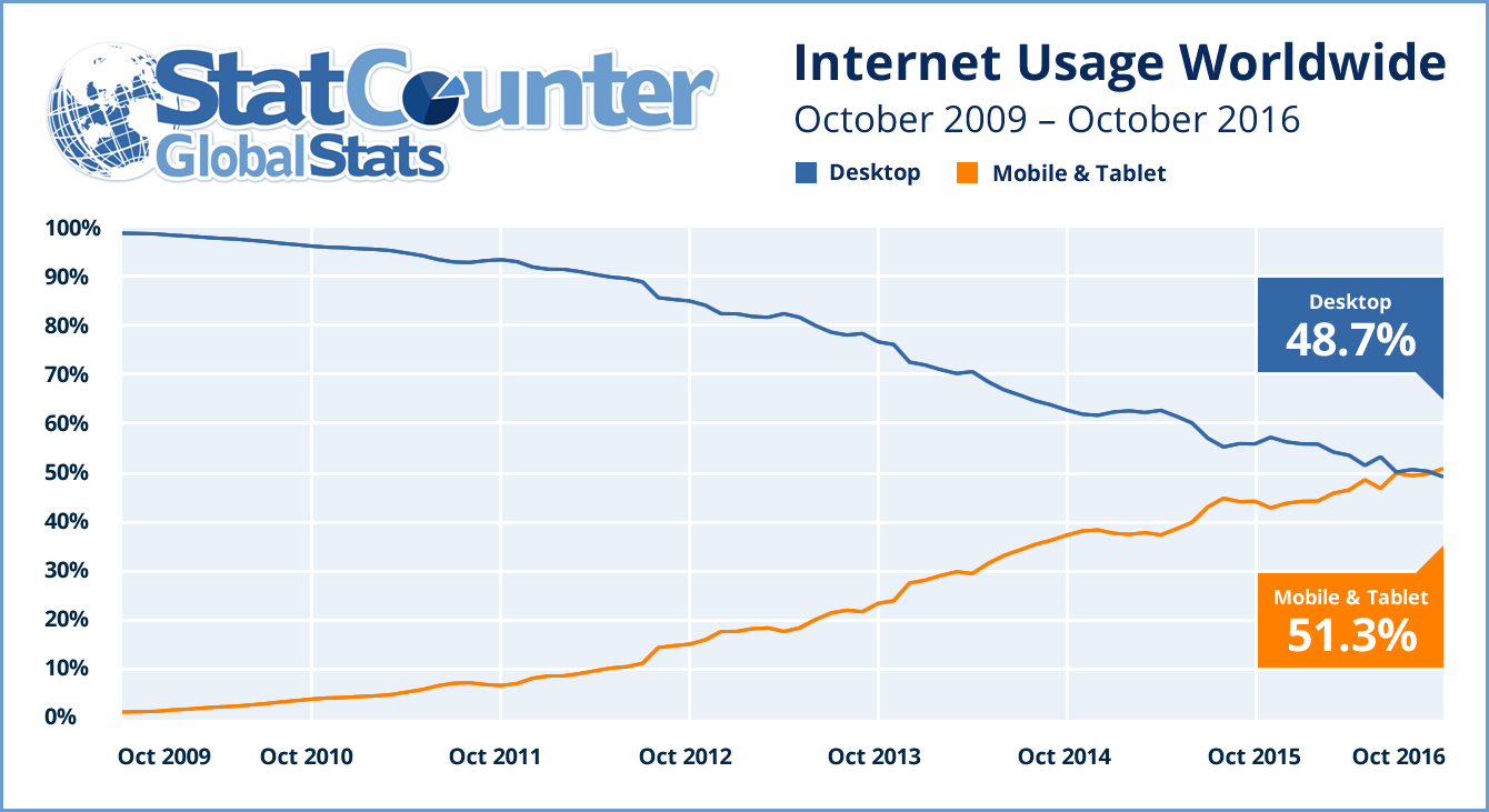
StatCounter Statshttp://gs.statcounter.com/press/mobile-and-tablet-internet-usage-exceeds-desktop-for-first-time-worldwide
The first time we heard the term responsive web design, it was from Ethan Marcotte in 2011. In his book on responsive design, he described a new way of designing for the desktop but also for the mobile interface, basically proposing to use the same content, but a different layout for the design on each screen. The introduction of the 960 grid system also helped this responsive issue (https://960.gs). The most popular versions being used were either 12 or 16 columns. It became a standard for designers to design their websites using 12 columns for desktop and downgrading progressively for mobile viewing. With the introduction of media queries with CSS3, it became easier for designers to design websites for mobile screens.
We will be exploring this subject in further detail in the next chapter.
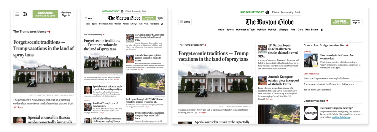
Media queries is a CSS3 module allowing content rendering to adapt to conditions such as screen resolution (for example, a smartphone screen compared to a computer screen). From left to right, we have the iPhone, iPad, and desktop version. This is a perfect example of a grid system and media queries (https://www.wired.com/2011/09/the-boston-globe-embraces-responsive-design/):
You've probably heard of this term. If not, flat design is the term given to the style of design in which elements do not have stylistic shapes and characters, such as gradient, drop shadows, textures, and any type of design that makes it look real and three dimensional. It's usually described as the opposite of rich design, which in contrast is used to make elements feel more tactile, real, and usable for users when they're navigating.
People often say that flat design originated from the Swiss Style. If you haven't heard of this, Swiss Style (also known as International Typographic Style) was the dominant design style back in the 1940-50s and started in Switzerland:

It still has a profound influence on graphic design as a part of the Modernist movement in many design-related fields. It became a solid foundation for graphic design in the mid-20th century around the world. The main characteristics of this design style are the use of asymmetric layouts, grids, sans-serif typefaces such as Akzidenz Grotesk, and a clean hierarchy of content. The famous typeface Helvetica was created during this period and was used in every type of design.
We can without a doubt say that the Swiss Style has had a strong influence on the flat design style we know today. However, the main reason for this trend was mainly caused by the development of responsive design during this period, where developers and designers struggled to implement a design that heavily relied on textures, drop-shadows, and background images. Shrinking those patterns for various screen sizes and because of browser compatibility constraints was just too much for designers. They had to go back to basics and simplify their design and make it less texturized. This would result in quicker-loading websites and would be more efficient and easier to design.
Being a designer, I saw this trend on the rise. I still remember designers testing out the latest features of CSS3 and trying to use as few design assets as possible while attempting to create everything by code. The main focus for both developers and designers at this time was efficiency and faster loading.
But the one thing we can agree on is that both Microsoft and Apple have had a major influence and popularized this trend even further. With Microsoft Metro and the launch of iOS 7 by Apple, people immediately felt that the so-called rich design was completely outdated and quickly found the need for a redesign of their website or app.
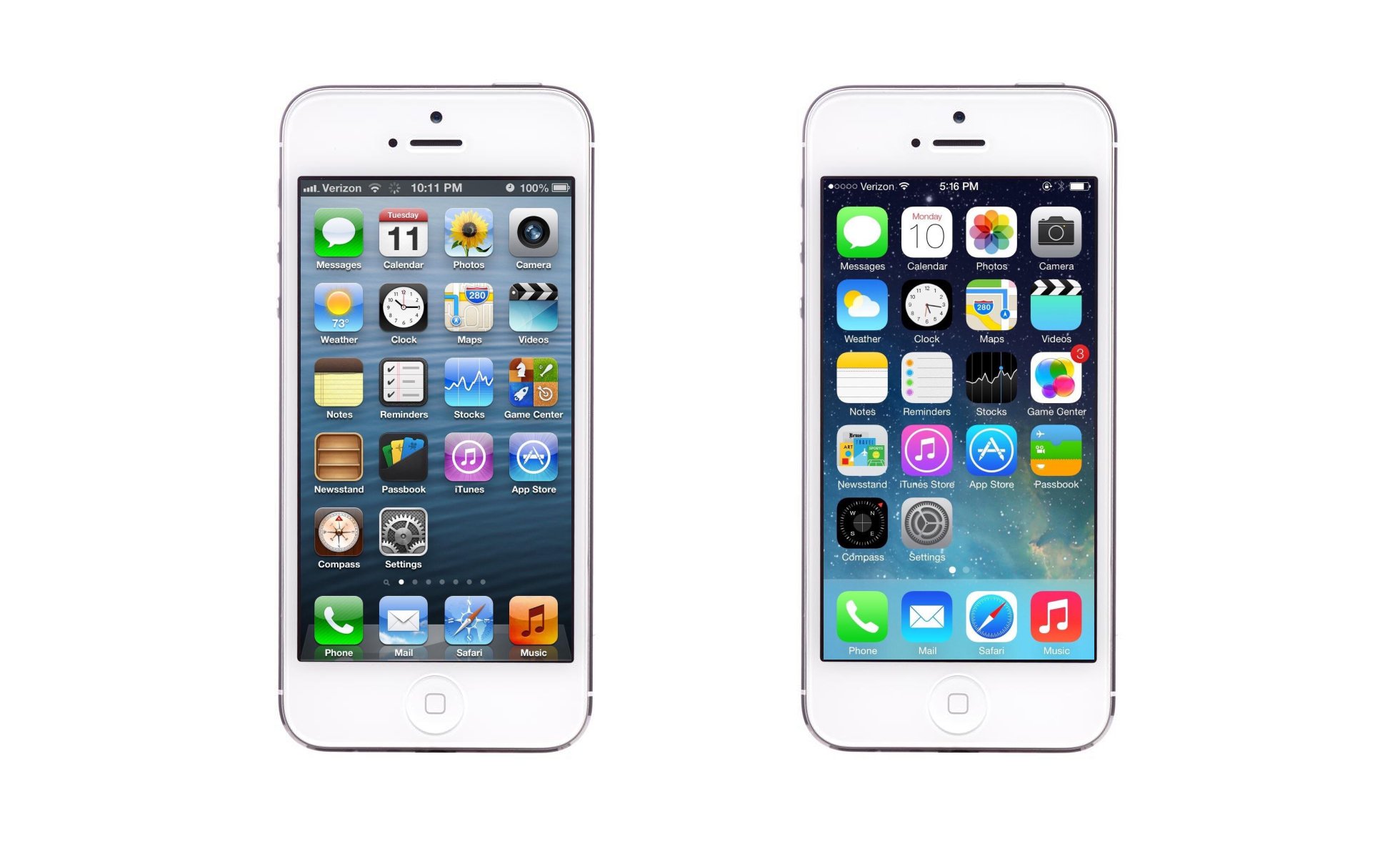
Comparison between iOS 6 and iOS 7
After reviewing all these important web design traits, an important thing to remember and keep in mind is that web design trends do not derive from any particular person or company. Web design is a mix of visual design (influenced by print design) and the technology used on the web. With the advancements made in HTML5 and CSS3, we can start to see that design is becoming far more complex as compared to the original flat design. Technology now allows people to have more flexibility with their design and forms. Let's see how the web design trend will evolve, but keep in mind that it evolves quickly, very quickly.
To summarize this chapter, we saw how the web started with the first ever website by Sir Tim Berners-Lee, and how the web has evolved over the years with table-based layouts, Flash, the CSS, and especially the rise of smartphones, which have changed how users browse the web globally. With this history in mind, we can now jump to the second chapter, which will tackle web components and explain their usage. So, let's get started!


