


 Download code from GitHub
Introducing React
Facebook has become an incredibly popular app. As its popularity has grown, so has the demand for new features. React is Facebook’s answer to helping more people work on the code base and deliver features more quickly. React has worked so well for Facebook that Meta eventually made it open source. Today, React is a mature library for building component-based frontends that is extremely popular and has a massive community and ecosystem.
TypeScript is also a popular, mature library maintained by another big company, Microsoft. It allows users to add a rich type system to their JavaScript code, helping them be more productive, particularly in large code bases.
This book will teach you how to use both of these awesome libraries to build robust frontends that are easy to maintain. The first two chapters in the book will introduce React and TypeScript separately. You’ll then learn how to use React and TypeScript together to compose robust components with strong typing. The book covers key topics you’ll need to build a web frontend, such as styling, forms, and data fetching.
In this chapter, we will introduce React and understand the benefits it brings. We will then build a simple React component, learning about the JSX syntax and component props. After that, we will learn how to make a component interactive using component state and events. Along the way, we will also learn how to structure code in JavaScript modules.
By the end of this first chapter, you’ll be able to create simple React components and will be ready to learn how to strongly type them with TypeScript.
In this chapter, we’ll cover the following topics:
- Understanding the benefits of React
- Understanding JSX
- Creating a component
- Understanding imports and exports
- Using props
- Using state
- Using events
Technical requirements
We use the following tools in this chapter:
- Browser: A modern browser such as Google Chrome.
- Babel REPL: We’ll use this online tool to briefly explore JSX. It can be found at https://babeljs.io/repl.
- CodeSandbox: We’ll use this online tool to build a React component. This can be found at https://codesandbox.io/.
All the code snippets in this chapter can be found online at https://github.com/PacktPublishing/Learn-React-with-TypeScript-2nd-Edition/tree/main/Chapter1/.
Understanding the benefits of React
Before we start creating our first React component, in this section, we will understand what React is and explore some of its benefits.
React is incredibly popular. We have already mentioned that Meta uses React for Facebook, but many other famous companies use it, too, such as Netflix, Uber, and Airbnb. React’s popularity has resulted in a huge ecosystem surrounding it that includes great tools, popular libraries, and many experienced developers.
A reason for React’s popularity is that it is simple. This is because it focuses on doing one thing very well – providing a powerful mechanism for building UI components. Components are pieces of the UI that can be composed together to create a frontend. Furthermore, components can be reusable so that they can be used on different screens or even in other apps.
React’s narrow focus means it can be incorporated into an existing app, even if it uses a different framework. This is because it doesn’t need to take over the whole app to run; it is happy to run as part of an app’s frontend.
React components are displayed performantly using a virtual DOM (Document Object Model). You may be familiar with the real DOM – it provides the structure for a web page. However, changes to the real DOM can be costly, leading to performance problems in an interactive app. React solves this performance problem by using an in-memory representation of the real DOM called a virtual DOM. Before React changes the real DOM, it produces a new virtual DOM and compares it against the current virtual DOM to calculate the minimum amount of changes required to the real DOM. The real DOM is then updated with those minimum changes.
The fact that Meta uses React for Facebook is a major benefit because it ensures that it is of the highest quality – React breaking Facebook is not good for Meta! It also means a lot of thought and care goes into ensuring new versions of React are cheap to adopt, which helps reduce the maintenance costs of an app.
React’s simplicity means it is easy and quick to learn. There are many great learning resources, such as this book. There is also a range of tools that make it very easy to scaffold a React app – one such tool is called Create React App, which we will learn about in Chapter 3, Setting up React and TypeScript.
Now that we are starting to understand React, let’s dig deeper in the next section to understand how a React component defines what to display.
Understanding JSX
JSX is the syntax we use in a React component to define what the component should display. JSX stands for JavaScript XML, which starts to give us a clue as to what it is. We will start to learn about JSX in this section and write some JSX in an online playground.
The following code snippet is a React component with its JSX highlighted:
function App() {
  return (
    <div className="App">
      <Alert type="information" heading="Success">
        Everything is really good!
      </Alert>
    </div>
  );
}
You can see that JSX looks a bit like HTML. However, it isn’t HTML because an HTML div element doesn’t contain a className attribute, and there is no such element name as Alert. The JSX is also embedded directly within a JavaScript function, which is a little strange because a script element is normally used to place JavaScript inside HTML.
JSX is a JavaScript syntax extension. This means that it doesn’t execute directly in the browser – it needs to be transpiled to JavaScript first. A popular tool that can transpile JSX is called Babel.
Carry out the following steps to write your first piece of JSX in the Babel playground:
- Open a browser, go to https://babeljs.io/repl, and enter the following JSX in the left-hand pane:
<span>Oh no!</span>
The following appears in the right-hand pane, which is what our JSX has compiled down to:
React.createElement("span", null, "Oh no!");
We can see that it compiles down to a React.createElement function call, which has three parameters:
- The element type can be an HTML element name (such as
"span"), a React component type, or a React fragment type. - An object containing the properties to be applied to the element. Here,
nullis passed because there are no properties. - The content of the element. Note that the element’s content is often referred to as children in React.
Note
The right-hand panel may also contain a "use strict" statement at the top to specify that the JavaScript will be run in strict mode. Strict mode is where the JavaScript engine throws an error when it encounters problematic code rather than ignoring it. See the following link for more information on the strict mode in JavaScript: https://developer.mozilla.org/en-US/docs/Web/JavaScript/Reference/Strict_mode.
You may also see /*#__PURE__*/ comments in the right-hand panel. These comments help bundlers such as webpack remove redundant code in the bundling process. We will learn about webpack in Chapter 3, Setting up React and TypeScript.
- Let’s expand our example by putting a
divelement around thespanelement, as shown in the following code snippet:<div className="title"> <span>Oh no!</span> </div>
This now transpiles to two function calls to React.createElement, with span being passed in as a child to div:
React.createElement("div", {
  className: "title"
}, React.createElement("span", null, "Oh no!"));
We can also see a className property, with the "title" value passed with the div element.
Note
We have seen that React uses a className attribute rather than class for CSS class references. This is because class is a keyword in JavaScript, and using that would cause an error.
- Let’s do something really interesting now. Let’s embed some JavaScript within the JSX. So, make the following highlighted changes:
const title = "Oh no!";
<div className="title">
  <span>{title}</span>
</div>
We declared a title JavaScript variable, assigned it "Oh no!", and embedded it within the span element.
Notice that the title variable is placed in curly braces inside the element. Any piece of JavaScript can be embedded within JSX by surrounding it in curly braces.
Our code now transpiles to the following:
const title = "Oh no!";
React.createElement("div", {
  className: "title"
}, React.createElement("span", null, title));
- To further illustrate the use of JavaScript in JSX, let’s use a JavaScript ternary expression inside the
spanelement. Add the following ternary expression:const title = "Oh no!"; <div className="title"> <span>{title ? title : "Something important"}</span> </div>
A ternary expression is an inline conditional statement in JavaScript. The expression starts with the condition followed by ?, then what returns when the condition is true followed by :, and finally, what returns when the condition is false. For more information on ternary expressions, see the following link: https://developer.mozilla.org/en-US/docs/Web/JavaScript/Reference/Operators/Conditional_Operator.
We see that the nested call to React.createElement uses the ternary expression as the child of span:
React.createElement(
  "span",
  null,
  title ? title : "Something important"
);
This completes our exploration of JSX in the Babel playground.
In summary, JSX can be thought of as a mix of HTML and JavaScript to specify the output of a React component. JSX needs to be transpiled into JavaScript using a tool such as Babel. For more information on JSX, see the following link: https://reactjs.org/docs/introducing-jsx.html.
Now that we understand a little more about JSX, we will create our first React component in the next section.
Creating a component
In this section, we will create a React project using an online tool called CodeSandbox. We will take time to understand the entry point of a React app and how components are structured in a project before creating a basic React component.
Creating a CodeSandbox project
The great thing about CodeSandbox is that we can create a React project at the click of a button in a web browser and then focus on how to create a React component. Note that we will learn how to create React projects in a code editor on your local computer in Chapter 3, Setting up React and TypeScript. Our focus is learning about the React fundamentals in this chapter.
For now, let’s carry out the following steps to create a React component in CodeSandbox:
- Go to https://codesandbox.io/ in a browser and click the Create Sandbox button found on the right hand side of the page.
Note
You can create a CodeSandbox account if you want, but you can also create a React project as an anonymous user.
- A list of project templates appears. Click the React template (don’t choose the React TypeScript template because we are focusing solely on React in this chapter).
In a few seconds, a React project will be created:
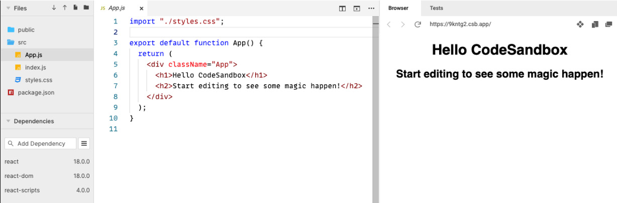
Figure 1.1 – React project in CodeSandbox
There are three main panels in the CodeSandbox editor:
- The Files panel: This is usually on the left-hand side and contains all the files in the project.
- The Code editor panel: This is usually the middle panel, and it contains the code. This is where we will write our React component code. Clicking a file in the Files panel will open it in the code editor panel.
- The Browser panel: This displays a preview of the running app and is usually on the right-hand side.
Now that we have created a React project, we will take some time to understand the app’s entry point.
Understanding the React entry point
The entry point of this React app is in the index.js file. Open this file by clicking on it in the Files panel and inspect its contents:
import { StrictMode } from 'react';
import { createRoot } from 'react-dom/client';
import App from './App';
const rootElement = document.getElementById('root');
const root = createRoot(rootElement);
root.render(
  <StrictMode>
    <App />
  </StrictMode>
);
There is quite a lot going on in this code. Here’s an explanation of each line of the code (don’t worry if you don’t fully understand it all at this point in the book, you will soon!):
- The first statement imports a
StrictModecomponent from React. This means that theStrictModecomponent from thereactlibrary will be used later in the code in this file. We will cover import statements in detail in the next section. - The second statement imports a
createRootfunction from React. - The third import statement imports an
Appcomponent from theApp.jsfile in our project. - A
rootElementvariable is then assigned to a DOM element with anidof"root". - React’s
createRootfunction takes in a DOM element and returns a variable that can be used to display a React component tree. TherootElementvariable is then passed intocreateRoot, and the result is assigned to arootvariable. - The
renderfunction is called on therootvariable, passing in JSX containing theStrictModecomponent with theAppcomponent nested inside. Therenderfunction displays the React components on the page. This process is often referred to as rendering.
Note
The StrictMode component will check the content inside it for potential problems and report them in the browser’s console. This is often referred to as React’s strict mode. The strict mode in React is different from the strict mode in JavaScript, but their purpose of eliminating bad code is the same.
In summary, the code in index.js renders the App component in React’s strict mode in a DOM element with an id of "root".
Next, we will take some time to understand the React component tree and the App component that is referenced in index.js.
Understanding the React component tree
A React app is structured in a tree of components and DOM elements. The root component is the component at the top of the tree. In our CodeSandbox project, the root component is the StrictMode component.
React components can be nested inside another React component. The App component is nested inside the StrictMode component in the CodeSandbox project. This is a powerful way of putting components together because any component can be placed inside StrictMode – it doesn’t necessarily need to be App.
React components can reference one or more other components, and even DOM elements, in their JSX. Open the App.js file and observe that it references DOM elements div, h1, and h2:
<div className="App">
  <h1>Hello CodeSandbox</h1>
  <h2>Start editing to see some magic happen!</h2>
</div>
The component tree in the CodeSandbox project is constructed as follows:
StrictMode
└── App
    └── div
         └── h1
           └── h2
In summary, a React app is structured in a tree of React components and DOM elements.
Next, it is time to create a React component.
Creating a basic alert component
Now, we are going to create a component that displays an alert, which we will simply call Alert. It will consist of an icon, a heading, and a message.
Important note
A React component name must start with a capital letter. If a component name starts with a lowercase letter, it is treated as a DOM element and won’t render properly. See the following link in the React documentation for more information: https://reactjs.org/docs/jsx-in-depth.html#user-defined-components-must-be-capitalized.
Carry out the following steps to create the component in the CodeSandbox project:
- In the Files panel, right-click on the
srcfolder and choose Create File in the menu that appears. - The cursor is placed in a new file, ready for you to enter the component filename. Enter
Alert.jsas the filename and press Enter.
Note
The filename for component files isn’t important to React or the React transpiler. It is common practice to use the same name as the component, either in Pascal or snake case. However, the file extension must be .js or .jsx for React transpilers to recognize these as React components.
- The
Alert.jsfile automatically opens in the code editor panel. Enter the following code into this file:function Alert() { return ( <div> <div> <span role="img" aria-label="Warning">⚠</span> <span>Oh no!</span> </div> <div>Something isn't quite right ...</div> </div> ); }
Remember that the code snippets are available online to copy. The link to the preceding snippet can be found at https://github.com/PacktPublishing/Learn-React-with-TypeScript-2nd-Edition/blob/main/Chapter1/Section3-Creating-a-component/Alert.js.
The component renders the following items:
- A warning icon (note that this is a warning emoji).
- A title, Oh no!.
- A message, Something isn’t quite right ….
Note
The role and aria-label attributes have been added to the span element containing the warning icons to help screen readers understand that this is an image with a title of warning.
For more information on the img role, see https://developer.mozilla.org/en-US/docs/Web/Accessibility/ARIA/Roles/img_role.
For more information on the aria-label attribute, see https://developer.mozilla.org/en-US/docs/Web/Accessibility/ARIA/Attributes/aria-label.
Alternatively, a React component can be implemented using arrow function syntax. The following code snippet is an arrow syntax version of the Alert component:
const Alert = () => {
  return (
    <div>
      <div>
        <span role="img" aria-label="Warning">
          ⚠
        </span>
        <span>Oh no!</span>
      </div>
      <div>Something isn't quite right ...</div>
    </div>
  );
};
Note
There aren’t any significant differences between arrow functions and normal functions in the context of React function components. So, it is down to personal preference which one you choose. This book generally uses regular function syntax because it has fewer characters to type, however, if you wish, you can find more information on JavaScript arrow functions here: https://developer.mozilla.org/en-US/docs/Web/JavaScript/Reference/Functions/Arrow_functions.
Congratulations, you have created your first React component. Let’s quickly recap the key points in this section:
- The entry point in a React app is usually
index.js. - React’s
createRootfunction allows a React component tree to be rendered inside a DOM element. - A React component is a JavaScript function whose name starts with a capital letter. The function returns what should be displayed using JSX syntax.
You may have noticed that the alert component doesn’t appear in the Browser panel. This is because it hasn’t been added to the React component tree yet. We will do this in the next section after we have learned about the import and export statements.
Understanding imports and exports
import and export statements allow JavaScript to be structured into modules.
This section will start by covering why JavaScript modules are important and then how to define and use them using import and export statements. We will then use that knowledge to add the alert component to the React component tree in the CodeSandbox project.
Understanding the importance of modules
By default, JavaScript code executes in what is called the global scope. This means code from one file is automatically available in another file. Unfortunately, this means that the functions we implement can overwrite functions in other files if the names are the same. You can imagine how this structure quickly becomes challenging and risky to maintain.
Thankfully, JavaScript has a modules feature. A module’s functions and variables are isolated, so functions with the same name in different modules won’t collide. This is a much safer way to structure code and is common practice when structuring React apps.
Next, we will learn about how to define modules.
Using export statements
A module is a file with at least one export statement. An export statement references members that are available to other modules. Think of this as making members publically available. A member can be a function, a class, or a variable within the file. Members not contained within the export statement are private and not available outside the module.
The following code statement is an example of a module with its export statement highlighted. This is called a named export statement because the public members are explicitly named:
function myFunc1() {
  ...
}
function myFunc2() {
  ...
}
function myFunc3() {
  ...
}
export { myFunc1, myFunc3 };
In the example, the myFunc1 and myFunc3 functions are public, and myFunc2 is private.
Alternatively, the export keyword can be added before the function keyword on the public functions:
export function myFunc1() {
  ...
}
function myFunc2() {
  ...
}
export function myFunc3() {
  ...
}
We will use the export keyword approach in this book because it is immediately apparent which function is public. With the single export statement at the bottom of the file, you have to keep going to the bottom of the file to find out whether a function is public.
A default export statement can be used to export a single public member. Like named exports, this comes in two variants. The first variant is where the export statement is defined at the bottom of the module:
export default myFunc1;
The default keyword signifies that the export is a default export statement.
The second variant is where the export and default keywords are added in front of the member:
export default function myFunc1() {
  ...
}
This book will generally use named exports rather than default exports.
Next, we will learn about import statements.
Using import statements
Using an import statement allows public members from a module to be used. Like an export statement, there are named and default import statements. A default import statement can only be used to reference a default export statement.
Here is an example of a default import statement:
import myFunc1 from './myModule';
The default exported member from the myModule.js file is imported and named myFunc1.
Note
The name of an imported default member doesn’t necessarily need to match the name of the default exported member, but it is common practice to do so.
Here is an example of a named import statement:
import { myFunc1, myFunc3 } from './myModule';
Here, the myFunc1 and myFunc3 named exported members from the myModule.js file are imported.
Note
Unlike default imports, the names of imported members must match the exported members.
Now that we understand how to structure JavaScript code into modules, we will use this knowledge to add the alert component in the CodeSandbox project to the React component tree.
Adding Alert to the App component
Going back to the Alert component in our CodeSandbox project, we will reference Alert in the App component. To do this, carry out the following steps:
- First, we need to export the
Alertcomponent. OpenAlert.jsand add theexportkeyword before theAlertfunction:export function Alert() { ... }
Note
It is common practice to have each React component in a separate file and, therefore, a separate module. This prevents files from becoming too large and helps the readability of the code base.
- Now we can import
Alertinto theApp.jsfile. OpenApp.jsand add the highlightedimportstatement at the top of the file:import { Alert } from './Alert'; import "./styles.css"; export default function App() { ... } - We can now reference
Alertin theAppcomponent’s JSX. Add the highlighted line inside thedivelement, replacing its existing content:export default function App() { return ( <div className="App"> <Alert /> </div> ); }
The component will display the following in the Browser panel:

Figure 1.2 – The alert component in the Browser panel
Nice! If you have noticed that the alert component isn’t styled nicely, don’t worry – we will learn how to style it in Chapter 4, Approaches to Styling React Frontends.
Here’s a recap of a couple of key points in this section:
- React apps are structured using JavaScript modules to help the code base be maintainable.
- Generally, a React component is structured in its own module and so needs to be exported and imported before being referenced in another React component.
Next, we will learn how to make the alert component a little more flexible.
Using props
Currently, the alert component is pretty inflexible. For example, the alert consumer can’t change the heading or the message. At the moment, the heading or the message needs to be changed within Alert itself. Props solve this problem, and we will learn about them in this section.
Note
Props is short for properties. The React community often refers to them as props, so we will do so in this book.
Understanding props
props is an optional parameter that is passed into a React component. This parameter is an object containing the properties of our choice. The following code snippet shows a props parameter in a ContactDetails component:
function ContactDetails(props) {
  console.log(props.name);
  console.log(props.email);
  ...
}
The props parameter contains the name and email properties in the preceding code snippet.
Note
The parameter doesn’t have to be named props, but it is common practice.
Props are passed into a component in JSX as attributes. The prop names must match what is defined in the component. Here is an example of passing props into the preceding ContactDetails component:
<ContactDetails name="Fred" email="fred@somewhere.com" />
So, props make the component output flexible. Consumers of the component can pass appropriate props into the component to get the desired output.
Next, we will add some props to the alert component we have been working on.
Adding props to the alert component
In the CodeSandbox project, carry out the following steps to add props to the alert component to make it more flexible:
- Open
alert.jsand add apropsparameter to the function:export function Alert(props) { ... } - We will define the following properties for the alert:
type: This will either be"information"or"warning"and will determine the icon in the alert.heading: This will determine the heading of the alert.children: This will determine the content of the alert. Thechildrenprop is actually a special prop used for the main content of components.
Update the alert component’s JSX to use the props as follows:
export function Alert(props) {
  return (
    <div>
      <div>
        <span
          role="img"
          aria-label={
            props.type === "warning"
              ? "Warning"
              : "Information"
          }
        >
          {props.type === "warning" ? "⚠" : "ℹ"}
        </span>
        <span>{props.heading}</span>
      </div>
      <div>{props.children}</div>
    </div>
  );
}
Notice that the Browser panel now displays nothing other than an information icon (this is an information emoji); this is because the App component isn’t passing any props to Alert yet:

Figure 1.3 – The alert component only showing the information icon
- Open
App.jsand update theAlertcomponent in the JSX to pass in props as follows:export default function App() { return ( <div className="App"> <Alert type="information" heading="Success"> Everything is really good! </Alert> </div> ); }
Notice that the Alert component is no longer self-closing so that Everything is really good! can be passed into its content. The content is passed to the children prop.
The Browser panel now displays the configured alert component:

Figure 1.4 – The configured alert component in the browser panel
- We can clean up the alert component code a little by destructuring the
propsparameter.
Note
Destructuring is a JavaScript feature that allows properties to be unpacked from an object. For more information, see the following link: https://developer.mozilla.org/en-US/docs/Web/JavaScript/Reference/Operators/Destructuring_assignment.
Open Alert.js again, destructure the function parameter, and use the unpacked props as follows:
export function Alert({ type, heading, children }) {
  return (
    <div>
      <div>
        <span
          role="img"
          aria-label={
            type === "warning" ? "Warning" :               "Information"
          }
        >
          {type === "warning" ? "⚠" : "ℹ"}
        </span>
        <span>{heading}</span>
      </div>
      <div>{children}</div>
    </div>
  );
}
This is a little cleaner because we use the unpacked props directly rather than having to reference them through the props parameter.
- We want the
typeprop to default to"information". Define this default as follows:export function Alert({ type = "information", heading, children }) { ... }
That completes the implementation of the props in the alert component for now. Here’s a quick recap on props:
- Props allow a component to be configured by the consuming JSX and are passed as JSX attributes
- Props are received in the component definition in an object parameter and can then be used in its JSX
Next, we will continue to make the alert component more sophisticated by allowing it to be closed by the user.
Using state
The component state is a special variable containing information about the component’s current situation. For example, a component may be in a loading state or an error state.
In this section, we’ll learn about state and use it within our alert component in the CodeSandbox project. We will use state to allow the alert to be closed by the user.
Understanding state
There isn’t a predefined list of states; we define what’s appropriate for a given component. Some components won’t even need any state; for example, the App and Alert components in our CodeSandbox project haven’t required state for the requirements so far.
However, state is a key part of making a component interactive. When a user interacts with a component, the component’s output may need to change. For example, clicking on a component may need to make an element in the component invisible. A change to a component state causes the component to refresh, more often referred to as re-rendering. So, a user could click on a component causing a state change, resulting in an element in the component becoming invisible.
State is defined using a useState function from React. The useState function is one of React’s hooks. React hooks were introduced to React in version 16.8 and give function components powerful capabilities such as state. There is a whole chapter on React hooks in Chapter 4, Using React Hooks.
The syntax for useState is as follows:
const [state, setState] = useState(initialState);
Here are the key points:
- The initial state value is passed into
useState. If no value is passed, it will initially beundefined. useStatereturns a tuple containing the current state value and a function to update the state value. The tuple is destructured in the preceding code snippet.- The state variable name is
statein the preceding code snippet, but we can choose any meaningful name. - We can also choose the state setter function name, but it is common practice to use the same name as the state variable preceded by
set. - Multiple states can be defined by defining multiple instances of
useState. For example, here are definitions for loading and error states:const [loading, setLoading] = useState(true); const [error, setError] = useState();
Next, we will implement state in the alert component to determine whether it is visible or not.
Implementing a visible state in the alert component
We will begin by implementing a feature in the alert component that allows the user to close it. A key part of that feature is controlling the alert’s visibility, which we will do with a visible state. This state will either be true or false and it will initially be set to true.
Follow these steps to implement a visible state in Alert:
- Open
Alert.jsin the CodeSandbox project. - Add the following
importstatement at the top of the file to import theuseStatehook from React:import { useState } from 'react'; - Define the
visiblestate as follows in the component definition:export function Alert(...) { const [visible, setVisible] = useState(true); return ( ... ); } - After the state declaration, add a condition that returns
nullif thevisiblestate isfalse. This means nothing will be rendered:export function Alert(...) { const [visible, setVisible] = useState(true); if (!visible) { return null; } return ( ... ); }
The component will render in the Browser panel the same as before because the visible state is true. Try changing the initial state value to false, and you will see it disappear in the Browser panel.
Currently, the alert component is making use of the visible state’s value by not rendering anything if it is false. However, the component isn’t updating the visible state yet – that is, setVisible is unused at the moment. We will update the visible state after implementing a close button, which we will do next.
Adding a close button to Alert
We will add a close button to the alert component to allow the user to close it. We will make this configurable so that the alert consumer can choose whether the close button is rendered.
Carry out the following steps:
- Start by opening
Alert.jsand add aclosableprop:export function Alert({ type = "information", heading, children, closable }) { ... }
The consumer of the alert component will use the closable prop to specify whether the close button appears.
- Add a close button between the heading and content as follows:
export function Alert(...) {
  ...
  return (
    <div>
      <div>
        ...
        <span>{heading}</span>
      </div>
      <button aria-label="Close">
        <span role="img" aria-label="Close">❌</span>
      </button>
      <div>{children}</div>
    </div>
  );
}
Notice that the span element that contains the close icon is given an "img" role and a "Close" label to help screen readers. Likewise, the button is also given a "Close" label to help screen readers.
The close button appears in the alert component as follows:

Figure 1.5 – The close button in the alert component
- At the moment, the close button will always render rather than just when the
closableprop istrue. We can use a JavaScript logicalANDshort circuit expression (represented by the&&characters) to render theclosebutton conditionally. To do this, make the following highlighted changes:import { useState } from 'react'; export function Alert(...) { ... return ( <div> <div> ... <span>{heading}</span> </div> {closable && ( <button aria-label="Close"> <span role="img" aria-label="Close"> ❌ </span> </button> )} <div>{children}</div> </div> ); }
If closable is a falsy value, the expression will short-circuit and consequently not render the button. However, if closable is truthy, the button will be rendered.
Note
See the following link for more information about logical AND short-circuit expressions: https://developer.mozilla.org/en-US/docs/Web/JavaScript/Reference/Operators/Logical_AND.
See the following link for JavaScript’s falsy values, https://developer.mozilla.org/en-US/docs/Glossary/Falsy, and https://developer.mozilla.org/en-US/docs/Glossary/Truthy for truthy values.
- Open
App.jsand pass theclosableprop intoAlert:export default function App() { return ( <div className="App"> <Alert type="information" heading="Success" closable> Everything is really good! </Alert> </div> ); }
Notice that a value hasn’t been explicitly defined on the closable attribute. We could have passed the value as follows:
closable={true}
However, there is no need to pass the value on a boolean attribute. If the boolean attribute is present on an element, its value is automatically true.
When the closable attribute is specified, the close button appears in the alert component as it did before in Figure 1.5. But when the closable attribute isn’t specified, the close button doesn’t appear:

Figure 1.6 – The close button not in the alert component when closable is not specified
Excellent!
A quick recap of what we have learned so far about React state:
- State is defined using React’s
useStatehook - The initial value of the state can be passed into the
useStatehook useStatereturns a state variable that can be used to render elements conditionallyuseStatealso returns a function that can be used to update the value of the state
You may have noticed that the close button doesn’t actually close the alert. In the next section, we will rectify this as we learn about events in React.
Using events
Events are another key part of allowing a component to be interactive. In this section, we will understand what React events are and how to use events on DOM elements. We will also learn how to create our own React events.
We will continue to expand the alert component’s functionality as we learn about events. We will start by finishing the close button implementation before creating an event for when the alert has been closed.
Understanding events
Browser events happen as the user interacts with DOM elements. For example, clicking a button raises a click event from that button.
Logic can be executed when an event is raised. For example, an alert can be closed when its close button is clicked. A function called an event handler (sometimes referred to as an event listener) can be registered for an element event that contains the logic to execute when that event happens.
Note
See the following link for more information on browser events: https://developer.mozilla.org/en-US/docs/Learn/JavaScript/Building_blocks/Events.
Events in React events are very similar to browser native events. In fact, React events are a wrapper on top of the browser’s native events.
Event handlers in React are generally registered to an element in JSX using an attribute. The following code snippet registers a click event handler called handleClick on a button element:
<button onClick={handleClick}>...</button>
Next, we will return to our alert component and implement a click handler on the close button that closes the alert.
Implementing a close button click handler in the alert
At the moment, our alert component contains a close button, but nothing happens when it is clicked. The alert also contains a visible state that dictates whether the alert is shown. So, to finish the close button implementation, we need to add an event handler when it is clicked that sets the visible state to false. Carry out the following steps to do this:
- Open
Alert.jsand register aclickhandler on the close button as follows:<button aria-label="Close" onClick={handleCloseClick}>
We have registered a click handler called handleCloseClick on the close button.
- We then need to implement the
handleCloseClickfunction in the component. Create an empty function to start with, just above thereturnstatement:export function Alert(...) { const [visible, setVisible] = useState(true); if (!visible) { return null; } function handleCloseClick() {} return ( ... ); }
This may seem a little strange because we have put the handleCloseClick function inside another function, Alert. The handler needs to be inside the Alert function; otherwise, the alert component won’t have access to it.
Arrow function syntax can be used for event handlers if preferred. An arrow function version of the handler is as follows:
export function Alert(...) {
  const [visible, setVisible] = useState(true);
  if (!visible) {
    return null;
  }
  const handleCloseClick = () => {}
  return (
    ...
  );
}
Event handlers can also be added directly to the element in JSX as follows:
<button aria-label="Close" onClick={() => {}}>
In the alert component, we will stick to the named handleCloseClick event handler function.
- Now we can use the
visiblestate setter function to make thevisiblestatefalsein the event handler:function handleCloseClick() { setVisible(false); }
If you click the close button in the Browser panel, the alert disappears. Nice!
The refresh icon can be clicked to make the component reappear in the Browser panel:

Figure 1.7 – The Browser panel refresh option
Next, we will extend the close button to raise an event when the alert closes.
Implementing an alert close event
We will now create a custom event in the alert component. The event will be raised when the alert is closed so that consumers can execute logic when this happens.
A custom event in a component is implemented by implementing a prop. The prop is a function that is called to raise the event.
To implement an alert close event, follow these steps:
- Start by opening
Alert.jsand add a prop for the event:export function Alert({ type = "information", heading, children, closable, onClose }) {}
We have called the prop onClose.
Note
It is common practice to start an event prop name with on.
- In the
handleCloseClickevent handler, raise the close event after thevisiblestate is set tofalse:function handleCloseClick() { setVisible(false); if (onClose) { onClose(); } }
Notice that we only invoke onClose if it is defined and passed as a prop by the consumer. This means that we aren’t forcing the consumer to handle this event.
- We can now handle when an alert is closed in the
Appcomponent. OpenApp.jsand add the following event handler toAlertin the JSX:<Alert type="information" heading="Success" closable onClose={() => console.log("closed")} > Everything is really good! </Alert>;
We have used an inline event handler this time.
In the Browser panel, if you click the close button and look at the console, you will see that closed has been output:
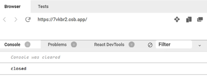
Figure 1.8 – The Browser panel closed console output
That completes the close event and the implementation of the alert for this chapter.
Here’s what we have learned about React events:
- Events, along with state, allow a component to be interactive
- Event handlers are functions that are registered on elements in JSX
- A custom event can be created by implementing a function prop and invoking it to raise the event
The component we created in this chapter is a function component. You can also create components using classes. For example, a class component version of the alert component is at https://github.com/PacktPublishing/Learn-React-with-TypeScript-2nd-Edition/blob/main/Chapter1/Class-component/Alert.js. However, function components are dominant in the React community because of the following reasons:
- Generally, they require less code to implement
- Logic inside the component can be more easily reused
- The implementation is very different
For these reasons, we will focus solely on function components in this book.
Next, we will summarize what we have learned in this chapter.
Summary
We now understand that React is a popular library for creating component-based frontends. In this chapter, we created an alert component using React.
Component output is declared using a mix of HTML and JavaScript called JSX. JSX needs to be transpiled into JavaScript before it can be executed in a browser.
Props can be passed into a component as JSX attributes. This allows consumers of the component to control its output and behavior. A component receives props as an object parameter. The JSX attribute names form the object parameter property names. We implemented a range of props in this chapter in the alert component.
Events can be handled to execute logic when the user interacts with the component. We created an event handler for the close button click event in the alert component.
State can be used to re-render a component and update its output. State is defined using the useState hook. State is often updated in event handlers. We have created state for whether the alert is visible.
Custom events can be implemented as a function prop. This allows consumers of the component to execute logic as the user interacts with it. We implemented a close event on the alert component.
In the next chapter, we will introduce ourselves to TypeScript.
Questions
Answer the following questions to reinforce what you have learned in this chapter:
- What is wrong with the following component definition?
export function important() { return <div>This is really important!</div>; } - A component with a prop is defined as follows:
export function Name({ name }) {
  return <div>name</div>;
}
The value of the prop isn’t output though. What is the problem?
- Component props are passed into a component as follows:
<ContactDetails name="Fred" email="fred@somewhere.com" />
The component is then defined as follows:
export function ContactDetails({ firstName, email }) {
  return (
    <div>
      <div>{firstName}</div>
      <div>{email}</div>
    </div>
  );
}
The name Fred isn’t output though. What is the problem?
- What is wrong with how the
clickevent is handled in the following JSX:<button click={() => console.log("clicked")}> Click me </button>; - What is the initial value of the
loadingstate defined here?const [loading, setLoading] = useState(true);
- What is wrong with how the state is set in the following component?
export function Agree() { const [agree, setAgree] = useState(); return ( <button onClick={() => agree = true}> Click to agree </button> ); } - The following component implements an optional
Agreeevent. What is wrong with this implementation?export function Agree({ onAgree }) { function handleClick() { onAgree(); } return ( <button onClick={handleClick}> Click to agree </button> ); }
Answers
Here are the answers to the questions on what you have learned in this chapter:
- The problem with the component definition is that its name is lowercase. React functions must be named with an uppercase first character:
export function Important() { ... } - The problem is that the
namevariable inside thedivelement isn’t enclosed in curly brackets. So, the wordnamewill be output rather than the value of thenameprop. Here’s the corrected version of the component:export function Name({ name }) { return <div>{name}</div>; } - The problem is that a
nameprop is passed rather thanfirstName. Here’s the corrected JSX:<ContactDetails
firstName="Fred" email="fred@somewhere.com" /> - The problem is that a
clickprop is passed rather thanonClick. Here’s the corrected JSX:<button
onClick={() => console.log("clicked")}> Click me </button>; - The initial value of the
loadingstate istrue. - The state isn’t updated using the state setter function. Here’s the corrected version of the state being set:
export function Agree() { const [agree, setAgree] = useState(); return ( <button onClick={() => setAgree(true)}> Click to agree </button> ); } - The problem is that clicking the button will cause an error if
onAgreeisn’t passed because it will beundefined. Here’s the corrected version of the component:export function Agree({ onAgree }) { function handleClick() { if (onAgree) { onAgree(); } } return ( <button onClick={handleClick}> Click to agree </button> ); }