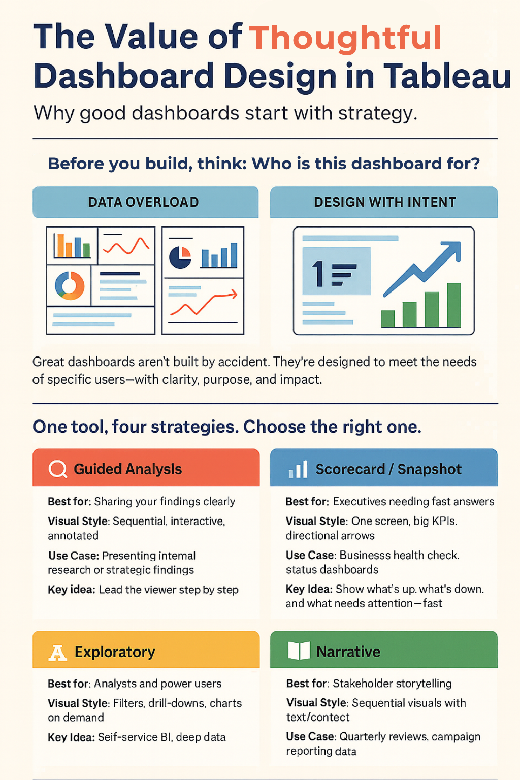
A common professional setting for Tableau users is the executives wanting quick insights without having to wade through noise, the analysts needing interactive exploration, and the broader audiences needing a narrative to make data relatable. A thoughtful dashboard design strategy aligns your Tableau visuals with these needs. (src) It ensures you’re not just throwing data on a page, but actually communicating the ideas. In the long run, a bit of planning on “dashboard strategy” saves time and elevates the impact of your work.
Four approaches to dashboard design
One of the key insights from the upcoming book Learning Tableau 2025 is that there isn’t a one-size-fits-all approach to dashboard design. The book’s authors outline at least four common design approaches, each suited to different scenarios. Lightly adapted from Learning Tableau 2025, here are the four approaches and what they entail:
🔹Guided Analysis – This approach guides the audience through the data to facilitate discovery. In practice, you lead viewers step-by-step so they can understand the data’s implications and arrive at clear actions. A guided dashboard often anticipates a specific analysis path – you’ve done the analysis and now walk the user through those findings in a logical sequence.
🔹Exploratory – An exploratory dashboard is an open sandbox. It provides tools (filters, drill-downs, etc.) for the audience to explore the data on their own. The idea is that the data’s story may evolve over time, so you empower users to investigate trends and relationships themselves. This approach is common in self-service BI scenarios, where different users might have different questions.
🔹Scorecard / Status Snapshot – This is all about at-a-glance information. A scorecard or status snapshot delivers a concise summary of key performance indicators (KPIs) and metrics. It’s the classic executive dashboard: think of a one-page layout with big numbers, up/down arrows, and color-coded indicators. The goal is quick problem identification and monitoring – no heavy narrative, just the vital signs of the business in one view.
🔹Narrative – A narrative dashboard focuses on telling a story with the data. It guides the viewer through a beginning, middle, and end using visuals and text in a cohesive sequence. For example, you might show how a metric changed over time during a specific event (imagine illustrating the spread of a disease or the timeline of a marketing campaign). This approach adds context and commentary to data, making the insights memorable and compelling.
(Extracted and adapted from Learning Tableau 2025 by Milligan et al.)
Putting these approaches into practice
These different approaches matter because of their impact. Matching your dashboard design to your audience’s needs can dramatically improve how your insights land. For instance, if your CEO just wants a daily health check of the business, a scorecard-style dashboard ensures they see all critical KPIs in seconds (and nothing more). If you’re presenting to stakeholders at a quarterly review, a narrative dashboard with a clear storyline might be more effective – it can walk them through performance drivers and outcomes in a logical flow. On the other hand, when you’re building tools for analysts or power users, an exploratory dashboard gives them the flexibility to ask their own questions about the data. And if you’ve conducted deep analysis yourself, a guided dashboard lets you package those insights into an interactive journey, so colleagues can essentially retrace your steps and findings.
Keep in mind that these approaches aren’t mutually exclusive. Often, a well-crafted dashboard will blend elements of each. You might start with a snapshot overview up top (scorecard style), then provide interactive filters for deeper exploration, and perhaps include annotations or highlights to add a mini narrative. The key is to be deliberate: know when you’re trying to simply inform versus when you need to persuade or invite exploration. By aligning the design to the goal, you avoid the common pitfalls of cluttered or directionless dashboards.
In today’s data-driven environment, dashboards are a staple of communication – and thoughtful design is what separates the mediocre from the truly effective. A bit of upfront strategy about how you present information pays off with dashboards that people actually use and understand. (src) Whether you’re guiding a user through a data story or letting them dive in themselves, choosing the right approach will ensure your Tableau work delivers value, not just charts.
For those who want to dive deeper and see these principles in action, the book Learning Tableau 2025 is packed with practical examples and tips on building impactful dashboards. It’s a resource well worth exploring if you’re looking to sharpen your Tableau skills and design more thoughtful, effective dashboards. By approaching your next project with a clear strategy in mind, you’ll be well on your way to creating dashboards that not only look good, but drive smarter decisions in your organization.
Want to design dashboards that communicate, not just display?
Take the Tableau dashboard design quiz to find your weak point—and see how Learning Tableau 2025 can help you fix it. Take the quiz here!
Then, pre-order your copy of Learning Tableau 2025 to learn how to apply guided analysis, exploratory tools, executive snapshots, and narrative techniques in real projects—so your dashboards deliver insight with impact.
🛒 Pre-order here.
 United States
 Great Britain
 India
India
 Germany
 France
 Canada
 Russia
 Spain
Spain
 Brazil
 Australia
 Singapore
 Canary Islands
 Hungary
 Ukraine
 Luxembourg
 Estonia
 Lithuania
 South Korea
 Turkey
 Switzerland
 Colombia
 Taiwan
 Chile
Chile
 Norway
 Ecuador
 Indonesia
 New Zealand
 Cyprus
 Denmark
 Finland
 Poland
 Malta
Malta
 Czechia
 Austria
 Sweden
 Italy
Italy
 Egypt
Egypt
 Belgium
 Portugal
 Slovenia
 Ireland
 Romania
 Greece
 Argentina
 Netherlands
 Bulgaria
 Latvia
 South Africa
 Malaysia
 Japan
Japan
 Slovakia
 Philippines
 Mexico
 Thailand


