


 Download code from GitHub
Any attempt at mastering a technology, any technology, requires a good understanding of its foundations. This understanding makes it possible to grasp the more complex aspects of that technology; Windows Presentation Foundation (WPF) is no different.
In this first chapter, we'll discuss recipes concerning the very foundations of WPF – what makes it tick—and also along the way, what makes it unique.
The first noticeable facet of WPF is XAML (eXtensible Markup Language). XAML is an XML based language used in WPF to declaratively create user interfaces. Actually, XAML has nothing to do with UI. It's merely a declarative way of constructing objects and setting their properties. In fact, it's leveraged in other technologies, such as the Windows Workflow Foundation (WF), where it's used as a way of constructing workflows. To create objects in XAML, they must be "XAML friendly" – meaning they must have the following:
The second item is not strictly a requirement, but the lack of settable properties would make the object a bit dull. Note that starting with .NET 4, XAML is in fact capable of handling parameterized constructors, but WPF's XAML parser currently does not leverage that capability.
XAML is not an absolute requirement. In fact, you can create an entire application using C# or VB (or whichever .NET language you fancy) without a single XAML tag. However, that would be much more difficult and error prone with high maintenance costs, not to mention the difficulty of integration with your fellow designers.
XAML is about the what, not the how. This declarative style makes things easier (granted, after some getting used to), and is a paradigm shift in software development in general (the classic example in .NET being the LINQ-based technologies). XAML is neutral—it's not C# or anything like that—so other, non-developer tools can create or manipulate it. Microsoft provides the Expression Blend tool, which at its core, is a glorified XAML producer/consumer.
What happens to a XAML file? How is it tied to the code behind file created by Visual Studio? A XAML file is compiled by a XAML compiler that produces a binary version of the XAML, known as BAML. This BAML is stored as a resource inside the assembly and is parsed at runtime in the InitializeComponent call to create the actual objects. The result is bundled with the code behind file (the typical Window class is declared as partial, meaning there may be more source files describing the same class) to produce the final code for that class.
Browsing a typical WPF application, we won't find the canonical Main method, because it's generated by WPF. It constructs the singleton Application object instance and creates the first window specified by the
Application.StartupUri property (if not null). We can find that code in the file App.g.cs (g stands for generated) inside the Obj\x86\Debug sub-folder.
.NET properties are nothing more than syntactic sugar over set and get methods. What those methods do is up to the property's developer. More often than not, a property is a thin wrapper over a private field, perhaps adding some validation logic in its setter.
WPF requires more out of its properties. Specifically, WPF's dependency properties provide the following:
Change notifications when the property's value is changed.
Validation handler called as part of a set operation.
Coercion handler that is able to "coerce" the provided value to an acceptable value.
Various providers can attempt to set the property's value, but only one such provider wins at a time. Nevertheless, all values are retained. If the winning provider goes away, the property's value is set to the next winner in line.
Property value inheritance down the visual tree (if so desired).
No memory is allocated for a property's value if that value is never changed from its default.
These features provide the basis of some of WPF's strong features, such as data binding and animation.
On the surface, these properties look the same as any other property—a getter and a setter. But no private fields are involved, as we'll see in the following recipes.
Sometimes there's a need to create instances of your own types, or other .NET Framework, non-WPF types within XAML. A classic example is a data binding value converter (which we'll explore in Chapter 6, Data Binding, but other scenarios might call for it).
We'll create a simple application that creates an instance of a custom type in XAML to demonstrate the entire procedure:
Create a new WPF Application project named CH01.CustomTypes.
Let's create a custom type named
Book. In the Solution Explorer window, right-click on the project node and select Add and then Class…:
Type
Bookin the Name box and click on Add:
Add four simple properties to the resulting class:
class Book {
   public string Name { get; set; }
   public string Author { get; set; }
   public decimal Price { get; set; }
   public int YearPublished { get; set; }
 }
Tip
Downloading the example code
You can download the example code files for all Packt books you have purchased from your account at http://www.PacktPub.com. If you purchased this book elsewhere, you can visit http://www.PacktPub.com/support and register to have the files e-mailed directly to you.
Open the
MainWindw.xamlfile (using the Solution Explorer), which was created automatically by the project wizard. We would like to create an instance of theBookclass. As aBookis not an element (does not derive fromUIElement), we cannot simply create it inside ourGrid. But, we can make it theContentproperty (that can be anything, as its type isObject) of aContentControl-derived type, such asButton. Add a button control to the existing grid, as follows:<Grid> <Button FontSize="20"> </Button> </Grid>To create an instance of
Book, we first need to map the .NET namespace (and assembly) whereBookis defined to an XML namespace that can be used by the XAML compiler. Let's add a mapping at the top of the XAML near the default mappings added by the application wizard:<Window x:Class="CH01.CustomTypes.MainWindow" xmlns="http://schemas.microsoft.com/winfx/2006/xaml/presentation" xmlns:x="http://schemas.microsoft.com/winfx/2006/xaml" xmlns:local="clr-namespace:CH01.CustomTypes"This says that anything prefixed by the string
local(we can select anything here), should be looked up in theCH01.CustomTypesnamespace (in the current assembly).Now, we can finally create a
Bookinstance. Add the following inside theButtontag:<Button FontSize="20"> <local:Book Name="Windows Internals" Author="Mark Russinovich" Price="40" YearPublished="2009" /> </Button>
That's it. We can verify this by adding a suitable
ToStringimplementation to theBooktype, and running the application:public override string ToString() { return string.Format("{0} by {1}\nPublished {2}", Name, Author, earPublished); }
The XAML compiler needs to be able to resolve type names such as Button or Book. A simple name like Button is not necessarily unique, not in the XML sense and certainly not in the .NET sense (there are at least four Button types in .NET, naturally in diffrent namespaces)
.
A mapping is required between an XML namespace and a .NET namespace, so that the XAML compiler can reference the correct type. By default, two XML namespaces are declared by a typical XAML file: the first, which is the default XML namespace, is mapped to the normal WPF namespaces (System.Windows, System.Windows.Controls, and so on). The other, typically with the x prefix, is mapped to the XAML namespace (System.Windows.Markup).
For our own types, we need to do similar mapping (but with a different syntax) means map the XML namespace prefix local to the .NET namespace CH01.CustomTypes. The following line:
xmlns:local="clr-namespace:CH01.CustomTypes"
This allows our Book class to be recognized and used within the XAML.
If the type was defined in a referenced assembly (not our own assembly), then the mapping would continue to something like the following:
xmlns:local="clr-namespace:CH01.CustomTypes;assembly=MyAssembly"
For example, suppose we want the ability to create instances of the System.Random type. Here's how we'd map an XML namespace to the .NET namespace and assembly where Sys
em.Random resides:
xmlns:sys="clr-namespace:System;assembly=mscorlib"
Now, we could create an instance of anything in the System namespace (that is XAML friendly) and the mscorlib assembly (such as Random):
<sys:Random x:Key="rnd" />
In this case, it's hosted in a ResourceDictionary (which is a kind of dictionary, meaning every value requires a key; we'll discuss these in more detail in the next chapter).
It's possible to map a single XML namespace to multiple .NET namespaces. This is the same technique used by the WPF assemblies itself: a single XML namespace maps to multiple WPF namespaces, such as System.Windows, System.Windows.Controls, and System.Wind
ws.Media.
The trick is to use the XmlnsDefinition attribute within the assembly where the exported types reside. This only works for referenced assemblies; that is, it's typically used in class library assemblies.
For example, suppose we create a MyClassLibrary class library assembly, with a type like the Book introduced earlier:
namespace MyClassLibrary {
   public class Book {
      public string Name { get; set; }
      public string Author { get; set; }
      public decimal Price { get; set; }
      public int YearPublished { get; set; }
   }
}
We can make all types within this assembly and the MyClassLibrary namespace part of an XML namespace by adding the following attribute:
[assembly: XmlnsDefinition("http://mylibrary.com",
"MyClassLibrary")]
The first argument to the attribute is the XML namespace name. This can be anything, but is typically some form of fictitious URL (usually a variation on the company's URL), so as to lower chances of collisions (this is exactly the same idea used by WPF). The second string is the .NET namespace mapped by this XML namespace.
Now, suppose we have another .NET namespace within that same assembly with some types declared within it:
namespace MyClassLibrary.MyOtherTypes {
   public class MyType1 {
      //...
   }

   public class MyType2 {
      //...
   }
}
We can add another attribute to map the same XML namespace to the new .NET namespace:
[assembly: XmlnsDefinition("http://mylibrary.com", "MyClassLibrary.MyOtherTypes")]This means that a single XML prefix (in some client application) can now map to multiple .NET namespaces:
xmlns:mylib="http://mylibrary.com"
This scheme can save multiple distinct XML prefix declarations. One consequence of this idea is that all public type names must be unique across the mapped .NET namespaces (as they are indeed within WPF itself).
Dependency properties are the workhorse of WPF. This infrastructure provides for many of WPF's features, such as data binding, animations, and visual inheritance. In fact, most of the various element properties are Dependency Properties. Sometimes we need to create such properties for our own controls or windows.
We'll create a simple user control with one new dependency property to illustrate the entire procedure:
Within Visual Studio 2010, create a new WPF Application named CH01.DependencyProperties.
We'll add a simple User Control, to which we'll add a dependency property. Don't worry if you don't understand exactly what a user control is; we'll discuss those in a later chapter. For now, just concentrate on the dependency properties we'll create and use. To create the User Control, right-click on the Project node in the Solution Explorer and select Add and then User Control….

In the resulting dialog, type
SimpleControlin the Name box, and then click on Add:
We'll add a dependency property to the
SimpleControlclass. A dependency property needs to be "registered" with the property system. Open theSimpleControl.xaml.csfile and typepropdpjust after the closing brace of the constructor. This is how it would look in the Visual Studio editor:
This is a code snippet that helps with the (somewhat unpleasant) details of properly registering the property. Press Tab; the code snippet is expanded to something like the following:

The first part looks like a normal getter/setter of a property (although the implementation is anything but "normal"). The second part actually registers the property with some information (more on that in the How it works… section). Let's create a property named
YearPublishedof typeint.Press Tab to skip the
intpart (as that's what we want here). The focus should jump toMyProperty. TypeYearPublishedas the property name.Press Tab again. Note that this changes the property name in the lower
Registercall toYearPublished. The focus should jump to theownerclasspart. TypeSimpleControl.Press Tab again. The focus should jump to the
0. This should be the default value of the property, if not altered. Change the0into2000. After removing the (unhelpful) comment from the snippet provided, the code should look as follows:public int YearPublished { get { return (int)GetValue(YearPublishedProperty); } set { SetValue(YearPublishedProperty, value); } } public static readonly DependencyProperty YearPublishedProperty = DependencyProperty.Register( "YearPublished", typeof(int), typeof(SimpleControl), new UIPropertyMetadata(2000));Now let's test it. If that's indeed a dependency property, then there are a few things it can do, such as data bind. We'll add an instance of the
SimpleControlclass to our main window and bind the property we defined to some other control.Open the
MainWindow.xamlfile. Replace the existingGridwith aStackPanel, and add an instance of ourSimpleControl. The entire markup should look like as follows:<Window x:Class="CH01.DependencyProperties.MainWindow" xmlns="http://schemas.microsoft.com/winfx/2006/xaml/presentation" xmlns:x="http://schemas.microsoft.com/winfx/2006/xaml" xmlns:local="clr-namespace:CH01.DependencyProperties" Title="MainWindow" Height="350" Width="525"> <StackPanel> <local:SimpleControl x:Name="_simple" /> </StackPanel> </Window>Note the
localprefix pointing to our .NET namespace (as explained in an earlier recipe of this chapter). Now let's add aTextBlockand aButtoninside theStackPanel. TheTextproperty ofTextBlockshould bind to theYearPublishedproperty of theSimpleControlinstance:<TextBlock Text="{Binding YearPublished, ElementName=_simple}" FontSize="30" /> <Button Content="Change Value" FontSize="20"/>When the button is clicked, we'll increment the
YearPublishedproperty and see if that changes the displayed text in theTextBlock. First, add aClickevent handler; within theButtonelement typeClick=. Visual Studio writes a pair of quotes and suggests adding a handler. You can press Tab to accept the default handler name, or type yourself an appropriate name, such asOnChangeValue:<Button Content="Change Value" FontSize="20" Click="OnChangeValue"/>
Right-click on the handler name (
OnChangeValuein this case), and select Navigate to Event Handler:
Visual Studio switches to the
MainWindow.xaml.csfile inside the event handler. Add a simple increment of theYearPublishedproperty ofSimpleControlnamed_simple. The entire method should look as follows:private void OnChangeValue(object sender, RoutedEventArgs e) { _simple.YearPublished++; }Run the application. You should see the
TextBlockshowing 2000. That's the default value we set in theDependencyProperty.Registercall.
Now press the button Change Value a few times— the text should be incremented. This happened because of the change notifications raised by the dependency property system, to which the data binding system registered.

A dependency property is managed by a public static (readonly) field named with the property name suffixed with Property; in our case it's MyValueProperty. This field manages the property value for any instance of the type it's declared in. The call to DependencyProperty.Register sets the property's name, its type, the owner type, and set of metadata for that property. The previous code uses an instance of UIPropertyMetadata (one of several possible types), that accepts (at least) the default value for the property (10 in our example).
The classic getter/setter method pair includes calls to SetValue and GetValue. These are defined in the DependencyObject base class, which means any type that wants to leverage the dependency property system must inherit from this class (directly or indirectly). For WPF elements, this is not a problem, as everything inherits from DependencyObject eventually.
When a new value is set for the property (as we did for our code), the SetValue method does "the right thing", meaning (for example), sending notifications to whoever is listening (such as the data binding system).
When we register a dependency property, we can provide a property changed callback delegate, to be called when that property value changes for whatever reason:
public static readonly DependencyProperty
   YearPublishedProperty =   DependencyProperty.Register(
      "YearPublished", typeof(int), typeof(SimpleControl),
      new UIPropertyMetadata(2000, OnValueChanged));


private static void OnValueChanged(DependencyObject obj,
   DependencyPropertyChangedEventArgs e) {
   // do something when property changes
}
We'll examine this technique in a future recipe when we discuss attached properties.
This may seem unnecessary— after all, can't we just add code to the setter, and then just know when the property value is changed? No. The reason is that the property setter is just syntactic sugar—it's not always called directly. It is used by developers, as this is the familiar property syntax, but the XAML parser, for example, just calls SetValue directly—bypassing the property setter altogether. And it's not the only entity doing so. The setter should have nothing in it except the SetValue call.
User interface needs to be consistent, usually having the same fonts, sizes, and so on. Setting a font size, for example, on each and every element so they have the same value is tedious and unmaintainable. One of the ways WPF deals with that (not the only way; we'll see another powerful way in Chapter 8) is the idea of propagating a property value down the visual tree. This mechanism, property value inheritance, is supported by the dependency property infrastructure.
A canonical example is the font-related properties. If we set the FontSize property (for instance) on some container element, child elements (in any level) would use that property instead of the default:
<Window x:Class="CH01.InheritDemo.MainWindow"
        Title="MainWindow" FontSize="20"
        Width="400" Height="300">
    <StackPanel>
        <TextBlock Text="Text 1" />
        <TextBlock Text="Text 2" />
        <TextBlock Text="Text 3" />
    </StackPanel>
</Window>
Note the FontSize is set to 20 on the Window object. All the TextBlocks will now use the value of 20 for their font size instead of the default. This is a feature a dependency property may choose to use, specified at registration time. Here's an example of a dummy property:
public static readonly DependencyProperty DummyProperty =
   DependencyProperty.Register("Dummy", typeof(int),
      typeof(MainWindow), new FrameworkPropertyMetadata(0,
      FrameworkPropertyMetadataOptions.Inherits));
That last flag makes this property inheritable by default (same as the font related properties).
What is the "dependency" part of dependency properties? In the previous section, we looked at visual inheritance. Suppose that one of those example TextBlocks sets a different FontSize values like so:
<Window x:Class="CH01.InheritDemo.MainWindow"
        Title="MainWindow" FontSize="20"
        Width="400" Height="300">
    <StackPanel>
        <TextBlock Text="Text 1" />
        <TextBlock Text="Text 2" FontSize="30"/>
        <TextBlock Text="Text 3" />
    </StackPanel>
</Window>
What will be the final result? It turns out 30 is the winner for the second TextBlock. What we see is a set of priorities for providers of values. The first (and lowest) priority is the default value registered with DependencyProperty.Register. A higher priority is the inheritance feature (if registered as such for that property). A higher still priority is a local value (30 in our example) that takes precedence over inheritance. So, a dependency property depends on one of several levels or priorities of value providers. In fact, there are about 11 different levels in all (we have seen three in this example). All provider values are not lost—they may become effective if the highest provider is cleared. Here's an example:
_text2.ClearValue(TextBlock.FontSizeProperty);This clears the local value of the (for example) second TextBlock, reverting its FontSize value to 20 (the inherited value).
By the way, the highest priority provider (except for a coercion callback, explained in the next section) is an active animation. If this wasn't so, an animation would simply have no effect. Once the animation is removed, the property value reverts to its previous state (depending on the highest provider at that time).
We need to take this behavior into consideration. If a property does not seem to get the expected value, there's a good chance we missed some provider that's "stronger" than the one we expected to win. The Visual Studio debugger has a visualizer that can be used to view the current property values of elements, and (very important) the provider that's effectively providing this value. Here's an example for our famous second TextBlock:
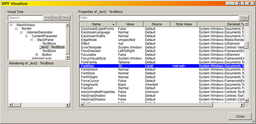
Note the Local reading of the Source column.
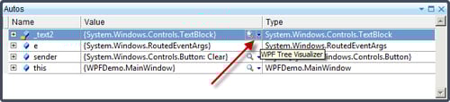
The CH11.InheritDemo project, available with the downloadable source for this chapter, can be used to test it out. To get to this dialog, set a breakpoint where you have easy access to the required variable (in this case it could be done in the MainWindow constructor after InitializeComponent), and then click on the small magnifying glass near the variable's value column:
If we remove the FontSize="30" local value setting, and use the visualizer again, we get the following:
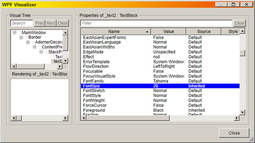
The Source column clearly indicates that the value was set because of visual inheritance.
This information is also available by using other tools that don't require Visual Studio or a debugger of any kind. One such free tool is Snoop (http://snoopwpf.codeplex.com). This tool can look at any WPF window and drill down into the visual tree, showing property values (with their source); since it does not require anything special, it can be used in production environments, where tools such as Visual Studio are not typically found.
As mentioned, there are 11 levels, or priorities, of dependency property providers. Here's the complete list (highest to lowest precedence):
Property coercion: The coercion mechanism allows a delegate to execute before the final value is set for the property. That coercion delegate is provided as part of the property metadata at registration time. For example, if a property signifies an hour in the day, it should have a value between 0 and 23. The coercion callback can look at the suggested value, and if (say) it's greater than 23, return 23 as the final value.
Active animation: If an animation is active, it provides the property's current value.
Local value: Set through the property setter in code, or through XAML.
Template parent properties: If the control was created as part of a
ControlTemplateorDataTemplate, these properties apply (we'll discuss data templates in Chapter 6 and control templates in Chapter 8).Implicit style: (We'll discuss implicit styles in Chapter 8).
Style triggers from Windows or the application (we'll discuss triggers in Chapter 8).
Template triggers: Triggers that are part of a template (again, Chapter 8).
Style setters: Values from styles defined in the Window or the application (styles are discussed in Chapter 8).
Default style: Set by the control creator and can be based on the current Windows theme.
For a detailed look at all dependency property levels, you can refer to this link in the official MSDN documentation: http://msdn.microsoft.com/en-us/library/1FBADA8E-4867-4ED1-8D97-62C07DAD7EBC(v=vs.100,d=loband).aspx
Attached properties are curious beings. There is no direct analogue to anything else in the .NET framework. The closest may be extension methods, introduced in C# 3.0. Extension methods are a way of extending a type without inheriting from it (even if that type is sealed). Attached properties are dependency properties that are defined by some type, but can be used by (almost) any other typed object. That is, they can extend a type's properties without code derivation. In this recipe, we'll see how to use an existing attached property, and in the next one we'll learn how to create a new attached property.
We'll create an application that creates a rectangle and places it inside a canvas at exact coordinates using attached properties:
Create a new WPF Application named
CH01.SimpleAttached.Open the
MainWindow.xamlfile and create the following basic layout:<Grid> <Canvas> <RepeatButton Content="Move" /> </Canvas> </Grid>This creates a grid which hosts a
Canvasand that canvas hosts aRepeatButton. Let's add aRectangleelement to theCanvasand place it in some position:<Canvas> <RepeatButton Grid.Row="1" Content="Move" /> <Rectangle x:Name="_rect" Width="50" Height="50" Fill="Red" Stroke="Black" StrokeThickness="5" Canvas.Left="30" Canvas.Top="40" /> </Canvas>Run the application. You should see something like this:

The
Canvas.LeftandCanvas.Topare attached properties. They are defined by theCanvastype, but they can be applied to any element (technically, anything that derives fromDependencyObject). In this case, these two properties are applied to theRectangle, essentially "extending" its property set with two new properties. The syntaxDefiningClassName.PropertyNameis the way to access an attached property in XAML.Now let's try changing these properties in code. When the repeat button is clicked, let's move the rectangle a little bit to the right. First, let's name the
Rectangle, so we can easily refer to it in code:<Rectangle x:Name="_rect" Width="50" Height="50" Fill="Red" Stroke="Black" StrokeThickness="5" Canvas.Left="30" Canvas.Top="40" />Add a
Clickevent handler to theRepeatButton. In the handler, add the following code:Canvas.SetLeft(_rect, Canvas.GetLeft(_rect) + 5);
An attached property is accessed in code using a set of static methods on the class declaring the property (in this case, the
Canvas). The first argument to these methods is the intended target of the property (in this case theRectangle). Run the application. Click on the button (and hold); you should see the rectangle moving along to the right, 5 units at a time.
An attached property is first and foremost a dependency property, meaning it supports all the capabilities of dependency properties. However, as an attached property is "attached" to an object that did not define it, a simple property like syntax is not possible – as C# does not support the concept of attached properties natively. Instead, the declaring class provides two static methods, named DeclaringType.SetPropertyName and DeclaringType.GetPropertyName, that provide a way to set or get the property value for some object passed in as the first argument (as demonstrated in the last code snippet).
In XAML, things are simpler, as the XAML parser is aware of attached properties, and converts the simpler DeclaringType.PropertyName attribute to the aforementioned Set method.
The actual implementation of the Set/Get static methods mentioned above is to call the regular DependencyObject.SetValue/GetValue as for a regular dependency property. This means that the code to move the rectangle could have been written as follows:
_rect.SetValue(Canvas.LeftProperty,
   (double)_rect.GetValue(Canvas.LeftProperty) + 5);
One may wonder why to go to all this trouble for the Left and Top properties. Would it not be simpler to define the Left and Top properties on the (for example) UIElement class and be done with it? These properties could have been normal dependency properties and enjoy the simpler syntax they carry.
The reason is, that a Left or Top property may not always make sense. In fact, it only makes sense when the element is placed within a Canvas. What if the rectangle is inside a Grid? Or a StackPanel? The Left/Top properties wouldn't make sense. This leads to the conclusion that attached properties are a kind of contextual property – they are relevant under particular circumstances, so they can be "attached" if and when actually needed.
The previous example may lead to a wrong conclusion. It seems Canvas.Left and the like are only relevant when the element is inside a Canvas. Similarly, the Grid.Row and Grid.Column attached properties only make sense for elements placed inside a Grid. Is this somehow necessary from an attached property point of view?
Not at all. This is just coincidence. The above properties in fact make sense only for elements placed inside their respective declaring type, but that does not have to be the case. For example, suppose we have a button with a tool tip defined:
<Button Content="Copy" ToolTip="Copy the Selected Items" />
If the button is disabled (IsEnabled set to true), the tool tip does not appear at runtime. To make it appear even if the control is disabled, we must set the ToolTipService.ShowOnDisabled attached property to true:
<Button Content="Copy" ToolTip="Copy the Selected Items"
        ToolTipService.ShowOnDisabled="True"/>
We set the property on the button, but it's defined in the ToolTipService class. This class is not an element (unlike the Canvas for example). In fact, it's a static class (instances of it cannot be created). So, there is no relationship between the button and the ToolTipService class, or between the ToolTip and ToolTipService classes, for that matter. The way this connection is established (so it can have some effect) will be revealed in the next recipe in this chapter.
An attached property can be used to somehow "enhance" or extend another object. In the case outlined in the previous recipe, Using an attached property, an element was placed at exact coordinates within a Canvas using the attached Canvas.Left and Canvas.Top properties. An attached property is a powerful tool for extending the behavior of any object without the need to inherit from the type of the object. In this task, we'll see this in action.
We'll create an attached property that would rotate any element it's attached to:
Create a new WPF Application named
CH01.CustomAttached.Open
MainWindow.xaml. Add some elements in aCanvas(replace the defaultGrid) as follows:<Canvas> <Ellipse Fill="Red" Width="100" Height="60" /> <Rectangle Fill="Blue" Width="80" Height="80" Canvas.Left="100" Canvas.Top="100" /> <Button Content="Hello" Canvas.Left="130" Canvas.Top="30" FontSize="20" /> </Canvas>Suppose we want to rotate a particular element around its center. We would have to write something like this (example for the
Ellipse):<Ellipse Fill="Red" Width="100" Height="60" RenderTransformOrigin=".5,.5"> <Ellipse.RenderTransform> <RotateTransform Angle="30" /> </Ellipse.RenderTransform> </Ellipse>Although this is certainly possible, this makes for a lot of typing. Now imagine doing something similar for other elements. Let's make it shorter by defining and using an attached property.
Add a new class to the project named
RotationManager.We'll register a new attached property within this class; a property any other object can use. To do that, we'll take advantage of a Visual Studio code snippet,
propa(similar in concept topropdpdiscussed in the task Creating a dependency property in this chapter). Inside the class definition, typepropa(without the quotes). This is how it should look at this point:
Press Tab once, and fill in the property details as follows: the property type should be double, its name should be
Angle, its owner classRotationManager, and its default value zero. You'll have to add ausingstatement forSystem.Windowsnamespace. The generated code should look as follows (after removing the comment and some formatting):class RotationManager : DependencyObject { public static double GetAngle(DependencyObject obj) { return (double)obj.GetValue(AngleProperty); } public static void SetAngle(DependencyObject obj, double value) { obj.SetValue(AngleProperty, value); } public static readonly DependencyProperty AngleProperty = DependencyProperty.RegisterAttached("Angle", typeof(double), typeof(RotationManager), new UIPropertyMetadata(0.0)); }
Now that we have an attached property definition, let's use it. We'll set it on our various elements. The first step is mapping an XML namespace to our namespace (as we learned in the recipe Creating custom type instances in XAML in this chapter). Open
MainWindow.xamland add a mapping on the root element, as in the following code snippet:xmlns:local="clr-namespace:CH01.CustomAttached"
Now let's set the property with various values on the various elements. Here's an example for the
Ellipse(notice the intellisense popping up to help):<Ellipse Fill="Red" Width="100" Height="60" local:RotationManager.Angle="45"/>Add similar settings for the
RectangleandButtonlike as follows:<Rectangle Fill="Blue" Width="80" Height="80" Canvas.Left="100" Canvas.Top="100" local:RotationManager.Angle="30" /> <Button Content="Hello" Canvas.Left="130" Canvas.Top="30" FontSize="20" local:RotationManager.Angle="90"/>Notice that the designer preview shows no change. If you run the application, nothing happens. And why would anything happen? We declared a property and nothing else. Let's add some behavior logic if the property is actually used. For that, we'll add a property changed handler notification. Go back to
RotationManager.csand modify the property registration as follows:public static readonly DependencyProperty AngleProperty = DependencyProperty.RegisterAttached("Angle", typeof(double), typeof(RotationManager), new UIPropertyMetadata(0.0, OnAngleChanged));
The
OnAngleChangedmethod will be called for any change in the property value on any object it's applied to. Let's add some simple logic that will rotate the element:private static void OnAngleChanged(DependencyObject obj, DependencyPropertyChangedEventArgs e) { var element = obj as UIElement; if(element != null) { element.RenderTransformOrigin = new Point(.5, .5); element.RenderTransform = new RotateTransform( (double)e.NewValue); } }
If we switch back to the designer, we'll see the elements rotated according to the specified angles. If we run the application, we'll see something like this:

There we have it. An easy way to rotate any element by using an attached property.
Attached properties are registered similarly to regular dependency properties. In terms of functionality, they are dependency properties. This means they support everything a dependency property supports: data binding, animation, and so on. An attached property can be defined by any class (RotationManager in our example) and can be applied to any object whose type derives from DependencyObject.
Simply registering an attached property has no effect on its own. There must be some "extra" code that looks for that property and does something when it's applied or changed. In the example shown, this is done by specifying a property changed handler, called by WPF whenever the property is changed on any object. In the example code, we restrict using a UIElement-derived type, as this is the first type that supports RenderTransform and RenderTransformOrigin. This also shows the weakness of attached properties: it's not possible to know whether specifying the property on some object is beneficial. We could have thrown an exception if the object was not UIElement-derived to somewhat rectify this (albeit at runtime rather than compile time), but this is not typically employed (although we could have written something with Debug.WriteLine to indicate this needs attention), as there may be other code that does not consider this an invalid setting.
The property change notification scheme is typically used by WPF with attached properties that are defined by panels, such as Canvas, DockPanel, and Grid. Note that the panels only look for the relevant attached properties on their immediate children (and not grandchildren). This is not a limitation of attached properties, it's simply the way these panels work. Although attached properties within panels are common, there are other ways these properties can be used.
One possibility is to use the existence of these property values within styles (a complete treatment of styles is in given Chapter 8) or templates (templates are discussed in Chapter 6 and Chapter 8). For now, think of a style as a grouping of related settings that can be applied as a group to an element. For example, the following style accomplishes roughly the same thing as our property change handler:
<Style TargetType="Button">
   <Setter Property="RenderTransformOrigin" Value=".5,.5" />
   <Setter Property="RenderTransform">
      <Setter.Value>
         <RotateTransform Angle="{Binding Path=(local:RotationManager.Angle), RelativeSource={RelativeSource Mode=FindAncestor, AncestorType=Button}}" />
      </Setter.Value>
   </Setter>
</Style>
Of course, this example works with buttons only because of the targeted style (style that works on buttons only), but the result is the same. Note the parentheses around the attached property name. This is essential – otherwise the XAML parser does not understand this to be an attached property; it interprets local:RotationManager as the property name (and expects Angle to be a sub-property). Also, leaving out the "Path=" (as is customary in binding expressions), causes the expression to fail (for a similar reason).
An attached property is (paradoxically) a detached entity. It has no special affinity to the declaring type. This means we can use an already defined attached property if it's typed appropriately, named appropriately, and has no use in the needed situation. In our example, we need an attached property that is of type double, has an intuitive enough name (maybe something with "angle" or "rotate"), and is unused in scenarios where the use of our property makes sense.
Clearly, it's not easy finding such a property, but sometimes one may get lucky. For instance, if we elect to go for the attached property ToolTipService.HorizontalOffset (typed as double), we can achieve the same effect as previously (with a style setter) without defining a new attached property. This is not a good choice in this case, as an offset is not an angle, and clearly tooltips have nothing to do with rotation. The worse problem here is that there may be a legitimate reason to place that property on a button (to cater offsetting a tooltip), so that reusing for rotation purposes would collide with the tooltip, making only one a winner. Still, the general concept holds – any attached property can be reused.
Attached property reuse is possible in styles, templates (data template and control template), and triggers (within styles and templates).
XAML provides an easy way to set values of properties—type converters and the extended property syntax allow for flexible setting of values. However, some things cannot be expressed as a simple value, such as setting a property to the value of some static property.
We'll create an application that uses a static property from within XAML:
Create a new WPF Application named
CH01.StaticProperties.Open
MainWindow.xaml. Replace theGridelement with aStackPanel.Add some shapes as shown in the following code block:
    <StackPanel>
        <Ellipse Stroke="Black" Height="50" />
        <Rectangle Stroke="Black" Height="50" />
    </StackPanel>
Suppose we want to fill the ellipse with the desktop color selected by the user in Windows. WPF provides the
SystemColorsclass, with many static properties that return aBrushrepresenting the user's choice. For the desktop, this is aDesktopBrushproperty. We can try the following:<Ellipse Stroke="Black" Height="50" Fill="SystemColors.DesktopBrush" />
This throws an exception at runtime, as it cannot be converted to any "known" color (such as Red or Blue). To access a static property, we must use the
{x:Static}markup extension, as follows:<Ellipse Stroke="Black" Height="50" Fill="{x:Static SystemColors.DesktopBrush}" />
This works. You can verify this by going to Control Panel, then selecting Personalization (on Windows 7 or 8).

Select Window Color (switch to the classic theme first if the following window is shown differently). The Window Color and Appearance dialog is displayed:

Change the desktop color and run the application again. You should see the ellipse filled with the new color.
Similarly, let's fill the rectangle with the active window caption color:
<Rectangle Stroke="Black" Height="50"
Fill="{x:Static SystemColors.ActiveCaptionBrush}"/>
Running the application shows something like the following:

In this case, the active caption color on my system is a gradient, so the
ActiveCaptionBrushprovides the left side. The right side is provided by theGradientActiveCaptionBrushproperty. They are both brushes. If we wanted to recreate the caption gradient within the rectangle, we would need color objects, not brushes. Fortunately, these are provided via properties in the same class, namedActiveCaptionColorandGradientActiveCaptionColor. Let's combine these in aLinearGradientBrush:<Rectangle Stroke="Black" Height="50"> <Rectangle.Fill> <LinearGradientBrush EndPoint="1,0"> <GradientStop Offset="0" Color="{x:Static SystemColors.ActiveCaptionColor}" /> <GradientStop Offset="1" Color="{x:Static SystemColors.GradientActiveCaptionColor}" /> </LinearGradientBrush> </Rectangle.Fill> </Rectangle>This is the final result:
XAML basically has very few capabilities. It can create objects, set values for properties, and set up event handlers. This is intentional, as XAML is declarative in nature. It cannot, for instance, call methods. That would make it closer to an imperative language (such as C#), which would make its existence dubious at best.
Sometimes, however, declarative operations require more than setting up properties. A method may be involved, or some other unusual construct, but the intent may still be declarative. This is where markup extensions come in. They provide a way to extend XAML with new (hopefully declarative) capabilities.
A markup extension is a class that derives from System.Windows.Markup.MarkupExtension and implements a single method, ProvideValue. In this example we have used the {x:Static} markup extension, which allows accessing any static property (whether it belongs to WPF or not; if not, a XAML namespace mapping is required as explained in the recipe Creating custom type instances in XAML in this chapter). {x:Static} is implemented by the System.Windows.Markup.StaticExtension class. Note that if the markup extension class ends with "Extension" we can remove it when referring to it in XAML – the XAML compiler will search with and without the word "Extension". This means {x:Static} can be written {x:StaticExtension}. In fact, most markup extensions end with "Extension" (a notable exception is the Binding markup extension).
Markup extensions are used to extend the capabilities of XAML, by providing declarative operations that need more than just setting some properties. These can be used to do pretty much anything, so caution is advised – these extensions must preserve the declarative nature of XAML, so that non-declarative operations are avoided; these should be handled by normal C# code.
We'll create a new markup extension that would provide random numbers and use it within a simple application:
First, we'll create a class library with the markup extension implementation and then test it in a normal WPF application. Create a new Class Library project named
CH01.CustomMarkupExtension. Make sure the checkbox Create directory for solution is checked, and click on OK:
The base
MarkupExtensionclass resides in theSystem.Xamlassembly. Add a reference to that assembly by right-clicking the References node in the Solution Explorer, and selecting Add Reference…. Scroll down toSystem.Xamland select it.Delete the file
Class1.csthat was created by the wizard.Right-click the project node, and select Add Class…. Name the class
RandomExtensionand click on Add. This markup extension will generate a random number in a given range.Mark the class as public and inherit from
MarkupExtension.Add a
usingstatement toSystem.Windows.Markupor place the caret somewhere overMarkupExtension, click on the smart tag (or press Ctrl + . (dot), and allow the smart tag to add the using statement for you. This is how the class should look right now:public class RandomExtension : MarkupExtension {}We need to implement the
ProvideValuemethod. The easiest way to get the basic prototype is to place the caret overMarkupExtensionand use the smart tag again, this time selecting Implement abstract class. This is the result:public class RandomExtension : MarkupExtension { public override object ProvideValue(IServiceProvider sp) { throw new NotImplementedException(); } }
Before we create the actual implementation, let's add some fields and constructors:
readonly int _from, _to;
public RandomExtension(int from, int to) {
   _from = from; _to = to;
}
public RandomExtension(int to)
   : this(0, to) {
}
Now we must implement
ProvideValue. This should be the return value of the markup extension – a random number in the range provided by the constructors. Let's create a simple implementation:static readonly Random _rnd = new Random(); public override object ProvideValue(IServiceProvider sp) { return (double)_rnd.Next(_from, _to); }
Let's test this. Right-click on the solution node in Solution Explorer and select Add and then New Project….

Create a WPF Application project named
CH01.TestRandom.Add a reference to the class library just created.
Open
MainWindow.xaml. We need to map an XML namespace to the namespace and assembly ourRandomExtensionresides in:xmlns:mext="clr-namespace:CH01.CustomMarkupExtension; assembly=CH01.CustomMarkupExtension"
Replace the
Gridwith aStackPaneland a couple ofTextBlocksas follows:<StackPanel> <TextBlock FontSize="{mext:Random 10, 100}" Text="Hello" x:Name="text1"/> <TextBlock Text="{Binding FontSize, ElementName=text1}" /> </StackPanel>he result is a
TextBlockthat uses a random font size between 10 and 100. The secondTextBlockshows the generated random value.
A markup extension is a class inheriting from MarkupExtension, providing some service that cannot be done with a simple property setter. Such a class needs to implement one method: ProvideValue. Whatever is returned provides the value for the property. ProvideValue accepts an IServiceProvider interface that allows getting some "context" around the markup extension execution. In our simple example, it wasn't used.
Any required arguments are passed via constructor(s). Any optional arguments can be passed by using public properties (as the next section demonstrates).
Let's try using our markup extension on a different property:
<TextBlock Text="{mext:Random 1000}" />We hit an exception. The reason is that our ProvideValue returns a double, but the Text property expects a string. We need to make it a bit more flexible. We can query for the expected type and act accordingly. This is one such service provided through IServiceProvider:
public override object ProvideValue(IServiceProvider sp) {
   int value = _rnd.Next(_from, _to);
   Type targetType = null;
   if(sp != null) {
      var target = sp.GetService(typeof(IProvideValueTarget))
         as IProvideValueTarget;
      if(target != null) {
         var clrProp = target.TargetProperty as PropertyInfo;
         if(clrProp != null)
            targetType = clrProp.PropertyType;
         if(targetType == null) {
            var dp = target.TargetProperty
               as DependencyProperty;
            if(dp != null)
               targetType = dp.PropertyType;
         }
      }
   }
   return targetType != null ?
      Convert.ChangeType(value, targetType) :
      value.ToString();
}
You'll need to add a reference for the WindowsBase assembly (where DependencyProperty is defined). IServiceProvider is a standard .NET interface that is a kind of "gateway" to other interfaces. Here we're using IProvideValueTarget, which enables discovering what property type is expected, with the TargetProperty property. This is either a PropertyInfo (for a regular CLR property) or a DependencyProperty, so appropriate checks must be made before the final target type is ascertained. Once we know the type, we'll try to convert to it automatically using the Convert class, or return it as a string if that's not possible.
For more information on other interfaces that can be obtained from this IServiceProvider, check this page on the MSDN documentation: http://msdn.microsoft.com/en-us/library/B4DAD00F-03DA-4579-A4E9-D8D72D2CCBCE(v=vs.100,d=loband).aspx.
Constructors are one way to get parameters for a markup extension. Properties are another, allowing optional values to be used if necessary. For example, let's extend our random extension, so that it is able to provide fractional values and not just integral ones. This option would be set using a simple public property:
public bool UseFractions { get; set; }The implementation of ProvideValue should change slightly; specifically, calculation of the value variable:
   double value = UseFractions ?
      _rnd.NextDouble() * (_to - _from) + _from :
      (double)_rnd.Next(_from, _to);
To use it, we set the property after the mandatory arguments to the constructor:
<TextBlock Text="{mext:Random 1000, UseFractions=true}" />Markup extensions are powerful. They allow arbitrary code to run in the midst of XAML processing. We just need to remember that XAML is, and should remain, declarative. It's pretty easy to go overboard, crossing that fine line. Here's an example: let's extend our RandomExtension to allow modifying the property value at a regular interval. First, a property to expose the capability:
public TimeSpan UpdateInterval { get; set; }Now, some modifications to the ProvideValue implementation:
if(UpdateInterval != TimeSpan.Zero) {
   // setup timer...
   var timer = new DispatcherTimer();
   timer.Interval = UpdateInterval;
   timer.Tick += (sender, e) => {
      value = UseFractions ?
         _rnd.NextDouble() * (_to - _from) + _from :
         (double)_rnd.Next(_from, _to);
      finalValue = targetType != null ?
         Convert.ChangeType(value, targetType) :
         value.ToString();
      if(dp != null)
         ((DependencyObject)targetObject).SetValue(
            dp, finalValue);
      else if(pi != null)
         pi.SetValue(targetObject, value, null);
   };
   timer.Start();
}
targetObject is obtained by calling IProvideValueTarget.TargetObject. This is the actual object on which the property is to be set.
And the markup:
<TextBlock Text="This is funny"
FontSize="{mext:Random 10, 50, UpdateInterval=0:0:1}" />
This is certainly possible (and maybe fun), but it's probably crossing the line.
Events are essentially notifications from an object to the outside world – a variation on the "observer" design pattern. Most of the time an object is told what to do via properties and methods. Events are its way of talking back to whoever is interested. The concept of events existed in .NET since its inception, but WPF has something to say about the way events are implemented. WPF introduces routed events, an enhanced infrastructure for raising and handling events, which we'll look at in this recipe.
We'll create a simple drawing application that uses routed events to handle user interaction:
Create a new WPF Application named
CH01.SimpleDraw. This will be a simple drawing program.Add some markup to
MainWindows.xamlthat includes aCanvasand some rectangle objects to select drawing brushes:<Canvas Background="White" Name="_root"> </Canvas>
To do some drawing, we'll handle the
MouseLeftButtonDown,MouseMove, andMouseUpevents on the canvas object. Within theCanvastag, typeMouseLeftButtonDown=. Intellisense will pop up, suggesting to add a default handler name. Resist the temptation, and typeOnMouseDown:<Canvas Background="White" Name="_root" MouseLeftButtonDown="OnMouseDown">Right-click on OnMouseDown and select Navigate to Event Handler. Visual Studio will add the required handler method in the code behind file (
MainWindow.xaml.cs) and jump straight to it:private void OnMouseDown(object sender, MouseButtonEventArgs e) { }Add similar handlers for the
MouseMoveandMouseUpevents, namedOnMouseMoveandOnMouseUp, respectively.Let's add simple drawing logic. First, add the following fields to the
MainWindowclass:Point _pos; bool _isDrawing; Brush _stroke = Brushes.Black;Now the
OnMouseDownevent handler:void OnMouseDown(object sender, MouseButtonEventArgs e) { _isDrawing = true; _pos = e.GetPosition(_root); _root.CaptureMouse(); }Next, we'll handle mouse movement, like in the following code snippet:
If we're in drawing mode, we create a
Lineobject, set its two points locations and add it to theCanvas.Finally, when the mouse button is released, just revert things to normal:
void OnMouseUp(object sender, MouseButtonEventArgs e) {
   _isDrawing = false;
   _root.ReleaseMouseCapture();
}
Run the application. We now have a functional little drawing program. Event handling seemed to be as simple as expected.

Let's make it a little more interesting, with the ability to change drawing color. We'll add some rectangle elements in the upper part of the canvas. Clicking any of them should change the drawing brushing from that point on. First, the rectangles:
   <Rectangle Stroke="Black" Width="25" Height="25"
              Canvas.Left="5" Canvas.Top="5" Fill="Red" />
   <Rectangle Stroke="Black"  Width="25" Height="25"
              Canvas.Left="35" Canvas.Top="5" Fill="Blue" />
   <Rectangle Stroke="Black" Width="25" Height="25"
              Canvas.Left="65" Canvas.Top="5" Fill="Yellow" />
   <Rectangle Stroke="Black" Width="25" Height="25"
              Canvas.Left="95" Canvas.Top="5" Fill="Green" />
   <Rectangle Stroke="Black" Width="25" Height="25"
              Canvas.Left="125" Canvas.Top="5" Fill="Black" />
How should we handle clicks on the rectangles? One obvious way is to attach an event handler to each and every rectangle. But that would we wasteful. Events such as
MouseLeftButtonDown"bubble up" the visual tree and can be handled at any level. In this case, we'll just add code to theOnMouseDownmethod:void OnMouseDown(object sender, MouseButtonEventArgs e) { var rect = e.Source as Rectangle; if(rect != null) { _stroke = rect.Fill; } else { _isDrawing = true; _pos = e.GetPosition(_root); _root.CaptureMouse(); } }Run the application and click the rectangles to change colors. Draw something nice.

WPF events are called routed events because most can be handled by elements that are not the source of the event. In the preceding example, the MouseLeftButtonDown was handled on the Canvas element, even though the actual event may have triggered on a particular Rectangle element. This is referred to as a routing strategy of
bubbling.
When the left mouse button is pressed, we make a note that the drawing has started by setting _isDrawing to true (step 7). Then, we record the current mouse position relative to the canvas (_root) by calling the MouseButtonEventArgs.GetPosition method. And finally, although not strictly required, we "capture" the mouse, so that subsequent events will be sent to the Canvas and not any other window, even if the mouse pointer technically is not over the Canvas.
To properly ascertain which element was actually the source of the event, the RoutedEventArgs.Source property should be used (and not the sender, in our example the sender is always the Canvas).
Bubbling is not the only routing strategy WPF supports. The opposite of bubbling is called
tunneling; events with a tunneling strategy are raised first on the top level element (typically a Window), and then on its child, and so on, towards the element that is the actual source of the event. After the tunneling event has finished (calling any handlers along the way), its bubbling counterpart is raised, from the source up the visual tree towards the top level element (window).
A tunneling event always has its name starting with Preview. Therefore, there is PreviewMouseLeftButtonDown and its bubbling counterpart is simply MouseLeftButtonDown.
A third routing strategy is supported, called Direct. This is the simplest strategy; the event is raised on the source element of the event and that's it. No bubbling or tunnelling occurs. By the way, only very few events use the Direct strategy (for example, MouseEnter and MouseLeave).
After a bubbling event is handled by some element – it continues to bubble. The bubbling can be stopped by setting the RoutedEventArgs.Handled property to true.
If the event is a tunneling one – setting Handled to true stops the tunneling, but it also prevents the buddy-bubbling event from ever firing.
Suppose we want to write a simple calculator application:
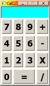
This is a Grid that contains various Button controls.
We would like to use as few handlers as we can. For the "=" button, we can attach a specific handler and prevent further bubbling:
void OnCalculate(object sender, RoutedEventArgs e) {
   // do operation
   e.Handled = true;

}
What about the digit buttons? Again, we could add a click handler to each one, but that would be wasteful. A better approach would be to leverage the Click event's bubbling strategy and set a single handler on the container Grid.
Typing "Click=" on the Grid tag seems to fail. Intellisense won't help and in fact this won't compile. It may be obvious – a Grid has no Click event. Click is specific to buttons. Does this mean we can't set a Click handler on the Grid? Fortunately, we can.
WPF provides the notion of attached events. Such events can be handled by any element, even if that element's type does not define any such event. This is achieved through attached event syntax (similar to attached properties), such as the following code snippet:
<Grid ButtonBase.Click="OnKeyPressed">The Click event is defined on the ButtonBase class, although Button.Click works just as well, because Button inherits from ButtonBase. Now we can look at the actual source of the click with the same RoutedEventArgs.Source described previously:
int digit;
string content = ((Button)e.Source).Content.ToString();
if(int.TryParse(content, out digit)) {
   // a digit
}
You can find the complete calculator sample in the CH01.Calculator project, available with the downloadable source for this chapter.