


Data binding in Windows Phone 7 is basically connecting the UI Element with any data source. The data source may be a CLR Object, File, XML, RSS/Atom, SQL Server Database, ODATA, or any web service. The data source can reside on either on-device or external sources. Data binding is a powerful feature that makes it easy to tie UI elements to data elements in one simple property.
In this chapter, we will look into different aspects of data binding. In the first recipe we will learn how to declare Binding properties for a textbox element. Then, you will be introduced to DataContext, which is very important for connecting the data to UI elements. DataContext is also very important for separating the View from the Model, which is used in the MVVM (Model-View-ViewModel) pattern. We will learn how DataTemplates make it easy to reuse templates. DataMode helps in setting the Databinding to one way or two way updates. Notification sends the refresh notification to UI elements that data has been updated. Finally, we will learn about Converters and how they can be used to convert and format the displayed data.

In our first recipe, let's learn how to create XAML elements and about data binding to another control like textbox using the ElementName property of the binding object.
Open the Visual Studio for Phone 7 and create a Windows Phone Application. Name the application
Recipe1and click on OK.
A shell application with default files is added as shown in the following screenshot. Notice that there are several files added to the project by default. The
App.xamlfile contains the App constructor with different App event handlers included in theApp.xaml.csfile. There are three image files;ApplicationIcon.pngis for the App Icon displayed in the Phone,Background.pngis the default background image of the app, andSplashScreenImage.jpgcan be used for flashing the screen before the app launches.MainPage.xamlis the main page to be displayed when the app is launched. This is where we add all the display elements for the application. TheMainPage.xaml.csfile is where all the code is added to manipulate the data.
After you open the project, just press F5 and run it to make sure there are no errors. It is good practice to run the app as often as you can so you can resolve any issue, otherwise you end up accumulating too many bugs.
Let's build a simple display page where we have one textbox to enter data and a text block to display it. When you enter text in the textbox you will see it is displayed in the display text block.
Let's change the application title and the page title text blocks in the
MainPage.xaml.csfile. Open the file and look forStackPanelwithNameTitlePanel.<!--TitlePanel contains the name of the application and page title--> <StackPanel x:Name="TitlePanel" Grid.Row="0" Grid.ColumnSpan ="2">> <TextBlock x:Name="ApplicationTitle" Text="Ch1 Recipes" Style="{StaticResource PhoneTextNormalStyle}"/> <TextBlock x:Name="PageTitle" Text="Element Name" Style="{StaticResource PhoneTextTitle1Style}"/> </StackPanel>
Tip
Downloading the example code
You can download the example code files for all Packt books you have purchased from your account at http://www.PacktPub.com. If you purchased this book elsewhere, you can visit http://www.PacktPub.com/support and register to have the files e-mailed directly to you.
In order to display two columns and three rows, we should change the Grid
ColumnDefinitionandRowDefinitionas illustrated in theXAMLsnippet. Locate this inside theGridnamedLayoutRoot:<Grid.RowDefinitions> <RowDefinition Height="Auto"/> <RowDefinition Height="81"/> <RowDefinition Height="526*"/> </Grid.RowDefinitions> <Grid.ColumnDefinitions> <ColumnDefinition Width="159*"></ColumnDefinition> <ColumnDefinition Width="321*"></ColumnDefinition> </Grid.ColumnDefinitions>
Add three
TextBlockelements and a text element inside theContentPanelgrid. Here we will add binding information to thetbNameDisplayContentcontrol.ElementNameis assigned toTextBoxcontrol name.Pathis assigned to theTextproperty of theTextBoxcontrol; this is where the data is fetched.<Grid x:Name="ContentPanel" Grid.Row="1" Grid.RowSpan="2" Grid.ColumnSpan="2" Margin="0,0,0,-16"> <TextBlock x:Name ="tbName" Text ="Name:" Margin="2,13,371,582" /> <TextBox x:Name ="txtNameContent" Text ="" Margin="128,0,6,567" /> <TextBlock x:Name ="tbNameDisplay" Text ="Display Name:" Height="43" VerticalAlignment="Top" Margin="2,94,0,0" HorizontalAlignment="Left" Width="133" /> <TextBlock x:Name ="tbNameDisplayContent" Text ="{Binding ElementName=txtNameContent, Path=Text}" Margin="140,100,24,505" /> </Grid>
Press F5; now enter a name in the textbox and as you type you will see the text in the display text block, as shown in the following screenshot. This is the power of Data Binding.

We used the Binding class in the XAML using the following shorthand syntax:
<object property="{Binding ElementName=name, Path=property}" …/>You can either use Path=Name or just the name in the property Path. We set the binding information to the Content property of the TextBlock control. We used ElementName as the textbox control name and then we assigned the textbox control's Text property to the Path. Basically, the data source for the binding is the Text property of the textbox.
In the last recipe, we learned how to use Binding with ElementName and Path. Similar to Path, we can use many properties like Converter, Mode, StringFormat, and so on. We will discuss the usage of these properties in the next several recipes in this chapter. For more information on Binding check this MSDN article:
In the last recipe, we discussed how the data binding is done at the element level. In this recipe, let's add some CLR Object and use the DataContext to link a Databound element and the property in the CLR Object.
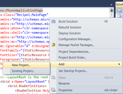
Let's create a new project for this recipe. Right-click on the last solution folder Ch1_Recipes and Add | New Project, select the Windows Phone Application Template, and name it Ch1_Recipe2.
Here, let's create a simple application to tie data elements with a CLR Object. A data class with just two properties is created and then initialized to some test data. Then, it is assigned to the data context.
Right-click on Ch1_Recipe2 and Add | Class.
Create the class, name it
DataClassand add just two string properties; one calledNameand the otherNotes:namespace Recipe2 { public class DataClass { public string Name { get; set; } public string Notes { get; set; } } }Open the
MainPage.xamlfile and change theApplicationTitleandPageTitleas shown in the following code snippet:<!--TitlePanel contains the name of the application and page title--> <StackPanel x:Name="TitlePanel" Grid.Row="0" Grid.ColumnSpan ="2">> <TextBlock x:Name="ApplicationTitle" Text="Phone7 Recipes" Style="{StaticResource PhoneTextNormalStyle}"/> <TextBlock x:Name="PageTitle" Text="Object Bindings" Style="{StaticResource PhoneTextTitle1Style}"/> </StackPanel>
In order to display two columns and three rows, we should change the Grid
ColumnDefinitionandRowDefinitionas illustrated in the followingXAMLsnippet:<!--LayoutRoot is the root grid where all page content is placed--> <Grid x:Name="LayoutRoot" Background="Transparent"> <Grid.RowDefinitions> <RowDefinition Height="Auto"/> <RowDefinition Height="50"/> <RowDefinition Height="*"/> </Grid.RowDefinitions> <Grid.ColumnDefinitions> <ColumnDefinition Width="74*"></ColumnDefinition> <ColumnDefinition Width="406*"></ColumnDefinition> </Grid.ColumnDefinitions>Let's add two
TextBlockcontrols to displayNameandNotes. Here theNameandNotesare referring to the properties of the ObjectDataClass. Add fourTextBlockelements inside theContentPanelgrid; here we will add binding information to display both elementstbNameContentandtbNoteContent. Binding objects tie a name to a control object without knowing where it comes from, as follows:<!--ContentPanel - place additional content here--> <Grid x:Name="ContentPanel" Grid.Row="1" Grid.RowSpan="2" Grid.ColumnSpan="2" Margin="0,0,0,-16"> <TextBlock x:Name ="tbName" Text ="Name:" Grid.Row="1" Grid.Column ="0"/> <TextBlock x:Name ="tbNameContent" Text ="{Binding Name}" Margin="74,0,6,567" /> <TextBlock x:Name ="tbNotes" Text ="Notes:" Height="43" VerticalAlignment="Top" Margin="0,85,412,0" /> <TextBlock x:Name ="tbNotesContent" Text ="{Binding Notes}" Margin="74,85,0,16" /> </Grid>Press F5. Now you will see the two display items without any data, as follows:

Open the
MainPage.xaml.csfile. First, create a private variable forDataClassbefore theMainPageconstructor. In theMainPageconstructor, initialize theDataClassobject with sample data using the object initializer as shown in the following code snippet. Finally,myDataobject is assigned toDataContext, which updates the text blocks with the data.namespace Recipe2 { public partial class MainPage : PhoneApplicationPage { private DataClass myData; // Constructor public MainPage() { InitializeComponent(); // Initialize data class myData = new DataClass() { Name = "Name 1", Notes = "Note 1" }; // Set the DataContext of the grid to DataClass Object LayoutRoot.DataContext = myData; } } }Press F5. Now test data, which is initialized in the code behind the file, is displayed.

Initially, we set the Binding properties of the elements to DataClass property names. Here the binding enables us to set the property names without actually knowing how they will be assigned later. Magic happens through the DataContext. The DataContext of the elements allows inheriting the information about the data, used for data binding, from their parent elements. Hence, setting the DataContext of Layoutroot to the DataClass object automatically applied to the text block elements with its properties.
For more understanding of the DataContext class, check this MSDN resource online:
http://msdn.microsoft.com/en-us/library/system.windows.frameworkelement.datacontext.aspx
We will learn how to use Recipe2 as a template so you can easily reuse the project as a starter application for future projects. You can export any of the projects you are working on as a template for future use.
Open the previous project
Recipe2.Go to File | Export Template.

Select the default project template as the option, which is
Recipe1.
Fill in the Template Name
Ch1_Recipeand click on Finish. The template is saved to your project template folder. Now, all the files are copied as a part of the project templateCh1_Recipe.
Data Templates are a very powerful feature in XAML. Data Templates can be reusable within element level or application level. In this recipe, let's use the Data Template in the listbox control.
In this recipe we will give priority to the ListBox control.
Open the
MainPage.xamlfile, locate theGridwith the nameContentPaneland add aTextBlockand aListBoxafter the last text block control. TheListBoxcontrol will containItemTemplatein whichDataTemplateis added.<!-- List box priority --> <TextBlock x:Name ="tbPriority" Text ="Priority:" Grid.Row="3" Grid.Column ="0" /> <ListBox x:Name ="lstPriority" Grid.Row="3" Grid.Column ="1"> <ListBox.ItemTemplate> <DataTemplate> <Border Name="border" BorderBrush="Red" BorderThickness="1" Padding="5" Margin="5"> <StackPanel> <TextBlock x:Name ="tbPriorityContent" Text ="{Binding}" /> </StackPanel> </Border> </DataTemplate> </ListBox.ItemTemplate> </ListBox>Let's initialize the
Listboxin the code behind theXAMLfile,MainPage.xaml.cs, using theItemsSourceproperty of theListBox.ItemSourceis a collection property. Add the following code inside theMainPageconstructor before the initialization:lstPriority.ItemsSource = new string[] { "Low", "Medium", "High" };Press F5 to see how the
ListBoxis filled withLow,Medium, andHighvalues. Also, notice how theListBoxbehavior changes with theBorderstyle.
A Data Template is the most flexible way to display data in XAML. It can include all the XAML controls like button, text blocks, textboxes, data grid, and so on. Here in the ListBox control, a Data Template is applied to all the items in the listbox along with all the formatting properties. We applied the Red border to the items in the DataTemplate mark-up.
In this recipe let's understand the DataMode property of the Binding class. By default, the Data Mode property is OneWay. It has two other modes, OneTime and TwoWay . OneTime mode pulls the data only once from the source. OneWay mode only pulls the data from the source and updates it every time the source changes. TwoWay mode not only pulls the data from the source, but also pushes the changes back. These settings are not only used for data sources, they can also be tied to another element. Let's learn how we can use a TwoWay mode for the slider control to indicate the changes in a text block.
Open the
MainPage.xamlpage and add a text block and a slider control to the existing page after theNotestext block. Here the slider control's value property is set to bind to text block controltbPriorityContent.<TextBlock x:Name ="tbPriorityContent" Text ="{Binding Priority}" Grid.Row="3" Grid.Column ="1" /> <Slider x:Name ="slPriority" Width="300" Minimum="1" Maximum="10" Grid.Row="4" SmallChange="10" Grid.ColumnSpan ="2" Orientation="Horizontal" HorizontalAlignment="Left" Value="{Binding ElementName=tbPriorityContent, Path=Text, Mode=TwoWay}" />Open the
DataClass.csfile and add another property calledPriorityto theDataClass, as follows:public class DataClass { public string Name { get; set; } public string Notes { get; set; } public int Priority { get; set; } }Open the
MainPage.xaml.csfile and add another line in the object initializer to set thePriorityto8. This is illustrated in the following code:public MainPage() { InitializeComponent(); // Initialize our data class myData = new DataClass() { Name = "Name 1", Notes = "Note 1", Priority = 8 };1 // Set the DataContext of the grid to DataClass LayoutRoot.DataContext = myData;Press F5 to run the app. As we set the priority to 8, the slider will move automatically based on the text block
tbPriorityContentcontent. Also, try to move the slider position and you will see the text block value also changing.
You noticed that when the slider changes its position the priority text block gets updated automatically. Because of the two-way mode setting the text block gets the data updated in the control's property as soon as it is changed. Similarly, when the text block is initialized with a value, the slider value is changed. This demonstrates how the controls can be refreshed with two-way mode.
On many occasions, we need to convert the data coming from the source into a form that is suitable for users to read. For example, we want to format a date as short date. In this recipe, let's add a date field to our CLR object and use the binding converter to display short date instead of long date.
For this recipe, let's copy the preceding project and name the new project as Recipe5. You can also do this by exporting the preceding project as a template and then creating the new project from this saved template.
Open the
DataClass.csfile from the solution window. Add a new propertyDateCreated:public class DataClass { public string Name { get; set; } public string Notes { get; set; } public int Priority { get; set; } public DateTime DateCreated { get; set; } }Add another class; as we are formatting the
Datevalue, let's name itDateFormatter. In order for this class to inheritIValueConverter, you should use theSystem.Windows.Datanamespace. Now add two functionsConvertandConvertBack:public class DateFormatter : IValueConverter { public object Convert(object value, Type targetType, object parameter, System.Globalization.CultureInfo culture) { string formatString = parameter as string; if (!string.IsNullOrEmpty(formatString)) { return string. Format(culture, formatString, value); } return value.ToString(); } public object ConvertBack(object value, Type targetType, object parameter, System.Globalization.CultureInfo culture) { throw new NotImplementedException(); } }Open the
MainPage.xamland let's add the namespace at the top first asPhoneApplicationPageattribute.xmlns:local="clr-namespace:Recipe5">
Now Add the
Resourcemarkup as shown in the following code snippet:<phone:PhoneApplicationPage.Resources> <local:DateFormatter x:Key ="FormatConverter" /> </phone:PhoneApplicationPage.Resources>Now, add two
TextBlockcontrols forDateCreatedcolumn inside theListBoxcontrol as shown in the following code snippet. Notice how theConverterproperty is set to a static resource with a converter parameter.<TextBlock x:Name ="tbDateCreated" Text ="DateCreated:" Grid.Row="5" Grid.Column ="0" /> <TextBlock x:Name="tbDateCreatedContent" Grid.Row="5" Grid.Column ="1" Text="{Binding DateCreated,Converter={StaticResource FormatConverter}, ConverterParameter=\{0:d\}}" />Add initialization data for the
DateCreatedfield in the code behind theXAMLfile:myData.DateCreated = DateTime.Now;
Press F5 to run the code and you should see the following results:

You can see that the DateCreated field is shorter than before. Converters are used for displaying the correct format of the data for users. In this recipe, DateFormatter uses string format to convert the date format. Similarly, various other conversions such as currency and percentage can be performed.
You can learn deeper concepts related to data binding using this online resource:
In this final recipe of this chapter, let's make use of all the knowledge we gained and apply it to one simple MyTasks App.
Right-click on the solution folder from the preceding recipe and navigate to Open | New Project. Select the Windows Phone 7 application project template. Name the project Recipe5_MyTasks.
Let's first build the UI for this app. This app will have two pages; the first page is the main.xaml file and the second one is the add task.xaml file.
Add an application bar at the bottom to provide navigation to the two pages that we are going to build in this app. The application bar is added, as shown in the following code snippet:
<!--Sample code showing usage of ApplicationBar-->
<phone:PhoneApplicationPage.ApplicationBar>
  <shell:ApplicationBar BackgroundColor="Orange" IsVisible="True" IsMenuEnabled="True">
    <shell:ApplicationBarIconButton IconUri="/Images/appbar.folder.rest.png" Click="ButtonFolder_Click" Text="Task Folder"/>
    <shell:ApplicationBarIconButton IconUri="/Images/appbar.add.rest.png" Click="ButtonAdd_Click" Text="Add Task"/>
  </shell:ApplicationBar>
</phone:PhoneApplicationPage.ApplicationBar>
Right-click on the
Recipe5_MyTasksproject folder and add a new folder calledImages.Let's copy two images
appbar.folder.rest.pngandappbar.add.rest.pngto this folder from\ProgramFiles(x86)\MicrosoftSDKs\WindowsPhone\v7.1\Icons\light. For a non-64 bit machine, you may navigate to\ProgramFiles\MicrosoftSDKs\WindowsPhone\v7.1\Icons\light.Right-click on the image files you added and select the Build Action property to Content. This will copy the images to an
XAPfile.Open the
MainPage.xaml.csfile and add two button event methods. The first button event,ButtonFolder_Click, uses theNavigationServiceclass to navigate toMainPage.xaml. The second button event,ButtonAdd_Click, navigates toAddTask.xamlfile:private void ButtonFolder_Click(object sender, EventArgs e) { NavigationService.Navigate(new Uri("/MainPage.xaml", UriKind.Relative)); } private void ButtonAdd_Click(object sender, EventArgs e) { NavigationService.Navigate(new Uri("/AddTask.xaml", UriKind.Relative)); }Open the
Main.xamlfile and add the list box with its data template:<!--ContentPanel - place additional content here--> <Grid x:Name="ContentPanel" Margin="12,0,12,-13" Grid.Row="1"> <ListBox x:Name ="lstTasks" Grid.Row="3" Grid.Column ="1"> <ListBox.ItemTemplate> <DataTemplate> <Grid> <Grid.RowDefinitions> <RowDefinition/> <RowDefinition /> <RowDefinition Height="15" /> </Grid.RowDefinitions> <Grid.ColumnDefinitions> <ColumnDefinition Width="150" /> <ColumnDefinition Width="200" /> <ColumnDefinition Width="100" /> </Grid.ColumnDefinitions> <TextBlock Grid.Row="0" Grid.Column="0" Text="{Binding Name}" /> <TextBlock Grid.Row="0" Grid.Column="1" Text="{Binding DateDue}" /> <TextBlock Grid.Row="0" Grid.Column="2" Text="{Binding Priority}" Forground = "{StaticResource PhoneAccentBrush}" /> <TextBlock Grid.Row="1" Grid.ColumnSpan="3" Text="{Binding Notes}" /> <TextBlock Grid.Row="2" Grid.ColumnSpan="3" /> </Grid> </DataTemplate> </ListBox.ItemTemplate> </ListBox> </Grid>
Open the
AddTask.xamlfile and add four text blocks in theContentPanelgrid:<!--ContentPanel - place additional content here--> <TextBlock x:Name="tbName" HorizontalAlignment="Left" TextWrapping="Wrap" Text="Name" VerticalAlignment="Top" /> <TextBlock x:Name="tbDescription" HorizontalAlignment="Left" Margin="8,70,0,0" TextWrapping="Wrap" Text="Description" VerticalAlignment="Top" /> <TextBlock x:Name="tbPriority" HorizontalAlignment="Left" Margin="8,150,0,0" TextWrapping="Wrap" Text="Priority" VerticalAlignment="Top" /> <TextBlock x:Name="tbDueDate" HorizontalAlignment="Left" Margin="8,277,0,0" TextWrapping="Wrap" Text="Due Date" VerticalAlignment="Top"/>
Now add corresponding textbox controls for each one, as follows:
<TextBox x:Name="txtName" Margin="119,0,70,0" TextWrapping="Wrap" VerticalAlignment="Top"/>
<TextBox x:Name="txtDescription" Margin="119,62,70,0" TextWrapping="Wrap" VerticalAlignment="Top"/>
<TextBox x:Name="txtDueDate" Margin="119,262,74,298" TextWrapping="Wrap"/>
<Button x:Name="btnAdd" Content="Add"  Margin="131,0,205,225" VerticalAlignment="Bottom" RenderTransformOrigin="0.969,0.514" Click="btnAdd_Click" />
<Button x:Name="btnCancel" Content="Cancel" HorizontalAlignment="Right"  Margin="0,0,74,225" VerticalAlignment="Bottom" Click="btnCancel_Click" />
<ListBox x:Name="lsyPriority" Margin="131,154,84,0" VerticalAlignment="Top">
  <ListBoxItem Content="Low"/>
  <ListBoxItem Content="Medium"/>
  <ListBoxItem Content="High"/>
</ListBox>
</Grid>

Right-click on the project folder and add a new class file. Name it
DataClass.cs. Now, add the followingDataClasswith all its properties. If you compare this class with the preceding recipes, for simplicity we changedintPrioritytostringPriorityand added one moreDateTimeproperty calledDateDue.public class DataClass { public string Name { get; set; } public string Notes { get; set; } public string Priority { get; set; } public DateTime DateDue { get; set; } public DateTime DateCreated { get; set; } }Open the
MainPage.xaml.csfile and add theusingstatement for the referenceSystem.Collections.ObjectModel.using System.Collections.ObjectModel;
ObeservableCollectionis the collection class that we will use for building our task collection. Observable Collection provides the notifications whenever items get added or removed. Add the following line of code before theMainPageconstructor method in theMainPage.xaml.csfile:private ObservableCollection<DataClass> myTasks;
Let's add a method to initialize
myTasks:private void InitalizeTasks() { myTasks = new ObservableCollection<DataClass>(); DataClass myTask1 = new DataClass() { Name = "Task Name 1", Notes = "Task Note 1", Priority = "Low", DateDue = new DateTime(2011, 9, 1), DateCreated = DateTime.Now }; myTasks.Add(myTask1); DataClass myTask2 = new DataClass() { Name = "Task Name 2", Notes = "Task Note 2", Priority = "Medium", DateDue = new DateTime(2011, 10, 1), DateCreated = DateTime.Now }; myTasks.Add(myTask2); DataClass myTask3 = new DataClass() { Name = "Task Name 3", Notes = "Task Note 3", Priority = "High", DateDue = new DateTime(2011, 11, 1), DateCreated = DateTime.Now }; myTasks.Add(myTask3); }Initialize this in the
MainPageconstructor and assign themyTaskscollection to the listboxitemsourceproperty:public MainPage() { InitializeComponent(); InitalizeTasks(); lstTasks.ItemsSource = myTasks; }Press F5 and check out the results.
In this recipe we created a display of the list of tasks in the ListBox and a form to add a new task to the list.
We initialized the tasks using the ObeservableCollection class and then added static data to this collection using the Add method.
Once the collection was built, we bound this list to ListBox for display. We added a navigation bar using the built-in ApplicationBar and then added two icons, one for adding a task to the list and another for navigating back to the main page.
In the previous recipe, we mainly covered how to create the data binding for the main page list and then navigate to a new form to add the task. We can also add another important feature to select a list item and then update the existing data.