


 Download code from GitHub
In this chapter, we will cover the following recipes:
Starting with Tableau Desktop
Introduction to My Tableau Repository and connecting to the sample data source
Building our first visualization and understanding the Tableau workspace
Saving a Tableau workbook
Earlier, in the preface, we saw the various products that are available under Tableau's product suite. The focus of this book will be on Tableau Desktop, the UI authoring tool of Tableau that will help us analyze and visualize our data. So, let's get started by familiarizing ourselves with Tableau Desktop.
To get started in terms of creating our visualizations, we will be using Tableau Desktop Professional Edition Version 10.1. This is the latest version of Tableau products and offers compatibility with both Windows OS as well as Mac OS. However, for the sake of a wider audience, we will be using the Windows-OS-compatible version in this book. That said, those using version 10.1 on a Mac OS should not see much of a difference since the User Interface and functionality is essentially the same.
Before we get started, we need to make sure that Tableau Desktop Professional Edition Version 10.1 is downloaded and installed on our machines.
Tip
Note that if we use Tableau Public, then some of the protocols for saving our work will change since Tableau Public doesn't allow us to save our work locally. Also, if we use Tableau Desktop Personal Edition, then apart from certain limitations, such as being able to connect to databases, the rest of the functionality will mostly remain the same.
If you are an existing licensed user of Tableau Desktop, then make sure that you are using the latest version. If the version is anything below 10.1, then it is recommended that you upgrade it to the latest version, as there are significant changes in terms of the User Interface as well as features. Nonetheless, even if we decide to continue with the earlier versions, the majority of the fundamental concepts and features outlined in this book would remain the same, although their implementation may differ.
If you do not have a license, the 14-day full-feature trial of Tableau Desktop Professional Version 10.1 can be installed and downloaded from Tableau's website (http://www.tableau.com/).
Tableau, being a plug and play software, simply needs to be downloaded and installed just like any .exe or .dmg installable.
Download and install Tableau Desktop Professional 10.1.
Upon installation, you can activate the trial version by registering your details; alternatively, if you have a license key, then you can activate the license by entering the same. We are now ready to get started.
When we click on the Tableau 10.1 icon on the desktop, we will see the starting or landing page of Tableau. Check out the following screenshot:

The Start Page of Tableau is divided into three parts, namely Connect, Open, and Discover; refer to the numbers 1, 2, and 3 respectively in the preceding screenshot.
The top-left corner, which says Connect (number 1), consists of three sections called To a File, To a Server, and Saved Data Sources. In each of these sections, we will see the list of data sources that Tableau can connect to.
The To a File section consists of flat file data sources such as Excel files, Access files, Text files, JSON files, and statistical files, including SAS, SPSS, and R. Clicking on the More… option under this section allows us to even connect to Tableau's data extract files, which we will understand in detail in the later chapters.
The To a Server section consists of data sources such as Microsoft SQL Server, MySQL, Oracle, and so on. To see a more detailed list of data sources that Tableau can connect to, we need to click on the More… option and expand the section by clicking on the arrow. Refer to the following image that illustrates this:
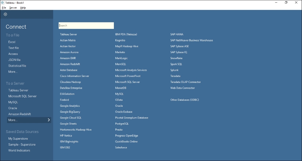
Just below the To a Server section, we will see the Saved Data Sources section. This section essentially points to those data sources that have been previously worked on and then saved for later purposes. Currently, we will not use this option and we will start by connecting to the raw data and not use any of the existing saved data sources.
Adjacent to the Connect header is an empty section that is covered under the header Open (number 2). This is the section where we will see the thumbnails of all our recently opened workbooks. This section is blank to begin with; however, as we create and save new workbooks, this section will display the thumbnails of the nine most recently opened workbooks.
This section also gives us access to some sample workbooks that are provided by Tableau for our reference. We can open these workbooks in Tableau Desktop to see how certain functionalities are used or how a particular visualization is created in Tableau.
Note
A workbook in Tableau is similar to that of Excel. Just as an Excel workbook consists of multiple sheets, the workbook in Tableau contains multiple worksheets, and/or dashboards, and/or stories. The worksheet in Tableau consists of one view/visualization/report, whereas a dashboard is a combination of multiple worksheets which when viewed will provide the viewer with a holistic view.
The next section is the Discover section (number 3). This section basically provides links to resources that are available on the Tableau website. Apart from the training videos, this section also shows the blogs, forums, latest news about Tableau, as well as the views that are selected as the Viz of the week on Tableau Public.
Tableau is a very versatile tool and is being used across various industries, businesses, and organizations. These include government and non-profit organizations, the BFSI sector, consulting, construction, education, healthcare, manufacturing, retail, FMCG, software and technology, telecommunications, and many more. The good thing about Tableau is that it is industry- and business-vertical-agnostic, and hence, as long as we have data, we can analyze and visualize it.
Tableau can connect to a wide variety of data sources, and many of the data sources are implemented as native connections in Tableau. This ensures that the connections are as robust as possible.
Note
To view the comprehensive list of data sources that Tableau connects to, we can visit the technical specification page on the Tableau website by clicking on http://www.tableau.com/products/techspecs.
Tableau provides some sample datasets with the Desktop edition. In this book, we will frequently use the sample datasets that have been provided by Tableau. We can find these datasets in the Datasources folder within the My Tableau Repository folder, which gets created in the Documents folder when Tableau Desktop is installed on the machine. We can look for these data sources in the repository or quickly download them from https://1drv.ms/f/s!Av5QCoyLTBpnhj06IKTNX0S9hK48. Once you do this, you save them in a new folder called Tableau Cookbook data that you'll find by navigating to Documents\My Tableau Repository\Datasources.
There are three files that have been uploaded, and these are the ones that we will primarily use throughout the book. They are as follows:
Microsoft Excel data called
Sample - Superstore.xlsMicrosoft Access data called
Sample - Coffee Chain.mdbMicrosoft Excel data called
Sample - CoffeeChain (Use instead of MS Access).xlsx
In the following section, we will see how to connect to the sample data source. We will be connecting to the Excel data called Sample - Superstore.xls.
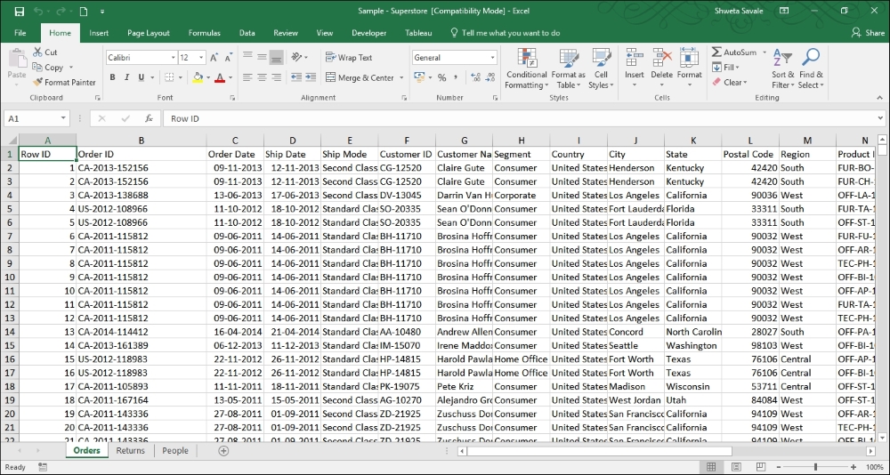
This Excel file contains transactional data for a retail store. There are three worksheets in this Excel workbook. The first sheet, called the Orders sheet, contains the transaction details, The Returns sheet contains the status of returned orders. And the People sheet contains the region names and the names of the managers associated with those regions. Refer to the following image to get a glimpse of how the Excel data is structured:
Now that we have looked at the Excel data, let's see how to connect to this data in the following recipe. To begin with, we will work on the Orders sheet of the Sample - Superstore.xls data. This worksheet contains the order details in terms of the products purchased, the name of the customer, sales, profits, discounts offered, day of purchase, and the order shipment date, among many other transactional details.
Open Tableau Desktop by double-clicking on the Tableau 10.1 icon on the desktop. You can also right-click on the icon and select Open. When you do this, you will see the Start page of Tableau, as shown in following image:

Select the Excel option from under the Connect header on the left-hand side of the screen.
Once you do this, browse the Excel file called
Sample - Superstore.xls, which is saved inTableau Cookbook dataunderDocuments|My Tableau Repository|Datasources.Once we are able to establish a connection to the referred Excel file, we will get a view as shown in the following image:

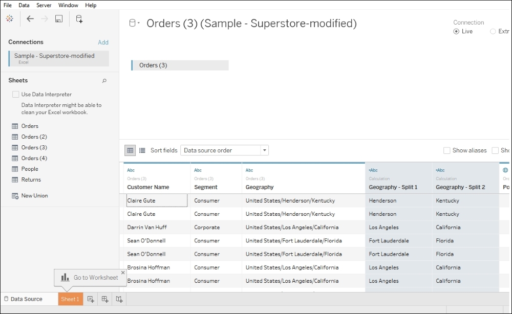
The number 1 in the preceding image refers to the data that we have connected to, and 2 refers to the list of worksheets/tables/views in our data.
Let's double-click on the Orders sheet or drag and drop the Orders sheet from the left-hand side section of the screen into a blank space that says Drag sheets here. Refer to the number 3 in the preceding image.
Once we select the Orders sheet, we will get to see the preview of our data, highlighted using the number 1 in the following image. We will see the column headers, their data type (
#,Abc, and so on), and the individual rows of data:
While connecting to a data source, we can also read data from multiple tables/sheets from that data source. However, this is something that we will explore a little later. Moving on, we will need to specify what type of connection we wish to maintain with the data source. Do we wish to connect to our data directly and maintain a Live connectivity with it or do we wish to import the data into Tableau's data engine by creating an Extract? Refer to the number 2 in the preceding image. We will understand these options in detail in the next section. However, to begin with, we will select the Live option.
Next, to get to our Tableau workspace, where we can start building our visualizations, click on the Go to Worksheet option and then Sheet 1, which we will find at the bottom left-hand side corner. Refer to the number 3 in the preceding image.
This is how we can connect to the data in Tableau. If we have a database to connect to, then we can select the relevant data source from the list and fill in the necessary information in terms of the server name, username, password, and so on. Refer to the following image to see what options we get when we connect to the Microsoft SQL Server:

Before we connect to any data, we need to make sure that our data is clean and in the right format. The Excel file that we connected to was stored in a tabular format where the first row of the sheet contained all the column headers and every other row is basically a single transaction in the data. This is the ideal data structure for making the best use of Tableau. Typically, when we connect to databases, we get a columnar/tabular type of data. However, flat files, such as Excel, can have data even in cross-tab formats. Although Tableau can read cross-tab data, we may end up facing some limitations in terms of creating certain chart types, thereby aggregating and slicing and dicing our data in Tableau.
Having said that, there may be situations where we have to deal with such cross-tab or preformatted Excel files. These files will essentially need cleaning up before being pulled into Tableau. Refer to http://kb.tableausoftware.com/articles/knowledgebase/preparing-excel-files-analysis to understand more about how we can clean up these files and make them Tableau-ready. Refer to the following article to quickly understand how we can quickly pivot the data in Excel. http://kb.tableau.com/articles/knowledgebase/addin-reshaping-data-excel.
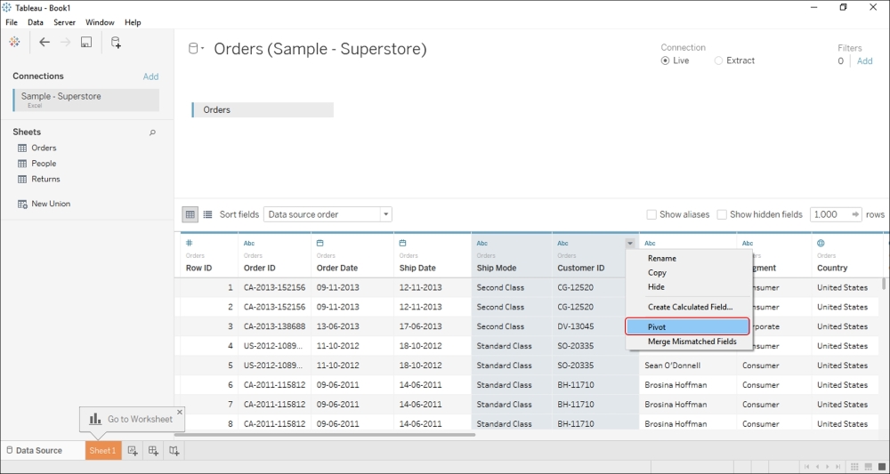
If it is a cross-tab file, then we will have to pivot it into normalized columns either at the data level or at the Tableau level on the fly. We can do so by selecting multiple columns that we wish to pivot and then selecting the Pivot option from the drop-down menu that appears when we hover over any of the columns. Refer to the following image:
Further, if the format of the data in our Excel file is not suitable for analysis in Tableau, then we can turn on the Data Interpreter option, which becomes available when Tableau detects any unique formatting or any extra information in our Excel file. For example, the Excel data may include some empty rows and columns or extra headers and footers. Refer to the following image:
Data Interpreter can remove that extra bit of information to help prepare our Tableau data source for analysis. Refer to the following image:
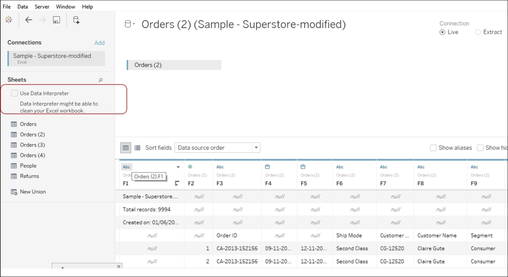
When we enable Data Interpreter, the preceding view will change to what is shown in the following image:
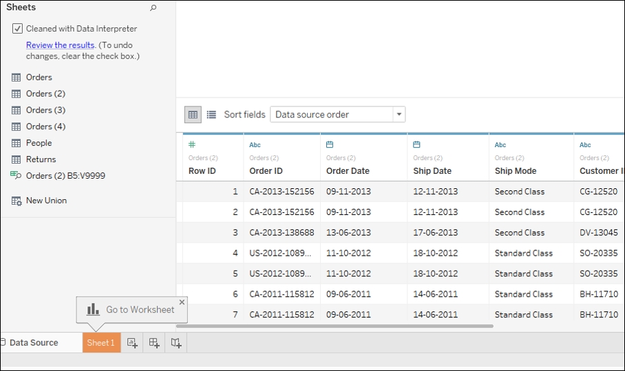
This is how Data Interpreter works in Tableau.
Now, many a times, there may also be situations where our data fields are compounded or clubbed in a single column. Refer to the following image:
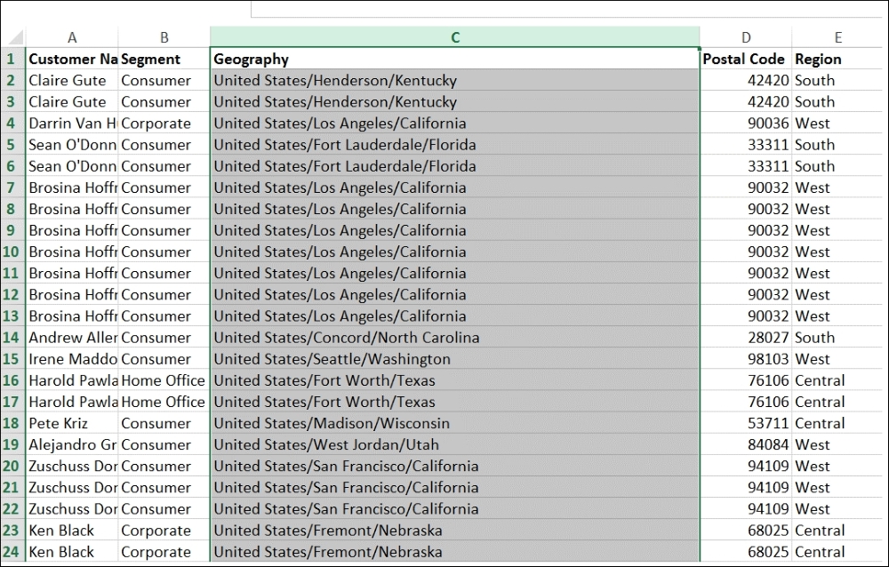
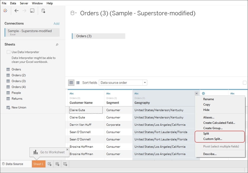
In the preceding image, the highlighted column is basically a concatenated field that has the Country, City, and State fields. For our analysis, we may want to break these and analyze each geographic level separately. To do so, we simply need to use the Split or Custom Split option in Tableau. Refer to the following image:
Once we do this, our view would be as shown in the following image:
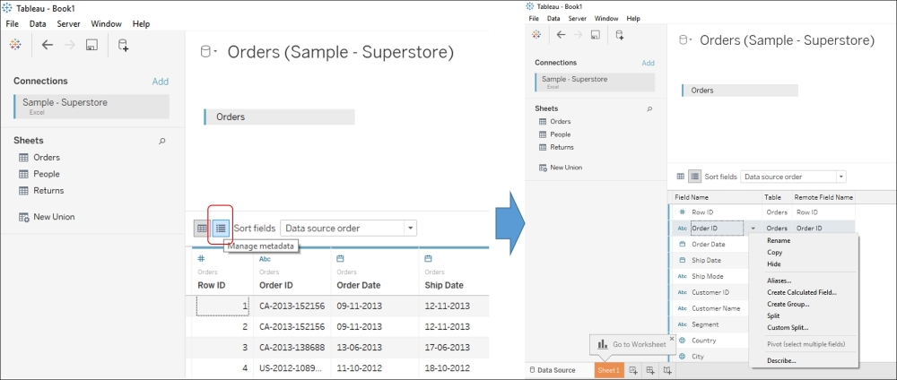
Further, when preparing some data for analysis, at times a list of fields may be easy to consume as against the current preview of our data. The Metadata grid in Tableau allows us to do the same along with many other quick functions such as renaming fields, hiding columns, changing data types, changing aliases, creating calculations, splitting fields, merging fields, and pivoting the data. Refer to the following image:
After having established the initial connectivity by pointing to the right data source, we need to specify how we wish to maintain that connectivity. We can choose between the Live option and the Extract option.
The Live option helps us connect to our data directly and maintains a live connection with the data source. Using this option allows Tableau to leverage the capabilities of our data source, and in this case, the speed of our data source will determine the performance of our analysis.
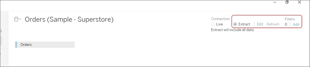
The Extract option, on the other hand, helps us import the entire data source into Tableau's fast data engine as an extract. This option basically creates a .tde file, which stands for Tableau Data Extract. In case you wish to extract only a subset of your data, then you can select the Edit option, as highlighted in following image. The Add link in the right-hand side corner helps us add filters while fetching the data into Tableau:
One point to remember about Extract is that it is a snapshot of our data stored in a Tableau proprietary format, and as opposed to a Live connection, the changes in the original data won't be reflected in the dashboard unless and until the Extract is updated.
Tip
Note that we will have to decide between Live and Extract on a case-to-case basis. Refer to http://www.tableausoftware.com/learn/whitepapers/memory-or-live-data for more clarity.
Tableau is a very user-friendly tool that helps us visualize our data with a simple drag and drop technique. In the previous recipe, we saw how to connect to the data, and in this section, we will create our very first visualization and get acquainted with the Tableau workspace.
We will continue from where we left in the previous recipe where we are still connected live to the Orders sheets of Sample - Superstore.xls. Let's quickly build our first view and then understand the workspace of Tableau.
If you haven't already connected to the data, then make sure that you are connected live to the
Orderssheets ofSample - Superstore.xlsby following the steps mentioned in the previous recipe.Click on the Go to Worksheet option and then the Sheet 1 tab. Refer to the following image:

Once we do this, we will get a view as shown in the following image:

Then, let us drag Region field from the left-hand side pane and drop it into the Rows shelf. Refer to the following image:

Once you do this, drag Sales and drop it into the Columns shelf, and our view will be updated as shown in the following image:

What we see in the preceding image is a bar chart that shows region-wise Sales.
After having established the connection to the data and having read the data in Tableau by clicking on the Go to Worksheet option and then the Sheet 1 tab, we get the view where we will create our visualizations. Refer to the following image:

The preceding image gives us a quick glimpse into the Tableau workspace. Let's understand this workspace in more detail:
Workbook name: Refer to the number 1 in the preceding image. This is the name of the workbook. By default, it is
Tableau – Book 1or so. However, we can change the name once we save the workbook.Go to the start page: Refer to the number 2 in the preceding image. This helps us navigate back to the start page of Tableau.
Toolbar: Refer to the number 3 in the preceding image. This is Tableau's toolbar that consists of various commands that help us enable/disable various features and functionalities.
Side bar: The number 4 in the preceding image refers to the sidebar that provides two panes: the Data pane and the Analytics pane.
The Data pane, as the name suggests, shows the data to begin with, which is populated from the data source that we have connected to. The top section of the Data pane displays the data source that we have connected to. In the case of multiple data sources, we will see a list of data sources.
Further, just below the data source section are the fields available in that data source. Refer to the following image:

The Data pane is primarily divided into two sections: Dimensions and Measures.
Dimensions are all the descriptive fields in our data. These are fields that hold categorical/discrete qualitative data. In short, any field that contains text or date values will be identified as Dimensions, for example, customer name, purchase date, customer state, and so on.
On the other hand, Measures are all the fields that contain numeric values. These are fields that hold quantitative data, for example, sales, profit, budget, and so on. Typically, Measures are the fields that will be aggregated while analyzing. For example, we may want to see the sum of sales across regions, the average sales for a particular category, and so on.
Basically, Dimensions and Measures are Tableau's way of classifying our data fields. At a little later point in time, you will understand how Tableau is capable of doing this classification, and in case we wish to change it, then how to go about it.
Further, the Data pane may additionally accommodate sections for Sets and Parameters, functionalities that we will explore later.
The Analytics pane, on the other hand, provides quick and easy access to features such as reference lines, box plots, trend lines, forecasts, and so on. We will explore these options at a later stage. To begin with, the Analytics pane may be disabled/grayed out. However, once we start creating our visualizations, then depending on the visualization, some of the options from this pane will be enabled/disabled for us. Refer to the following image:

Go to the data source page: Refer to the number 5. This helps us navigate back to the data source page of Tableau.
Status bar: Refer to the number 6. The status bar shows us the number of rows and marks that we are dealing with. It also displays occasional warning icons.
Worksheet tabs: Refer to the number 7. The worksheet tab helps us view our worksheets, dashboards, or story. These can either be shown as tabs or filmstrips.
Worksheet view: Refer to the number 8. The worksheet view is the place where we build a view/visualization.
Cards and shelves: Refer to the number 9. These are containers for shelves, such as the Column shelf, the Row shelf, the Filter shelf, and the Page shelf. This is where we define what the columns, rows, and filters of our worksheet are. The Marks card consists of a drop-down list that helps us specify the mark type (for example, bar, line, pie, circles, and many more) and also contains shelves for Color, Size, Text, Detail, and Tooltip. This is where we can define the appearance of our worksheet in terms of the visualization type, color scheme, labels, and many more. Depending on what kind of chart we create, we would see the Label shelf, the Shape shelf, the Path shelf, and the Angle shelf as well. However, the availability of these shelves is dependent on the visualization that we create. Refer to the following image to see the options from the Marks dropdown:

We shall explore these various shelves in more detail as we progress with our understanding of Tableau.
In the earlier section, we read about Dimensions and Measures. As a quick recap, Dimensions are basically fields that contain categorical/descriptive/qualitative data, such as text and dates, whereas, Measures are fields that contain numeric/quantitative data that can be aggregated.
Dimensions and Measures are the fundamental building blocks of our analysis, and it is very important that they are identified correctly. As mentioned earlier, Tableau is capable of classifying our data fields as either a Dimension or a Measure, and it does so based on the data type of the fields.
So, what data types are supported by Tableau and how does Tableau identify them? When we connect to a database, the data types are already defined in the database and that is what Tableau would read. However, when we connect to typical flat file formats, such as Excel, Access, or CSVs, Tableau will read the data types of the first 10,000 rows of an Excel data source or the first 1,024 rows of a text file data source. Once it does this, it will accordingly decide the data type of that field. So, in an Excel file, if most of the first 10,000 rows are numeric values, the entire column is mapped as Integer.
Tip
Before version 8.2 came out, Tableau used Microsoft Jet Engine to connect to Excel, Access, and CSVs. We call this a legacy connection. However, with the latest versions, there are new connectors that are being used for connectivity to Excel and CSVs. With the legacy connection, the datatype mapping was done by reading the first 16 rows of the data for Excel, Access, and CSVs.
Each field under the Dimensions and Measures section will have a prefixed icon before it. These are the data types supported by Tableau and are identified in the Data pane by one of the following icons:

Is it possible to change the datatype of the fields in Tableau? Yes! Ideally, it is recommended that we handle all the data-related changes at the data source level. However, if we feel that Tableau has incorrectly identified the data type of a certain field, then we can right-click on the field in the Data pane, select Change Data Type, and then select the appropriate data type. Refer to the following image:

Once Tableau identifies the data type, it simply classifies all String and Date / Date & Time data types as Dimensions and all Integer data types as Measures.
Why is Row ID a Dimension even though its datatype is Integer? Even though Row ID is a numeric field in this case, taking a sum or average of Row ID won't be useful. It is actually a descriptive field that gives us information about the transaction. Since the header/field name contains the word ID, Tableau assumes that it is an identifier and hence places it in the Dimensions shelf.
Is it possible to convert a Dimension to a Measure and vice versa? Yes! It is easily possible to convert Dimension to Measure and vice versa. To do so, we can simply right-click on the Dimension field and select the option of Convert to Measure. If we right-click on the Measure field, then we get an option of Convert to Dimension. Refer to the following image:

We can also drag Dimension fields and then drop them into the Measures pane and vice versa to convert them from Dimensions to Measures. The same method can be used to convert Measures to Dimensions as well.
When we connect to the data, apart from reading the data fields and classifying them as Dimensions or Measures, Tableau also autogenerates certain new fields in both the Dimensions and Measures pane. They are as follows:
Measure Names: This contains the names of all our measures in a single dimension and is shown at the bottom of the Dimensions pane.
Measure Values: This contains the values of all our measures into a single field and is shown at the bottom of the Measures pane.
Number of Records: This shows the number of records that we are dealing with after we have connected to our data.
Latitude and Longitude: Tableau has the ability to create geographic maps and plot any point on a Map; we would essentially require the latitudes and longitudes of these geographic points. Tableau understands certain geographic roles and will automatically generate these two measures if it identifies any field as a geographic field. We will revisit this in more detail when we discuss Maps in the later chapters.
Now that we have connected to data, built our first visualization, and have learned the fundamentals of Tableau, we will go ahead and save our workbook so that we can continue working on it without losing what we have already done. To do so, let's follow the following recipe.
In the coming chapters, we will learn how to create various charts in Tableau. However, before we go there, let's understand how we can save the file that we are currently working on:
After following the steps mentioned in the previous recipe, we will first right-click on the Sheet tab, which currently says Sheet 1, and select the Rename Sheet option as shown in the following image:

We will rename the sheet to
My first Tableau view.Then, we will click on the File menu in the toolbar and select the Save option as shown in the following image:

We will now have to decide where the workbook needs to be saved. Let's save it in
Documents|My Tableau Repository|Workbooks.We will name our workbook
My first Tableau Workbook.We will select the
.twbextension that stands for Tableau Workbook, and once we have done this, our workbook name will be changed toMy first Tableau Workbook. Refer to the following image: