Download code from GitHub
Getting Started with Tableau Software
In this chapter, we will cover the following recipes:
- Connecting to the data
- Building a bar chart using Show Me
- Building a text table
- Adding filters
- Adding color
- Building a tree map
- Building a map
- Customizing tooltips
- Building a dual axis map
Technical requirements
To follow the recipes in this chapter, you will need to have Tableau 2019.x installed. You will also need to save a local copy of the Baby_names.csv dataset to your device, as we will be using it in the recipes. You can download this dataset from the GitHub repository: (https://github.com/PacktPublishing/Tableau-2018-Dot-1-Cookbook/blob/master/Baby_names.csv).
Introduction to Tableau
Tableau is one of the fastest-evolving business intelligence (BI) and data visualization tools at the moment. The user-friendly interface, combined with powerful capabilities, makes it one of the most widely used and popular BI tools around the globe. Tableau offers many functionalities, and getting started with the basic ones is surprisingly easy. This chapter will get you familiar with Tableau basics and, by the end of it, you will have learned how to connect to a data source, and how to make simple visualizations.
To complete the recipes in this chapter, we will be using data on baby names in the US, which have been collected by the US Federal Social Security Administration (SSA). The Baby_names.csv dataset contains the most popular baby names (that have 100 or more registered appearances) in the US, from 2010 through 2017. The dataset contains information about the state, gender of the name, name itself, year, and number of babies with said name.
Connecting to the data
In this recipe, we will go through the basics of connecting to a data source. The first step you must take when you open Tableau, before you create any visualizations, is to connect to a data source. You will then use that data source to create your views and dashboards.
Getting ready
In this recipe, we will be using the Baby_names.csv dataset. Make sure that you have a local copy of the dataset saved to your device.
How to do it...
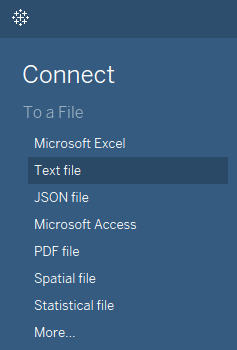
- Open Tableau.
- From the Connect pane on the left-hand side, choose the Text file option:
- A new window will open. Navigate to your local copy of the Baby_names.csv dataset, select it, and click Open.
- Tableau has now opened the Data Source page for you, where the file you loaded has been selected as the data source, and where you can also preview it.
- To begin making your first visualization, just click on the Sheet 1 tab in the bottom of the workbook.
You are all set!
How it works...
Tableau reads the file you connected to and recognizes fields and their respective data types. There are the following data types in Tableau:
- Number (decimal)
- Number (whole)
- Date and time
- Date
- String
- Boolean
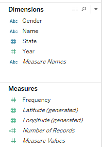
After you have connected to the data source and you click on Sheet 1, you will see the Data pane on the left-hand side of the workspace, with all the fields from the data source listed, and their respective types marked by small symbols to the left of their names, as shown in the following screenshot:
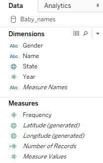
The globe symbols in front of State, Longitude, and Latitude denotes the geographical roles of these fields, which are important when building maps. On the other hand, the Abc symbol signifies strings, while the # symbol denotes numerical values.
There's more...
Tableau allows users to connect to a wide range of data. You can connect to different types of files that are stored locally on your device, or data stored on the cloud or in relational or multidimensional databases. You can connect to the list of data that is available on the Start page, which opens when you launch Tableau Desktop, under Connect.
See also
- For more on connecting to data, see the Tableau help resource on the topic at https://onlinehelp.tableau.com/current/pro/desktop/en-us/basicconnectoverview.html
Building a bar chart using Show Me
In this recipe, we will build a bar chart using Show Me. The Show Me option is a handy way to get started with building Tableau visualizations. To make a visualization, you don't need to know exactly how to do it, you just need to know what fields from your data source you would like to include in it. Tableau will suggest the appropriate visualizations.
Getting ready
To complete this recipe, you need to connect to the Baby_names.csv dataset and open a new blank worksheet.
How to do it...
We will now create the bar chart using the Show Me option, while referring to the given steps.
Creating a chart using Show Me
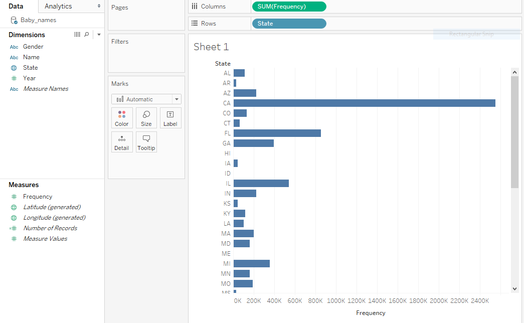
- Hold the Ctrl key on your keyboard, then on State under Dimensions, and then choose Frequency under Measures.
- Release the Ctrl key and click on Show Me in the top-right corner of the workbook:
- A menu will open, offering various visualizations that are suitable for your data. Choose horizontal bars. You have just created your first visualization! Now, let's make it tidier and easier to read:
Sorting the chart
- Hover over the State pill in the Rows shelf so that a white arrows appears on it. Click on the arrow and select Sort...:
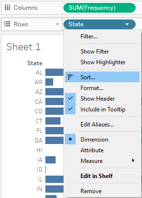
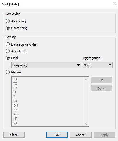
- Under Sort order, choose Descending.
- Under Sort by, select Field:
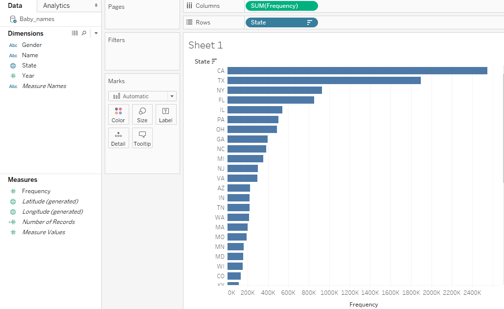
- Click on OK. The states are now sorted in descending order, by the value of Frequency, as follows:
How it works...
Tableau classifies the fields from a data source you connect to into two main types:
- Dimensions: This section includes qualitative and categorical values, such as dates, strings, or geographical data
- Measures: This section includes quantitative and numerical values
Measures and Dimensions can be both continuous, which means that they add axes to a view, and discrete, meaning they add field headers to a view. Continuous fields are marked with a green color, and discrete are marked with blue. However, you will notice that Measures are mostly continuous, while Dimensions are discrete:
When you select some measures and dimensions and click on Show Me, Tableau presents you with a range of basic visualizations that require the particular combination of measures and dimensions you selected.
There's more...
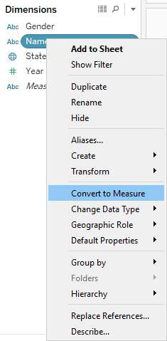
When you connect to a data source, Tableau automatically assigns type (measure or dimension) to each field in your data source. However, you can always change them manually by right-clicking on the field name under Measures/Dimensions and selecting Convert to Dimension / Convert to Measure:
See also
- For more details on data types, check out the Tableau help resource on this topic at https://onlinehelp.tableau.com/current/pro/desktop/en-us/datafields_typesandroles.html
Building a text table
In this recipe, we will build a simple table that includes two dimension, and one measure. Dimensions will define the column and row headers, while the measure will be aggregated.
Getting ready
Connect to the Baby_names.csv dataset and open a new worksheet.
How to do it...
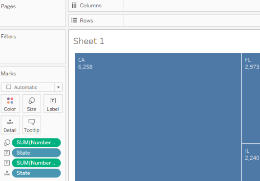
- Drag and drop State from Dimensions into the Rows shelf.
- Drag and drop Gender from Dimensions into the Columns shelf.
- Drag and drop Frequency from Measures onto Text in the Marks card:
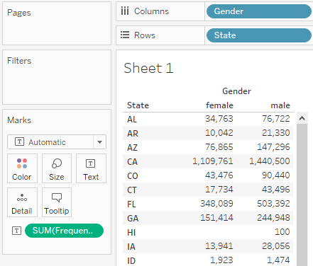
How it works...
We have placed State and Gender, two discrete dimensions, into the rows and columns of our table. However, this still leaves the table itself empty. We can only see the Abc placeholder text. When we place Frequency, a continuous measure, onto Text, Tableau fills our table with that measure, and automatically aggregates it along the dimensions we placed in rows and columns.
There's more...
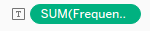
When you place a continuous measure into a view, Tableau needs to aggregate it. It will use SUM as the default aggregation function. You can also see that if you look at the Frequency pill in Text, in the Marks card, it says SUM(Frequency):
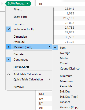
However, you can change the aggregation function. Hover over the SUM(Frequency) pill in the Marks card, so that a white arrow appears on it, and click on the arrow. If you hover over Measure (Sum) in the drop-down menu, it opens another drop-down menu. From it, you can choose from a range of aggregation functions, as shown in the following screenshot:
See also
- For more on text tables, see the Tableau Help page on this topic at https://onlinehelp.tableau.com/current/pro/desktop/en-us/buildexamples_text.html
Adding filters
This chapter will get you familiar with basic filtering functionality in Tableau. We will create a chart that shows name frequency across years, but we will then filter one name to see how its popularity has been changing over the years, and also narrow our view down to one state.
Getting ready
Connect to the Baby_names.csv dataset, and open a new worksheet.
How to do it...
- Drag and drop Year from Dimensions into the Columns shelf.
- Drag and drop Frequency from Measures into the Rows shelf.
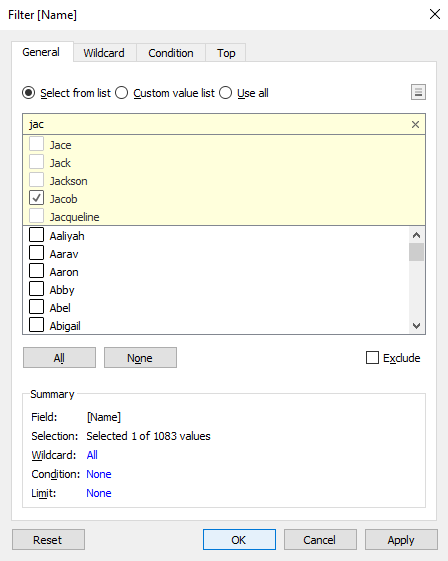
- Drag and drop Name into the Filters shelf.
- In the search bar at the top of the list, start typing jac.
- Select Jacob, and click OK:
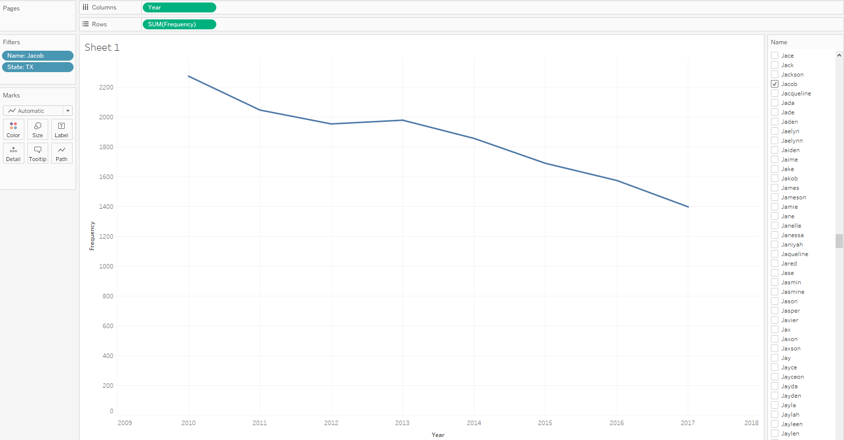
- We can see that the name Jacob has been gradually decreasing in popularity since 2010. Let's see how it has fared in Texas specifically. Drag and drop State from Dimensions into the Filters card.
- In the search box in the Filter [State] window, type tx.
- Select TX, click OK, and you will see the following results:
How it works...
Filters exclude rows from your dataset. When you select the name Jacob using a filter, only rows that contain the Jacob value from your dataset are analyzed, while all the other rows are excluded. You can also filter multiple values and select two, three, or 50 names to show in your view.
There's more...
One of the main advantages of Tableau filters is their interactivity. Let's execute the following steps to see how the Filter option works:
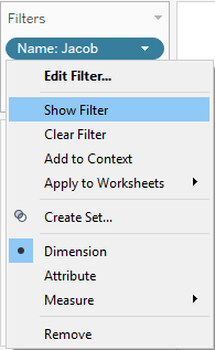
- If you hover over the Name: Jacob pill in the Filters shelf, a small white arrow will appear on it.
- Click on the arrow, and in the drop-down menu, click on Show Filter.
- A list of all the names will appear in the top-right corner of the worksheet. Only Jacob is selected, because that's how we set our filter. However, you can select and deselect any name(s) to change your visualization:
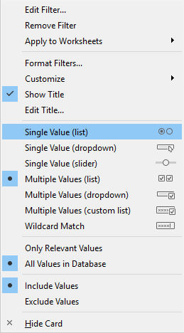
- If you hover over the filter control and click on the small black arrow that appears in the top-right corner, you can change the mode of the filter. You can choose whether you would like the filter to allow single or multiple values. You can also decide whether to implement the filter control as a drop-down list, checkboxes, or slider, as shown in the following screenshot:
See also
- For more information on filtering, see the Tableau Help page at https://onlinehelp.tableau.com/current/pro/desktop/en-us/filtering.html
Adding color
Colors are a very useful way to enrich your visualization. In this recipe, you will learn how to add information to your visualization by selecting Dimension and adding it to Color, which is present in the Marks card.
Getting ready
Connect to your local copy of Baby_names.csv and open a blank worksheet.
How to do it...
- Drag and drop State from Dimensions into the Columns shelf.
- Drag and drop Frequency from Measures into the Rows shelf.
- Drag and drop Name into the Filter shelf.
- In the Filter[Name] window, in the General tab, make sure Select from list is selected.
- Click on None to deselect all values.
- In the search bar at the top of the list, start typing soph.
- Tableau will show the results that start with those letters, such as Sophia and Sophie. Select both values:
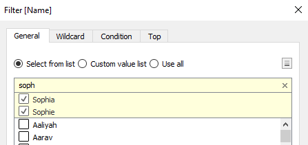
- Click on OK.
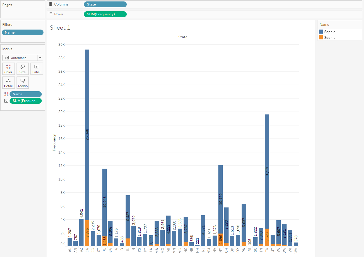
- Drag and drop Frequency to Label in the Marks card.
- We have now created a chart with the summed total frequency of the names Sophie and Sophia per State. But, what if we wanted to know which of the two names is more popular in which state? We will achieve that by adding Name to Color in the Marks card.
- Drag and drop Name from Dimensions onto Color in the Marks card:
How it works...
When you add a discrete dimension (Name) to Color, Tableau disaggregates the measure you are using, Frequency, by the categories of Name, and assigns each category a different color. Since we filtered out all names except for Sophia and Sophie, only those two colors appeared in the chart. It's also possible, and often useful, to add a measure to Color. In that case, the value measure will be represented by a color gradient. For an example of adding a measure to Color, you can refer to the Creating a map with a color gradient recipe.
There's more...
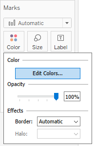
It’s possible to customize the colors in your view by performing the following steps:
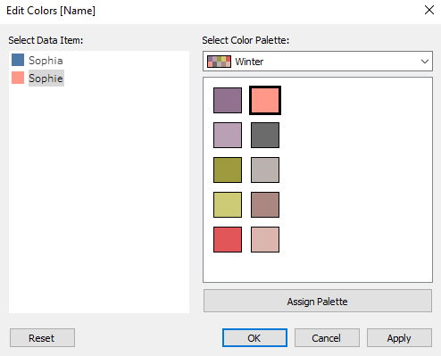
- Click on Color in the Marks card, and then click on Edit Colors…:
- In the Edit Colors[Name] window that opens, you can select a color palette from the drop-down menu that appears and click on the Assign Palette button. This will assign colors from the palette that you chose to the categories of your dimension. You can also manually assign specific colors to a category by selecting it in the Select Data Item pane, and by clicking on the desired color on the right-hand side:
- When you are satisfied with the colors, click OK to exit. Note that this will only affect the colors in the particular view you created.
- You can also hardcode a color palette for a specific measure or dimension. Hover over the field pill under Measures or Dimensions and click on the white arrow that appears on it. In the drop-down menu, navigate to Default Properties | Color...:
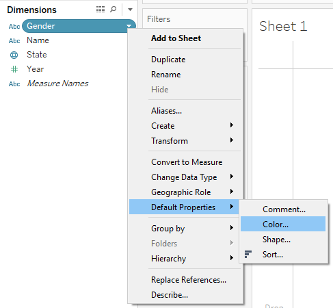
This will launch the Edit Colors window, where you can choose the color palette. However, once you assign your desired color palette to a field this way, it will be used by default every time you add this field to Color in a view.
See also
- For more information on color palettes, see the Tableau Help page at https://onlinehelp.tableau.com/current/pro/desktop/en-us/viewparts_marks_markproperties_color.html
Building a tree map
Tree maps are useful for showing relative proportions of many categories in a total. In this recipe, we will investigate the composition of our dataset to see which states are dominant, with the most records, and which are represented with fewer records.
Getting ready
Connect to the Baby_names.csv data source and open a new worksheet.
How to do it...
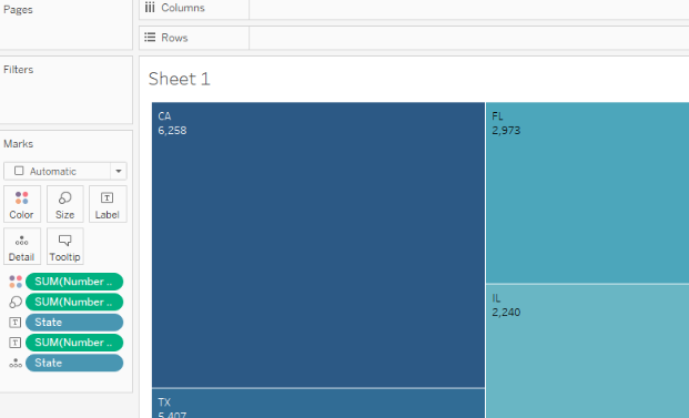
- Drag and drop Number of Records from Measures onto Size in the Marks card.
- Drag and drop State from Dimensions onto Detail in the Marks card.
- Drag and drop State from Dimensions onto Label in the Marks card.
- Drag and drop Number of Records from Measures onto Label in the Marks card:
How it works...
The number of records is an automatically generated measure that simply represents the number of rows in the dataset. We are using it to see the relative representation of each state in our dataset.
There's more...
Placing a measure, in this case, Number of Records, on Size is necessary for creating a tree map. However, you can make your tree map even more intuitive by adding Number of Records to Color as well. You just need to drag and drop Number of Records from Measures onto Color in the Marks card button, and the value of Number of Records will also be reflected by a color gradient of the rectangles. You can also change and adjust the color palette by clicking on the Color button in the Marks card and choosing the settings you prefer:
See also
- For more information, look at the following Tableau Help article on building tree maps: https://onlinehelp.tableau.com/current/pro/desktop/en-us/buildexamples_treemap.html
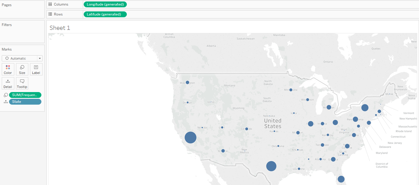
Building a map
Maps are a great way to present geographical data, as they are intuitive and easy to read. In this recipe, we will show name frequency by state, but this time using a map. This recipe will cover two frequently used ways to present data on a map: creating a map with circles of different sizes, and creating a filled map with a color gradient.
Getting ready
To complete this recipe, you will need to connect to the Baby_names.csv dataset and open a new blank worksheet.
How to do it...
First, we will make a map with circles.
Creating a map with circles
- Drag and drop State into the worksheet workspace.
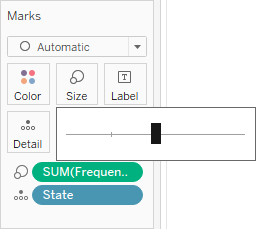
- Drag and drop Frequency onto Size in the Marks card.
- Click on Size in the Marks card, and move the slider to the center, through which we can increase and decrease the size of the circle in the following map:
You can see the results in the following screenshot:
Creating a map with a color gradient
- Drag and drop State into the worksheet workspace.
- Drag and drop Frequency onto Color in the Marks card:
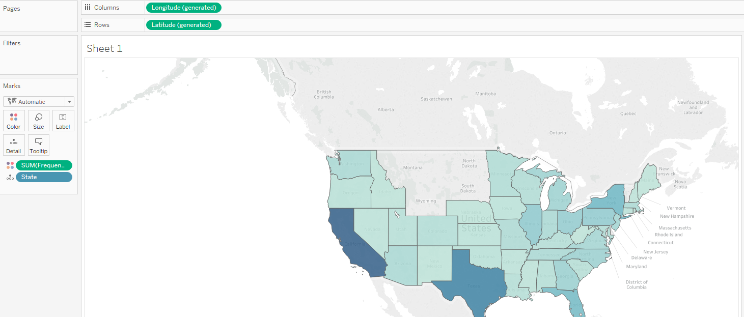
How it works...
Tableau has correctly recognized that the State dimension contains geographical information, and has assigned a geographical role to it. This is indicated by a small globe symbol ( ) next to the dimension name in the Dimensions pane, as well as in the data preview on the Data Source page. Based on that, it has automatically generated two new measures, which are not in the dataset itself: Longitude and Latitude. When you drag and drop the State dimension into the worksheet workspace, the Show Me functionality is implemented. It places State in Detail in the Marks card, Longitude into the Columns shelf, and Latitude into the Rows shelf. Based on what we do with our measure, Frequency, Tableau automatically chooses the appropriate mark type, which is a circle or a map.
There's more...
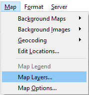
It is possible to add and subtract layers from a map and change the map style by performing the following steps:
- From the main menu toolbar, navigate to Map | Map Layers… to open the Map Layers pane:
- In the Map Layers pane, you can add and remove map layers by checking and deselecting the boxes in front of them:
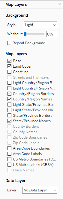
- You can also add data layers by selecting them from the Data Layer drop-down menu. Depending on the data you are showing on your map, adding different data layers might add relevant information to your visualization.
- It's also possible to adjust the background style under Background.
- Set the map style and layers as default. This means that every time you create a new map, those settings will be applied.
See also
- For more on maps, see the Tableau Help page on this topic at https://onlinehelp.tableau.com/current/pro/desktop/en-us/maps_build.html
Building a dual-axis map
In this recipe, you will learn how to create a dual-axis map. We will build on what we learned in the Building a map recipe and learn how to implement a dual axis.
Getting ready
Connect to the Baby_names.csv dataset and open a new worksheet.
How to do it...
- Drag and drop State from Dimensions into the worksheet workspace so that a basic map appears.
- Drag and drop Latitude (generated) from Measures into the Rows shelf to the right of the Latitude (generated) pill, which is already there:
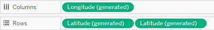
Now we have two maps, one beneath the other. Also, notice how new sections have appeared in the Marks card. There is the All section, followed by Latitude (generated), which refers to the upper map, and Latitude (generated) (2), which refers to the bottom map:
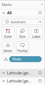
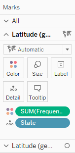
- Click on the second section, Latitude (generated), in the Marks card to expand it.
- Drag and drop Frequency from Measures onto Color:
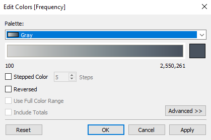
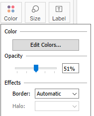
- Click on the Color button and select Edit Colors….
- From the Palette drop-down menu, select Gray, and click on OK:
- Click on the Color button again, and use the slider to decrease the opacity to around 51%:
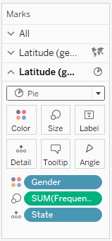
- Click on the third section, Latitude (generated) (2), to expand it. In it, drag and drop Gender from Dimensions onto Color.
- Drag and drop Frequency from Measures onto Size.
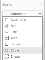
- Click on the Automatic drop-down menu and change the mark type to Pie:
- Let's set the dual axis. In the Rows shelf, hover over the second Latitude (generated) pill so that a small white arrow appears on it:
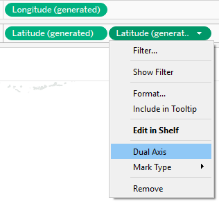
- Click on the arrow, select Dual Axis, and you will get the following result:
How it works...
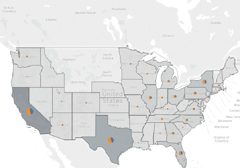
Adding the Latitude measure to the Rows shelf twice duplicates our view, making two maps instead of one. The two maps initially have the same specifications in the Marks card and State in Detail. However, we then build them separately by adding different dimensions and measures on each of them, and they show different information. We have finally implemented the dual axis, and we have also made the maps overlap. We ended up with one map that has two layers.
There's more...
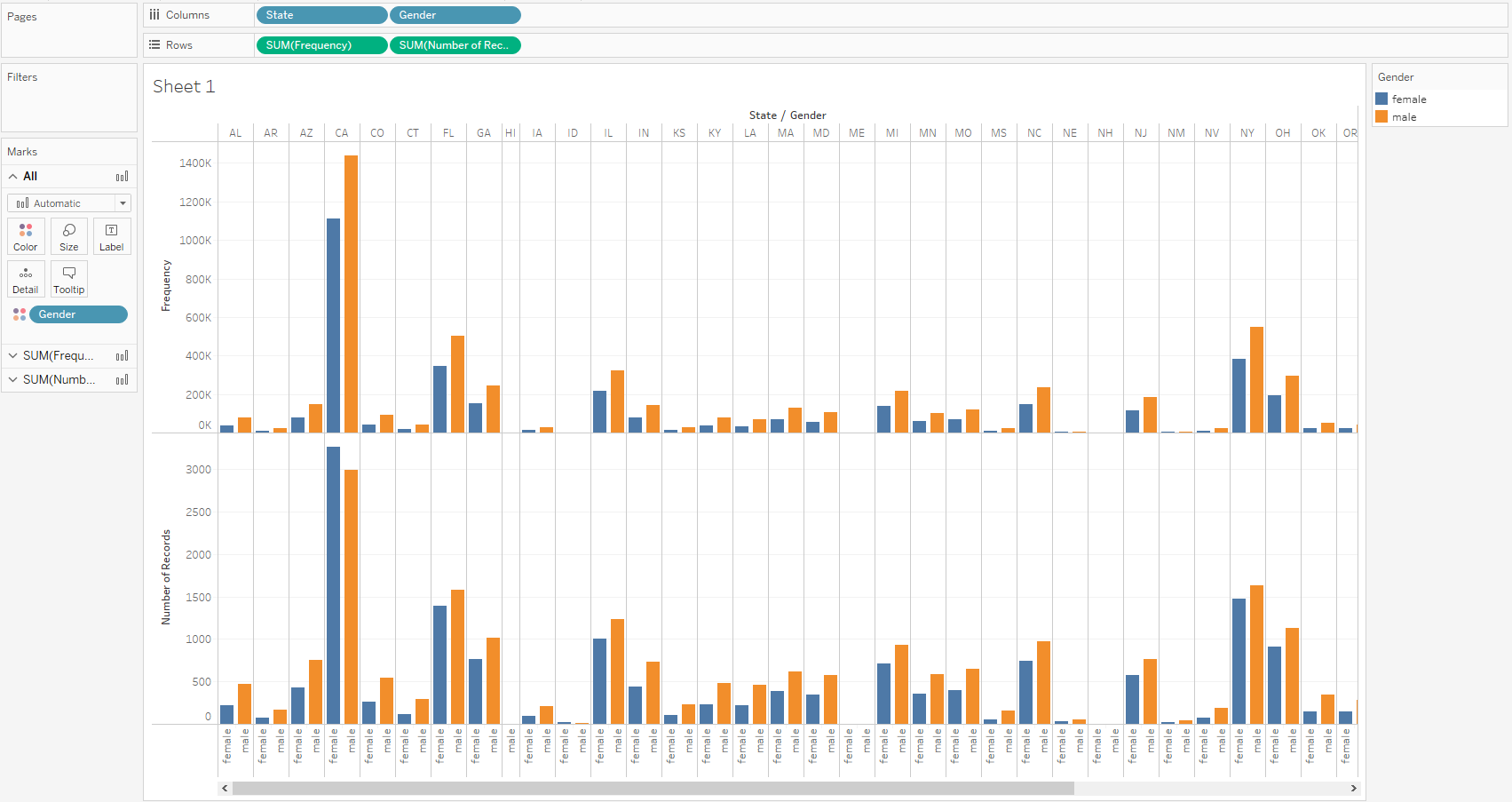
The dual axis can be implemented with different types of visualizations, not just maps. In the following example, we can see two different measures in the rows so that the upper bar chart shows Frequency and the lower chart shows Number of Records:
If we implement dual axis, both measures will be displayed in one chart:
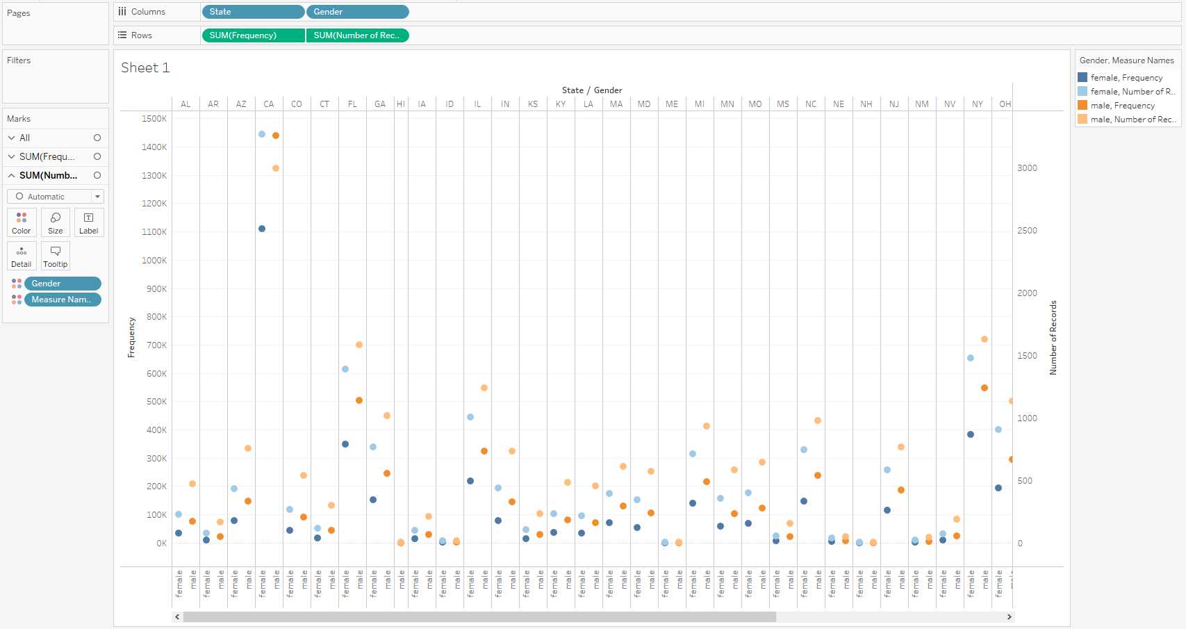
However, we must notice that the new chart has two y axes on each side—one showing Frequency and the other showing Number of Records. The axes are very different, as these two measures have different scales, thus showing that the same scale would make the measure with the narrower scale, in this case, Number of Records, look flat on the chart. However, Tableau does offer an option for synchronizing the axes, which is useful when the scales are similar.
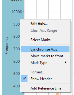
To implement it, right-click on any of the two y axes and select Synchronize Axis:
See also
- For more information, see the Tableau Knowledge Base article on dual axis: https://kb.tableau.com/articles/howto/dual-axis-bar-chart-multiple-measures
Customizing tooltips
When you hover over a point in your view, a tooltip will appear. Tooltips are small boxes, holding detailed information about a data point in the view, and are present by default. In this recipe, you will learn how to customize tooltips.
Getting ready
To follow this recipe, connect to the Baby_names.csv data source and open a new worksheet.
How to do it...
- Drag and drop Frequency from Measures onto Size in the Marks card.
- Drag and drop State from Dimensions onto Detail in the Marks card.
- Drag and drop State from Dimensions onto Label in the Marks card.
- Drag and drop Frequency from Measures to Color in the Marks card.
- Click on the drop-down menu in the Marks card and select Circle:
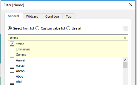
- Drag and drop Name from Dimensions into the Filter shelf.
- In the Filter [Name] window, click None to deselect all values.
- Start typing emma in the search bar at the top of the list, select Emma, and click on OK:
- Drag and drop Gender from Dimensions onto Detail in the Marks card.
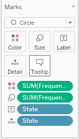
- Drag and drop Name from Dimensions onto Tooltip in the Marks card.
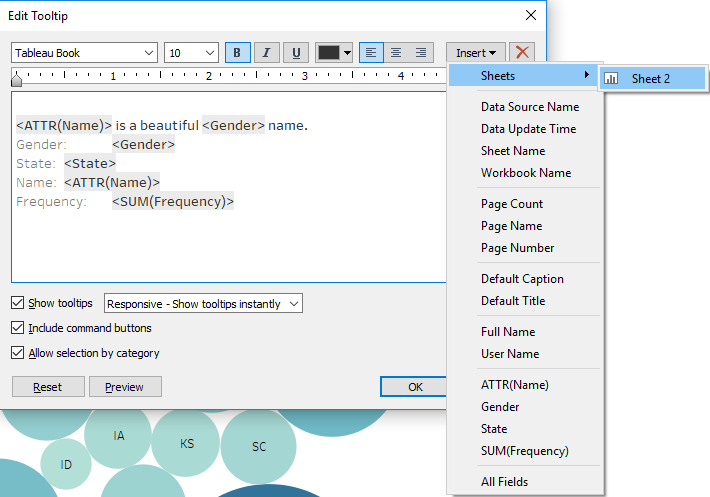
- Double-click on Tooltip in the Marks card.
- In the Edit Tooltip window, hit Enter to add a row above the existing text and place your cursor in the new row.
- Click on Insert and select ATTR(Name):
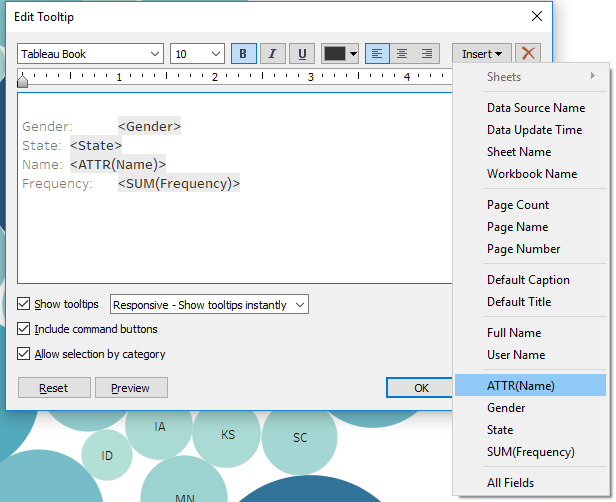
- Click on Insert again and select Gender.
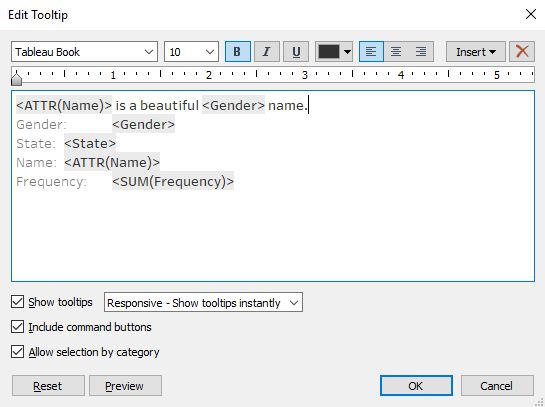
- Between <ATTR(Name)> and <Gender>, type is a beautiful. After <Gender>, type name. The whole expression should be <ATTR(Name)> is a beautiful <Gender> name, as shown in the following screenshot:
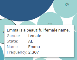
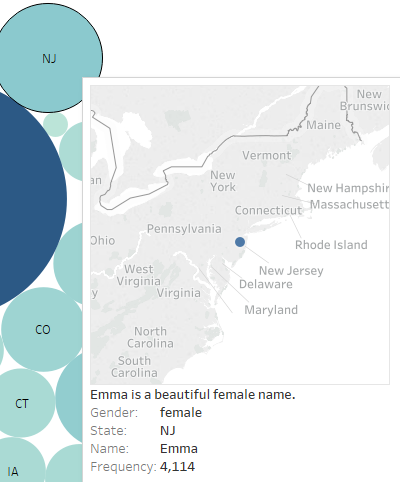
- Click on OK. The expression we entered into the tooltip will now appear when you put your mouse over any of the circles:
How it works...
Tooltips are, by default, set to hold information on the fields that are in the view and their current values. However, as we just saw, you can customize them by adding additional elements, or removing the ones that are there by default. We inserted fields such as Name and Gender into the Tooltip section; they will change automatically. If we change the Name filter from Emma to another name, it will change the value of the name in the sentence, as well as automatically update the gender.
There's more...
You can also insert another worksheet from the workbook into the tooltip. Let’s say you want your user to be able to see where the particular state is on the map. We can do this by executing the following steps:
- Create another sheet with the map, just by opening a blank worksheet and double-clicking on State in Dimensions.
- On the original sheet, double-click on Tooltip to open the Edit Tooltip window and add an empty row:
- Click on Insert and navigate to Sheets | Sheet 2. Tableau will insert an expression referencing Sheet 2 into the Tooltip section:
- If you go to Sheet 2, you will notice that Tableau added Tooltip (State) as a filter. When your mouse cursor goes over any of the states in Sheet 1, a tooltip with a map marking that state will show up:
See also
- For more information on formatting tooltips, refer to the following Tableau Help page at https://onlinehelp.tableau.com/current/pro/desktop/en-us/formatting_specific_titlecaption.html