


In this chapter, we will begin with the introduction of SAP BusinessObjects Dashboards and understanding the dashboard workspace.
In this chapter, we will cover the following recipes:
Using the Object Browser
Searching for components
Grouping the canvas components
Making the spreadsheet more readable with colors
Making the spreadsheet more readable with comments
Making the spreadsheet more readable with borders
Using named ranges
Copying the format of one cell to another cell or range
Debugging the spreadsheets
Navigating between worksheets
During the development of a typical SAP BusinessObjects dashboard, the number of components as well as the Excel spreadsheet data bindings can become quite complex. To prevent us from getting lost in an unmanageable chaos of components, interactions, bindings, and several different Excel functionalities, a structured approach should be followed right from the start of dashboard development. Also, we should use the advantages Excel gives us to build an optimal data model that is easy to read and maintain.
Before you begin designing dashboards, it is important that you understand the workspace. The workspace area is illustrated as follows:

Let's have a look at some of the important sections of the dashboard workspace as depicted in the preceding screenshot:
Menu bar and toolbar (1): SAP BusinessObjects Dashboards consists of a menu bar as well as five toolbars that are used to help develop dashboards.
Dashboard canvas (2): This is where the dashboard presentation is built. Users drag and drop dashboard objects here.
Embedded spreadsheet (3): This embedded spreadsheet is used to associate the dashboard objects with data. More information on tips and best practices when building your spreadsheet models can be found later in this chapter.
The Components window (4): Users can drag and drop dashboard components from the Components window onto the dashboard canvas.
The Object Browser (5): All objects existing in the dashboard model can be found in the Object Browser. It provides a way to easily access your dashboard objects. For more instructions on using the object browser, please refer to the following recipe, Using the Object Browser.
The Properties window (6): This contains settings and formatting options for a selected component.
The Query Browser (7): This allows users to create and manage dashboard queries. For more information, please refer to the recipe Using the Query Browser in Chapter 8, Dashboard Data Connectivity.
The Mobile Compatibility window (8): This provides mobile compatibility information on all the objects found in the dashboard model. For more information, please refer to the recipe Going mobile in Chapter 9, Exporting and Publishing.
The Object Browser has a number of features which come in very handy during the development of a complex dashboard. In this section, we will discuss hiding, locking, and ordering of components.
Go to the Object Browser.
Click on the dot in the first of the two columns on the right side of the Object Browser for the component that you want to hide. The dot turns into a checkmark. As you can see, the component now disappears from the canvas.

Now click on the dot on the right for any of the components.
Try to move the component or make any other change to it.
As you'll see, the component is completely locked and doesn't change.
Make sure some of your components are on top of each other in the canvas. We now want to use the Object Browser to rearrange these overlapping components.
Select the component in the Object Browser that is on top of the list.
Click the arrow down button in the Object Browser multiple times until the component is on top of all the other components.
As you can see, the component shifts all the way to the top.
As we have seen in this recipe, we can hide components and/or groups of components, which will make your life easier if you are using a lot of overlapping components. By checking Hide for some components, you won't be bothered by these and you can work with the others that are unhidden.
Note
There is one thing you should keep in mind. If you hide a component that is part of a group but the group itself is unhidden, the complete group will still be movable and its properties will be changeable.
Also, we saw that we can lock one or more components or groups of components. Doing this makes it impossible to select these components, so it won't be possible to move, change, or do anything else with them. In this way you can be sure you won't accidentally alter these components.
Note
Hiding and/or locking a component from the Object Browser only hides and/or locks that component during the development of a dashboard. When you preview or execute the dashboard, the component will appear again and function normally.
Finally, we changed the order of components on the canvas. This is an important feature when we are using overlaying components in our dashboard.
To move a component on top of all other components, you can also right-click on it and select the Bring To Front option. Send To Back will move the component all the way down. The options Bring Forward and Send Back do the same as the arrows in the Object Browser: they move the component one step up or down at a time.
The ability to do a search for components from the Object Browser is a helpful feature new to SAP BusinessObjects Dashboards 4.1. You can perform a search by either name or component type. This comes in handy when you have a lot of objects on the dashboard that are inside groups or canvas containers.
Open up the Object Browser window.
In the top-left input box, type in the object name or component type that you are searching for. You will see that your search will filter the objects accordingly.

Canvas components can be grouped with one or more other components.
Drag several components to the canvas.
Tip
Downloading the example code
You can download the example code files for all Packt books you have purchased from your account at http://www.packtpub.com. If you purchased this book elsewhere, you can visit http://www.packtpub.com/support and register to have the files e-mailed directly to you.
Select the components that you want to group. You can do this by either selecting multiple components from the dashboard canvas by dragging the mouse over them, or clicking the components one-by-one while holding the Ctrl button on your keyboard.

Right-click anywhere on the canvas and select Group from the context menu. You can also use the shortcut Ctrl + G to group these components. As you can see, the components are now a group with a common border.

If you double-click on the grouped object you will see a Common tab where you can set the Dynamic Visibility and Entry Effect.

If you create a lot of groups of components, we advise that you name these groups to prevent you from getting lost and confused during the dashboard development. First go to the Object Browser.

Select the group you want to rename.
Double-click the group or right-click and select Rename from the context menu.
Type in the new name for this group.
When your dashboard gets more complex, not only will the data model in the spreadsheet grow, the number of components used on the canvas will also increase. Using groups to differentiate the canvas components from each other is a great way to stay in control of your dashboard.
The more complex a dashboard gets, the more clogged the spreadsheet might get with data, Excel formulas, and other usages. To make clear what the exact purpose of a cell is, we color code them to make things more clear.
You need a basic SAP BusinessObjects Dashboards file containing a few components in the canvas with some bindings to the data model in the spreadsheet.
Select the cell(s) you want to color.
Click on the Fill Color button in the Font section of the Home tab and select the desired color.
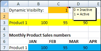
Color the cells that have dynamic visibility values in orange.

Color the cells with input values from canvas components in yellow. In the following screenshot, row A3:N3 is used as the destination range for a drill down from a chart.
Color the cells that will be filled with data from an external data source in blue.
Color the cells with Excel formulas in green.

As you can see, there are many roles that cells in the spreadsheet can play. If these were not color coded, you would be faced with a daunting task when updating the Excel model in the future. In our example, we colored calculations in green, external data input in blue, and component input data in yellow.
To make the data model readable, not only for yourself but also for others, it is helpful to create a legend in your spreadsheet that explains what each color represents. Any color scheme can be used, but it is important that you stick to the chosen scheme and use it consistently throughout the development of your dashboard.
It is important to create a separate worksheet that houses the legend, as seen in the following screenshot. You can also use this overall summary worksheet to include the information such as project name, description, usage, version (history), and so on.

Sometimes, cells need additional information to explain how they are used. You can create comment text on an adjacent cell. Or, if you do not want to fill up other cells, you can right-click on the same cell and select Insert Comment.
You need a basic dashboard containing a few components in the canvas with some bindings to the data model in the spreadsheet. You can also just reuse the dashboard from the previous recipe.
Right-click on the cell to which you want to add the extra information.
Choose Insert Comment.

Add your text. A small red triangle will appear in the upper-right corner of the cell.
Now hover your mouse over the cell and the comment you just entered will appear.
Comments are related to one spreadsheet cell only and are shown if you hover over the cell. This is a great way to document information that you do not need to see all the time, and keeps your data model clean.
A little remark about the usage of comments: they increase the size of the SAP BusinessObjects Dashboards file a bit.
To separate cells from each other and create different areas within a spreadsheet, you can use cell borders.


We will now discuss three more topics regarding spreadsheet borders: using the toolbar border button, using multiple worksheets, and placing Excel logic within the spreadsheet.
Instead of right-clicking on the cells and using the Format Cells option, you can also use the Border button on the toolbar to adjust the border styles for a cell or a group of cells. You can find this button in the Font section of the Home tab. If you select the cell(s) and click on this button, a list of options will be shown, which you can choose from.

You can use borders to split data within a spreadsheet. But if your dashboard contains data from a lot of different (functional) areas, it is recommended that you split your spreadsheet into several worksheets. This will help you to keep your dashboard maintainable.
A good strategy to split up the spreadsheet is to divide your data in different areas that correspond to certain layers or tabs that you created on the dashboard canvas. You can also use separate sheets for each external data connection. Give each worksheet a meaningful name.

Another general guideline is to place as many cells with Excel logic and SAP BusinessObjects Dashboards interactivity functionality at the top left of the spreadsheet. This place is easy to reach without a lot of annoying scrolling and searching. Even more importantly, your dataset may grow (vertically and/or horizontally) over time. This can be a risk especially when you are using an external data connection and you don't want your logic to be overwritten. For example, if you use a column summation, place it at the top of the column instead of the bottom. This way, if you need to add another value to the list of cells to be summed, you can add it to the bottom without having to shift down the formula cell.
With named ranges, it is possible to define a worksheet cell or a range of cells with a logical name.
You can use one of the dashboards from the previous recipes, or just create a new blank dashboard.


Using named ranges makes your formulas more readable, especially when you are working with multiple worksheets and using formulas that refer to cells in other worksheets.
Note
There is a restriction to using named ranges in SAP BusinessObjects Dashboards: the defined named range must refer to a single cell or must use formulas that return a single value from a range of cells. For example, let's say we have two named ranges: Sales (A1:A12) and Cost (B1:B12). A supported formula would be =SUM(Sales)-SUM(Cost). An unsupported formula would be =Sales-Cost.


This recipe shows you how to copy the formatting of one cell to another cell or range. For example, we can copy a yellow background and Calibri font from cell A1 to cell A2.

For SAP BusinessObjects Dashboards developers, it happens very often when they have to copy colored cells that represent different types of logic such as dynamic visibility cells, insertion cells, and so on.
The Format Painter tool works by taking the source cell that you have selected and applying the formatting to the cell(s) that you paint to. This is very useful because we can copy cell formats without having to perform a Copy and Paste Special action every time.
It is common that SAP BusinessObjects Dashboards developers may accidently put in the incorrect formula when developing logic on their spreadsheets. Using the Ctrl + ` hotkey will make things much easier.
Select the worksheet you want to see formulas for.
Hit the Ctrl + ` (grave accent) hotkey.
You will see the value in the cell change to the formula.
The Ctrl + ` hotkey works by showing the underlying formula of a cell. This is extremely useful if you are comparing formulas from multiple cells, as the developer does not have to flip between formulas in order to see what they are doing wrong when comparing multiple cells. Developers can quickly analyze their worksheet and find the cause of their problem.
The following screenshot shows the results of two Excel formulas in cells A1 and A2:

After using the Ctrl + ` hotkey, the formulas of both cells are displayed, as you can see in the next screenshot:


When developing dashboards it is a common problem to have to manually scroll through tabs when there are too many worksheets. To access tabs that are not visible, we are used to pressing the arrow keys to move to the desired tab.

To have all tabs displayed in one menu, right-click on any of the arrow keys at the bottom, in the left-hand side navigation area. You will then see the list of tabs that you can choose from.

You can also use Ctrl + PageUp, which will move to the previous sheet in your workbook.
Ctrl + PageDown will navigate to the next sheet in the workbook.
This tip allows developers to quickly toggle between worksheets. Being able to quickly right-click and view a menu of all available tabs is faster than scrolling through each tab in order to reach tabs that are not visible. In addition, the ability to use a hotkey to cycle through each tab brings some time-saving benefits to those who are comfortable with using the keyboard to perform all their actions.


