


In this chapter, we will cover:
Making the spreadsheet more readable with colors
Making the spreadsheet more readable with comments
Making the spreadsheet more readable with borders
Using Named Ranges
Selecting all worksheet cells with one click
Copying the format of one cell to another cell or range
Debugging the spreadsheet
Navigating between worksheets
Grouping canvas components
During the development of a typical Dashboard Design dashboard, the number of components on the canvas increases steadily and the exact type of used components may change over time. Also, several interactions between components are added and maybe one or more connections with external data sources are created. All those canvas components are bound to the Excel data model that has been defined in the spreadsheet area.
To prevent us from getting lost in an unmanageable chaos of components, interactions, bindings, and several different Excel functionalities, a structured approach should be followed right from the start of the dashboard development. Also, we should use the advantages Excel gives us to build an optimal data model that is easy to read and maintain.
To make clear what the exact purpose of a cell is we need a set of guidelines to follow.
You need a basic Dashboard Design dashboard containing a few components in the canvas with some bindings to the data model in the spreadsheet.
Select the cell(s) you want to color.
Click on the Fill Color button and select the desired color. You can find this button in the Font section of the Home tab.
Color the cells that have dynamic visibility values in orange.

Color the cells with input values from canvas components yellow. In the following screenshot, row A3:N3 is used as the destination range for a drill down from a chart.
Color the cells that will be filled with data from an external data source in blue.
Color the cells with Excel formulas in green.

A cell in an Excel spreadsheet can have several different roles. It can contain a fixed value, it may show the result of a (complex) formula, and it can be used by formulas in other cells. Within Dashboard Design, an additional role can be recognized—the insertion role. In this type of cell, an interaction from an Dashboard Design component results in a certain value being inserted into this cell.
To make the data model readable, not only for yourself but also for others, it is helpful to create a legend in your spreadsheet that explains what each color represents. Any color scheme can be used, but it is important that you stick to the chosen scheme and use it consistently throughout the development of your dashboards.
Make sure that you add another worksheet to your spreadsheet to place this legend in. You can also use this overall summary worksheet to include the information such as project name, description, uses, version (history), and so on.

Sometimes cells need additional information to explain how they are used. Of course you can write this text as a label in another spreadsheet cell, but a better solution is to use comments.


Comments are related to one spreadsheet cell only and are only shown if you hover the mouse over this cell. This is a great way to document information that you do not need to see all the time, which keeps your data model clean.
A good case to use this is when you are building a dashboard with multiple layers in combination with dynamic visibility. You might use numbers to identify each layer and use a cell to contain the number of the active layer. You can use a comment to describe the meaning of these cell values.
A little remark about the usage of comments is that they do increase the size of the Dashboard Design file a bit.
To separate cells from each other and create different areas within a spreadsheet, you can use cell borders.


Instead of right-clicking the cells and using the Format Cells option you can also use the Border button on the toolbar to adjust the border styles for a cell or a group of cells. You can find this Border button in the Font section of the Home tab. If you select the cell(s) and click on this button, a list of options will be shown, which you can choose from.

You can use borders to split data within a spreadsheet. But if your Dashboard Design dashboard contains data from a lot of different (functional) areas, it is recommended that you split your spreadsheet in several sheets. This will help you to keep your dashboard maintainable.
A good strategy to split up the spreadsheet is to divide your data in different areas that correspond to certain areas, layers, or tabs that you created on the dashboard canvas. You can also use separate sheets for each external data connection. Give each worksheet a meaningful name.

Another general guideline is to place as many cells with logic and Dashboard Design interactivity functionality at the top left of the spreadsheet. This place is easy to reach without a lot of annoying scrolling and searching. Even more importantly, your data set may grow (vertically and/or horizontally) over time. This can especially be a risk when you are using an external data connection, and you don't want your logic to be overwritten.
With named ranges , it is possible to define a worksheet cell or a range of cells with a logical name.


Using named ranges makes your formulas more readable, especially when you are working with multiple worksheets and using formulas that refer to cells on other worksheets.


With a click of the mouse button, we can select everything on a worksheet.
If you want to select an entire worksheet without having to drag your mouse to select everything, you can just click on the half triangle on the top left corner of the worksheet.
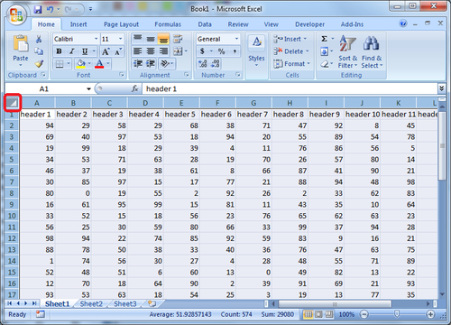
Clicking on the half triangle button will allow you to select the entire worksheet with just one click. Here are some reasons why we would want to select an entire worksheet:
With an entire worksheet selected, you can easily apply formatting or change attributes to all cells.
You can copy the selection from one workbook and paste it onto a worksheet from another workbook. A common use would be copying data elements from an external spreadsheet and pasting it onto the internal Dashboard Design spreadsheet.
You can easily perform row height or column width formatting that will apply to all rows or columns in that spreadsheet.
This recipe shows you how to copy the formatting of one cell to another cell or range. For example, we can copy a yellow background and Calibri font from cell A1 to cell A2.
Click on the source cell that you want to copy the formatting from.
Click on the Format Painter icon which you can find on the Clipboard section of the Home tab.

Click on the cell or range that you want to copy the source cell's formatting to.
The Format Painter works by taking the source cell that you have selected and applying the formatting to the cell(s) that you paint to.
This is very useful because we can copy cell formats without having to perform a copy and paste special every time.
For Dashboard Design developers, it happens very often where we have to copy colored cells that represent different types of logic such as dynamic visibility cells, insertion cells, and so on.
It is common that Dashboard Design developers may accidently put in the incorrect formula when developing logic on their spreadsheets. Using the Ctrl+` hotkey will make things much easier.
Select the worksheet you want to see formulas for.
Hit the Ctrl key and ` (grave accent) key together.
You will see the value in the cell change to the formula.
The hotkey Ctrl +` works by showing the underlying formula of a cell. This is extremely useful if you are comparing formulas from multiple cells, the reason being that the developer does not have to flip between formulas in order to see what they are doing wrong when comparing multiple cells. Developers can quickly analyze their worksheet and find the cause of their problem quickly.
The following screenshot shows the results of two Excel formulas in cells A1 and A2:

After using the Ctrl+ ` hotkey, the formulas of both cells are displayed as you can see in the next screenshot:


It is often the case that when we are developing Dashboard Design dashboards, we run out of room for our worksheet tabs. We then have to scroll through each tab in order to get to the one that we want; this is kind of a pain. To access tabs that are not visible, we are used to pressing the arrow keys to move to the desired tab.

To have all tabs displayed in one menu, right-click on the tab at bottom, left-hand side navigation area. You will then see the list of tabs that you can choose from.

You can also use Ctrl + PageUp, which will move to the previous sheet in your workbook.
Ctrl + PageDown will activate the next sheet in the workbook.
The methods explained work by allowing developers to move between worksheets more quickly. Being able to quickly right-click and show a menu of all available tabs is faster than scrolling through each tab in order to reach tabs that are not visible. In addition, the ability to use a hotkey to cycle through each tab brings some time savings benefits for those who are comfortable with using the keyboard to perform all their actions.
Canvas components can be grouped with one or more other components.
Select the components that you want to group by either selecting them by dragging the mouse over the components, or clicking the components one-by-one while holding the Ctrl button on your keyboard.

Right-click anywhere on the canvas and select Group from the context menu. You can also use the shortcut Ctrl + G to group these components. As you can see, the components are now a group with a common border (Dynamic Visibility and Entry Effect):

And some shared preferences (Dynamic Visibility and Entry Effect):

If you create a lot of groups of components, we advise that you name these groups to prevent you from getting lost and confused during the dashboard development. First go to the Object Browser.
Select the group you want to rename.
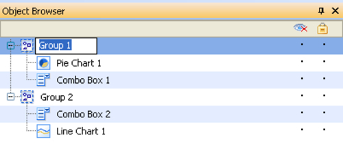
Double-click the group or right-click and select Rename from the context menu.
Type in the new name for this group.
When your dashboard gets more complex, not only will the data model in the spreadsheet grow, the number of components used on the canvas will also increase. Using groups to differentiate the canvas components from each other is a great way to stay in control of your dashboard.
Besides browsing through your (grouped) components, the Object Browser has two additional options which come in very handy during the development of a complex dashboard.
Firstly, you can hide components and/or groups of components, which will make your life easier if you are using a lot of overlaying components. By checking Hide for some components, you won't be bothered by these components and you can work with the components that are unhidden.
Secondly, the Object Browser gives us the possibility to lock one or more components and/or groups of components. Doing this makes it impossible to select these components so it won't be possible to move, change, or do anything else with it.
Hiding or locking components is easy. In the Object Browser you will see two symbols with two columns of dots beneath them. The first column is the 'hide' column; the second one defines which components are locked. To hide or lock a component, you just have to click on the correct dot in the row of the component. The dot will be replaced with a checkmark. In the following screenshot, you can see that the Budget group is hidden while the Actual group is locked: