


"A picture tells a thousand words…"
These words used in an advert dating from 1913 for the Piqua Auto Supply House of Piqua, Ohio, still ring true over a hundred years later. The only difference is the advent of technology—with the increasing use of mobile phones, tablets, and portable devices comes a need to display content on smaller devices. While text might be easy to display, images are less so, but are still just as important. Throughout this chapter, we're going to look at some of the tips and tricks you need to learn in order to display images of the right size and quality on a variety of different devices.
Creating responsive images can be as easy or complex as needed. In this chapter, we will cover a host of topics, which include:
Working with fluid images, icons, and sprites
Catering to vendor prefixes, image formats, and different platforms
Catering to HD/Retina images and using the
<picture>tagsDetermining an available viewport for use
Working out media queries using CSS, JavaScript, or data tags
Building a responsive carousel and creating responsive maps
Curious? Let's get started!
Throughout this chapter, we'll work using a project area. Before we get started, it is strongly recommended that you create a project folder. For the purposes of this chapter, I will assume it is called code; inside it, you will need to create four folders: css, js, font, and img, as shown in this screenshot:

We will refer to the folders created here throughout the chapter.
How many times have you created web pages only to find that a viewer complains that they look poor on a mobile device? I'll bet that one possible reason for this is image content. The image is set with fixed sizes, so it doesn't resize well in smaller browsers, right?
In this tutorial, we will take a look at the basics needed to move away from fixed images to those that adapt when a browser window has been resized or content is being viewed on a mobile device.
For this exercise, I've created a dummy page about Lake Peyto in Canada—a truly stunning part of Canada if you are fortunate to be able to visit! Throughout this tutorial, we're going to make some changes to help make the image react better when resized in a browser window. These steps will guide you through the exercise:
Let's start by cracking open a copy of the code download and extracting
simplefluid1.htmlandsimplefluid1.css. This a simple web page about Lake Peyto, Canada.Try resizing the browser window. Notice how it doesn't resize any of the content? Let's fix that by making two small changes to our code.
Alter the two lines in
simplefluid1.cssas shown in these lines of code:img { max-width: 100%; height: auto; float: left; padding: 10px; } #description { box-sizing: border-box; } #peytoe { ... padding: 0px 10px 10px; width: 66%; }The three changes we just performed are all that is required to make the content responsive and adapt to fit the resized window. We've used
max-widthto control the size of the image and the use ofheight: autohelps to keep the aspect ratio of the image to prevent it from looking distorted.One might think that this is enough, right? Well no, not quite; try resizing the content to a smaller size and we can see the image is starting to spill over the border.
To make the image truly adaptive, we need to convert the sizes to their percentage equivalents; for this, we can use the formula target ÷ context = result. Let's put this into practice. Consider
443px(width of image) /800px(original size of box) * 100 = 55.375 percent.Using this formula, go ahead and modify the
imgrule as follows:img { width: 55.375%; height: 37.125%; float: left; padding: 10px; }
If all is well when resizing the image, the content will adjust but remain within the confines of the #peytoe div, as shown in this screenshot:

It should be noted that this approach may not work for all sites. For example, it may be preferable to crop it first using the background position before scaling it down to a smaller size. It will depend on your design as well as the type and quantity of images used; this is something that needs to be considered during design.
Now that we've seen the basics of making images responsive, let's move on and take a look at how we can improve on this by using higher quality images on supported devices. Before we do this though, it is worth covering a couple of key points about responsive design, namely relating to the use of vendor prefixes and image formats.
We'll start this section with a question. Hands up if you thought that creating responsive content requires special image formats or lots of vendor prefixes? If you think yes is the answer, then think again—two to three years ago, you may have had to work with something like the following lines of code as an example media query:
@media only screen and (-webkit-min-device-pixel-ratio: 1.5),
only screen and (min--moz-device-pixel-ratio: 1.5),
only screen and (-o-device-pixel-ratio: 3/2),
only screen and (min-device-pixel-ratio: 1.5) {
    /* High-res version of image assets go here */
}
Now, all you need to cater to most modern browsers (that is, versions released within the last 12 to 18 months) is this—not a vendor prefix in sight:
(min-resolution: 192dpi) {
    /* CSS styles here */
}
A similar principle applies for images—there is no need for a special format that needs to be used solely for media queries, or a need to use lots of different formats to cater to different devices. We only need to choose one format—any format will work. The exception here is that while using PNG or JPG images will produce results, you will find that the quality will begin to suffer in some instances as these formats do not scale up well.
Instead, it is better to use the SVG format when working responsively. This is effectively XML, which can be edited using tools such as Inkscape or Illustrator; it even can be edited in a text editor! The key to using SVG though is that it scales perfectly; irrespective of the size of the browser window, the image quality will be unaffected. It's an ideal format for logos, patterns, icons, and so on, but not for photographs, where the lossy format will not scale well.
At this point, you may hopefully be asking yourself, "What about mobile devices?"—it's a good question after all: the whole point of responsive design is to cater to mobile devices! Most of the tips and tricks we will encounter throughout this chapter will work on a mobile platform, although there are some useful guidelines that are worth noting:
Shrink the images. Use any online service such as TinyPNG or XnConvert; they need to be made as small as possible without sacrificing too much quality.
Be careful with retina images. Memory usage for these can vary dramatically between different mobile devices, so ensure you set your media queries appropriately.
If you're using jQuery to provide fallback support, then consider using conditional loading to only call jQuery when needed and not by default.
Make sure that different sized versions of the same image have been created. There is no point in forcing a mobile user to download a huge file when a small one will do! To get help with this, look online for tools such as Andi Smith's Responsive Images tool at http://www.andismith.com/grunt-responsive-images/, which can help automate the process.
Test in an online applet such as the Responsive tool available at http://coolestguidesontheplanet.com/responsive/, as there is no substitute for testing! It is much better to test thoroughly now and fix errors before going live than to suffer the embarrassment at a later date.
Work in a mobile first capacity. Mobile devices need to be set to download the smallest images first; browsers will handle the replacement with larger images automatically if the media queries have been created within the site.
Consider using something similar to the Network API (http://code.tutsplus.com/tutorials/html5-network-information-api--cms-21598) or Modernizr (http://www.modernizr.com) to determine whether the visitor is using a mobile platform; we can link these to jQuery/JavaScript based media queries if required to determine which image should be served.
Don't use display: none to hide images, serve them in media queries. Using the former approach still downloads them even if they are hidden.
Tip
Remember this sentence from RevUnit's Seth Waite: "1 in 4 people abandon a web page that takes more than four seconds to load." This becomes more critical with mobile devices; loading a large image will blow this straight out of the water! You can see his original article at http://sethwaite.com/2012/08/how-slow-website-speed-destroys-your-conversion-rates/.
Now that the theory is out of the way, let's get coding! We're going to begin with one of the key elements of working with responsive media—catering to high-resolution (hi-res) or retina-based images.
How often have you used a mobile device, such as an iPad, only to find images of poor quality? With the advent of retina displays on devices such as iPads, it is becoming more important to ensure your images are of sufficient quality on high-resolution screens.
Retina display is a proprietary marketing term coined by Apple, rather than a scientific term. To some it might evoke images of a complex scientific process; in reality it is just double resolution where pixels have been very closely packed to give higher quality and resolution. As an example, the pixel count can be anywhere from 220 pixels per inch (PPI) for third generation Mac Book Pros to 401 PPI for iPhone 6 Plus!
Adding retina support to our code is easy. There are several options open to us:
We can set images as the background image using
background-size: coverto ensure it covers the full display. Images can then be swapped out with higher resolution ones using CSS media queries.We can resize images as larger retina images then use CSS to resize them on screen; this results in a larger file but not necessarily twice as large due to the way JPEG compression works. We may need to use
-ms-interpolation-mode: bicubicto ensure the compression level is as efficient as possible in some browsers though!
We can always set our code to display high-resolution images; however, there is a cost in displaying these images in the form of a bigger file size; the quality will be lost on low-resolution (low-res) devices.
Instead, we could use a plugin, such as Retina JS, to tell browsers to serve hi-res images only when needed. Let's take a look at using one in action:
Start by adding the following code to a new file, saving it as
retina.html:<!DOCTYPE html> <html> <head> <meta charset="utf-8"> <script src="js/retina.min.js"></script> </head> <body> <img src="img/mothorchid.png" data-at2x="img/mothorchid@2x.png" width="584px" height="389px"> </body> </html>
Next, we need to download the RetinaJS library—this is available at https://github.com/imulus/retinajs/releases/download/1.3.0/retina-1.3.0.zip (at the time of writing of this book, the latest version is 1.3.0). Extract
retina.min.jsand drop it into a subfolder calledjswithin your project folder.We also need two images: one needs to be of a higher resolution than the other; for this example, I will use two PNG files that are available in the code download:
mothorchid.pngandmothorchid@2x.png. Note that the second file must have@2xat the end of the filename; this is the key to making Retina JS work.
To preview the results, it is recommended to use Google Chrome. We can easily simulate changing the device pixel ratio setting; change it from 1 to 2 and refresh the screen to see the change from the low-res image to the one of higher quality. We will cover how to create media queries that support hi-res images later in this chapter in the Working out media queries section.
Note
There are plenty of examples online of plugins that can provide retina support—two of the examples are: responsImg, which you can download from http://etiennetalbot.github.io/responsImg/. Alternatively, you can use Grunt to do the heavy work with Andi Smith's responsive images plugin for Grunt at http://mattstow.com/experiment/responsive-images/responsive-images.html.
So far, our examples all have something in common: they work with individual images. This is fine for those that may only appear once or twice at the most, but what if they appear frequently throughout your site? It seems pointless to have to call them each time. Fortunately, we can get around this with the use of image sprites.
Note
For a discussion on how image sprites work, take a look at a useful article by Chris Coyier at http://css-tricks.com/css-sprites/.
For the uninitiated, image sprites are a way of combining lots of (ideally, small) images into one larger one then using CSS style rules to display the relevant part of that image. We typically might use background-position to position the image; using values in pixels, this works perfectly well. We can use the same principle with responsive sprites but with one key difference: we use percentage values instead, not pixels! Let's take a look at how to do it using some battery icons as an example:
Start by extracting a copy of
imagesprites.htmlfrom the code download that accompanies this book. It contains some simple markup with<img>references to some battery icons that we will use in our demo.Note
At this point, you may notice the long string of random characters—these are data URIs; they were generated using the responsive sprite image creator service at http://responsive-css.spritegen.com/. For now, it's enough to know that these are the images converted into a format that reduces the need to continually request images from the server.
In a separate file, add the following code, saving it as
imagesprites.cssin thecsssubfolder of our project folder:#demo img { display: block; margin: 1em auto; } .battery { background-position: 0 0%; background-size: 100%; } .battery-charge { background-position: 0 25%; background-size: 100%; } .battery-full { background-position: 0 50%; background-size: 100%; } .battery-half { background-position: 0 75%; background-size: 100%; } .battery-plug { background-position: 0 100%; background-size: 100%; } .battery, .battery-charge, .battery-full, .battery-half, .battery-plug { max-width: 100%; background-size: 100%; background-image: url('../img/index.png'); }From the code download, extract a copy of
index.pngfrom theimgfolder. This is our sprite image that has been premade using the CSS Sprites service from earlier in this exercise. Save it in theimgsubfolder of the project folder. The battery icons used were from http://www.fatcow.com/free-icons. If you have others you would prefer to use, please alter the code accordingly.If we preview the results, we should expect to see our responsive sprite image appear. If we resize the screen, it automatically updates the position of the image as shown in this screenshot:

However, there are some drawbacks that we need to be aware of when using this approach:
If we try to decode the base64 URIs given in the code, it doesn't appear to produce a valid image—what gives?
The use of long URIs in HTML makes it harder to read
It makes it very difficult, if not impossible, to adapt this code for use with
@mediaqueries or to use retina-based images
To see how awkward it is and to see the resulting changes in code required to remove the use of data URIs from the HTML markup, take a look at imagesprites2.html and imagesprites2.css in the code download that accompanies this book. Notice how the CSS has significantly changed.
Let's change tack—a key concept of responsive design is to determine the available viewport we can use when displaying content. Let's see what this means, when working with images.
Viewport? Surely you mean screen estate or perhaps resolution? In this instance, no. When designing responsively, we have to cater to screens of all different shapes and sizes; it's not enough to simply design for a certain screen resolution. Instead, we have to allow for the fact that the available space in a browser window (or viewport) might be smaller; we have to design our breakpoints to fit this available space.
A good reference point to see the available viewport on a host of devices is http://viewportsizes.com/ and then navigating to http://viewportsizes.com/mine/. This will display the current space available to us. There are two ways to set the available viewport for use: one using CSS/HTML markup and the other using jQuery or JavaScript. We'll take a look at using the CSS method first.
This is probably one of the simplest settings to add to any responsive design, yet it has the potential to open up a hornet's nest of problems! Setting the viewport using CSS is a one-line piece of code; the difficulty is in working out the CSS styling needed to position the elements correctly once the viewport has been set.
Tip
For this demo, it is recommended that you use Google Chrome. It has a built-in device emulation facility that makes it easy to test our results in different viewports. I will assume for the purposes of this demo that you have it installed.
We'll begin with setting the markup first, so we can at least see what happens when the viewport has not been set in CSS:
We'll start, as always, by preparing our markup. From the code download, extract the files:
viewport-css.html,viewport-css.css, andpixel-grid.png; save them into thecsssubfolder andimgsubfolder respectively.We've used the PT Sans font for decorative purposes. This is available from http://www.fontsquirrel.com/fonts/PT-Sans; you will need to download it and extract the fonts into a
fontssubfolder within your project area.Open Google Chrome and set the Emulation facility to emulate the Sony Xperia S, Ion devices, within the Developer Toolbar.
At this point, it is worth previewing the results in a browser; if all is well, we should see a result similar to this screenshot:

The keen-eyed among you will have noticed that something is clearly amiss. Our screen has not resized properly and text is being chopped off the right edge of the window. Let's fix that now using the following steps:
In
viewport-css.html, add the following line as indicated:<title>Demo - Setting a viewport using CSS</title> <meta name="viewport" content="width=360"> <link href="css/viewport-css.css" rel="stylesheet">Resave the file and then refresh the screen in Chrome. If all is well, we can now see the results of our change with the text correctly sized and no overlap:

In this example, we've used <meta name="viewport" content="width=360">, which sets a very specific width of 360 px. For a more general setting where no specific width is used <meta name="viewport" content="width=device-width, initial-scale=1"> can be set instead.
When using media queries, we can always set the size of elements within our query. It's worth setting the viewport too so that items don't disappear off the page when resizing the browser window.
Note
For a good discussion on using the viewport meta tag, it is worth checking out an article by Paul Underwood, which is available at http://www.paulund.co.uk/understanding-the-viewport-meta-tag.
The alternative to using the CSS <meta viewport> tag is to use JavaScript (or we could equally use jQuery). In this instance, we can work out what the values are and use these as a basis for our design, rather than simply set specific sizes as we did in the previous example.
Let's dig in and take a look to see how we can get our sizes:
We'll begin with adding the following markup to a new file, saving it as
viewport-js.htmlin the root of our project folder:<!DOCTYPE html> <html> <head> <meta charset="utf-8" /> <title>Demo - What's my Viewport Size?</title> <meta name="viewport" content="width=device-width, initial-scale=1, minimum-scale=1, maximum-scale=1" /> <link rel="stylesheet" href="css/viewport-js.css"> </head> <body> <div id="c"> <p>Your viewport size:</p> <p id="ua"></p> </div> <div id="vp"><span id="w"></span><span id="h"></span></div> <script src="js/viewport-js.js"></script> </body> </html>
Next, add this JavaScript to a new file, saving it as
viewport-js.jsin thejssubfolder in the project folder:(function() { if (typeof(document.documentElement.clientWidth) != 'undefined') { var $w = document.getElementById('w'), $h = document.getElementById('h'), $ua = document.getElementById('ua'); $w.innerHTML = document.documentElement.clientWidth; $h.innerHTML = ' × ' + document.documentElement.clientHeight; window.onresize = function(event) { $w.innerHTML = document.documentElement.clientWidth; $h.innerHTML = ' × ' + document.documentElement.clientHeight; }; $ua.innerHTML = navigator.userAgent; } })();We need some basic styling, so go ahead and add the following to
viewport-js.css, saving it to thecsssubfolder in our project folder:html, body { border: 0; margin: 0; padding: 0; font-family: 'Helvetica',courier new; font-weight: bold; } #vp { background: #e00; color: #fff; font-size: 3.125em; line-height: normal; padding: 3px; text-align: center; } #h { color: #ff8080; } #c { font-size: 1.25em; line-height: 1.5em; padding: 0 1em; }Tip
Downloading the example code
You can download the example code files for all Packt books you have purchased from your account at http://www.packtpub.com. If you purchased this book elsewhere, you can visit http://www.packtpub.com/support and register to have the files e-mailed directly to you.
If we preview the results in a browser, we'll see the size of our available viewport area displayed along with the current user agent string being used by our browser, as shown in this screenshot:

There are plenty of good examples online to show us how to determine the available viewport area; we've used a modified version of one produced by Matt Stow at http://viewportsizes.com/. In it, he also has an extensive list of viewport sizes for a variety of devices. We could of course use something like Modernizr to perform the same function, but this is at the expense of depending on an outside solution; our example here is written in vanilla JavaScript, removing any dependencies and keeping the code concise.
Now that we've worked out how much space we have to work with, we can now work out what happens to elements when we hit the limits of our available space. This is particularly relevant if we want to display hi-res images for example. After all, we don't want to show a high quality image if it chokes the available bandwidth of our device!
Let's take a look at how we can use media queries to switch between lo-res and hi-res versions of a single image:
We will start with setting up the markup we need for our demo. From the code bundle for this book, extract a copy of
min-resolution.htmland save it to the root of the project folder.In a new file, add these style rules and save it as
min-resolution.cssin thecsssubfolder of our project folder. This is where the magic happens, that is, switching from the lo-res to hi-res versions of our image:#orchid { background-image: url('../img/mothorchid.png'); height: 24.31rem; width: 36.5rem; } @media (min-resolution: 120dpi) { #orchid { background-image: url('../img/mothorchid@2x.png'); height: 24.31rem; width: 36.5rem; } }From the code download that accompanies this book, extract and save copies of
mothorchid.pngandmothorchid@2x.pnginto theimgsubfolder of our project folder.If we preview the results of our work, we will first see the standard resolution image
mothorchid.png.
However, if we resize the image by zooming in to at least 133 percent, we will see it switch to its hi-res equivalent.

Click on the – button to reset back to 100 percent and we will see the image revert back to the standard resolution version.
Tip
Using Google Chrome?
We can achieve the same effect using Chrome's Developer Toolbar. Press Ctrl + Shift + I to display it and then click on the drawer icon. Now, switch to the Screen tab and change the Device pixel ratio setting from 1 to 2 to show the hi-res image. For more details, please visit https://developer.chrome.com/devtools/docs/device-mode.
At this point, we can use this trick to display any hi-res image we need; the key is to ensure we have two images, one of a standard resolution, while the other is of a higher quality. A small word of note though—if you spend any time researching different types of media queries, then you may come across something akin to these lines of code:
@media (-webkit-min-device-pixel-ratio: 1.25),
(min-resolution: 120dpi){
    /* Retina-specific stuff here */
}
While still perfectly usable, the initial –webkit-min-device-pixel-ratio setting has been deprecated in favor of min-resolution; there is no need to use it unless you have to cater to really old browsers!
Now, we could easily use CSS queries in all of our projects, but there may still be occasions where standard queries might not work. A good example is for a navigation that behaves differently at different sizes. Fortunately, there is a solution for this—we can achieve a similar effect using the breakpoints.js library. Let's delve in now and take a look.
So far, we've worked mainly with modern browsers. These handle media queries effectively, allowing us to display the right image at the right time. What if we had to support old IE browsers, for example, that can't handle media queries without some form of help? No problem—enter breakpoints.js, one of the many JavaScript/jQuery libraries available to help us mimic media queries. I feel an exercise coming on, so let's make a start building an example to see how it works:
We'll begin with setting up our markup for the demo. This contains some simple textboxes set to show in a group. For this, we need to extract copies of
breakpoints.htmlandbreakpoints.cssfrom the code download that accompanies this book. Save them both into the project folder: the HTML file at the root and the CSS file within thecsssubfolder.We need a copy of jQuery 2.x—there should already be one in our project folder from earlier demos; if not, extract a copy from the code download that accompanies this book or from http://code.jquery.com.
Next comes the all important
breakpoints.jslibrary. Go ahead and extract a copy from the code download that accompanies this book and save it to thejssubfolder of our project folder. Newer versions will be available at http://xoxco.com/projects/code/breakpoints/.We need to add the call to initialize our breakpoints, so go ahead and add this code in between the empty
<script>tags:$(function () { $.breakpoints({ '.article': { 'small': [0, 320], 'medium': [320, 480], 'large': [480, null] } }); });Save your work. If all is well, we should see these three boxes when previewing our work in a browser session:

At this point, try resizing the browser window. Notice how each of the text boxes resize. We're using image placeholders from the Placehold.it service at http://placehold.it/; these automatically resize in the same manner.
Note
There is a working example of this exercise available on the code download for this book—extract breakpoints-finished.html and breakpoints-finished.css, along with jQuery and breakpoints.js, then rename the HTML and CSS files to breakpoints.html and breakpoints.css to view the demo. You will need to store them in the appropriate subfolder of our project folder for them to work correctly.
But hold on! A closer look at the CSS shows no media queries. This is the beauty of breakpoints.js; it allows us to replicate media queries for those browsers that don't support them natively. Sure, it's a little extra overhead; we can get around this using conditional comments (or Modernizr), so the overhead only appears when needed.
Tip
There are other examples available online that you may prefer to use. Take a look at http://www.responsivejs.com or search through GitHub to find alternatives.
Let's move forward and take a look at a different method of switching images; so far we've used media queries to handle which image should be displayed. However, we're not limited to using them. We can use an alternative method in the form of source shuffling.
Source shuffling uses both jQuery and CSS—if JavaScript is disabled, then CSS media queries will kick in and perform a similar function instead. Let's dig into an example to see how it works and why this could potentially provide the best of both solutions to us.
The title of this exercise is a real mouthful, but serves to highlight an interesting experiment: "What if we could use data tags to switch images?"
The immediate benefit of source shuffling is that it keeps CSS media queries out of the HTML markup (to see what I mean, take a look at the HTML code used in Working with the <picture> tags in the next section.)
It's an interesting concept and one you may want to consider using; to see how it works, we'll use an adapted version of an example created by the UX designer Jordan Moore. This uses JavaScript-based Conditional CSS library by Jeremy Keith to great effect. To see what I mean, let's get going on a demo to see how it works:
Our journey through this demo starts with setting up the markup needed. In a new file, add the following and save it as
datatags.htmlin the root of our project area:<!DOCTYPE html> <html> <head> <title>Responsive Images using data- tags - Demo</title> <meta charset="utf-8" /> <meta name="viewport" content="width=device-width,initial-scale=1"> <link rel="stylesheet" href="css/datatags.css"> <script src="js/jquery.min.js"></script> <script src="js/onmediaquery.min.js"></script> <script src="js/datatags.js"></script> </head> <body> <img class="thumbnail" src="img/small.jpg" data-medium="img/ medium.jpg" data-large="img/large.jpg" alt="Responsive images example"> </body> </html>We now need a handful of accompanying files. From the code bundle, extract
small.jpg,medium.jpg, andlarge.jpgand save these to theimgsubfolder in our project folder.Next comes the three JavaScript files that we need:
jquery.min.js,onmediaquery.min.js, anddatatags.jsshould be extracted from the code download and saved into thejssubfolder of our project area.Finally, we need some styling. In a new file, add the following and save it as
datatags.cssin ourcsssubfolder:img { max-width: 100%; } body:after { content: "global"; display: none; } @media screen and (min-width: 35em) { body:after { content: "tablet"; display: none; } } @media screen and (min-width: 56em) { body:after { content: "desktop"; display: none; } }We're all set. If all is well, we should see our small image appear first followed immediately by either of the large ones, depending on the size of our browser window.
The key to note in this demo is that we will only see the small.jpg image on mobile devices where the viewport is already smaller. On larger devices and desktops, either the medium.jpg or large.jpg images will be shown instead as dictated by the media query in effect.
When working in responsive design, we frequently have to provide different images and use a series of media queries to display the right ones at the appropriate time. This works fine, but is a little labor intensive. Instead, we can use the upcoming <picture> tag to produce a neater effect.
Note
Support for the <picture> tag is still somewhat early; we have to use a polyfill to provide support for the tag for some browsers. For more details, it's worth checking the CanIUse.com site at http://caniuse.com/#feat=picture.
Let's dive in and take a look at how we can use the tag using these steps:
We'll start, as always, with setting up the markup for our demo. From the code download that accompanies this book, extract copies of the
picturefill.html,picturefill.css, andpicturefill.jsfiles; save these into the root,css, andjssubfolders of our project area, respectively.In the code download, there are three images we also need:
small.jpg,medium.jpg, andlarge.jpg; these need to go into theimgsubfolder as well.
Now, we have our demo set up. Next, try resizing the browser window smaller or larger. Notice how the two images change, albeit at different response points. The key to this is the use of the picturefill.js polyfill created by Scott Jehl. This aims to replicate the functionality of <picture> until such time as the browser supports it natively and we can remove the fall back.
The library is called using this script block—document.createElement is used to create a dummy picture fallback element, as it doesn't exist yet at this point:
  <script>
    document.createElement( "picture" );
  </script>
  <script async="true" src="js/picturefill.js"></script>
We then provide the fallback code as follows:
  <p>Here's how that renders in the browser. Feel free to resize to see it change.</p>
  <img sizes="(min-width: 20em) 80vw, 100vw" srcset="img/small.jpg 375w, img/medium.jpg 480w, img/large.jpg 768w" alt="A random image">
This is followed by the native <picture> element, which will be supported by Firefox, Opera, and Chrome within the next few versions of each browser:
  <picture>
    <source srcset="img/large.jpg" media="(min-width: 768px)">
    <source srcset="img/medium.jpg" media="(min-width: 480px)">
    <img srcset="img/small.jpg" media="(min-width: 375px)">
  </picture>
It's worth getting to know the <picture> element. While it means that we have to have our CSS media queries in-line, it produces a cleaner result as we don't need to use individual media queries in a separate style sheet.
Note
Rather than using plain PNG or JPG images, you may like to look at using WebP images instead. They are technically similar but provide a better compression rate. You may need to get additional support added to use them in applications such as GIMP (visit http://registry.gimp.org/node/25874).
A small word of warning: the <picture> tag is still very new, so expect there to be changes to the overall design before it is finalized. It may raise some important questions about whether using it is right for your needs and how it should be maintained within your code; for example, are you happy to use it, but accept that not every browser might support it yet? Are your needs such that you can't use it yet, but can live with using a polyfill as an interim measure?
If you do decide to use it, it will require careful planning in terms of implementing it. Thankfully, Scott Jehl's implementation (as used in this chapter), is close to the intended final version of <picture>; this should make the switchover relatively painless.
Note
To get an up-to-date picture (pun intended!) of the latest state of play with the <picture> tag and its use for responsive images, it's worth taking a look at the Responsive Image Community Group's site at http://responsiveimages.org/.
In the last exercise, we mentioned some different formats and that something similar to WebP is a better alternative; we can do even better by using SVG, when working responsively. How? Let me reveal all with a look at using it for improved scalability.
If you have spent any time working with media in a responsive capacity, no doubt you will find that some image formats don't resize well. To get around it, it may be necessary to provide several different versions of our image and set the code to pick the right one at the appropriate point.
Do we want to be doing that all the time? Somehow I don't think so. It's a real pain to produce all those different versions! There's a better way to achieve the same result if we switch to using the vector-based SVG format, which will resize smoothly without loss of quality. Let's delve into an example to see how it works:
We'll start with preparing the images that we will use for the purposes of this demo. We'll use the dark modern LCD display SVG image that is available from the XOO.me website at http://xoo.me/template/details/12636-dark-modern-lcd-display-vector. If you prefer to use an alternative, then please alter the code accordingly; we will need PNG and SVG versions of the same image.
Add this code to a new file and save it as
svgfallback.htmlin the root of our project folder:<!DOCTYPE html> <html> <head> <meta charset="utf-8"> <link rel="stylesheet" href="css/svgfallback.css"> </head> <body> This is an image displayed using SVG, with PNG fallback: <br> <div id="lcd"></div> </body> </html>
Next, add the following CSS styles to a new file and save it as
svgfallback.cssin thecsssubfolder of our project folder:#lcd { background: url('../img/lcd.png'); background-image: url('../img/lcd.svg'), none; width: 576px; height: 383px; background-repeat: no-repeat; }Let's see what happens when we preview the results in most browsers; it will show the SVG image of our LCD monitor. Let's first look at the source code of our page in a DOM inspector where we can see both PNG and SVG ticked as shown in this screenshot; the latter takes precedence:

To prove it works, the following is the SVG image in all its glory:

To force our demo to display the PNG fallback, we need to emulate a browser that doesn't support SVG images natively; IE8 is a perfect candidate for this. I recommend using a recent version of IE, such as 9 or 10. We can use its Emulation mode to force it to display in IE8 mode, and therefore choose the PNG image instead:

The beauty of using SVG is that we can actually edit the content of the image using a text editor; SVG images are after all just plain XML files! SVG images are great for several reasons:
Using standard images such as PNGs or JPGs will work, but they won't resize properly beyond their native resolution; instead, we are likely to need several versions of the same image in order to view them properly. It's worth spending time getting to know the SVG format. There is a useful article by Nick Salloum at http://callmenick.com/2014/04/02/svg-fallback-with-png/, which extols different mechanisms we can use to provide fallback for SVG images.
If you really want to get into editing SVG images, take a look at http://css-tricks.com/using-svg/. It's a great article by Chris Coyier that shows us how we can edit the content to really alter its appearance.
One of the major problems we have when creating responsive content is the use of icons: their bitmap format doesn't scale well when resizing them. This is often the same for icon sprites; for example, if you resize the battery icons demo from earlier in the chapter, then you will soon notice how pixelated it becomes when anti-aliasing kicks in!
To get around this, designers may simply drop the use of icons; the alternative is to replace them with vector-based web fonts, such as the Font Awesome icons, available at http://fortawesome.github.io/Font-Awesome/. There is an excellent article online by Jason Cranford Teague at http://webstandardssherpa.com/reviews/responsive-webfont-icons, extolling the benefits of using them in the main due to their scalability with no loss of fidelity.
To see how they work in action, we're going to use some social media icons from Entypo, created by Daniel Bruce and available at http://www.entypo.com. For this tutorial, we're going to use a simplified version of an example created by Teague, which uses a number of icons. You can see the original article at http://webstandardssherpa.com/reviews/responsive-webfont-icons.
Perform these steps for this tutorial:
Let's start by extracting a copy of
webicons.htmlandwebicons.cssfrom the code download that accompanies this book. Instead of building this up (particularly as it uses a fair bit of CSS), we're going to take a look at some of the key concepts in use. Store thewebicons.cssfile in thecsssubfolder of our project folder, while thewebicons.htmlfile should be stored at the root.If we preview the file in a browser window, we will see a range of icons displayed; the screenshot shows them resized in Firefox at 67 percent:

Try zooming in and out. Notice how the icons increase and decrease in size without any apparent loss of quality? We've used web fonts, in place of standard images; this principle works beautifully for simple icons such as the logos used in our example. The key to this is the use of the
remsizes or rootem. This sizes each character to the font size of the HTML element not the parent, which is used byem.Tip
There's a useful article by Jonathan Snook that explains how
remandemwork, available at http://snook.ca/archives/html_and_css/font-size-with-rem.Notice the use of the format set for each icon? This is the Unicode Private Use area of the font; instead of using
tfrom the font (which represents the Twitter icon), we can use this private use area. It achieves the same result. The only difference being that the lettertis not displayed when using the private area.Note
For more information about Unicode Private Use Areas, take a look at the article on Wikipedia at http://en.wikipedia.org/wiki/Private_Use_Areas.
Let's move on and take a look at a couple of examples of real-world applications of responsive design, beginning with Building a responsive carousel.
So far we've covered a lot of different techniques to help us produce responsive content. Most of it has been simple examples in a development context. It's time to take a look at a couple of examples of real-world applications where responsive functionality has been put to good use. Our first example is in the form of a responsive carousel. There are dozens of example libraries online that can be used to create one, so there is no need to build from scratch!
Let's take a look at one of my favorites—ResponsiveSlides.js; it's a simple library that provides a useful solution, but doesn't try to achieve everything. We'll borrow one of their examples to see how it works.
As always, we need to start somewhere. Let's begin by downloading the
ResponsiveSlideslibrary from http://responsiveslides.com/; the current version is 1.5.4 at the time of writing. Save this in thejssubfolder of our project folder.We also need the styling file for
ResponsiveSlides, along with a copy of the jQuery library. Extract a copy ofcarousel.css, saving it in thecsssubfolder of our project folder; then do the same for jQuery in thejssubfolder.Next, extract a copy of
carousel.htmlfrom the code download that accompanies this book; add the following code between the empty<script>tags immediately below the link to theresponsiveslides.jslibrary:<script> $(function () { $("#slides1").responsiveSlides({ auto: false, pagination: true, nav: true, fade: 500, maxwidth: 800 }); }); <script>Save the file. If we preview the results in a browser, we will see our carousel appear.

Try resizing the browser window now. We should see the carousel reduce in size but continue to scroll through the images with no loss of quality.
There are plenty of examples of responsive carousels available online—two such examples are WOW Slider at http://wowslider.com/, with an example of what is possible at http://www.wowslider.com/responsive-image-gallery-glass-collage.html, Owl Carousel (http://www.owlgraphic.com/owlcarousel) and BXSlider, available at http://bxslider.com/. It is a matter of trying a selection and choosing the one that suits your requirements.
Note
There is a prebuilt working example on the code download that accompanies this book. Extract copies of carousel-finished.html and carousel-finished.css, then rename them to carousel.html and carousel.css. You will need to extract the accompanying libraries, as outlined in this exercise, for it to operate correctly.
In the second of our two real-world examples, we're going to look at making a responsive map using Google Maps. Responsive maps, I hear you ask? Surely this should come automatically, right? Well no, it doesn't, which makes its use a little awkward on mobile devices. Fortunately, we can easily fix this; the great thing about it is that it only requires a little additional CSS:
Let's make a start by browsing to http://maps.google.com, then entering the zip code of our chosen location. In this instance, I will use the UK office of Packt Publishing, which is B3 2PB.
Click on the cog, then select Share and embed map:

In the dialog box that appears, switch to the Embed map tab, then copy the contents of the text field starting with
<iframe src=….In a copy of the code download that accompanies this book, extract a copy of
googlemaps.htmlin your favorite text editor and add the<iframe>code in between thegoogle-maps divtags.Next, add this CSS styling to a new file and save it as
googlemaps.css:#container { margin: 0 auto; padding: 5px; max-width: 40rem; } .google-maps { position: relative; padding-bottom: 60%; height: 0; overflow: hidden; } .google-maps iframe { position: absolute; top: 0; left: 0; width: 100% !important; height: 100% !important; }
If all is well, we will see a Google Maps image of Birmingham with our office marked accordingly:
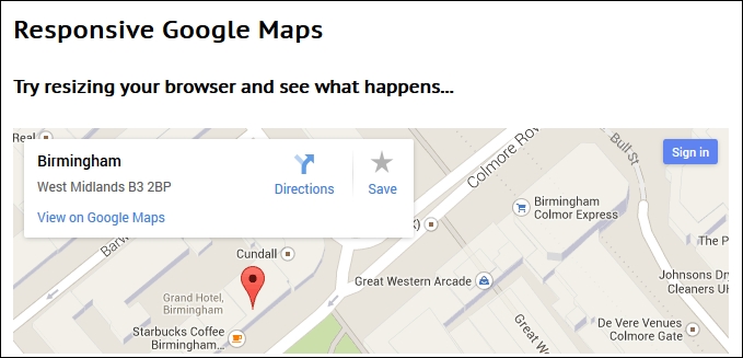
At this point, try resizing the browser window. You will see that the map resizes automatically; the CSS styling that we've added has overridden the standard styles used within Google Maps to make our map responsive and accessible from any device we care to use.
Wow! We've certainly covered a lot over the last few pages! Let's take a moment to recap and let what we've learned sink in.
We began with a look at creating basic fluid images, which are a key to responsive design and should form the mainstay for any responsively designed site. We then covered some key points in the form of what image formats to use, as well as whether we need to use any vendor prefixes in our code. Next up came a discussion on some useful tips to cater to mobile devices. We saw how many are common sense, but particularly apply when designing for mobile devices.
Our first coding example came in the form of a look at catering to high-definition or retina images; we then moved on to examining how we can also use sprites to add responsive media to our projects. We then moved on to looking at sizing our available viewport space using both jQuery and CSS; these we can then use to determine what our media queries should look like. We also covered off how you can use JavaScript to define media queries as well, in the event we need to provide fallback support in our sites.
Moving on, next up we covered a couple of examples of how to switch images responsively—the first using data tags and the second using the upcoming <picture> tags. We also looked at a trick whereby we can provide two images at the same time but rely on the browser to pick which one it can support. We finished our look at using images in the form of a peek at how we can use web icons to serve content responsively and that these scale beautifully without any loss of quality. We then finished of the chapter with a look at two real-world examples in the form of building a responsive carousel and creating responsive maps.
In the next chapter, we'll take a look at the other major element of media content and how to add videos responsively to our sites.
