


In this chapter, we will cover:
Creating custom pop-up labels in a bar chart
Creating a box plot chart for a simple data set
Using the wizard to create a box plot chart
Creating a "Stephen Few" bullet chart
Creating a modified bullet chart in a straight table
Creating a bar chart in a straight table
Creating a Redmond Aged Debt Profile chart
Creating a waterfall chart
Replacing the legend in a line chart with labels on each line
Creating a secondary dimension in a bar chart
Creating a line chart with variable width lines
Brushing parallel coordinates
Using redundant encoding with a scatter chart
Staggering labels in a pie chart
Creating dynamic ad hoc analysis in QlikView
Charts are the most important area of QlikView because they are the main method of information delivery, and QlikView is all about information delivery.
There are a few terms that I want to just define before we get cracking, just to make sure you know what I am talking about.
The basis of every chart is some kind of calculation—you add up some numbers or you count something. In QlikView, these calculations are called expressions. Every chart should have at least one expression. In fact, some charts require more than one expression.
Most of the time, the expression value that is calculated is not presented in isolation. The calculation is normally made for each of the values in a category. This category is generally the values within a field of data, for example, country or month, in the QlikView data model, but it could be a more complex calculated value. Either way, in QlikView charts, this category is called a dimension. Some charts, such as a gauge, would normally never have any dimension. Other charts, such as a pivot table, will often have more than one dimension.
Many simple charts will have just one dimension and one expression. For historical and mathematical reasons, the dimension is sometimes called the X-Axis and the expression is sometimes called the Y-Axis and you may see these terms used in QlikView.
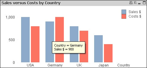
The default pop up for a QlikView bar chart is useful but is not always exactly what you want.
The format is as follows:
Dimension name = value
Expression label = value
Now, we may not like this pop up and wish to display the values differently or add different formats. We may even want to include additional information.
In the preceding example, the pop up shows the value of Sales $ for Germany. If I want to see the value of the Costs $, I need to hover over the Costs $ bar. And what if I wanted to see Margin $ or Margin %?
Create a new QlikView document and save it to a folder. Edit the script (Ctrl + E or the File menu – Edit Script).
Enter the following script:
LOAD * INLINE [
    Country, Sales, Costs
    USA, 1000, 800
    UK, 800, 700
    Germany, 900, 1000
    Japan, 600, 400
];
Tip
Downloading the example code
You can download the example code files for all Packt books you have purchased from your account at http://www.packtpub.com. If you purchased this book elsewhere, you can visit http://www.packtpub.com/support and register to have the files e-mailed directly to you.
Use the following steps to create a new bar chart and add custom labels:
Create a new bar chart with the following characteristics:
Dimension
CountryExpression 1
Sum(Sales)Expression 2
Sum(Costs)Click on Finish.
You should see a bar chart with two bars for each country. Confirm that the pop up on each bar displays as expected.
Open the chart properties.

Click on the Presentation tab and deselect the Pop-up Labels checkbox. Click on OK and note that there are no longer any pop-up labels appearing.
Edit the properties again and click on the Expressions tab. Click on the Add… button and enter the following expression:
='Sales : ' & Num(Sum(Sales), '#,##0')
Click on OK.

Deselect the Bar option for this expression and turn on the Text as Pop-up option. Click on OK.
Edit the properties again and edit the pop-up expression as follows:
= Country & chr(10)
& 'Sales : ' & Num(Sum(Sales), '$(MoneyFormat)') & chr(10)
& 'Costs : ' & Num(Sum(Costs), '$(MoneyFormat)') & chr(10)
& 'Margin : ' & Num(Sum(Sales)-Sum(Costs), '$(MoneyFormat)')
& chr(10) & 'Margin % : '
& Num(1-(Sum(Costs)/Sum(Sales)), '0.0%')
Click on OK on the expression editor and then click on OK to close the properties.
By turning off the Bar option for the expression, QlikView will not try and evaluate the expression as a value and will not try to render a bar for it. By turning on the Text as Pop-up option, we tell QlikView to calculate the text of the expression and display it in the pop up.
We also had to turn off the default pop-up option in the Presentation tab or else it would display both (which might be what you want, have a play with it).
The chr function is useful to know about adding, so called, non-printable characters into your output. chr(10) is a line feed that moves the text onto the next line.
Box plot charts, or box and whisker charts, are often used for displaying statistical mean and quartile information.
This can be useful for seeing how a value ranges across categories by visualizing the median, the twenty-fifth and seventy-fifth percentile, and the outlying values.
With a simple data set, it is easier to create the chart manually than using the wizard that QlikView provides—although there is a slightly strange sequence of actions to go through a "funny"—that you need to know about.
Load the following script:
LOAD * INLINE [
    Country, Value
    USA, 12
    USA, 14.5
    USA, 6.6
    USA, 4.5
    USA, 7.8
    USA, 9.4
    UK, 11.3
    UK, 10.1
    UK, 3.2
    UK, 5.6
    UK, 3.9
    UK, 6.9
];There is a "funny" in here because you have to tell the chart properties that you are using a box plot, then click on OK and then go back in and edit the properties. Here's how you do it:
Create a new combo chart. Select Country as the dimension.
When the expression editor pops up, just enter
0as the expression. It doesn't really matter what you enter, you just need to enter something.Deselect Bar and select Box Plot. At this stage, just click on Finish. Your chart will come up with No Data to Display—this is not a problem.

When you go back into editing the expression properties, you will find five new subexpressions. Enter the following expressions for each of them:
Box Plot Top
Fractile(Value, .75)Box Plot Bottom
Fractile(Value, .25)Box Plot Middle
Fractile(Value, .5)Box Plot Upper Whisker
Max(Value)Min(Value)
Max(Value)
Min(Value)
For the two new expressions, deselect the Line option (or Bar if it is selected) and select the Symbol option. Select Circles from the Symbol drop-down menu:

On the Presentation tab, turn off Show Legend. Set the Symbol Size option to
3 pt:
Check that the box plot looks like the following screenshot:

The five separate values define the different portions of the box plot:
|
Top |
The top of the box |
|
Bottom |
The bottom of the box |
|
Middle |
The median value, the line in the box |
|
Upper Whisker |
The upper outlier value |
|
Lower Whisker |
The lower outlier value |
This recipe is for when you have a simple set of data and you are looking for the statistics across all of the data.
In QlikView, we can have much more control of the values in the box plot, especially where we want to look at averages and percentiles of aggregated data.
As well as box plots, within the combo chart settings there is also a Stock option, which allows us to specify the minimum, the maximum as well as an open and close value.
With a simple data set, we want to see the median (or mean) values and different percentile values across the whole data set. But quite often, we want to look for a particular dimension (for example, Month), at the median and percentiles of the totals for another dimension (for example, Country). So, rather than the median for the individual values (say Sales), which could be quite small or quite large, we want to see the median for the total value by the second dimension.
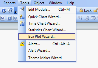
We can create this manually, but this can be achieved quickly using the Box Plot Wizard.
Load the following script:
LOAD * INLINE [
    Country, Value, Month
    USA, 12, 2013-01-01
    USA, 14.5, 2013-01-01
    USA, 6.6, 2013-02-01
    USA, 4.5, 2013-02-01
    USA, 7.8, 2013-03-01
    USA, 9.4, 2013-03-01
    UK, 11.3, 2013-01-01
    UK, 10.1, 2013-01-01
    UK, 3.2, 2013-02-01
    UK, 5.6, 2013-02-01
    UK, 3.9, 2013-03-01
    UK, 6.9, 2013-03-01
];Use the following steps to create a box plot using the wizard:


The wizard takes care of creating the expressions that will be needed for this box plot. In this case, where there is an "aggregator"; that dimension is used as part of an Aggr expression.
There are two approaches to the box plot that can be achieved from the wizard:

Stephen Few designed the bullet chart as a replacement for a traditional gauge.
A traditional gauge takes up a large amount of space to encode, usually, only one value. A bullet chart is linear and can encode more than one value.
The main components of a bullet chart (from Stephen Few's perceptualedge.com) are as follows:
There is no native bullet chart in QlikView. However, we can create one by combining a couple of objects.
Items 1, 2, 4, and 5 can be achieved with a linear gauge chart. The bar, item 3, can then be overlaid using a separate and transparent bar chart.
Load the following script:
LOAD * INLINE [
    Country, Sales, Target
    USA, 1000, 1100
    UK, 800, 1000
    Germany, 800, 700
    Japan, 1000, 1000
];Perform the following steps to create a Stephen Few bullet chart:
Add a new gauge chart. You should add a title and enter text for Title in chart. Click on Next.
There is no dimension in this chart. Click on Next.
Enter the following expression:
Sum(Target)
Click on Next.
There is no sorting (because there is no dimension), so click on Next.
On the Style tab, select a linear gauge and set the orientation to horizontal. Click on Next.

There are a few changes needed in the Presentation tab:
Gauge Settings, Max
Sum(Target) * 1.2Indicator, Mode
Show NeedleIndicator, Style
LineShow Scale,
Show Labels on Every
1Autowidth Segments
Off
Hide Segment Boundaries
On
Hide Gauge Outlines
On
There should be two segments by default, add a third segment by clicking on the Add button. The settings for each segment are as follows:
Segment 1, Lower Bound
0.0Segment 2, Lower Bound
Sum(Target) * 0.5Segment 3, Lower Bound
Sum(Target) * 0.9Apply appropriate colors for each segment (for example, RAG or Dark/Medium/Light gray).
Click on Finish.

Most of the bullet chart elements are now in place. In fact, this type of linear chart may be enough for some uses. Now we need to add the bar chart.
Add a new bar chart. Don't worry about the title (it will be hidden). Turn off Show Title in Chart. Click on Next.
There is no dimension in this chart either. Click on Next.
Add the following expression:
Sum(Sales)
Click on Next.
There is no sort (as there is no dimension). Click on Next.

Select a plain bar type. The orientation should be horizontal. Leave the style at the default of Minimal. Click on Next.

Set the following axis settings:
Hide Axis
On
Static Max
On
Static Max Expression
Sum(Target)*1.2Click on Next.
On the Color tab, set Transparency to 100%. Set the first color to a dark color. Click on Next.
Continue to click on Next until you get to the Layout tab. Set the shadow to No Shadow and the border width to
0. Set the Layer to Top. Click on Next.Turn off the Show Caption option. Click on Finish.

Position the bar chart over the gauge so that the scales match (Ctrl + arrow keys are useful here). The bullet chart is created.
By matching the Static Max setting of the bar and the gauge (to the sum of target * 1.2), we ensure that the two charts will always size the same. The 1.2 factor makes the area beyond the target point of 20 percent of the length of the area before it. This might need to be adjusted for different implementations.
It is also crucial to ensure that the layer setting of the bar chart is at least one above the layer of the gauge chart. The default layer (on the Layout tab) for charts is Normal so, in that situation, you should change the bar chart's layer to Top. Otherwise, use the Custom option to set the layers.
Using techniques such as this to combine multiple QlikView objects can help us create many other visualizations.
The main components of a bullet chart (from Stephen Few's perceptualedge.com) are as follows:
The "traditional" approach is to have bar representing the feature measure and a line representing the comparative measure. However, as long as we have two separate representations, the bar is not absolutely necessary.
In this recipe we will present a modified bullet chart using an inline linear gauge in a straight table. This allows users to view the results across all the values in a dimension.
Load the following script:
LOAD * INLINE [
    Country, Sales, Target
    USA, 1000, 1100
    UK, 800, 1000
    Germany, 800, 700
    Japan, 1000, 1000
];Follow these steps to create a straight table with a modified bullet chart:
Create a new straight table. Set the dimension to be
Country. Add three expressions:Sum(Sales) Sum(Target) Sum(Sales)/Sum(Target)

Change the representation of the third expression to Linear Gauge.
Click on the Gauge Settings button and enter the following settings for the gauge:
Guage Settings, Max
1.5
Indicator, Mode
Show Needle
Indicator, Style
Arrow
Show Scale
Off
Autowidth Segments
Off
Hide Segment Boundaries
Off
Hide Gauge Outlines
On
There should be two segments already there. Configure these settings:
Segment 1, Lower Bound
0.0Segment 2, Lower Bound
1.0Set the color of both segments to be the same. I usually go for a light gray.
Click on OK. Click on Finish to close the chart wizard.

The modified bullet chart should appear in the straight table.
Because we are calculating a percentage here, it is valid to use the same gauge for each dimension (which would not have been valid in a straight table for absolute values).
By using two segments in the linear gauge, the border between them, which we have set to 1 = 100%, presents as a line. This is our target value. The needle of the gauge displays the percentage of sales versus that target.
The user can quickly scan down the table to see the better performing territories. This field is also sortable.
Straight tables are great for displaying numbers. Bar charts are great for showing the information visually. A great thing that you can do in QlikView is combine both—using linear gauges.
Load the following script:
LOAD * INLINE [
    Country, Total Debt, 0-60, 60-180, 180+
    USA, 152, 123, 23, 6
    Canada, 250, 100, 100, 50
    UK, 170, 170, 0, 0
    Germany, 190, 0, 0, 190
    Japan, 90, 15, 25, 50
    France, 225, 77, 75, 73
];Use these steps to create a straight table containing a bar chart:
Create a new straight table. Set the dimension to be
Country. Add two expressions:Sum([Total Debt]) Sum([Total Debt]) / Max(Total Aggr(Sum([Total Debt]), Country))
Set the Total Mode property of the second expression to No Totals.

Change the Representation property of the second expression to Linear Gauge.
Click on the Gauge Settings button and enter the following settings for the gauge:
Guage Settings, Max
1
Indicator, Mode
Fill to Value
Indicator, Style
Arrow
Show Scale
Off
Autowidth Segments
On
Hide Segment Boundaries
On
Hide Gauge Outlines
On
There should be two segments already there. Remove Segment 2, leaving only 1.
Set the color of the segment to an appropriate color. Pastels work well here.
Click on O K. Click on Finish to close the chart wizard.

The AGGR expression returns the maximum value across all the countries. In this example, 250 from Canada. If we then divide the total debt for each country by this maximum value, we will get a ratio with a maximum value of 1. This is exactly what we need to create the bar chart with the linear gauge.
This technique can be utilized anywhere that you need to create a bar chart in a table such as this. The added visual can really bring the numbers to light.
I can't claim that I really created this general type of chart. Someone once said, there is nothing new under the sun. I know that other people have created similar stuff. However, I did create this implementation in QlikView to solve a real business problem for a customer and couldn't find anything exactly like it anywhere else.
This recipe follows on from the previous one (it uses the same data). We are going to extend the straight table to add additional bars to represent the aged debt profile.
Follow these steps to create a Redmond Aged Debt Profile chart:
Open the properties of the chart and go to the Expressions tab. Right-click on the second expression and select Copy from the menu:

Right-click in the blank area below the expressions and select Paste. This will create a new expression with the same properties as the copy:

Repeat the paste operation two more times to create three copies in total.
Modify the three expressions as follows:
Sum([0-60])/Sum([Total Debt])
Sum([60-180])/Sum([Total Debt])
Sum([180+])/Sum([Total Debt])
Click on the Gauge Settings buttons for each and choose a different color from the original bar.
Click on OK when done.

The first column is a bar chart representing the vertical distribution of the total debt for each country. In the three following period columns, we divide each period value by the total debt for that country to get the ratio—the horizontal distribution of that country's debt across the periods. This allows the user to quickly scan down the chart and see which countries have the highest percentage debt in each period.
There a many more situations where this can be used. Anywhere that you might consider using a stacked bar chart, consider using a Redmond instead.
A waterfall chart is a type of bar chart used to show a whole value and the breakdown of that value into other subvalues, all in one chart. We can implement it in QlikView using the Bar Offset option.
In this example, we are going to demonstrate the chart showing a profit and loss breakdown.
Load the following script:
LOAD * INLINE [
    Category, Value
    Sales, 62000
    COGS, 25000
    Expenses, 27000
    Tax, 3000
];The following steps show you how to create a waterfall chart:
Create a new bar chart. There is no dimension in this chart. We need to add three expressions:
Sales $
Sum({<Category={'Sales'}>} Value)COGS $
Sum({<Category={'COGS'}>} Value)Expenses $
Sum({<Category={'Expenses'}>} Value)Tax $
Sum({<Category={'Tax'}>} Value)Net Profit $
Sum({<Category={'Sales'}>} Value)-Sum({<Category={'COGS','Expenses','Tax'}>} Value)Once you have added the expressions, click on Finish.

Edit the properties of the chart. On the Expressions tab, click on the + sign beside the COGS $ expression. Click on the Bar Offset option. Enter the following expression into the Definition box:
Sum({<Category={'Sales'}>} Value)
-Sum({<Category={'COGS'}>} Value)
Repeat for the Expenses $ expression. Enter the following expression for the Bar Offset:
Sum({<Category={'Sales'}>} Value)
-Sum({<Category={'COGS', 'Expenses'}>} Value)
Repeat once more for the Tax $ expression. Enter the following expression for the bar offset:
Sum({<Category={'Sales'}>} Value)
-Sum({<Category={'COGS', 'Expenses', 'Tax'}>} Value)
Click on OK to save the changes.
The waterfall chart should look like the following screenshot:

One of the problems with a standard QlikView line chart is that the legend is somewhat removed from the chart, and it can be difficult to keep going back and forth between the legend and the data to work out which line is which.
A way of resolving this is to remove the legend and replace it with labels on each line.
Load the following script:
CrossTable(Country, Sales)
LOAD * INLINE [
    Date, USA, UK, Japan, Germany
    2013-01-01, 123, 100, 80, 40
    2013-02-01, 134, 111, 75, 50
    2013-03-01, 155,  95, 70, 60
    2013-04-01, 165,  85, 88, 50
    2013-05-01, 154, 125, 90, 70
    2013-06-01, 133, 110, 75, 99
];These steps will create a line chart with labels on each line instead of a legend:
Add a new line chart. Add two dimensions,
DateandCountry.Add the following expression:
Dual(
   If(Date=Max(total Date), Country, ''),
   Sum(Sales)
)
On the Expressions tab, ensure that the Values on Data Points option is checked.
Click on Next until you get to the Presentation tab. Deselect the Show Legend option.
Click on Finish on the wizard.

The Dual function will only return a text value when the date matches the maximum date. Otherwise, it is blank. So, when we enable the Values on Data Points option, it only displays a value for the last data point.
It is critical that you don't set a number format for the expression. The Expression Default option means that it will use the text from the dual.
Dual is a really useful function to allow us to define exactly what will be displayed on labels such as this. It is also really useful for sorting text values in a specific order.
Within QlikView, there is the possibility of displaying a secondary X-axis in a bar chart. This can be useful for displaying some hierarchical data, for example, year and month. In fact, it only really works where there is a strict hierarchy such as this. Each of the secondary values would exist in each of the primary values (as each month occurs in each year).
Load the following script:
CrossTable(Year, Sales)
LOAD * INLINE [
    Month, 2011, 2012, 2013
    1, 123, 233, 376
    2, 423, 355, 333
    3, 212, 333, 234
    4, 344, 423
    5, 333, 407
    6, 544, 509
    7, 634, 587
    8, 322, 225
    9, 452, 523
    10, 478, 406
    11, 679, 765
    12, 521, 499
];Follow these steps to create a bar chart with a secondary dimension:
Create a new bar chart with
YearandMonthas dimensions and the expression:Sum(Sales)

Edit the chart and add a second expression with just a value of 0:

A new legend will appear.
Open the properties and go to the Presentation tab. Deselect the Show Legend option:

Note that all subvalues (months) are displayed under all the primary values (years).

Edit the properties of the chart and go to the Axes tab. Set the Secondary Dimension Labels to the / option as shown in the following screenshot:

Note that the labels for the secondary dimension are now at an angle:

QlikView will automatically add the secondary dimension to a bar chart when:
There are more than two dimensions
There are two dimensions and there are two or more bar expressions
If there are two expressions, the bars will automatically stack. By setting an expression with a value of 0, the second bars will not appear. However, we do need to remove the legend.
This can be useful in a number of situations. However, as previously noted, the two dimensions must be in a strict hierarchy. If there are values that don't exist under all the primary dimensions, they will be represented under all of them anyway and that may not achieve the results that you were hoping for.
This is an interesting technique that has some rare enough applications. However, it could be a useful one to have in your arsenal.
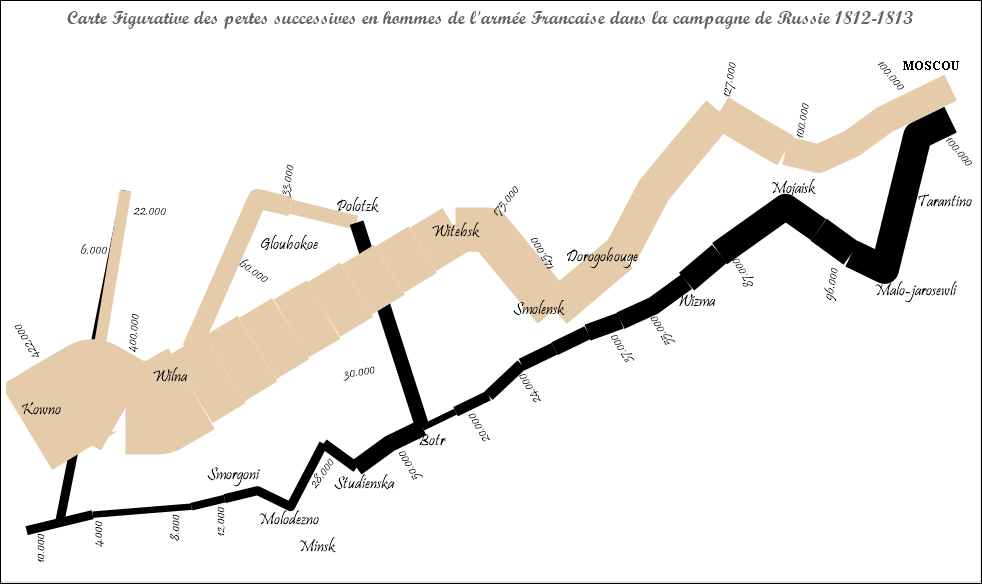
I used it to create my Homage to Minard (http://qliktips.blogspot.ie/2012/06/homage-to-minard.html).
Load the following script:
LOAD * INLINE [
    Country, Sales, Target, Month
    USA, 1000, 1500, 2013-01-01
    USA, 1200, 1600, 2013-02-01
    USA, 3500, 1800, 2013-03-01
    USA, 2500, 2000, 2013-04-01
    USA, 3000, 2500, 2013-05-01
    USA, 2500, 3000, 2013-06-01
    UK, 1000, 1500, 2013-01-01
    UK, 1700, 1600, 2013-02-01
    UK, 2200, 1800, 2013-03-01
    UK, 2000, 2000, 2013-04-01
    UK, 1300, 2500, 2013-05-01
    UK, 1900, 3000, 2013-06-01
];These steps will show you how to create a line chart with variable width lines:
Create a new line chart. Add
MonthandCountryas dimensions.On the Expressions tab, add this expression:
Sum(Sales)

Click on the + sign beside the expression and enter this expression for the Line Style property:
='<W' &
Round(0.5 + (7 * Sum(Sales)/Sum(Target)), 0.1)
& '>'
Still on the Expressions tab, in the Display Options section, select Symbol and select Dots from the drop-down menu:

Set the Line Width property to 1 pt and the Symbol Size property to 2 pt. Click on Finish:

The chart shows the values as normal; however, the lines are thicker where performance versus target is better:

The Line Style property allows you to specify a width attribute for the line chart. This is a tag in the format:
<Wn.n>
Where, n.n is a number between 0.5 and 8.0.
We use the Round function here to round the value down to one decimal place.
We add the dots style symbol because they help fill in some gaps in the lines, especially where there are sharper corners.
Parallel coordinates is a long established method of visualizing multivariate data. QlikView will display a parallel coordinate chart and a user can interact with the data, but sometimes it is useful to allow the user to "brush" the data, selecting different values and seeing those values versus the whole of the data.
We can do this by using two almost identical charts with one being transparent and sitting over the other.
We need to download some data for this from the United States Census QuickFacts website. Go to http://quickfacts.census.gov/qfd/download_data.html and download the first three files on offer:
|
Files |
Description |
|---|---|
|
|
Raw data |
|
|
Information on the different metrics in the raw data |
|
|
List of the U.S. counties |
Load the following script:
// Cross table the raw data into a temp table
Temp_Data:
CrossTable(MetricCode, Value)
LOAD *
FROM
DataSet.txt
(txt, codepage is 1252, embedded labels, delimiter is ',', msq);

// Load the temp table into our data table.
// Only load county information.
// Only load RHI data (Resident Population).
Data:
NoConcatenate
Load
  fips,
  MetricCode,
  Value
Resident Temp_Data
Where Mod(fips, 1000) <> 0  // Only County
And MetricCode Like 'RHI*'; // Only RHI

// Drop the temporary table
Drop Table Temp_Data;

// Load the location information.
// Use LEFT to only load locations that match Data.
Location:
Left Keep (Data)
LOAD @1:5 as fips,
     @6:n as Location
FROM
FIPS_CountyName.txt
(fix, codepage is 1252);

// Load the Metric information
// Use LEFT to only load metrics that match Data.
Metrics:
Left Keep (Data)
LOAD @1:10 As MetricCode,
     Trim(SubField(SubField(@11:115, ':', 2), ',', 1)) as Metric,
     @116:119 as Unit,
     @120:128 as Decimal,
     @129:140 as US_Total,
     @141:152 as Minimum,
     @153:164 as Maximum,
     @165:n as Source
FROM
DataDict.txt
(fix, codepage is 1252, embedded labels);To create a parallel coordinates chart with brushing, perform the following steps:
Add a list box for Location onto the layout.
Create a new line chart. Add
MetricandLocationas dimensions.Add the following expression:
Avg({<Location={*}>} Value)Label the expression as
%.Click on the + sign beside the expression and enter the following expression for Background Color:
LightGray()
On the Sort tab, set the sort for the Metric dimension to Load Order and Original as shown in the following screenshot:

On the Presentation tab, turn off the Suppress Zero-Values and Suppress Missing options. Also, turn off the Show Legend option:

On the Axes tab, turn on the Static Max option and set it to
101. Set the Primary Dimension Labels option to /. Turn on the Show Grid option under Dimension Axis:
Click on Finish.

Right-click on the chart and select Clone from the menu. Position the new chart so it exactly overlaps the first. Edit the properties.
On the Expressions tab, modify the expression:
Avg(Value)
Click on the + sign beside the expression and change the Background Color property to:
Blue()
On the Colors tab, set the Transparency option to
100%.On the Layout tab, set the Layer option to Top. Set the Show option to Conditional and enter the following expression:
GetSelectedCount(Location)>0


The transparent chart with the slightly different color and expression is the trick here. When a selection is made, our chart overlays the first chart and displays the "brush". The underlying chart will remain the same as we have a set that excludes selections in the Location field.
As far as the user is concerned, there is only one chart being displayed.
Using transparent charts to overlay another chart is a great technique to use when the particular visualization is just not available in QlikView.
It is very typical to display values for categorical dimensions using a bar chart. This is a very powerful and simple way to understand a chart. The length of the bars models the values in a very intuitive way.
Sometimes, however, it can be valuable to add an additional level of encoding to gain additional insight.
In this example, we are going to add space as an additional encoding. We can do this using a scatter chart.
Load the following script:
LOAD * INLINE [
    Country, Sales
    USA, 100000
    UK, 60000
    Germany, 50000
    France, 45000
    Canada, 30000
    Mexico, 20000
    Japan, 15000
];Use the following steps to create a scatter chart demonstrating redundant encoding:
Create a new scatter chart.
Add a calculated dimension with the following expression:
=ValueList(1,2)
Deselect the Label and Show Legend options for this dimension.
Add
Countryas the second dimension.On the Expressions tab, add two expressions:
Sum(Sales)
If(ValueList(1,2)=1, 0, Sum(Sales))
Both expressions can be labeled as Sales $:
On the Sort tab, select the Country dimension and turn on the Expression option. Enter the expression:
Sum(Sales)

The direction should be Descending.
Go onto the Axes tab and select Hide Axis under the X Axis options.
On the Numbers tab, format both expressions as Integer.
Click on Finish.

The chart displays with apparent bars and spacing between them. We can quickly see how much bigger the gap is between the USA and other countries. We can also identify clusters of similarly performing countries.
If a scatter chart has two dimensions, it will change from displaying bubbles to displaying lines between the values in the first dimension.
The first expression here positions where the bars will exist. It is our space encoding.
The second expression has a test to see if it is ValueList = 1, which sets a value of 0, or ValueList = 2, which sets the Sales $ value.
This is an example of the use of pseudo dimensions using ValueList. This can be a very powerful function in dimensions.
The more frequent first dimension of a multidimensional scatter chart would be a date dimension, such as a year. This gives you the option to show lines going from year to year. Additional options in Presentation allow such items as arrows.
I am not a big fan of using pie charts for many segments. The more segments that there are, the less easy it is to see the data. As the segments get smaller, even the labels get smudged into each other.
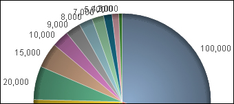
If you absolutely, positively must create this type of chart, you need to have a better strategy for the labels.
Load the following script:
LOAD * INLINE [
    Country, Sales
    USA, 100000
    Canada, 50000
    Mexico, 25000
    UK, 70000
    Germany, 20000
    Brazil, 15000
    France, 10000
    Japan, 9000
    China, 8000
    Australia, 7000
    South Korea, 5000
    New Zealand, 4000
    Italy, 2000
];Follow these steps to create a pie chart with staggered labels:
Create a new pie chart.
On the Expressions tab, add the following expression:
Dual(
  Country & '-' &
  Num(sum(Sales), '#,##0') &
  Repeat(chr(13)&chr(10), rank(Sum(Sales))-6),
  sum(Sales)
)
Select the Values on Data Points option.
On the Sort tab, select the Y-Value option. Confirm Descending as the direction.
On the Presentation tab, deselect the Show Legend option.
Click on Finish.

The magic here is the Repeat function:
Repeat(chr(13)&chr(10), rank(Sum(Sales))-6)
The ASCII characters 13 and 10 give us a carriage return and line feed. Note that there is a Rank()-6 here. Basically, the repeat doesn't kick in until you get to the seventh ranked value in the dimension. There is no reason to start staggering for the earlier values.
QlikView has some great tools to allow users to generate their own content. However, sometimes users don't want to learn those skills and would like to quickly just to be able to analyze data.
In this recipe, we will show how to create an easy-to-use dynamic analysis tool using some of the features from QlikView 11.
Load the following script:
// Set the Hide Prefix
Set HidePrefix='%';

// Load the list of dimensions
DimensionList:
Load * Inline [
  %Dimensions
  SalesPerson
  Country
  City
  Product
];

// Load the list of expressions
ExpressionList:
Load * Inline [
  %ExpressionName
  Total Sales
  Order Count
  Avg. Sales
];

// Load the Sales data
Data:
LOAD * INLINE [
    SalesPerson, Country, City, Product, Sales, Orders
    Joe, Germany, Berlin, Bricks, 129765, 399
    Joe, Germany, Berlin, Brogues, 303196, 5842
    Joe, Germany, Berlin, Widgets, 64358, 1603
    Joe, Germany, Berlin, Woggles, 120587, 670
    Joe, Germany, Frankfurt, Bricks, 264009, 2327
    Joe, Germany, Frankfurt, Brogues, 369565, 3191
    Joe, Germany, Frankfurt, Widgets, 387441, 5331
    Joe, Germany, Frankfurt, Woggles, 392757, 735
    Joe, Germany, Munich, Bricks, 153952, 1937
    Joe, Germany, Munich, Brogues, 319644, 645
    Joe, Germany, Munich, Widgets, 47616, 2820
    Joe, Germany, Munich, Woggles, 105483, 3205
    Brian, Japan, Osaka, Bricks, 17086, 281
    Brian, Japan, Osaka, Brogues, 339902, 2872
    Brian, Japan, Osaka, Widgets, 148935, 1864
    Brian, Japan, Osaka, Woggles, 142033, 2085
    Brian, Japan, Tokyo, Bricks, 161972, 1707
    Brian, Japan, Tokyo, Brogues, 387405, 2992
    Brian, Japan, Tokyo, Widgets, 270573, 3212
    Brian, Japan, Tokyo, Woggles, 134713, 5522
    Brian, Japan, Yokohama, Bricks, 147943, 4595
    Brian, Japan, Yokohama, Brogues, 405429, 6844
    Brian, Japan, Yokohama, Widgets, 266462, 3158
    Brian, Japan, Yokohama, Woggles, 477315, 5802
    Joe, UK, Birmingham, Bricks, 23150, 1754
    Joe, UK, Birmingham, Brogues, 200568, 1763
    Joe, UK, Birmingham, Widgets, 262824, 617
    Joe, UK, Birmingham, Woggles, 173118, 5359
    Joe, UK, London, Bricks, 621409, 712
    Joe, UK, London, Brogues, 504268, 2873
    Joe, UK, London, Widgets, 260335, 1313
    Joe, UK, London, Woggles, 344435, 743
    Joe, UK, Manchester, Bricks, 401928, 1661
    Joe, UK, Manchester, Brogues, 7366, 2530
    Joe, UK, Manchester, Widgets, 6108, 5106
    Joe, UK, Manchester, Woggles, 269611, 4344
    Mary, USA, Boston, Bricks, 442658, 3374
    Mary, USA, Boston, Brogues, 147127, 3129
    Mary, USA, Boston, Widgets, 213802, 1604
    Mary, USA, Boston, Woggles, 395072, 1157
    Michael, USA, Dallas, Bricks, 499805, 3378
    Michael, USA, Dallas, Brogues, 354623, 18
    Michael, USA, Dallas, Widgets, 422612, 2130
    Michael, USA, Dallas, Woggles, 217603, 2612
    Mary, USA, New York, Bricks, 313600, 6468
    Mary, USA, New York, Brogues, 559745, 1743
    Mary, USA, New York, Widgets, 94558, 2910
    Mary, USA, New York, Woggles, 482012, 3173
    Michael, USA, San Diego, Bricks, 95594, 4214
    Michael, USA, San Diego, Brogues, 24639, 3337
    Michael, USA, San Diego, Widgets, 107683, 5257
    Michael, USA, San Diego, Woggles, 221065, 5058
];These steps show you how to create dynamic ad hoc analysis in QlikView:
Open the Select Fields tab of the sheet properties. Select on the Show System Fields option (so you can see the hidden fields). Add a list box on the display for the %Dimensions and %ExpressionName fields.
Create a new bar chart.
Set the title of the chart to
Sales Analysis. Turn on Fast Type Change for Bar Chart, Pie Chart, Straight Table, and Block Chart. Click on Next.Add the four dimensions –
Country,City,Product, andSalesPerson. For each dimension, turn on Enable Condition and set the following expressions for each of them:Dimension
Expression
Country=Alt(WildMatch(GetFieldSelections(%Dimensions, '|'),'*Country*'),0)City=Alt(WildMatch(GetFieldSelections(%Dimensions, '|'),'*City*'),0Product=Alt(WildMatch(GetFieldSelections(%Dimensions, '|'),'*Product*'),0)SalesPerson=Alt(WildMatch(GetFieldSelections(%Dimensions, '|'),'*SalesPerson*'),0)Add the following three expressions and set Conditional on each of them:
Expression
Conditional Expression
Sum(Sales)
=Alt(WildMatch(GetFieldSelections(%ExpressionName, '|'),'*Total Sales*'), 0)Sum(Orders)
=Alt(WildMatch(GetFieldSelections(%ExpressionName, '|'),'*Order Count*'), 0)Sum(Sales)/
Sum(Orders)
=Alt(WildMatch(GetFieldSelections(%ExpressionName, '|'),'*Avg. Sales*'), 0)On the Style tab, set the orientation to Horizontal.
On the Presentation tab, turn on the Enable X-Axis Scrollbar option and set When Number of Items Exceeds to
8.On the Layout tab, deselect the Size to Data option.
On the Caption tab, turn off the Allow Minimize and Allow Maximize options. Click on Finish.
Add a list box for the four main dimensions. Add a container object for the four list boxes. Add a Current Selections box.
Lay the objects out for ease of use.

There are a couple of things going on here.
First, in the load script, we are setting a HidePrefix variable. Once this is set, any field that has this value as its prefix will become a hidden or system field. The benefit of using this for our dimension and expression selectors is that any selections in hidden fields will not appear in the Current Selections box.
The next thing that concerns us is the conditional functions. I am using the GetFieldSelections function to return the list of values that are selected. We use WildMatch to check if our dimension or expression should be shown. The whole expression is wrapped in an Alt function because if there are no values selected at all, the GetFieldSelections function returns null, so we need to return 0 in that case.


