Home Web-development Mobile First Design with HTML5 and CSS3

Mobile First Design with HTML5 and CSS3

By Jason Gonzales
books-svg-icon Book
Subscription
$10 p/m for first 3 months. $15.99 p/m after that. Cancel Anytime!
What do you get with a Packt Subscription?
This book & 7000+ ebooks & video courses on 1000+ technologies
60+ curated reading lists for various learning paths
50+ new titles added every month on new and emerging tech
Early Access to eBooks as they are being written
Personalised content suggestions
Customised display settings for better reading experience
50+ new titles added every month on new and emerging tech
Playlists, Notes and Bookmarks to easily manage your learning
Mobile App with offline access
What do you get with a Packt Subscription?
This book & 6500+ ebooks & video courses on 1000+ technologies
60+ curated reading lists for various learning paths
50+ new titles added every month on new and emerging tech
Early Access to eBooks as they are being written
Personalised content suggestions
Customised display settings for better reading experience
50+ new titles added every month on new and emerging tech
Playlists, Notes and Bookmarks to easily manage your learning
Mobile App with offline access
What do you get with eBook + Subscription?
Download this book in EPUB and PDF formats, plus a monthly download credit
This book & 6500+ ebooks & video courses on 1000+ technologies
60+ curated reading lists for various learning paths
50+ new titles added every month on new and emerging tech
Early Access to eBooks as they are being written
Personalised content suggestions
Customised display settings for better reading experience
50+ new titles added every month on new and emerging tech
Playlists, Notes and Bookmarks to easily manage your learning
Mobile App with offline access
What do you get with a Packt Subscription?
This book & 6500+ ebooks & video courses on 1000+ technologies
60+ curated reading lists for various learning paths
50+ new titles added every month on new and emerging tech
Early Access to eBooks as they are being written
Personalised content suggestions
Customised display settings for better reading experience
50+ new titles added every month on new and emerging tech
Playlists, Notes and Bookmarks to easily manage your learning
Mobile App with offline access
What do you get with eBook?
Download this book in EPUB and PDF formats
Access this title in our online reader
DRM FREE - Read whenever, wherever and however you want
Online reader with customised display settings for better reading experience
What do you get with video?
Download this video in MP4 format
Access this title in our online reader
DRM FREE - Watch whenever, wherever and however you want
Online reader with customised display settings for better learning experience
What do you get with video?
Stream this video
Access this title in our online reader
DRM FREE - Watch whenever, wherever and however you want
Online reader with customised display settings for better learning experience
What do you get with Audiobook?
Download a zip folder consisting of audio files (in MP3 Format) along with supplementary PDF
What do you get with Exam Trainer?
Flashcards, Mock exams, Exam Tips, Practice Questions
Access these resources with our interactive certification platform
Mobile compatible-Practice whenever, wherever, however you want
BUY NOW $10 p/m for first 3 months. $15.99 p/m after that. Cancel Anytime!
Subscription
What do you get with a Packt Subscription?
This book & 7000+ ebooks & video courses on 1000+ technologies
60+ curated reading lists for various learning paths
50+ new titles added every month on new and emerging tech
Early Access to eBooks as they are being written
Personalised content suggestions
Customised display settings for better reading experience
50+ new titles added every month on new and emerging tech
Playlists, Notes and Bookmarks to easily manage your learning
Mobile App with offline access
What do you get with a Packt Subscription?
This book & 6500+ ebooks & video courses on 1000+ technologies
60+ curated reading lists for various learning paths
50+ new titles added every month on new and emerging tech
Early Access to eBooks as they are being written
Personalised content suggestions
Customised display settings for better reading experience
50+ new titles added every month on new and emerging tech
Playlists, Notes and Bookmarks to easily manage your learning
Mobile App with offline access
What do you get with eBook + Subscription?
Download this book in EPUB and PDF formats, plus a monthly download credit
This book & 6500+ ebooks & video courses on 1000+ technologies
60+ curated reading lists for various learning paths
50+ new titles added every month on new and emerging tech
Early Access to eBooks as they are being written
Personalised content suggestions
Customised display settings for better reading experience
50+ new titles added every month on new and emerging tech
Playlists, Notes and Bookmarks to easily manage your learning
Mobile App with offline access
What do you get with a Packt Subscription?
This book & 6500+ ebooks & video courses on 1000+ technologies
60+ curated reading lists for various learning paths
50+ new titles added every month on new and emerging tech
Early Access to eBooks as they are being written
Personalised content suggestions
Customised display settings for better reading experience
50+ new titles added every month on new and emerging tech
Playlists, Notes and Bookmarks to easily manage your learning
Mobile App with offline access
What do you get with eBook?
Download this book in EPUB and PDF formats
Access this title in our online reader
DRM FREE - Read whenever, wherever and however you want
Online reader with customised display settings for better reading experience
What do you get with video?
Download this video in MP4 format
Access this title in our online reader
DRM FREE - Watch whenever, wherever and however you want
Online reader with customised display settings for better learning experience
What do you get with video?
Stream this video
Access this title in our online reader
DRM FREE - Watch whenever, wherever and however you want
Online reader with customised display settings for better learning experience
What do you get with Audiobook?
Download a zip folder consisting of audio files (in MP3 Format) along with supplementary PDF
What do you get with Exam Trainer?
Flashcards, Mock exams, Exam Tips, Practice Questions
Access these resources with our interactive certification platform
Mobile compatible-Practice whenever, wherever, however you want
About this book

The mobile first design philosophy aims to develop websites that will be lean and fast on small screens without sacrificing a tablet or desktop experience. Using HTML5, CSS3, and simple, standardized modern web tools you can make one site to rule them all.

Mobile First Design with HTML5 and CSS3 will teach you the tools you need to make a modern, standards-based web page that displays beautifully on nearly any web browser—essential knowledge for anyone who makes websites!

In this book, you will learn how to set up a project from scratch and quickly get up and running with a full portfolio website that will form the base for making almost any kind of web page. Learn to develop web pages that fit the web conventions we all have to conform to. You will learn how to make responsive image slideshows; image galleries with detail pages; and bold, eye-catching banners and forms. Best of all, you will learn how to make these things fast without compromising quality.

This book will walk you through the process step by step with all the code required, as well as the thinking that goes behind planning a mobile first responsive website.

Publication date:
September 2013
Publisher
Packt
Pages
122
ISBN
9781849696463


Chapter 1. Mobile First – How and Why?

If you are in the business of building/maintaining a company's website or building web properties for an agency, you can and should be using mobile first strategies. Why? Because it is of value to your end product. You will end up with a website that is used by most of the people on all the devices and browsers possible.

This book is targeted at both beginner and intermediate developers as well as designers. It is also intended to be for those in business and management who want to gain a deeper understanding of what is possible (and, by extension, what may not be practical) with modern tools and strategies on the web. The code examples in this book, when used step-by-step, should help anyone with even basic development skills to get a deeper understanding of what is possible as well as how it is possible. Of course I love building things and I do it every day, but for those of us who also have to strategize and educate clients and coworkers, having procedural knowledge of how to make a mobile first website is qualitatively better than only having the knowledge of theory and concepts.


What is Responsive Web Design?


Responsive Web Design (RWD) is a set of strategies used to display web pages on screens of varying sizes. These strategies leverage, among other things, features available in modern browsers as well as a strategy of progressive enhancement (rather than graceful degradation). What's with all the buzzwords? Well, again, once we dig into the procedures and the code, it will all get a lot more meaningful. But here is a quick example to illustrate a two-way progressive enhancement that is used in RWD.

Let's say you want to make a nice button that is a large target and can be reliably pressed with big, fat clumsy thumbs on a wide array of mobile devices. In fact, you want that button to pretty much run the full spectrum of every mobile device known to humans. This is not a problem. The following code is how your (greatly simplified) HTML will look:

<!DOCTYPE html>
  <head>
    <link rel="stylesheet" href="css/main.css">
  </head>
  <body>
    <button class="big-button">Click Me!</button>
  </body>
</html>

The following code is how your CSS will look:

.big-button {
  width: 100%;
  padding: 8px 0;
  background: hotPink;
  border: 3px dotted purple;
  font-size: 18px;
  color: #fff;
  border-radius: 20px;
  box-shadow: #111 3px 4px 0px;
}

Tip

Downloading the example code

You can download the example code files for all Packt books you have purchased from your account at http://www.PacktPub.com. If you purchased this book elsewhere, you can visit http://www.PacktPub.com/support and register to have the files e-mailed directly to you.

So this gets you a button that stretches the width of the document's body. It's also hot pink with a dotted purple border and thick black drop shadow (don't judge my design choices).

Here is what is nice about this code. Let's break down the CSS with some imaginary devices/browsers to illustrate some of the buzzwords in the first paragraph of this section:

  • Device one (code name: Goldilocks): This device has a modern browser, with screen dimensions of 320 x 480 px. It is regularly updated, so is highly likely to have all the cool browser features you read about in your favorite blogs.

  • Device two (code name: Baby Bear): This device has a browser that partially supports CSS2 and is poorly documented, so much so that you can only figure out which styles are supported through trial and error or forums. The screen is 320 x 240 px. This describes a device that predated the modern adoption levels of browsing the web on a mobile but your use case may require you to support it anyway.

  • Device three (code name: Papa Bear): This is a laptop computer with a modern browser but you will never know the screen dimensions since the viewport size is controlled by the user.

Thus, Goldilocks gets the following display:

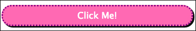
Because it is all tricked out with full CSS3 feature, it will render the rounded corners and drop shadow.

Baby Bear, on the other hand, will only get square corners and no drop shadow (as seen in the previous screenshot) because its browser can't make sense of those style declarations and will just do nothing with them. It's not a huge deal, though, as you still get the important features of the button; it stretches the full width of the screen, making it a big target for all the thumbs in the world (also, it's still pink).

Papa Bear gets the button with all the CSS3 goodies too.

That said, it stretches the full width of the browser no matter how absurdly wide a user makes his/her browser. We only need it to be about 480 px wide to make it big enough for a user to click and look reasonable within whatever design we are imagining. So in order to make that happen, we will take advantage of a nifty CSS3 feature called @media queries. We will use these extensively throughout this book and make your stylesheet look like this:

.big-button {
  width: 100%;
  padding: 8px 0;
  background: hotPink;
  border: 3px dotted purple;
  font-size: 18px;
  color: #fff;
  border-radius: 20px;
  box-shadow: #111 3px 3px 0px;
}

@media only screen and (min-width: 768px){
  .big-button { 
    width: 480px;
  }
}

Now if you were coding along with me and have a modern browser (meaning a browser that supports most, if not all, features in the HTML5 specification, more on this later), you could do something fun. You can resize the width of your browser to see the start button respond to the @media queries. Start off with the browser really narrow and the button will get wider until the screen is 768 px wide; beyond that the button will snap to being only 480 px. If start off with your browser wider than 768 px, the button will stay 480 px wide until your browser width is under 768 px. Once it is under this threshold, the button snaps to being full width.

This happens because of the media query. This query essentially asks the browser a couple of questions. The first part of the query is about what type of medium it is (print or screen). The second part of the query asks what the screen's minimum width is. When the browser replies yes to both screen and min-width 768px, the conditions are met for applying the styles within that media query. To say these styles are applied is a little misleading. In fact, the approach actually takes advantage of the fact that the styles provided in the media query can override other styles set previously in the stylesheet. In our case, the only style applied is an explicit width for the button that overrides the percentage width that was set previously.

So, the nice thing about this is, we can make one website that will display appropriately for lots of screen sizes. This approach re-uses a lot of code, only applying styles as needed for various screen widths. Other approaches for getting usable sites to mobile devices require maintaining multiple codebases and having to resort to device detection, which only works if you can actually detect what device is requesting your website. These other approaches can be fragile and also break the Don't Repeat Yourself (DRY) commandment of programming.

This book is going to go over a specific way of approaching RWD, though. We will use the 320 and Up framework to facilitate a mobile first strategy. In short, this strategy assumes that a device requesting the site has a small screen and doesn't necessarily have a lot of processing power. 320 and Up also has a lot of great helpers to make it fast and easy to produce features that many clients require on their sites. But we will get into these details as we build a simple site together.

Note

Take note, there are lots of frameworks out there that will help you build responsive sites, and there are even some that will help you build a responsive, mobile first site. One thing that distinguishes 320 and Up is that it is a tad less opinionated than most frameworks. I like it because it is simple and eliminates the busy work of setting up things one is likely to use for many sites. I also like that it is open source and can be used with static sites as well as any server-side language.


Prerequisites


Before we can start building, you need to download the code associated with this book. It will have all the components that you will need and is structured properly for you. If you want 320 and Up for your own projects, you can get it from the website of Andy Clarke (he's the fellow responsible for 320 and Up) or his GitHub account. I also maintain a fork in my own GitHub repo.

My GitHub Fork

https://github.com/jasongonzales23/320andup

That said, the simplest route to follow along with this book is to get the code I've wrapped up for you from: https://github.com/jasongonzales23/mobilefirst_book


Summary


In this chapter, we looked at a simple example of how responsive web design strategies can serve up the same content to screens of many sizes and have the layout adjust to the screen it is displayed on. We wrote a simple example of that for a pink button and got a link to 320 and Up, so we can get started building an entire mobile first-responsive website.

About the Author
  • Jason Gonzales

    Jason Gonzales has worked as a musician and an English teacher, but frontend engineering is his passion. He is a self-taught engineer and an obsessive learner and researcher. He's been working on frontends for over seven years, but also does full-stack work and lots of fretting over making sites that have awesome user experiences. This keeps him learning pretty much on a daily basis, which is how he likes it.

    Browse publications by this author
Latest Reviews (1 reviews total)
The author relies heavily on a Mac-based application and truly leaves Windows users screwed, and I am sure there are more than a few of us. The requirements/recommendations for really being able to use the book stated that HTML and CSS knowledge was necessary. It said NOTHING about CSS pre-processors, and that, too, was important to know. Now, I'm part-way through the book and I have to find some way to find/install a pre-processing application AND learn how to use it. That isn't learning. That is frustrating someone who had been motivated to learn. I'll think twice about setting myself up for another waste of time like this one, and that means no more Packt purchases.
Mobile First Design with HTML5 and CSS3
Unlock this book and the full library FREE for 7 days
Start now