


 Download code from GitHub
Humans began to record things long before writing systems were created. When the number and diversity of things to remember outgrew the capacity of human memory, we began to use external devices to register quantitative information. Clay tokens were used as early as 8000-7500 BC to represent commodities like measures of wheat, livestock, and even units of man labor. These objects were handy to perform operations that would have been difficult to do with the real-life counterparts of the tokens; distribution and allocation of goods became easier to perform. With time, the tokens became increasingly complex, and soon, the limitations of the complex token system were identified and the system began to be replaced with simpler yet more abstract representations of quantities, thereby originating the earlier systems of writing.
Keeping records has always had a strong economic and practical drive. Having precise accounts of grains and pastures for the livestock allowed people to plan rations for the winter, and knowing about seasons and climate cycles allowed people to determine when to plant and when to harvest. As we became better at counting and registering quantitative information, trading with other nations and managing larger administrative units became possible, thereby providing us with access to goods and knowledge from other latitudes. We keep records because we think it's useful. Knowing what we have allows us to better distribute our assets, and knowing the past allows us to prepare for the future.
Today, we register and store more data than ever. Imagine that you want to go out for a morning cup of coffee. If you pay in cash, the date, price of the coffee, and the kind of coffee will be recorded before your coffee was actually prepared. These records will feed the accounting and stock systems of the store, being aggregated and transformed to financial statements, staff performance reports, and taxes to be paid by the store. Paying with credit card will generate a cascade of records in the accounting system of your bank. We measure things hoping that having the information will help us to make better decisions and to improve in the future.
History demonstrates that gathering and understanding data can help to solve relevant problems. An example of this is the famous report of John Snow about the Broad Street cholera outbreak. On August 31, 1854, a major outbreak of cholera was declared in the Soho district of London. Three days later, 127 people died from the disease. At the time, the mechanism of transmission of the cholera was not understood. The germ theory was yet to exist, and the mainstream theory was that the disease spread by a form of bad air. The physician, John Snow, began to investigate the case, collecting and classifying facts, recording deaths and their circumstances as well as a great number of testimonials. Refer to the following screenshot:

Details of the original map made for Snow, displaying the deaths by cholera in the Soho district
He gave special attention to the exceptions in the map and noticed that neither the workhouse inmates nor the brewery workers had been affected. The exceptions became further proof as he discovered that about 70 employees who worked in the brewery drank only beer made with water from a pump inside the walls of the brewery. In the workhouse, which also had its own water pump, only 5 out of 500 died, and further investigation revealed that the deceased were admitted when the outbreak had already begun. Although the map is convincing enough, Snow's original report contains more than 150 pages filled with tables and testimonials that support or raise questions about his theory. The local council decided to disable the pump by removing its handle, when the outbreak had already began to decline.
The report from John Snow is a great triumph of detective work and data visualization. He gathered information about the deaths and their circumstances and displayed them as data points in their geographic context, which made the pattern behind the causalities visible. He didn't stop at studying the data points; he also investigated the absence of the disease in certain places, faced the exceptions instead of quietly dismissing them, and eventually formed stronger evidence to support his case.
In this chapter, we will discuss what makes visual information so effective and discuss what data visualization is. We will comment about the different kinds of data visualization works, which gives a list of references to learn more about it. We will also discuss D3 and its differences with other tools to create visualizations.
Our brains are specially adapted to gather and analyze visual information. Images are easier to understand and recall. We tend to analyze and detect patterns in what we see even when we are not paying attention. The relation between visual perception and cognition can be used to our advantage if we can provide information that we want to communicate in a visual form.
Data visualization is the discipline that studies how to use visual perception to communicate and analyze data. Being a relatively young discipline, there are several working definitions of data visualization. One of the most accepted definitions states:
"Data visualization is the representation and presentation of data that exploits our visual perception in order to amplify cognition."
The preceding quote is taken from Data Visualization: A successful design process, Andy Kirk, Packt Publishing.
There are several variants for this definition, but the essence remains the same—data visualization is a visual representation of data that aims to help us better understand the data and its relevant context. The capacity for visual processing of our brains can also play against us. Data visualization made without proper care can misrepresent the underlying data and fail to communicate the truth, or worse, succeed in communicating lies.
The kind of works that fall under this definition are also diverse; infographics, exploratory tools, and dashboards are data visualization subsets. In the next section, we will describe them and give some notable examples of each one.
There are countless ways to say things, and there are even more ways to communicate using visual means. We can create visualizations for the screen or for printed media, display the data in traditional charts, or try something new. The choice of colors alone can be overwhelming. When creating a project, a great number of decisions have to be made, and the emphasis given by the author to the different aspects of the visualization will have a great impact on the visual output.
Among this diversity, there are some forms that are recognizable. Infographics are usually suited with a great deal of contextual information. Projects more inclined to exploratory data analysis will tend to be more interactive and provide less guidance. Of course, this classification is only to provide reference points; the data visualization landscape is a continuum between infographics, exploratory tools, charts, and data art. Charles Minard's chart, which shows the number of men in Napoleon's 1812 Russian campaign, is shown in the following screenshot:
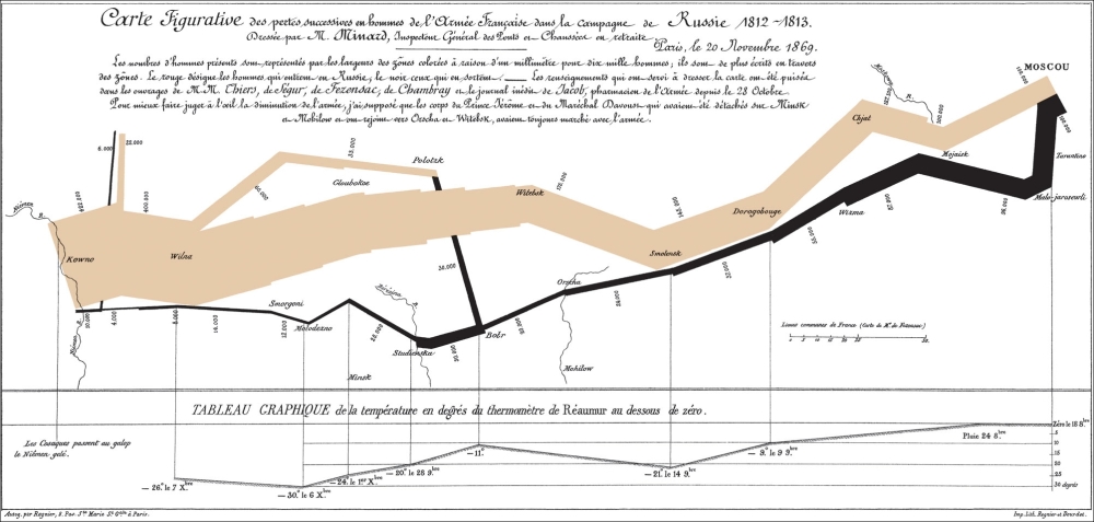
Charles Minard's flow map of Napoleon's march
It would be difficult to classify Charles Minard's figure as an infographic or as a flow chart because it allows for both. The information displayed is primarily quantitative, but it's shown in a map with contextual information that allows us to better understand the decline in the Napoleonic forces. There are several dimensions being displayed at once such as the number of soldiers, the geographic location of the soldiers during the march, and the temperature at each place. The figure does amazing work by showing how diminished the forces were when they arrived at Moscow and how the main enemy was the cold winter.
Infographics is a form of data visualization that is focused on communicating and explaining one or more particular views of a subject. It usually contains images, charts, and annotations, which provides context and enhances the reader's capacity to understand the main display of information. The award-winning infography about the right whale (La ballena Franca in original Spanish), created by Jaime Serra and published in the Argentinian newspaper, Clarin, in 1995 is a great example of how infographics can be a powerful tool to enlighten and communicate a particular subject. This can be found at http://3.bp.blogspot.com/_LCqDL30ndZQ/TBPkvZIQaNI/AAAAAAAAAik/OrjA6TShNsk/s1600/INFO-BALLENA.jpg. A huge painting of the right whale covers most of the infography area. A small map shows where this species can be found during their migratory cycles. There are outlines of the right whale alongside other kinds of whales, comparing their sizes. The image of the whale is surrounded by annotations about their anatomy that explain how they swim and breathe. Bar charts display the dramatic decline in their population and how they are recovering at least in some corners of the globe. All these elements are integrated in a tasteful and beautiful display that accomplishes its purpose, which is to display data to inform the reader. The Right Whale, Jaime Serra, 1995, can be seen in the following image:
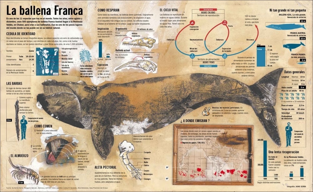
The Right Whale by Jaime Sierra
There are people who don't consider infographics as proper data visualization because they are designed to guide the reader through a story with the main facts already highlighted, as opposed to a chart-based data visualization where the story and the important facts are to be discovered by the reader.
This branch of data visualization is more focused on providing tools to explore and interpret datasets. These visualizations can be static or interactive. The exploration can be either looking at the charts carefully or to interact with the visualization to discover interesting things. In interactive projects, the user is allowed to filter and interact with the visualizations to discover interesting patterns and facts with little or no guidance. This kind of project is usually regarded as being more objective and data centered than other forms.
A great example is The Wealth and Health of Nations, from the Gapminder project (http://www.gapminder.org/world). The Gapminder World tool helps us explore the evolution of life in different parts of the world in the last two centuries. The visualization is mainly composed of a configurable bubble chart. The user can select indicators such as life expectancy, fertility rates, and even consumption of sugar per capita and see how different countries have evolved in regard to these indicators. One of the most interesting setups is to select life expectancy in the y axis, income per person in the x axis, and the size of the bubbles as the size of the population of each country. The bubbles will begin to animate as the years pass, bouncing and making loops as the life expectancy in each country changes. If you explore your own country, you will soon realize that some of the backward movements are related to economic crisis or political problems and how some countries that were formerly similar in their trends in these dimensions diverge. A visualization from Gapminder World, powered by Trendalyzer from www.gapminder.org, is shown in the following screenshot:
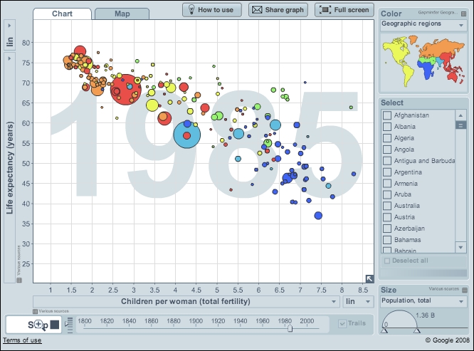
The time series for dozens of variables allow the user to explore this dataset, uncover stories, and learn very quickly about how countries that are similar in some regards can be very different in other aspects. The aim of the Gapminder project is to help users and policy makers to have a fact-based view of the world, and the visualization certainly succeeds in providing the means to better understand the world.
Dashboards are dense displays of charts that help us to understand the key metrics of an issue as quickly and effectively as possible. Business intelligence dashboards and website users' behavior are usually displayed as dashboards. Stephen Few defines an information dashboard as follows:
"A visual display of the most important information needed to achieve one or more objectives; consolidated and arranged on a single screen so the information can be monitored at a glance."
The preceding quote can be found in Information Dashboard Design: The Effective Visual Communication of Data, Stephen Few, O'Reilly Media.
As the information has to be delivered quickly, there is no time to read long annotations or to click controls; the information should be visible, ready to be consumed. Dashboards are usually bundled with complementary information systems to further investigate issues if they are detected. The distribution of the space in a dashboard is the main challenge when designing them. Compact charts will be preferred in this kind of project, as long as they still allow for speedy decoding of the information. We will learn about designing dashboards in Chapter 9, Creating a Dashboard. An example dashboard from Chapter 9, Creating a Dashboard, showing the performance of students in a class can be seen in the following screenshot:

This classification mentions only some of the forms of data visualization projects; most parts of data visualizations won't fit exactly under these labels. There is plenty of room to experiment with new formats and borrow elements of infographics, dashboards, and traditional charts to communicate more effectively.
Despite being a young discipline, there are great books on data visualization and information design. A successful data visualization practitioner should also know about design, statistics, cognition, and visual perception, but reading data visualization books is a good start.
Edward Tufte is an expert in information design and his works are a must-read in this field. They are filled with good and bad examples of information design and comments about how to better communicate quantitative information. They contain collections of images from ancient charts and visualizations, which explain their historic context and the impact they had. The discussion is not restricted to how to communicate quantitative information; there are examples ranging from natural history to architecture:
Visual Explanations: Images and Quantities, Evidence and Narrative, Edward R. Tufte, Graphics Press
The Visual Display of Quantitative Information, Edward R. Tufte, Graphics Press
Beautiful Evidence, Edward R. Tufte, Graphics Press
Envisioning Information, Edward R. Tufte, Graphics Press
Stephen Few is a data visualization consultant who specializes in how to display and communicate quantitative information, especially in business environments. His books focus on dashboard and quantitative information and provide actionable guidelines on how to effectively communicate data:
Information Dashboard Design: The Effective Visual Communication of Data, Stephen Few, O'Reilly Series
Now You See It: Simple Visualization Techniques for Quantitative Analysis, Stephen Few, Analytics Press
Alberto Cairo teaches visualization at the University of Miami. He has extensive experience in data journalism and infographics. His most recent book focuses on data visualization and how good infographics are made. He also has a strong presence on social media; be sure to follow him at http://twitter.com/albertocairo to be informed about infographics and data visualization:
The Functional Art: An introduction to information graphics and visualization, Alberto Cairo, New Riders
Andy Kirk is a data visualization consultant and author. He recently published a book sharing his experiences in creating data visualizations. He gives guidelines to plan and make the creation of visualizations more systematic. The book is filled with actionable advice about how to design and plan our visualization projects. Andy's blog (http://www.visualisingdata.com) is a great source to be informed about the latest developments in the field:
Data Visualization: A Successful Design Process, Andy Kirk, Packt Publishing
There isn't a universal recipe to create good data visualizations, but the experience and guidelines from experts in the field can help us to avoid mistakes and create better visualizations. It will take time to have the necessary skills to create great data visualizations, but learning from experienced people will help us make a safer journey. As with many other things in life, the key to learning is to practice, get feedback, and improve over time.
In 2011, I was working in a hedge fund, and most of my work consisted of processing and analyzing market data. It mostly consisted of time series, each row containing a timestamp and two prices: the bid and asking prices for stock options. I had to assess the quality of two years of market data and find whether there were errors or gaps between millions of records. The time series were not uniform; there can be hundreds of records in a couple of seconds or just a few records in an hour. I decided to create a bar chart that shows how many records there were in each hour for the two years of data. I created a Python script using the excellent packages NumPy and Matplotlib. The result was a folder with thousands of useless bar charts. Of course, the software was not to blame.
In my second attempt, I tried to create a heat map, where the columns represented hours in a week and the rows represented the weeks of a year. The color of each cell was proportional to the number of quotes in that hour. After tweaking the colors and the size of the cells, my first visualization emerged. Success! The pattern emerged. My coworkers began to gather around, recognizing and explaining the variations on market activity. The black columns at the end of the chart corresponded to weekends, when the market was closed. Mondays were brighter and had more activity than other days. Holidays were easy to spot after a quick consult to the holidays calendar for the year. More interesting patterns were also discernible; there was frantic activity at the beginning of the working day and a slight but noticeable decline at lunch. It was fun and interesting to recognize what we already knew.
However, besides the gaps explained by common sense, there were small gaps that couldn't be explained with holidays or hungry stock traders. There were hours with little or no activity; in the context of a year of market activity, we could see that it was something unusual. A simple heat map allowed us to find the gaps and begin to investigate the anomalies.
Of course, this first heat map required a better version, one that could allow the exploring of the dataset more easily. We needed an interactive version to know the exact date and time of the gaps and how many records there were in each hourly block. It should also highlight the weekends and holidays. This required better tools, something that allows for more interaction and that doesn't require Python's virtual environments and numerous packages to generate the graphics. This search led me to D3, and I began to learn.
There are several charting packages for web platforms, but D3 excels among them by its flexibility and strong features. A quick visit to the D3 home page (http://www.d3js.org) will amaze us with hundreds of examples of what can be done, from the humble bar chart to beautifully crafted interactive maps. Newcomers will soon realize that D3 is not a charting package, but is a tool to bind data items with DOM elements and associate data attributes with visual properties of the DOM elements. This could sound abstract, but this is all we need to create almost any chart.
A chart is a visual representation of a dataset. To create a chart, we must associate attributes of the data items with properties of graphic objects. Let's consider the following dataset:
|
x |
y |
|---|---|
|
2.358820 |
0.70524774 |
|
2.351551 |
0.71038206 |
|
... |
... |
|
3.581900 |
-0.426217726 |
This series of numbers doesn't have an intrinsic visual representation; we should encode the attributes of each record and assign them corresponding visual attributes. Using the most traditional representation for this kind of data, we can represent the rows as dots on a surface. The position of the dots will be determined by their x and y attributes. Their horizontal position will be proportional to the x attribute and their vertical position will be proportional to the y attribute. This will generate the following scatter plot:

Scatter plot, a visual representation of two-dimensional quantitative data
To help the viewer trace back from position to data attributes, we can add axes, which are essentially annotations for the visual representation of the data. All charts work on the same principle, which is associate visual attributes to data attributes.
With D3, we can manipulate attributes of DOM elements based on attributes of the data items. This is the essence of creating charts. SVG stands for Scalable Vector Graphics, and in most browsers, SVG images can be included in the page and thereby become a part of the DOM. In most cases, we will use svg elements to create charts and other graphic elements. SVG allows us to create basic shapes as rectangles, circles, and lines as well as more complex elements as polygons and text. We can color the elements by assigning them classes and adding CSS styles to the page, or we can use the fill attribute of svg objects. D3 and SVG form a powerful combination, which we will use to create interactive charts and maps.
Of course, there is a price to pay to effectively use these powerful tools. We must learn and understand how browsers work and know our way with JavaScript, CSS, and HTML. One of the fundamentals of D3 is that it manipulates DOM elements, knowing little or nothing about the visual representation of the elements. If we want to create a circle, D3 doesn't provide a createCircle(x, y, radius) function, but rather we should append a circle svg element in a DOM node (the element with the container ID) and set their attributes:
// Appending a circle element to a DOM node
d3.select('#container').append('circle')
    .attr('cx', 10)
    .attr('cy', 10)
    .attr('r', 10);
Tip
Downloading the example code
You can download the example code files for all Packt books you have purchased from your account at http://www.packtpub.com. If you purchased this book elsewhere, you can visit http://www.packtpub.com/support and register to have the files e-mailed directly to you.
As D3 doesn't know anything else other than the fact that we are appending a DOM element, it is up to us to check whether the parent element is an svg element and that cx, cy, and r are valid attributes for a circle.
As we mentioned before, D3 doesn't have ready-to-use charts, but has several tools to make creating visualizations and charts easy. Binding data to DOM elements allows us to create from bar charts to interactive maps by following similar patterns. We will learn how to create reusable charts so that we don't have to code them each time we want to add a chart to a page. For big projects, we will need to integrate our D3-based charts with third-party libraries that support our need, which is out of the D3 scope. We will also learn about how to use D3 in conjunction with external libraries.
Fortunately, D3 has a great community of developers. Mike Bostock, the creator of D3, has created a nice collection of in-depth tutorials about the trickiest parts of D3 and examples demonstrating almost every feature. Users of the library have also contributed with examples covering a wide range of applications.
In this chapter, we gave a working definition of data visualization, one of the main fields of application of the D3 library.
This book is about D3 and how to create interactive data visualizations in real-life settings. We will learn about the inner working of D3 and create well-structured charts to be used and shared across projects. We will learn how to create complete applications using D3 and third-party libraries and services as well as how to prepare our development environment to have maintainable and comfortable workflows.
Learning D3 may take some time, but it's certainly rewarding. The following chapters are focused on providing the tools to learn how to use D3 and other tools to create beautiful charts that will add life to your data.