


The Lightweight User Interface Toolkit (LWUIT) is a UI library for the Java ME platform. It enables a developer to create visually attractive and functionally sophisticated user interfaces that look and behave the same on all Java ME enabled devices compatible with MIDP 2.0 and CLDC 1.1. In this library, there are enhancements to graphical components that are part of the javax.microedition.lcdui package, brand new widgets like the TabbedPane and Dialog, and there is also support for new features like animation and transition. The Swing like architecture of LWUIT permits customization of the appearance of an application. And, best of all, it makes sure that our applications will look just the same, regardless of the platform they are deployed on.
In this chapter, we shall cover the following:
An overview of LWUIT
A look at the basic architecture
An introduction to Implementation and Display classes
By the time you get through this chapter, you will know what LWUIT is all about, and broadly, how it operates.
Java ME allows us to write applications that are, generally speaking, portable across a wide range of small devices that support the platform. While the basic functionalities usually work well on all supported devices, the area that does pose problems for developers is the User Interface. Native implementations of javax.microedition.lcdui—the primary API for UIs in Java ME, differ so widely from one device to another, that maintaining a device-independent and uniform look-and-feel is virtually impossible.
Non-uniform look-and-feel is not the only reason why developers have been waiting for something better to turn up. The javax.microedition.lcdui package does not support components and capabilities that can fully satisfy present day user expectations.
This is why the arrival of LWUIT is so exciting. LWUIT offers a wide range of Widgets for building UIs. While some of these widgets are also available under lcdui, there are a number of new ones too. These additions enable application developers to design UIs that can come very close to their desktop counterparts in terms of visual sophistication. Even the components that are also offered by lcdui have been functionally enhanced. LWUIT is not just about new components. The API supports a whole range of new functionalities (Theming, Transitions, and more).
A Component is an object that has a visible avatar. Generally speaking, a component can also sense and react to customer inputs. A Widget is a specific type of component with its own distinctive look and feel. A button is a widget and so is a combo box.
During our exploration of LWUIT, we shall keep using the terms Widget, Component (with a capital C) and component. To make sure that we avoid any confusion, let us define what we mean by these terms. The LWUIT library has a Component class that is the superclass for all widgets and embodies their essential qualities. The word Component (yes, with a capital C) will be used to refer to the class, while component (with a lowercase C) will mean any instance of the Component class. This principle of distinguishing between Component and component will be applicable to all classes and their instances. So the word Label refers to the class, and the word label refers to a specific object of that class.
The widgets are the visible faces of LWUIT. So before we delve into the inner details of the library, let us check out the widgets. The following figure is the widget family tree showing all major widgets.
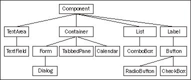
Among the widgets, the Container is the basic 'holder' which can contain other components, including other containers. This nesting ability of containers allows complex and elaborate UIs to be built-up. The arrangement of components within a container is taken care of by a layout manager.
Form is a container with a TitleBar at the top, on which the title of the form can be written, and a MenuBar at the bottom for commands and menu. The space between the two bars is for the content pane, which holds the components that are to be placed on the form.
The container branch of the family tree also has Dialog, TabbedPane, and Calendar. All of these Widgets will be introduced here, and dealt with in detail in Chapter 3.
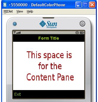
The previous screenshot shows a form and its constituent areas. The title of the form appears on the TitleBar, and the border at the bottom with the Exit command is the MenuBar. We can also see where the content pane goes.
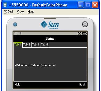
A TabbedPane lets a number of component groups share the same space. Each group of components has a tab associated with it, and the user sees only the group corresponding to the tab that has been selected.
The default placement of tabs is at the top of the pane. However, it is possible to position them at the left, right or at the bottom of the pane. The following screenshot shows a tabbed pane with the tabs at the top, and with the first tab selected.
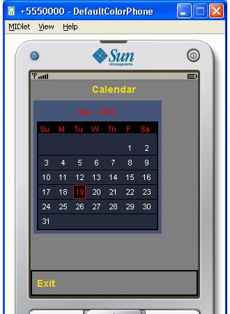
This widget shows date information and supports 'scrolling' through dates and months. The following screenshot shows a calendar:
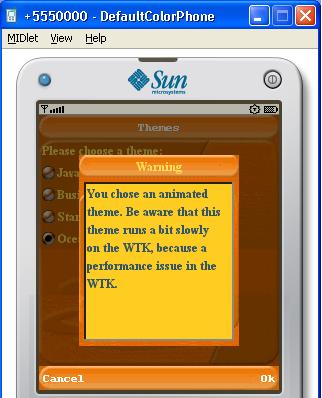
A Dialog is a component that is usually displayed against a tinted background and covers a part of the screen. By default, a dialog is modal, that is, it blocks the calling thread until it is closed by calling the dispose () method. Dialogs can be one of five types:
Dialogs can be used to convey information to the user at runtime, and also to collect user feedback. The type of the dialog would normally determine the sound to play when the dialog is displayed. It is possible to add icons to a dialog to graphically indicate the dialog type. The following screenshot shows a simple warning dialog with the Ok and Cancel commands:
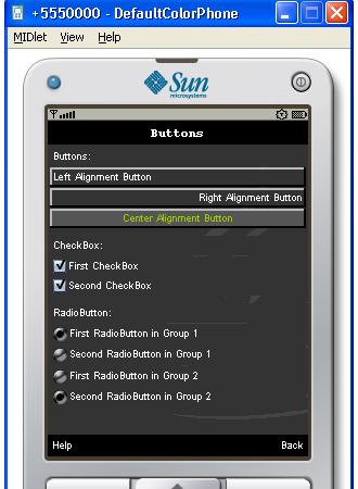
A Label displays images and text that cannot be selected. A label does not interact with the user. A number of alignment possibilities are supported for positioning the label, and also for positioning the text with respect to the image on the label. Label and its descendants (Button, RadioButton, and CheckBox) are covered in Chapter 4.
A Button is primarily intended for capturing an input from a user. In a way, we can think of a button as a label that can sense user action—specifically, a click.
The Button class extends Label. A button has states, and it generates an action event when selected and clicked on. Like a label, a button can have a descriptive text or an image or both. The three states of a button are as follows:
A button has two subclasses—RadioButton and CheckBox. A radio button has all of the functionalities of a button. In addition, a radio button can be added to a ButtonGroup, which allows it to maintain its selection state exclusively within the group. Within a button group, only one radio button can be in the pressed state at a time. If another radio button is clicked on, then the one that was in the pressed state earlier will get deselected. Also note that once a radio button is in the pressed state, clicking on it does not change the state.
A check box is similar to a radio button in the sense that it can remember its state, if it has been selected by being clicked on. However, repetitive clicking on a check box will toggle its state between selected and deselected. Another difference is that a check box cannot be a part of button group.
A number of labels, buttons, radio buttons, and check boxes are shown in the following screenshot. The screenshot shows that the first two buttons are in the default state, while the third is in the rollover state. Both the check boxes are shown selected, but only one radio button in each group is selected.
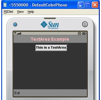
TextArea is a component that displays text that may be editable. The editing is performed using the native system editor, which often opens a new screen. A text area uses the concept of constraints just like TextField of javax.microedition.lcdui. The constraints allow a text area to be tailored to accept a particular type of input like a password or an email address. We shall study this in detail when we discuss TextArea in Chapter 6. The following screenshot shows a form with a text area:
A TextField (this one is a part of LWUIT) extends TextArea, and provides a single line text display. It differs significantly from TextArea in the way that it supports text editing. In Chapter 6, we shall study TextField in detail.
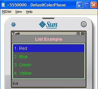
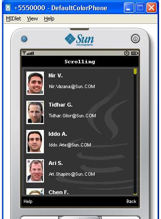
A List is a very widely used component that presents a number of information items to the user. The items are presented in a single column, but each item may contain multiple lines of text and images.
The data structure of a list is represented by the ListModel interface. Therefore, a list is not tied to any specific data structure, and can display information from any object that implements this interface. Similarly, the rendering of a list is performed by any class that implements the ListCellRenderer interface, thus making it possible to create the kind of look the application developer wants. The library includes default implementations of the above interfaces that make it easy to instantiate a list.
List and its subclass ComboBox will be discussed in Chapter 5. The following screenshot shows a simple list with four items:
Compare this with the list shown in the following screenshot and its significantly different appearance. The application behind the following screenshot implements its own renderer to achieve a very polished and attractive look. We shall see how to write custom renderers in Chapter 5.
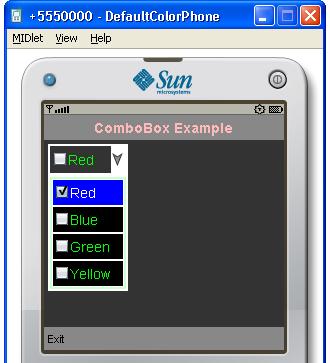
The ComboBox is a space saving component that drops down a list when its button is clicked on. The user can then select one of the items on that list. As ComboBox extends List, you can use custom models and renderers for combo boxes too. The following screenshot shows a combo box with a four item drop-down list:
LWUIT incorporates a number of 'behind the scenes' support elements that make it possible for the functional features to operate. We shall now take a look at these elements, and see how they work.
Applications often require non-code items. For example, an image used as an icon for a label by an application, is such an item. LWUIT allows such items to be packaged in bundles.
A resource bundle is essentially a binary file that can be loaded into a device. An application can have more than one resource file, and each such file can contain resource elements of the same or different types.
The following types of resource elements are supported:
Individual resource elements can be extracted by a set of appropriate methods in the Resource class. Resource files can be built by using the LWUIT Designer, which is an utility that is a part of the LWUIT bundle. In Chapter 9, we shall study the Resource class and resource files, and we shall also learn how to use the LWUIT Designer.
LWUIT brings the power of sophisticated layout managers to the design of UIs for small devices. These managers are responsible for arranging widgets on a container.
The managers supported are:
LWUIT provides a very convenient way of defining the appearance of a component at a single point. Each component has a Style object associated with it. The attributes related to the look of the component can be set within this object. The attributes are:
When a component is generated, it constructs a default style object. The values of the attributes of this object can be changed at runtime to modify the appearance of a component. We will talk about styles in greater detail in Chapter 3. We will also use style objects to specify the appearance of a widget in many other chapters.
The Painter interface, discussed in Chapter 12, allows you to draw on the background of a component. A painter can be used to draw a specific pattern on the background of one, or a group of components. The LWUIT package provides two classes that implement this interface:
A painter can also be used as a transparent or translucent layer called a glass pane on top of a form.
An interesting feature of LWUIT is that it manages the appearance of an entire application from a single point. The UIManager is the class that co-ordinates the visual aspects of an application. This is a singleton to ensure that there is only one instance of UIManager per application. The methods of this class enable it to impose the same look on all components and to localize the UI on the fly. As UIManager is the class that controls the rendering of components, there will be many examples in this book that will demonstrate the use of this class.
LookAndFeel is the interface that takes care of all rendering for an application. Therefore, it is possible to completely customize the appearance of an application by implementing the appropriate methods of this interface. The concrete implementation of LookAndFeel that comes with the LWUIT package is DefaultLookAndFeel and this class controls the actual rendering of the default look of the application. We can also plug in a custom implementation of LookAndFeel, by using the setLookAndFeel method of UIManager. We shall use DefaultLookAndFeel in many of our examples in this book.
A really interesting aspect of LWUIT is that it goes beyond just components, and offers features that enable us to produce very sophisticated UIs. In this section, we introduce these features.
The LWUIT library supports animation at different levels, and also the implementation of different modes of transition from one form to the next one to be displayed. In the context of LWUIT, animation essentially allows objects to paint succeeding frames at timed intervals. Transition refers to the way in which a form is brought into, or taken out of the display screen. SlideTransition, for instance, makes the new form slide in pushing the old one out.
The basic implementations of such transitions are achieved through the mechanisms provided by the Animation interface and the classes Motion, Transition, CommonTransitions, and Transitions3D, which are in the com.sun.lwuit.animations package.
The Animation interface defines objects that can be animated. All components are inherently capable of performing animation tasks, as all of them implement Animation.
Transition is an abstract class that represents animation from one form into another. Its two concrete subclasses are:
Motion is a class that implements motion equations. The types of motion that are built-in are Linear, Spline, and Friction.
In Chapter 11, we shall go into the details of these two functionalities, and create a custom transition.
A Theme defines a uniform look for all visual components in an application. A theme file is essentially a list of key-value pairs that define the relevant attributes. We have seen that a style object specifies how a particular component instance will look. A theme can be thought of as a common style for the components that appear in it as "keys". For example, if you want all buttons in your application to have a green background, then you can do it by defining an appropriate "key-value" pair in your theme. We shall learn how to apply themes in Chapter 10.
This is a debugging aid that allows you to log information at runtime. The com.sun.lwuit.util.Log class provides methods for logging information into a log file (created in the root directory) using the FileConnection API, for example, and also for displaying logged information on a form. You can use the information saved in the log file through the FileConnection API.
The use of logging will be studied in Chapter 13.
The creators of LWUIT have said that this library has been inspired by Swing. Naturally, the architecture of LWUIT has adopted a number of features from Swing, modified to fit the constraints imposed by the small device environment in which it is meant to operate.
Like Swing, LWUIT renders all the visual entities itself, and does not derive them from native equivalents. This ensures device independence and visual uniformity. Two other features that are of interest to us are the modified Model-View-Controller (MVC) model and the Event Dispatch Thread (EDT).
The modified MVC model separates the logic (and data) that specifies the behavior of a component from the part that takes care of its appearance and user interface. For example, a list will have a part that contains the items to be shown (the model), and another that defines its look and its interaction with the user like scrolling (the combined view and controller). The two parts will interact with each other through predefined rules. In the context of LWUIT, this means that the look and feel of a list can be modified by plugging in a new combination of view and controller. The new list will look, and perhaps interact with the user differently from the "standard" list that comes with the library. However, its operation will be correct, as long as the rules of interaction between the two parts of the list are adhered to. In essence, this is the concept of the pluggable look and feel (PLAF) capability that LWUIT offers us. Through PLAF we can customize the visual aspects of a component quite easily.
The EDT is a thread that handles all interaction between the LWUIT objects in an application. Since the interactions take place over a single channel, they occur serially. This helps to avoid logical race conditions, and the highly frustrating bugs that they can produce.
In the next section, we shall see how EDT handles inter-component communication, and how critical it is to the proper operation of LWUIT-based user interfaces.
The LWUITImplementation is an abstract class that extends javax.microedition.lcdui.game.GameCanvas, and performs a number of critical functions. The GameCanvasImplementation class extends LWUITImplementation, and implements the abstract methods of its superclass. To obtain an instance of LWUITImplementation, the createImplementation method of the ImplementationFactory class needs to be called. This method returns an instance of GameCanvasImplementation that works as the default LWUIT implementation. This activity of creating an LWUIT implementation object is performed by the Display class, as explained in the next section, and is transparent to the application developer. Although, a developer who wants to use LWUIT to create a user interface would have no need to have access to this class, a broad understanding of the role played by the LWUITImplementation class helps in more effective utilization of the library.
The key issue about the structure of LWUIT is that it is built on top of javax.microedition.lcdui—the UI package that comes with MIDP 2.0. This means LWUIT needs to use the infrastructure provided by lcdui to render everything. Specifically, lcdui has to provide a surface on which LWUIT can draw. So the starting point for an LWUIT application is an instance of LWUITImplementation (which is actually a game canvas object) on which all components are drawn. Regardless of the number of forms and widgets in your application, there is just one instance of game canvas, which is used for rendering the various visual entities. Therefore, when you see a form replace another on the screen, remember that the new form has been drawn on the same object on which the earlier form had been rendered.
In addition to being the common rendering surface, LWUITImplementation performs two very important tasks—it listens for all commands directed to the LWUIT environment, and also acts as EDT, the main thread for input events, painting, and animation. To get an idea of how this works, let's consider a simple example. The following screenshot shows three buttons with the top-most button having focus:
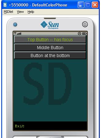
If the scroll-down key is pressed now, then an event is sent to the underlying game canvas, that is, the LWUIT implementation object. The LWUIT implementation object does not directly act on the event, but puts it in a queue for the EDT to handle.
The EDT takes events sequentially from the queue, and sends them to the form that is currently on display. The form keeps track of the component within it that has focus. It also knows the details of components contained by it, and the order in which focus will move from component to component. When the form finds that it has received a scroll-down event, it transfers focus to the next button. If the select key is pressed, then the form would know the event is meant for the button that has focus, and would retransmit the event to the appropriate button. The button will redraw itself as its state has changed, and call the registered listener(s). Finally, when the event reaches the listener for the button, the required action is taken.
The EDT also handles painting and animation activities in a similar way. Therefore, the EDT can be thought of as the lifeline of an LWUIT application, and care must be taken not to block it. Developers writing code for animation, painting, and for handling events have to understand that if the EDT ever gets blocked, then the user interface will become unresponsive.
This is the class that manages the painting and event handling with LWUITImplementation as a partner. Display is used to show forms and also to start the EDT. Like LWUITImplementation, there is just one instance of Display for an LWUIT application. However, unlike LWUITImplementation, it can be accessed, and used by us.
Before any form is shown, we must register the current MIDlet by calling the static method Display.init(MIDlet midlet). The init method instantiates LWUITImplementation, as well as a new Thread—the EDT and starts it off. It also invokes the init(MIDlet midlet) method of LWUITImplementation to get the underlying instance of the javax.microedition.lcdui.Display class. Obviously, nothing much can be done with the LWUIT API until the MIDlet is registered with the Display class of LWUIT.
Note
The fact that there are two Display classes—one in the LWUIT library and the other in the javax.microedition.lcdui package—can be a source of confusion. In the rest of this book, the word Display by itself will refer to the class in LWUIT. We will not need to talk about the other Display class very often, but when we do, it will be referred to as the javax.microedition.lcdui.Display class.
LWUIT is a powerful UI library for the Java ME platform. In this introductory chapter, we have laid the basic foundation through a bird's-eye view of LWUIT. We have:
Identified the constituents like the various widgets, support functions, and new capabilities like animation and transition
Understood the architectural similarities between Swing and LWUIT
Checked out the implications of the architectural features
Been introduced to
LWUITImplementationandDisplayclasses